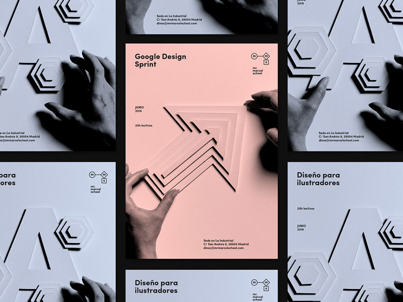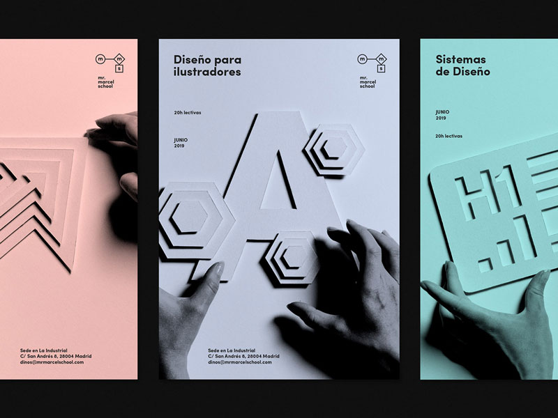
Mr. Marcel is an online school that teaches design and related topics. As such, they have to produce great visuals for their promotional material. To do this, they worked with Tata&Friends, a Spanish design agency.
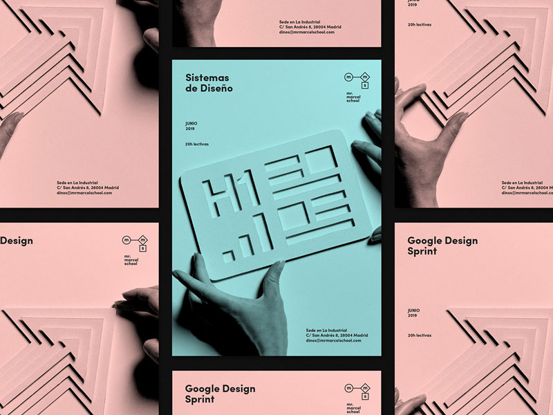
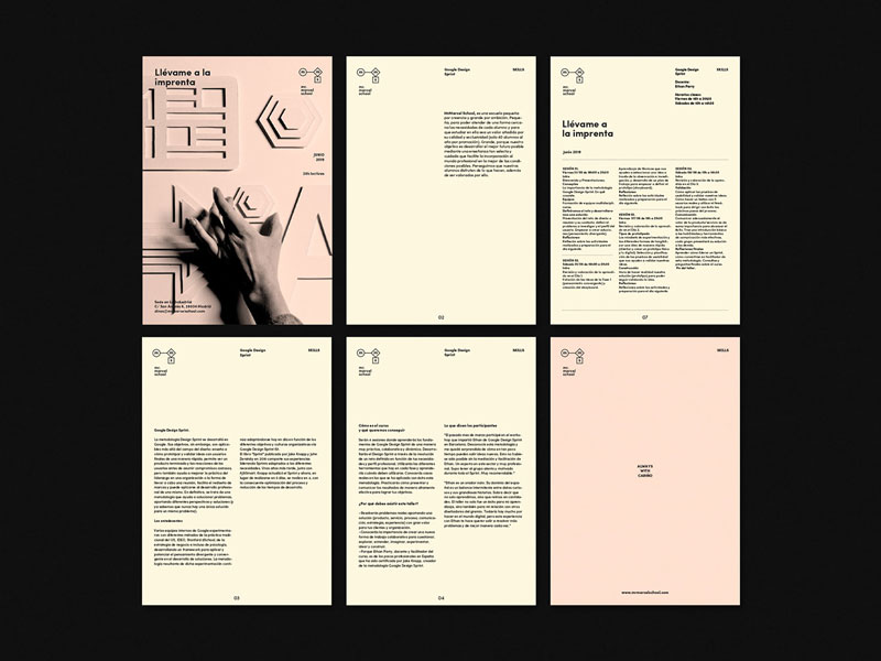
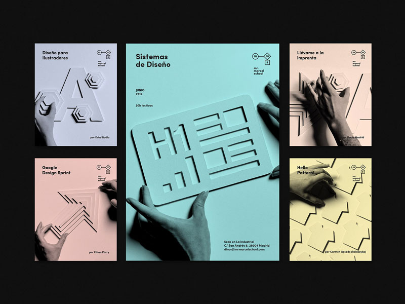
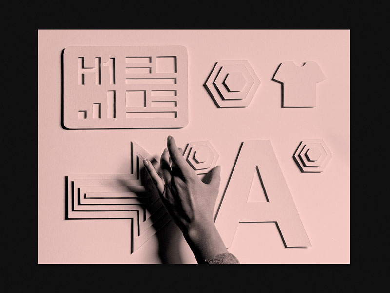
The designers went for bichromic visuals, with handmade designs and great photography. The color scheme is very subtle, with gorgeous use of white space and well-aligned typography.
