A great business card should convey the overall motto and images of your business. It is a not an easy task considering the fact that an average business card only measures 2 inches in width and 3.5 inches in length. It is inconsiderate to have the thought that your business card will portray the entirety of your business. However, what it can do is portray a professional image of your business which the other person will remember.
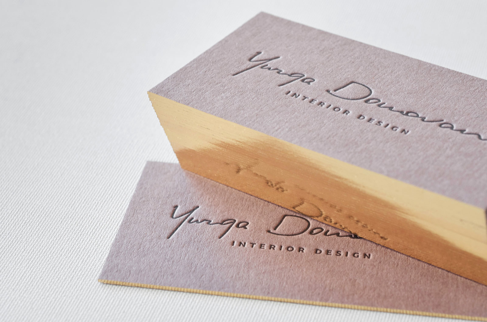
Business cards come in all forms and sizes starting from normal ones to letterpress business cards.
You need to consider a lot of factors before deciding on the design of your business card. These factors include colour, text and typography to name a few. And all of these factors should perfectly align in order to reflect a professional image of your business.
While designing your business card, it is important to use common sense. For example, if you are a business selling children products, the best bet will be to use bright colours and quirky designs. You can consider the typography to be written in child script for the design to stand out even more.
Another example to consider- suppose you are the proprietor of a financial advisory firm. When designing your business card, you should keep in mind that it should reflect the two most important aspects of your business, which are professionalism and integrity. Go for a simple black-gold or a white-beige business card design to successfully reflect the same.
While professional designers always suggest that an entrepreneur shouldn’t design their own business card, most small and cash-strapped business owners are left with few other choices. But don’t lose hope, keep the below-mentioned tips in mind, and you will be all set.
Keep your logo as the basis
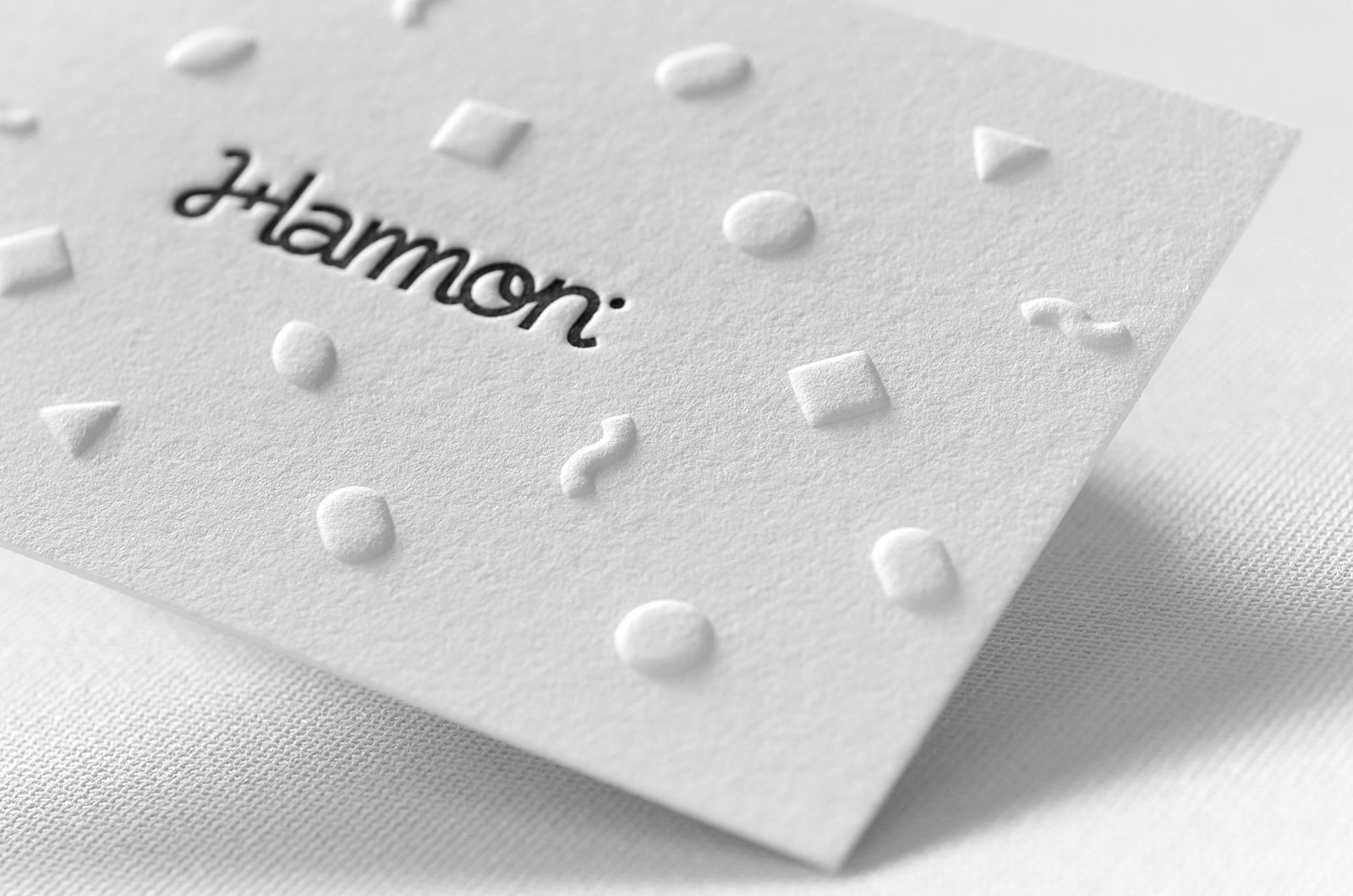
Make your business logo the biggest element in your business card. By making it big, you will not attract the attention of your readers on to it, but also utilise the space which would otherwise remain empty.
KISS- Keep it Simple, Stupid!
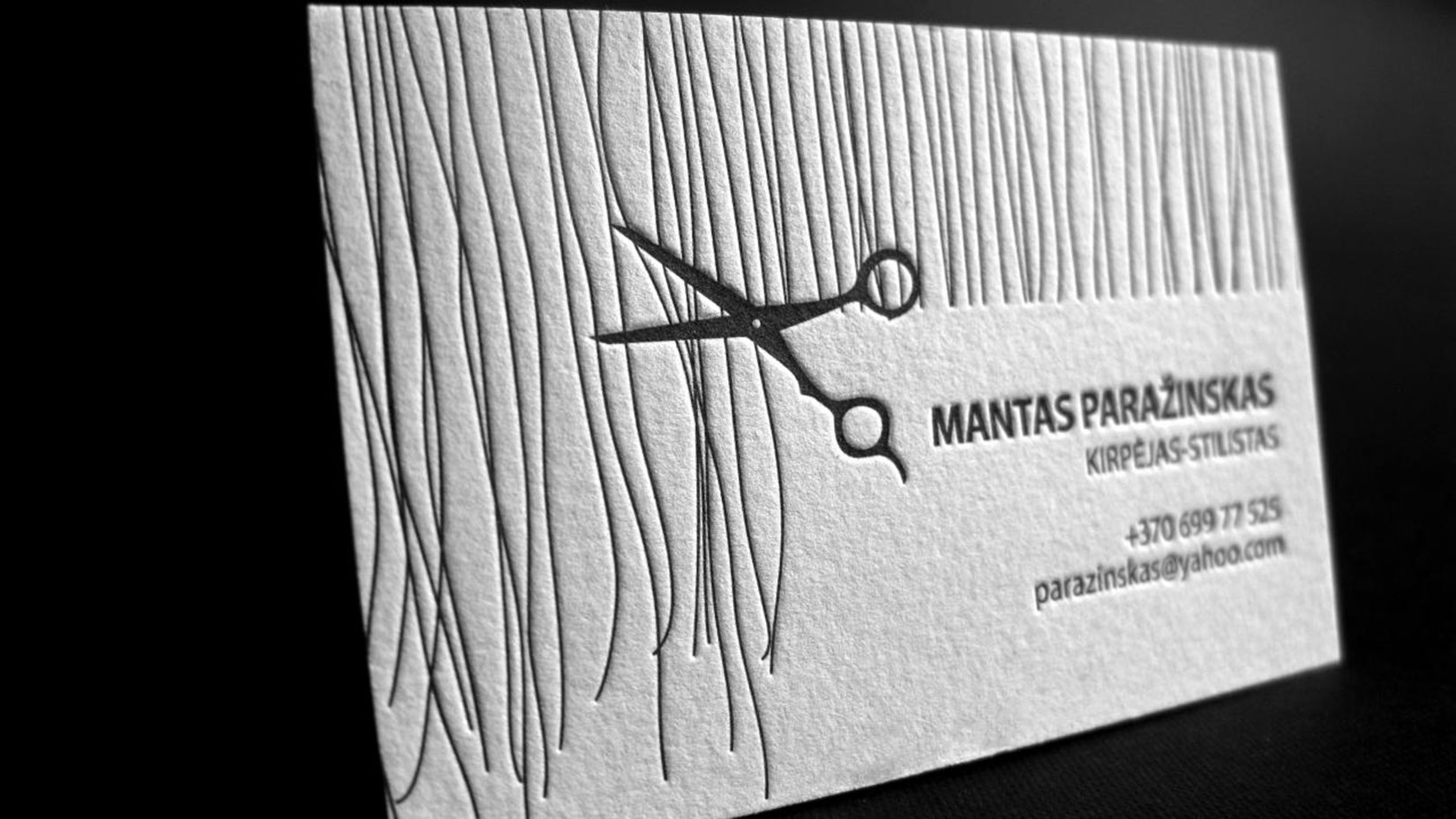
Professionalism is best reflected when the design is simple yet unique and convenient. Keeping the entire layout of your business card simple, will ease the eyes of your readers and only attract their attention to the important details of your company. Don’t cramp too much information into your business card.
Include the essentials
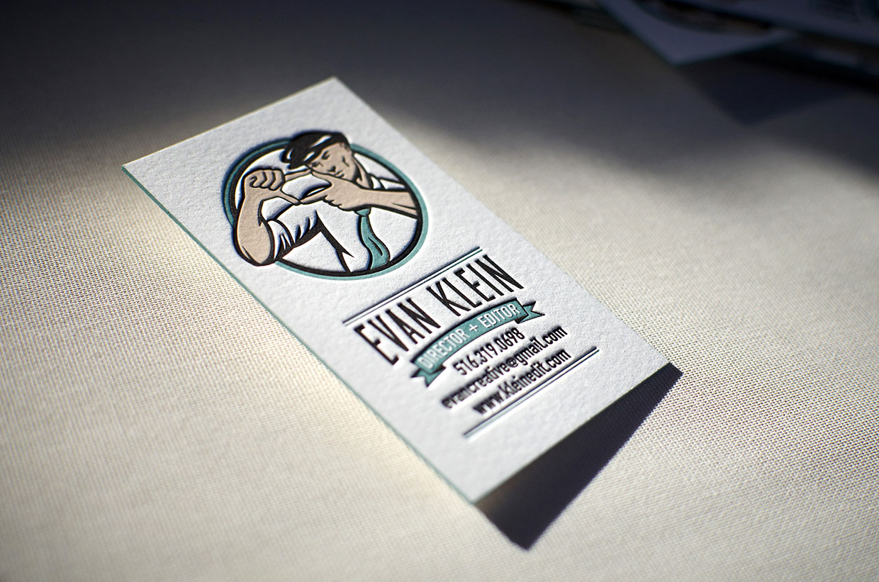
The most important aspect of having a business card is to portray essential information about your company or organisation. Include your name, designation, company name, email address and phone number. Keep the font size bigger than the rest of the card and also make them bold to stand out even more. Although there is no standard arrangement on how to portray this information, it is best practice to put your name, designation, email address and then the phone number.
Make it readable
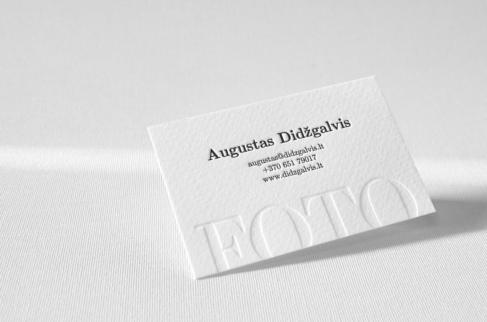
Being excessively creative with your design can take you to a whole different tangent. While in the flow, make sure to keep the entire font very readable. People don’t have the time to stretch their eyes and invest a lot of time into figuring out what you have written.
Stick to one or two colours
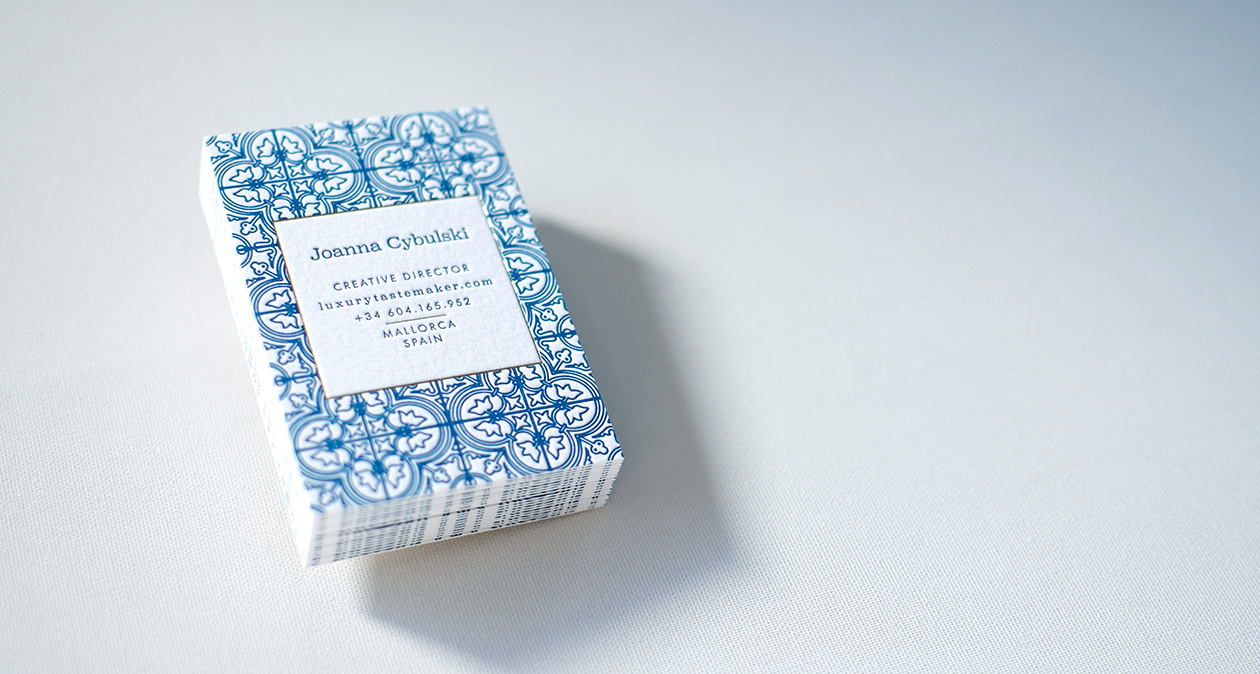
While some creative prefer keeping the colour scheme as a rainbow, it is usually not a good choice. First, it makes the card look unprofessional and moreover the cost of printing them will be very high. The more the number of colours the more will be the price of the overall card.
Try different papers and printing techniques
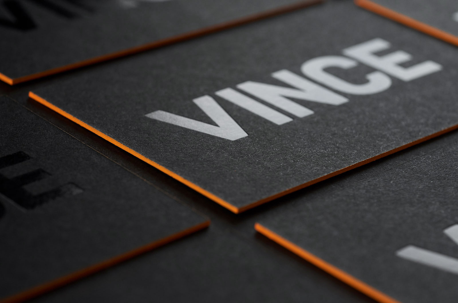
If you are in the creative industry, or a person who is very creative, you can surely out the various papers available in the market. Starting from pure cotton paper to recycled kraft or even corrugated cardboard, there are a lot of choices to choose from. Combining few different printing techniques like letterpress and hot foiling or engraving and silkscreen you can get really impressive results.
Break the norm
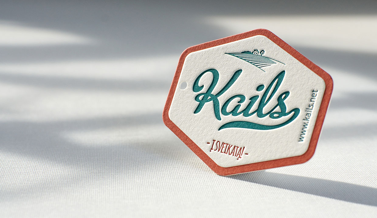
While traditional cards are surely more common, business cards in non-traditional shapes like oval, cuboidal or even round are super attention grabbers. Not only does the shape stand out and with the above-mentioned designs, they will look good to both you and the receiver. Designing a business card is fairly easy, and owning one will surely make you look more professional in the eyes of your business associates. Check out for more beautiful business cards samples on Elegante Press portfolio.

