Some designers and developers in the ProgrammerHumor subreddit have been working on an unusual challenge for a bit more than a week, they have decided to try to design the worst possible slider ever.
The joke took on pretty well, so the designers and devs produced some pretty aweful designs in term of UX and functionality. If you look at the creative side, you can say that the work produced was pretty stunning. A few of these are display below in this post, for more, check out this subreddit.
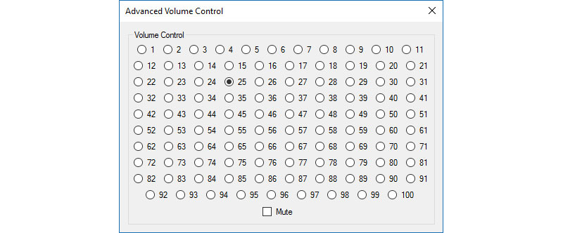
Pick the desired volume level.
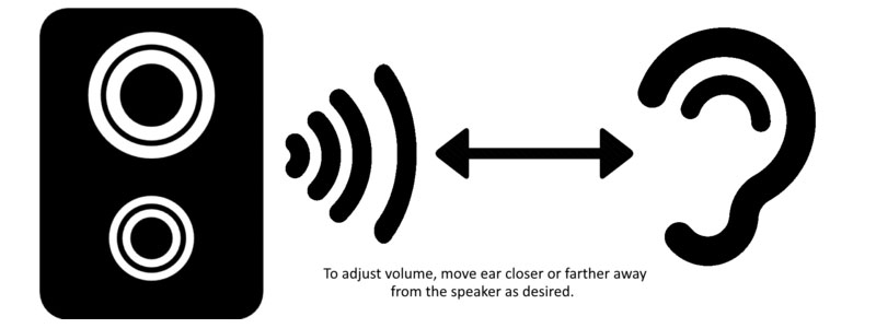
Hands-free volume adjuster.

Beat a dead horse to adjust your volume.

This one is pretty entertaining actually.
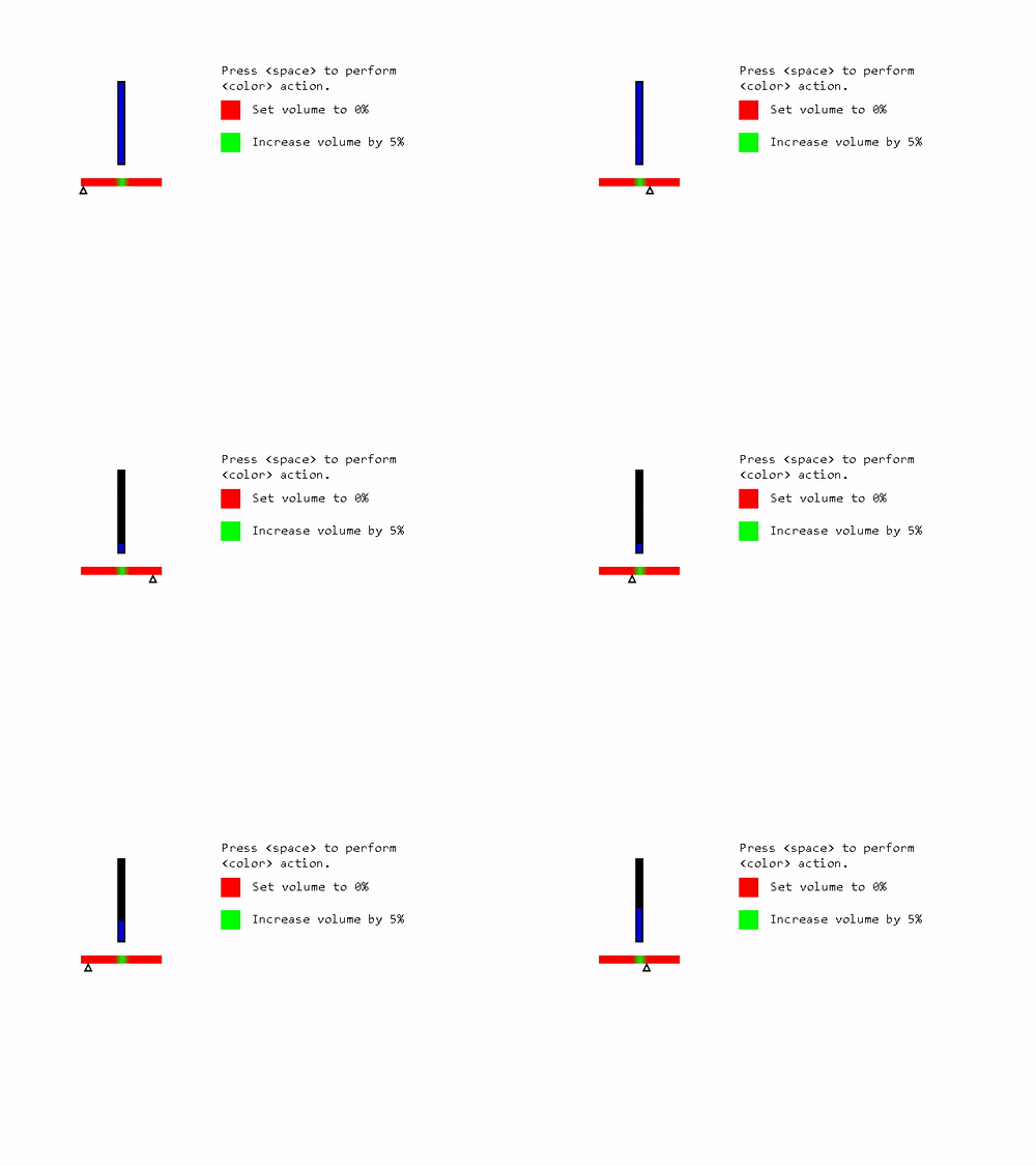
I didn’t even understand this one.
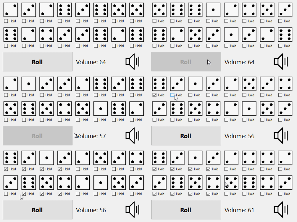
Rolling your volume, for old-school gamers.

Rickrolling latitude based volume picker.
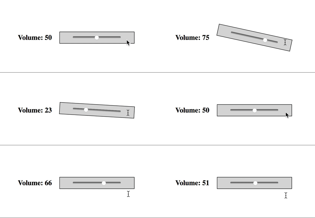
Physics at work.

Unproper use of gamification.

