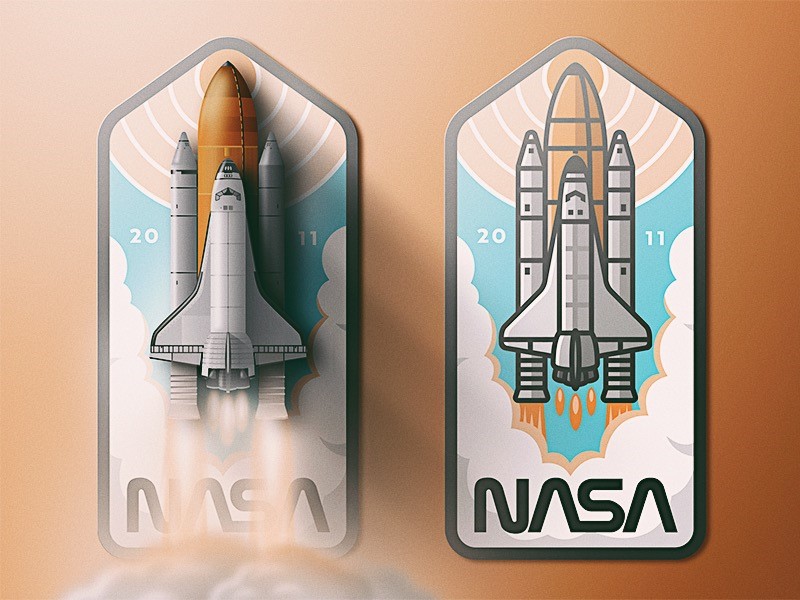
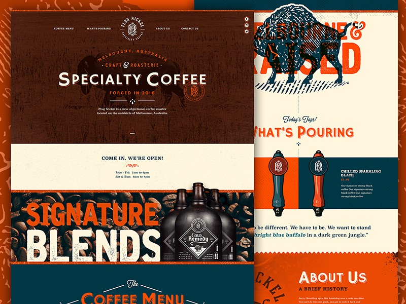
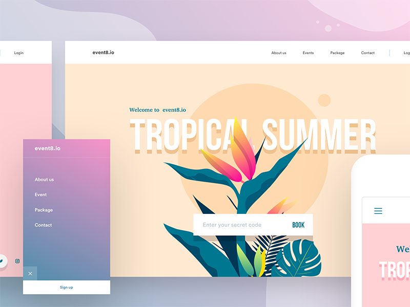
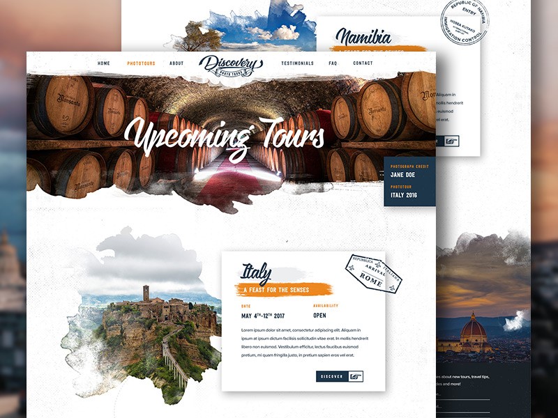
Trends often emerge from a collective feeling or mood, which is captured by designers in different fields. Retro color pallets, made popular through the emergence of photo filters, is an example of how old-world charm is being reborn into web design.
Designers have always kept an eye on the past, and every twenty or so years, trends return in updated form.
If you’re thinking of retro, imagine a mood board filled with a faded photo from your childhood, an image from a television program which takes you back in time, a vintage dress, architecture, an old album cover, and multiple other images from the last century.
Retro colors
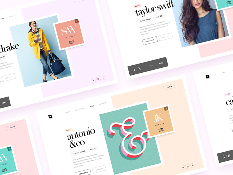
Retro colors come in a variety of hues but tend to be more muted. They don’t draw from primary colors, but range from neutrals such as creams, and yellowed browns, to blues, sage green, teal, and art deco style pastels such as peach or pale pink.
Color influences range from the 1920s to the 1980s. As time passed, colors became brighter. However, the large time range gives designers a huge variety of influences to draw from.
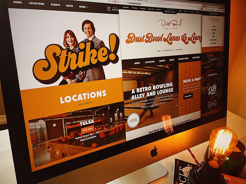
Retro templates are becoming increasingly popular in website design. These templates are characterized by iconic imagery from a particular time period, vivid graphics, and muted colors. This popular trend is emerging, not only in website design but in paintings, adverts and in fashion, home decor and color pallet choices.
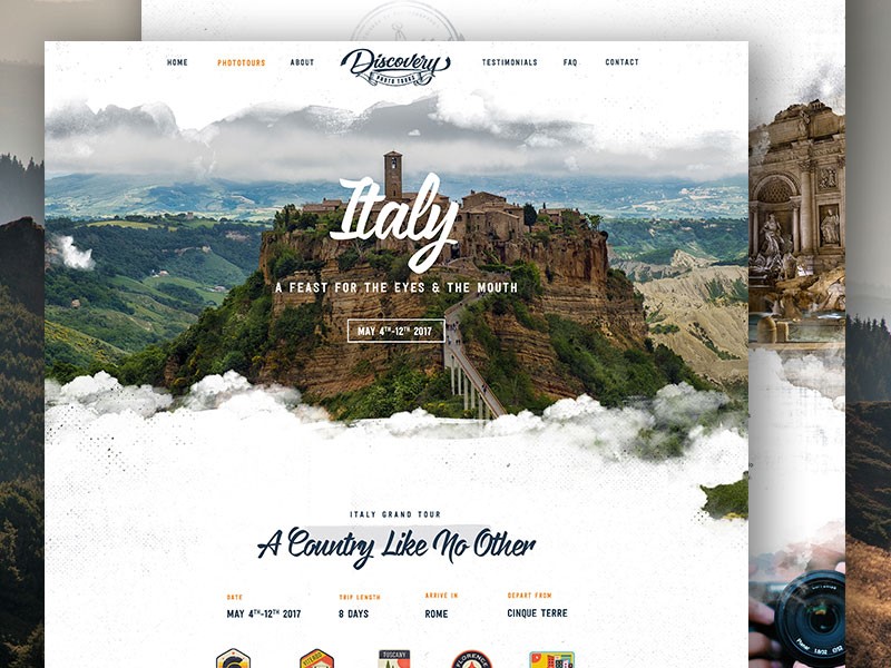
Retro is about giving space to the past, whether by using funky seventies psychedelics, the oversized light fixtures popular in the sixties, or mid-century style chairs, retro is back in a big way. Texture is often used to provide a gritty feel, mimicking popular printing techniques of the time.
You can even see it in sites that use a style similar to the soviet propaganda, with the Russian fonts included, of course.
Why is Retro so popular?
A retro style creates unity, transcending age, taste, and culture. A retro style website will be accepted by people from different countries.
This is because it focuses on iconic images or elements of pop culture that has loyal followers throughout the world. Retro is an indication of globalization, and it presents in a playful way, with color schemes that are muted but never dull.
Retro tunes into nostalgia, and the belief that in times gone by, products were better quality. Trying to extract the best out of the past, while leaving behind bad memories offers up a new appreciation of old style design.
Retro design is an attempt to bring this sense of nostalgia to life. Creating the perception of value helps to bring visitors, while modern design elements create interest, encouraging customers to return. In this way, retro design offers the best of both worlds, an old feel style with modern imagination.
Mixing old styles with new techniques
Retro style design encourages both the imagery and feelings associated with a world gone by. Using color is a great easy way to make a design stand out. It is often helpful to pick an era. The muted colors of vintage design are often juxtaposed with a strong hue in order to add contrast and interest to your design.
Retro design is associated with the nostalgia of the past, a time when life was simple, hedges were green, wild spaces flourished and streets were safe. The design aims to recreate these memories.
There are several different approaches or themes used to do this. Some designers use images of old cars, well known or iconic products, or old photographs. Early versions of electronic devices may also create a retro look.
Some might focus on the optimism of the 50’s, while others look at a celebration of 60s space travel, and the feeling of extended boundaries and new possibilities.
Elements used to create a retro design
Retro color schemes can be complicated to create as they use a lot of vintage or cream colors, which can be tricky to use in print.
On a website, however, they do stand out. These colors are contrasted with brighter hues. Background colors are normally desaturated.
Hues are muted, but often look as though they have been mixed with a touch of black, or grey when compared to the brightness of pastels.
Use shapes and illustrations
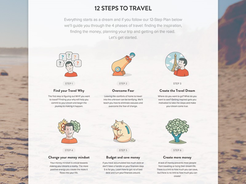
In times gone by, artists or designers often used simple shapes in order to create a big impact. Retro design often focuses on these simple shapes.
Varying sizes of circles are often used. Sometimes designers may also add floral patterns. Bright colors are often used to draw attention to these images.
A worn-in look – using texture effectively
Texture is often used in vintage design to draw back to old printing techniques of a time gone by. Textures often seem rigid, gritty, grainy or tough. Imagine images of rough cardboard, gritty paper or a chalkboard.
Imagery might include faded areas, as though depicting a comfortable, worn-in item of clothing. There may also be ‘rough’ patches, or an asymmetrical area within the texture, as though a background or figure has been handmade. These effects often appear to be random, and ‘worn in’ rather than carefully designed.
While creating texture, consider color as well. Many designers using background texture use a bold color so that contrasts are clear and noticeable rather than simply background noise.
When creating texture, the goal is to be subtle, so that the effect appears natural or genuine. The goal is to create depth, without too much repetition, so that the background has the appearance of natural wear.
Using fonts for funky effects
Typography has always played a crucial role in creating a retro design. It is not just choice of a font that will make a difference, but how this font is used. Designers wishing to create a retro look might reposition a font, duplicating pixel strokes for added texture and a unique element to their designs.
Typography is just as important as color in creating a retro design. Adding the correct font will create a coherent feel to your designs. Retro color palettes look great with fonts which have an old-style feel, such as period lettering.
Alternatively, you could use a curvy font. Choose a font which fits in with the era you are recreating. This way, you can add a feel of age and even texture to your design. Think of the handmade poster style designs of the 80’s, or the lettering used in old movie posters. Art Deco style fonts, or cursive inspired brush stroke lettering, or even laser styled neon writing.
Adding borders
Borders add an interesting touch to a vintage design and can be used for framing photos or images, highlighting content or may create focal areas.
They may be created out of ornamental designs or have matching colors. From art deco style borders to a border which takes the shape of worn paper, there are many options to choose from.
Vintage Touches
If you would like to create a vintage feel to your design without the full-blown effect of a retro template, this is possible too.
Add small elements of vintage style such as an iconic image, banners, fonts or borders. Alternatively, you could focus on a font, taking the viewer back to a particular era. You could also grab attention by focusing on using a vintage color palette for imagery or lettering.
Conclusion
Creating retro web designs is an attempt to bring back the nostalgia for a time gone by. The designer uses tools or techniques from an era gone by and blends this with new services or modern touches in order to create a retro effect.
Retro designs, borders, textures, and colors add interest and fun to a project. Experiment with a variety of color pallets, choosing those which are muted and less saturated, in order to create an authentic look. Remember that typefaces should connect to the era that you are representing. This will help you to achieve your overall look.
Retro design is a fun trend which adds interest, atmosphere, and emotion to projects. While some of the styles may seem as though they would be a lot of work, the end result is a style which grabs your attention and brings an atmospheric element to a design.
When working on a retro design, remember to combine color, texture, and type, so that you end up with a project which takes you back in time.

