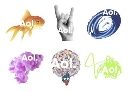
While preparing to massively lay off its employees, AOL (sorry, Aol.) announced a rebranding that looks… erm… Microsofpaintesque!
On the typographic side, I like the logo going lower case and taking some distance with the acronym, thus showing the company’s new orientation. The dot is also quite nice and acts as a connector with subdivisions of Aol. (Aol.music, Aol.whatever,…).
Unfortunatly, there are many chances that you won’t even notice the nice changes to the logo since it also features some horrible background images.

