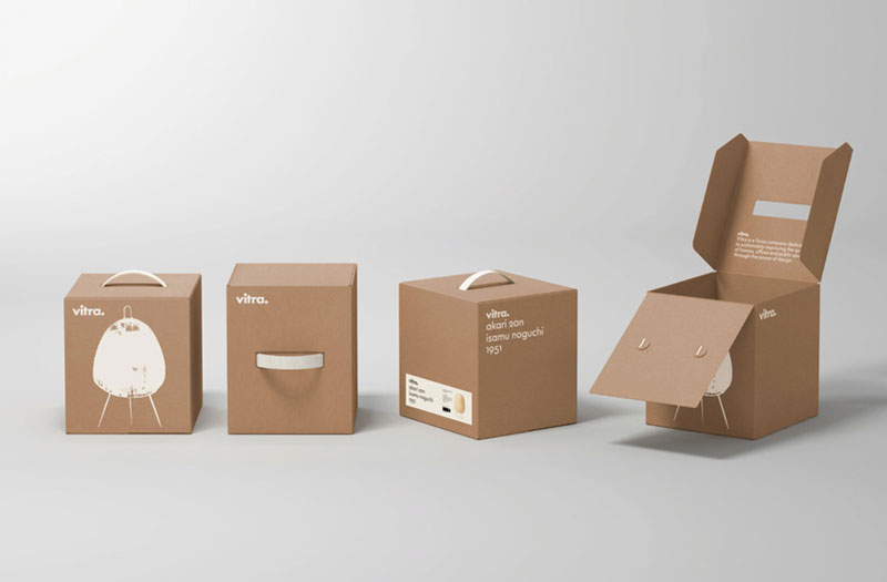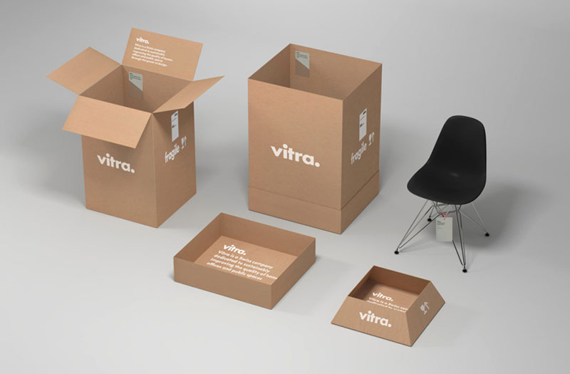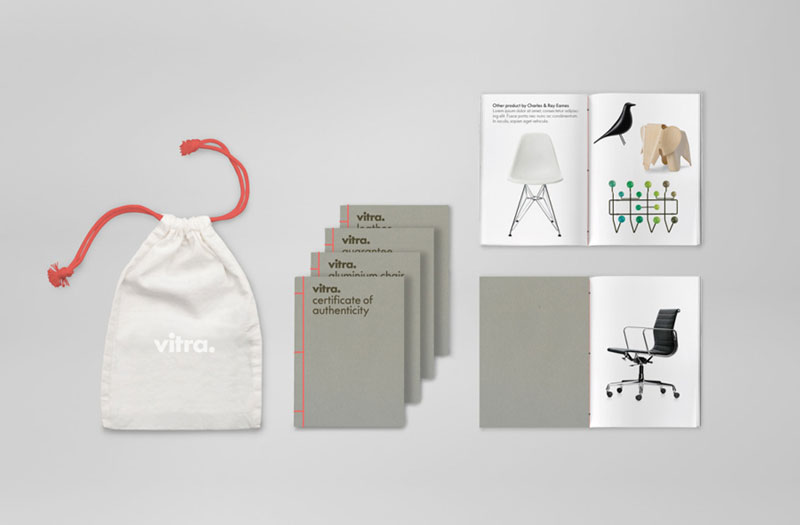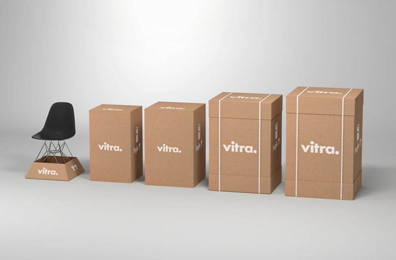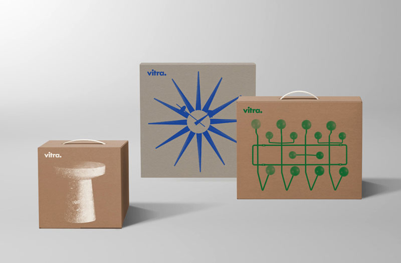
If you know Vitra, you know that the company doesn’t mess around when it comes to design. The Swiss furniture company holds the license for a large selection of Herman Miller’s products, among other things. They that stylish items need to be packaged with class, or they’ll lose some of their magic at sale.
For ensuring that their packaging will live up to the expectactions created by the furniture and products they sell, Vitra commissionned Studio BVD, a graphic design agency from Sweden whose style perfectly embodies Scandinavian design.
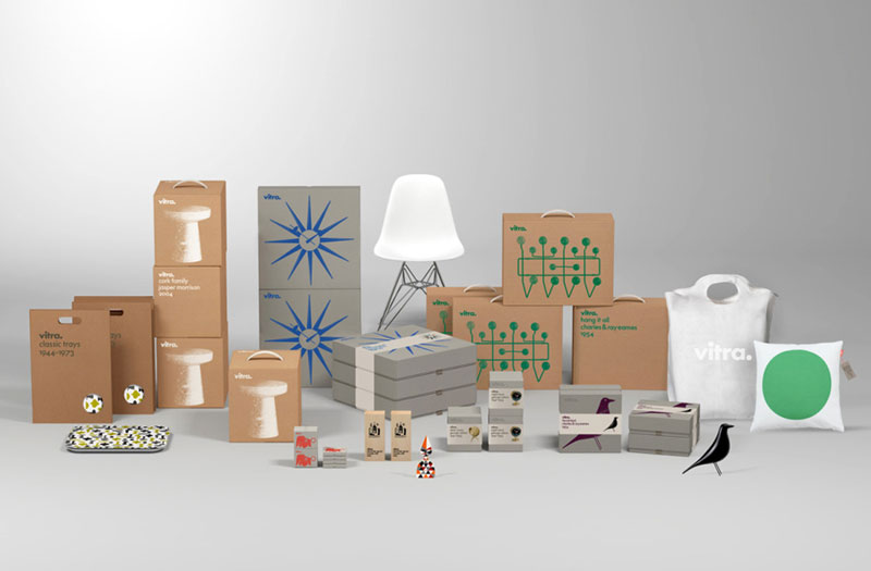
Using a minimalist approach to the design of the packaging, BVD used simple cardboard boxes with natural or neutral colors for most of the products. The text is a simple yet gorgeous sans-serif with a very Swiss setting. To represent the products, an monochrome outline of the product is enough, good design speaks for itself.

