Typography has become fundamental in web design projects. It makes the copy clear, legible, and appealing to readers as it’s considered an art of arranging text and letters. Typography assists in providing an excellent experience for users before they even click a button or read.
It tells a story that provides users information about the website and who is behind it. The type treatment creates a splendid atmosphere and obtains responses the same way as voice tone does. Typography has become one of the most popular trends of web design trends among designers.
What is Typography?
Typography is everything from structure, appearance, and font style. Its role is to evoke certain emotions and provides specific messages. In general, typography brings the text to life. It gives meaning to a website’s alignment, size, font, layout, and color.
Currently, the most popular trend is dramatic typography. Its typeface draws attention, and this coincides with minimalism trends and flat design with simple layouts. If the structure is simple, the more the typography is appealing to users.
Now, let’s take a closer look at website designs with great typography:

This fantastic site about a restaurant uses typography as a design element. The typography is used cleverly, and it’s breaking the grid in certain places. In short, users can interact easily because of its unique design.
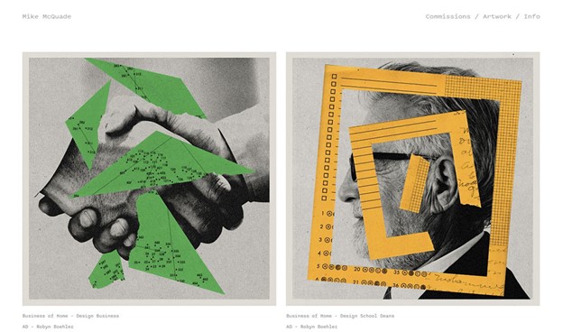
Mike McQuade’s portfolio includes a splendid interactive page that grabs the attention of many. Its website is set up as a grid with each square changing position. Clean and straightforward, its design uses a combination of a quirky and thin serif. Plus, a bold sans-serif that completes the portfolio’s attitude and tone.
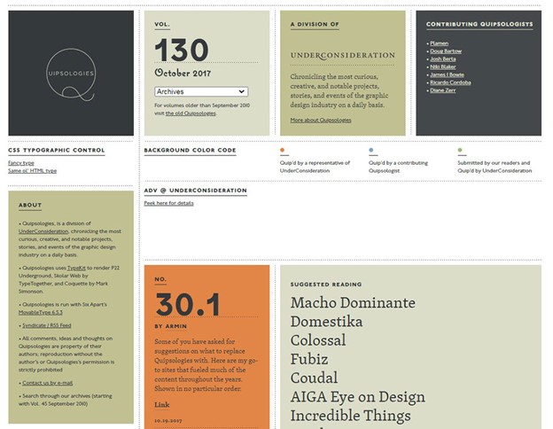
This site uses interesting ways of typography overall. The most exciting thing is that they stick to one typeface and work in many different situations. Moreover, the headline section has good use of letter-spacing in conjunction. The site includes caps that are small-sized; it is more engaging and easy to read.
Ditto
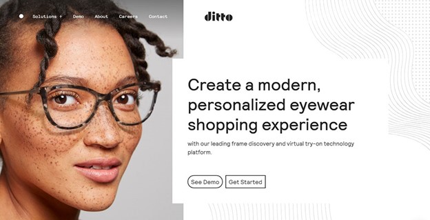
Ditto offers a clean and straightforward one-page site. Though, it provides a direct reading experience. The design process can be described as a strike between content structure and the right balance between type sizes. This design is the thing I’d want to see on hair salon websites as well.
Coudal Partners
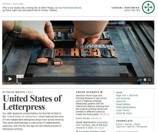
This website uses a sizeable bold version with negative letter-spacing of two pixels. The font’s variation creates unique white space. Avoiding solid black in website design creates an exquisite look. The letters are either are Verdana or Gill Sans. Two typefaces that are different and the negative letter-spacing and moderate letter-spacing tension make a unique typeface.
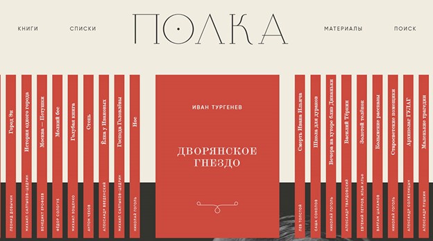
The main goal of Nonaka is to help users find the right books. The design of the website is a remarkably authentic style design because of artistic and unique vertical typography. Visitors can quickly checkbook details and switch to other books.
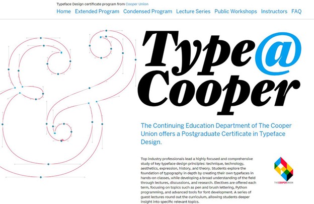
The large illustration of Cooper Type’s ampersand is a unique design and perfect mascot for the website’s typography. Plus, it works well with a big and bold header. Some body types are pretty small and difficult to read, so some paragraphs should use spacious letter spacing. The navigation looks a little bit messed up, but overall the pricing page is well-designed.
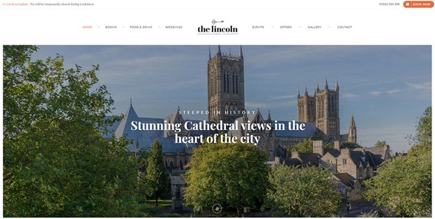
The Lincoln Hotel website used font’s combination (Lato and Playfair Display) that complement each other, and they are crucial in this high-class website as the hotel itself. The first thing you see when you enter the page is the font and its beautiful design.
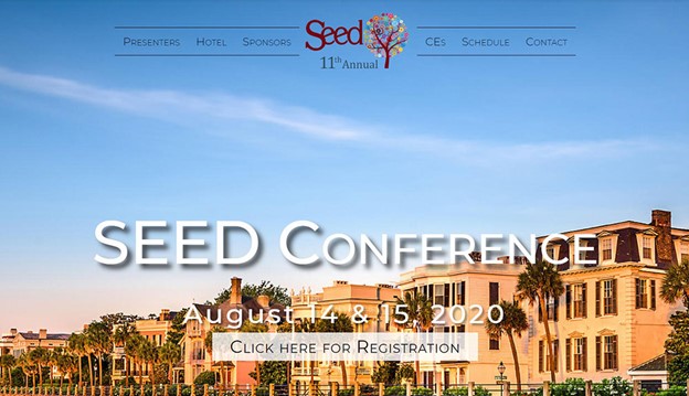
The design of the website is a mix of negative letter-spacing and various shapes of the letterforms. This nice typography with different typographic styles and sizes enliven the composition. Plus, the website attracts many visitors because of the contrast between caps, italics, and more significant type.
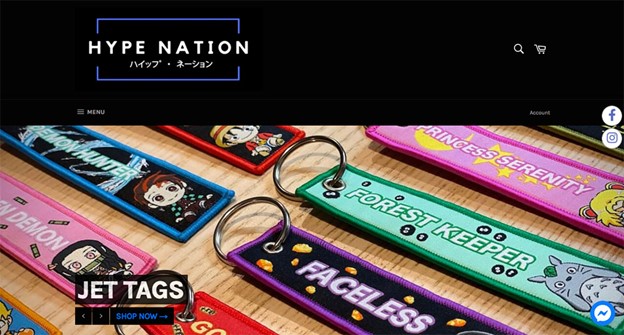
The pricing page of Hype Nation includes in the header a stylized font that gives a funky feeling of the site, as well as the grey color scheme and the bright orange. The header font is quite unusual. It has undoubtedly great benefit because of the footer contrast and the black on orange.
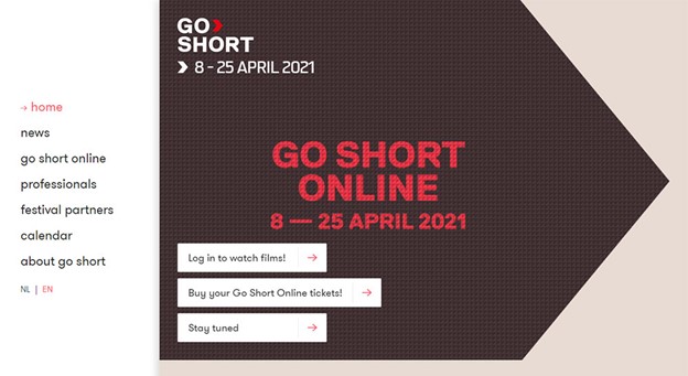
For this website, designers used a unique typeface for headers, navigation, and main text. Its unique templates and design make you stay forever on the page.
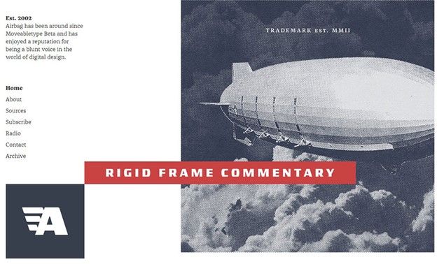
Despite the small dates and headlines, this fantastic site has a lot to teach. When designing a website, it is not recommended to put too small words, but in this case, the switch of the colors and the weight of the cool fonts there is a slightly exciting contrast. When users enter this site, they have got the “It looks good, but I don’t know why” sort of feeling.
Cambridge International School
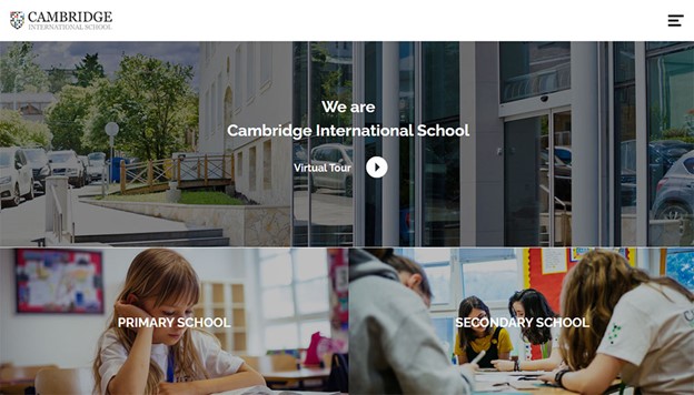
This website is about education, where you can meet the perfect navigation button and a creative design to follow. It attracts many users. The design of the typography includes texts in different sizes. This website is an example for designers; when they design a website, the menus, navigation systems, and buttons should be quite well designed and have a simple function.
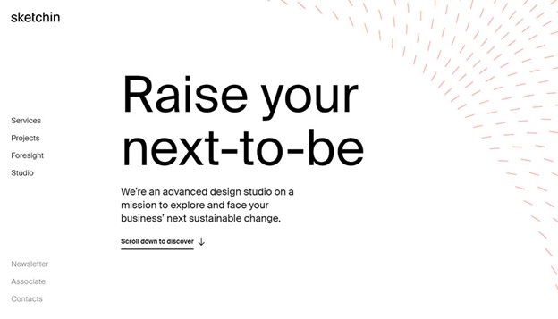
It is another example of a well-designed website. The typography includes backgrounds with a large picture that gives visitors a spread feel. The font, sans serif- white provides simplicity and makes designers follow every step just with seeing it.
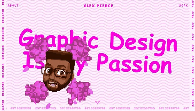
The typography of this website has gone wild. The designer used web design techniques with fun fonts that fill the screen. Considering how over the top it is, what was missing was some glowing text.
Despite the strange web design in a pink or purple color palette (depending on how you see it), this site is great to follow and can be an inspiration for many designers.
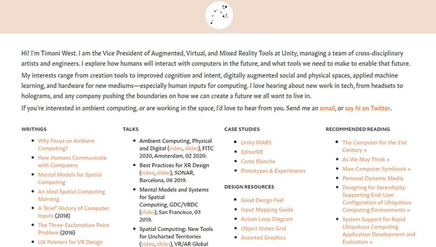
This site is another exciting design. When you enter the page, the things that grab your attention are margins and line-heights of all the page types. Designers used moderate letter spacing and many empty spaces between the lines. The contrast and letter spacing create a less formal look and shift the whole composition. There are many great chances to use typography to create significant visual effects, and this site is an excellent example of it.

