The Internet can be a somewhat scary place when you think about it a little. Every day, sites like Behance, Dribbble, CargoCollective, and countless personal portfolios, are flooded with design updates by millions of graphic designers. Many of them are talented, so that’s an impressive amount of work to get inspired by.
In this post, I’ll try to not get overwhelmed by this large quantity of amazing work, and just handpick a collection of excellent graphic design work.
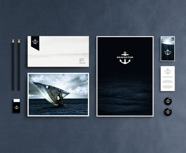
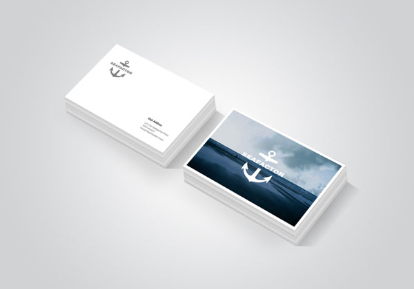
1. Seafactor
If you need proof that good photography can make your visual identity awesome, I think that the Seafactor identity speaks for itself.
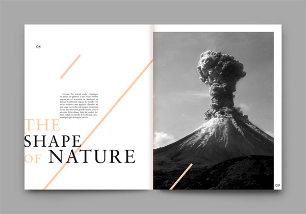
2. ROCCA Stories
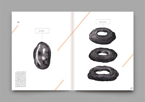
Simple yet effective for this personal project by Maiwenn Philouze.
3. Identity for Jeremy Maxwell Wintrebert
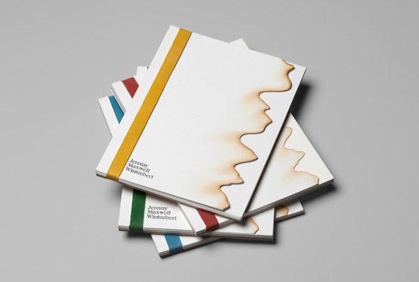
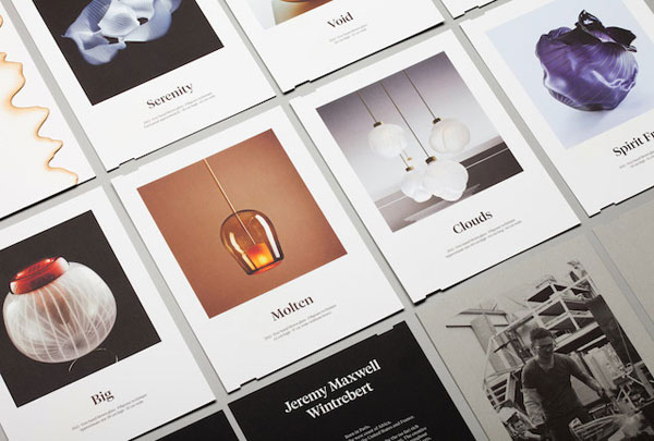
A visual identity created by Spanish design studio Hey for Jeremy Maxwell Wintrebert, a glassblowing sculptor.
4. Duke Art Con poster
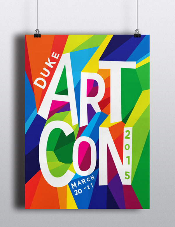
A colorful poster created by Meaghan Li.
5. Polevic candles
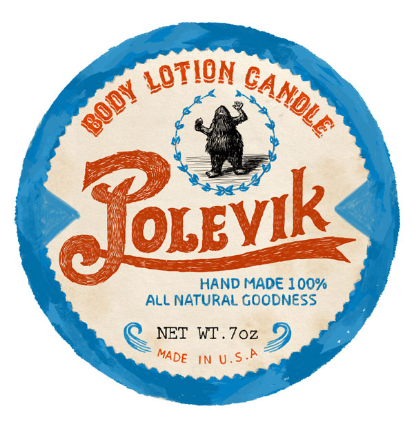
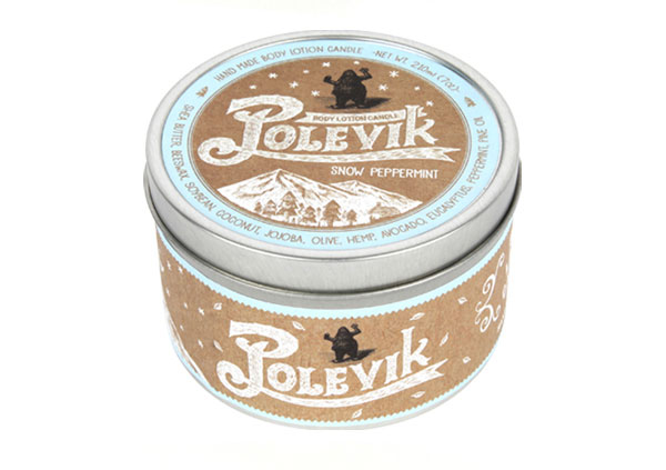
Gorgeous packaging design with a vintage look-and-feel, designed by SugarMeat.
6. Johanne Kolstad posters
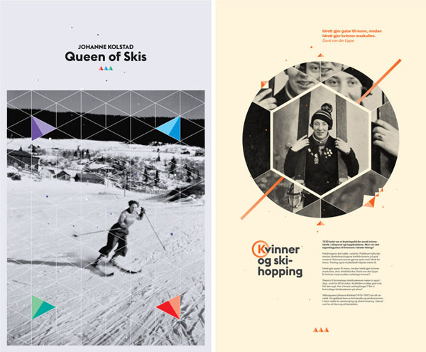
Posters created by Tata & Friends for Velour Design. The posters are about Johanne Kolstad, a woman who broke taboos about women in sports.
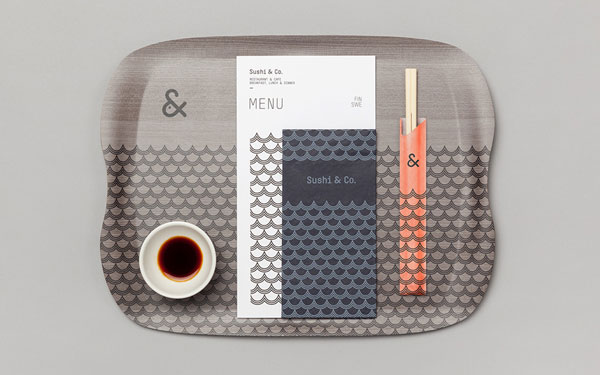
7. Sushi & Co
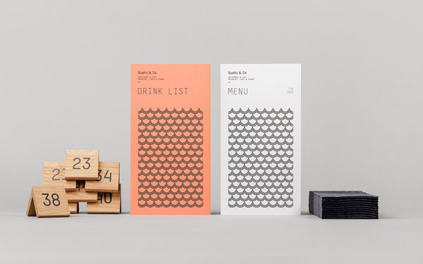
This visual identity developed by Helsinki based studio Bond makes a wonderful use of minimalism and patterns to create a strong but elegant identity.
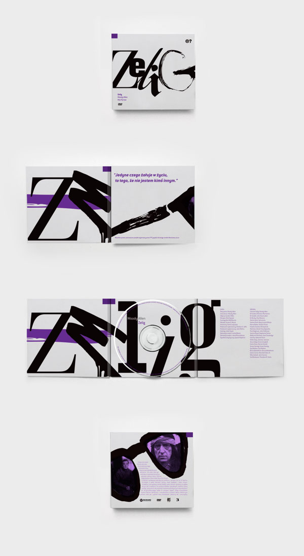
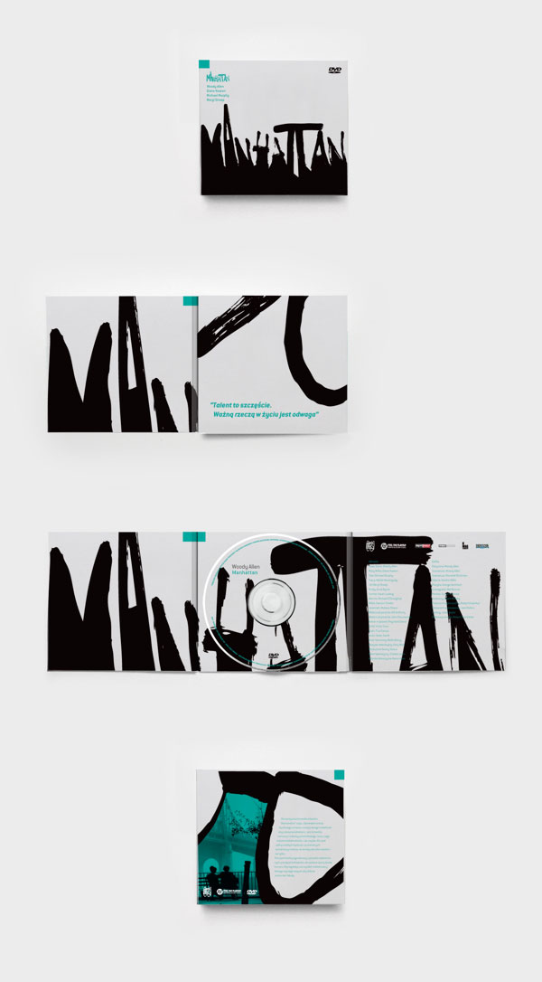
8. Woody Allen DVD covers
I don’t know if these are just concepts or have been produced like this. I don’t know either who still buys DVDs. Anyway, these cover designs are just gorgeous and use typography the right way, that’s all I need to know.
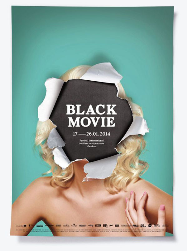
9. Black Movie poster
A gorgeous visual identity designed by Swiss design studio NeoNeo for a movie festival. The poster is the best part in my opinion.
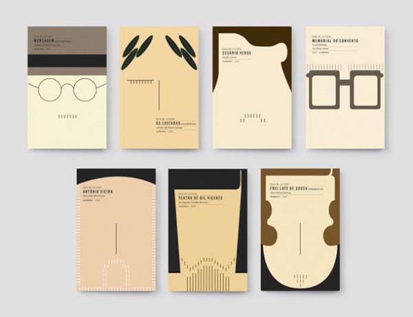
10. Ler Melhor
The cover of a book is like its face. Based on this, FBA design studio in Portugal designed book covers that look like faces, giving a more human touch to litterary achievements.
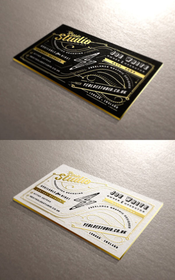
11. Joe White business cards
Gorgeous business cards with a complex, but well-balanced layout. The cards look very elegant in black, white and gold, and have been designed by Joe White for himself.
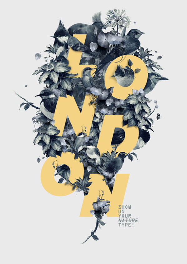
12. Show us your type
A poster created by Fabian de Lange for the “Show us your Type” project. The design is a gorgeous mix of flowers, birds, and bold typography.
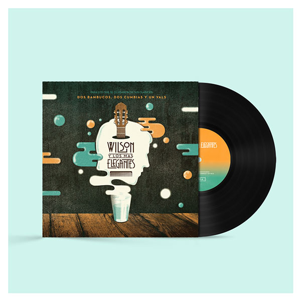
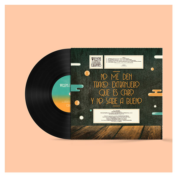
13. Wilson y Los Mas Elegantes
An album cover with great illustration, and good integration of the other design elements. A beautiful project by CaliDoso from Colombia.
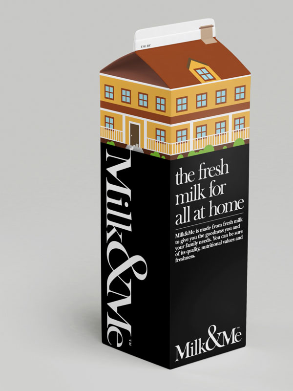
14. Milk & Me
Branding and packaging for milk. A creative design with cool illustrations, thanks to A Beautiful Design in Singapore. I feature this here because the packaging looks good, but honestly I don’t think it’s that good for milk. I wouldn’t buy this at the supermarket at least, the main reason being that I wouldn’t expect it to contain milk.
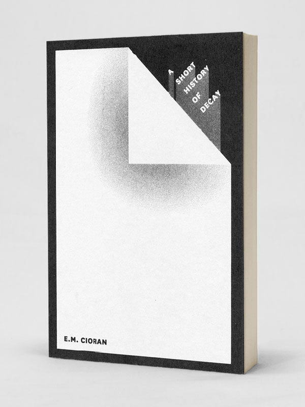
15. Cioran book cover
A minimalist cover for a book by one of the most pessimistic authors I’ve ever read, Cioran. Well executed by Jaci Kessler.
