In a digital era, trends constantly shift and change. This is true in the field of graphic art. What was trendy or modern a few years ago might look outdated in 2018. Some trends have staying power, while others disappear quickly.
Latest graphic design trends
2018 is the year that imagination has been given freedom to roam. Trends are wider, more experimental and far freer. Some trends in the field are new while others have been evolving over time.
Graphic design is a field which is never boring. New ideas constantly emerge and the boundaries of the industry shift and change all of the time. Nike does that with its magazine advertisements once a few years.
This article will introduce you to some of the current trends in graphic design.
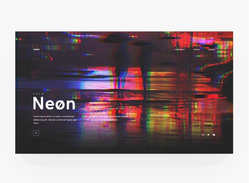
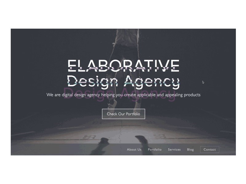
The glitch effect
One of the more popular movements in the graphic art field is ‘the glitch effect’’ which gives the appearance of a corrupted image.
Signs of imperfection which would (until recently) have been discarded or seen to be problematic are now being embraced and turned into a trend.
The film industry has used the glitch effect for a while, presenting broken images and imperfect shoots as a way to create tension.
However, 2018 is the year that faulted images are starting to take over the design world too.
Destroyed design
In recent times, graphic artists have been preoccupied with destroying their designs or imagery.
This might mean spray painting over them, tearing them or crumpling them. Rumpled, worn in or destroyed designs are leading the way in 2018.
Color channels
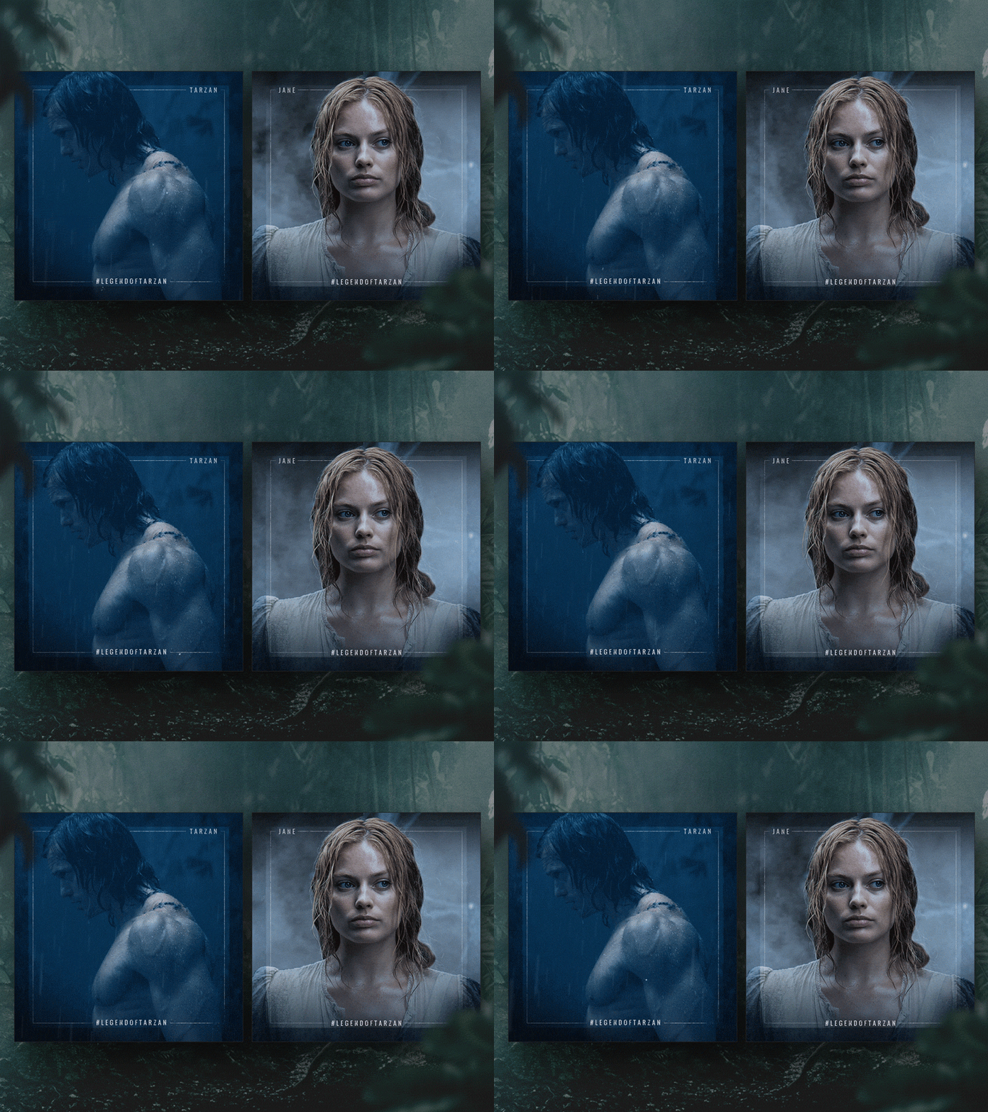
Playing with color is a new trend in 2018. Designers are using color to distort images, producing a psychedelic or hallucinogenic effect.
These images have a psychological impact on viewers, keeping them engaged. As a result, ‘color channels’ are emerging as a popular trend in 2018.
Holography is slowing down
The hologram effect has been hugely popular for a while, with designers using holograms in branding, logo design, brochures and even stock photos.
Holograms added an interesting detail to the minimalist design. Recently, however, the trend has begun to slow down. While the holographic design will still hold some power, we’ll be seeing it less frequently in 2018.
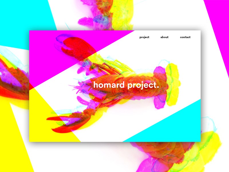
Double exposure duotones
Double exposure duotones offer a radically new element to the graphic designer. In 2018 this trend uses vivid colors.
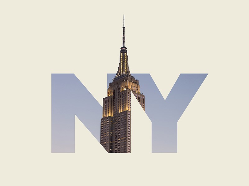
Different overlapping images are used to create an interesting visual effect. This combination is used to create a modern design which is taking over the industry.
Muted or moody color tones
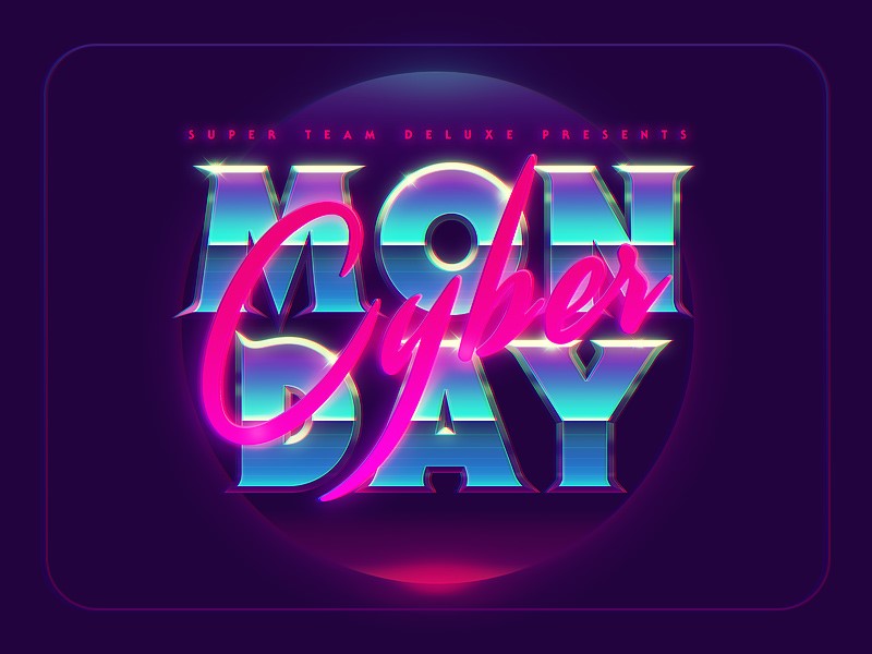
As the retro themes of the 80s and 90s are starting to reemerge, moodier colors are beginning to dominate the design field.
These colors reflect the themes of times gone by when cameras and screens were not able to capture saturated colors.
Popular trends include muted colors (or low-intensity colors with a greyed out effect). These colors are removed from their primary base and have a low Chroma.
Moody colors have been used to create texture, fabrics, screens, paper and retro website designs. This trend is emerging strongly in the design field and will gain popularity in 2018.
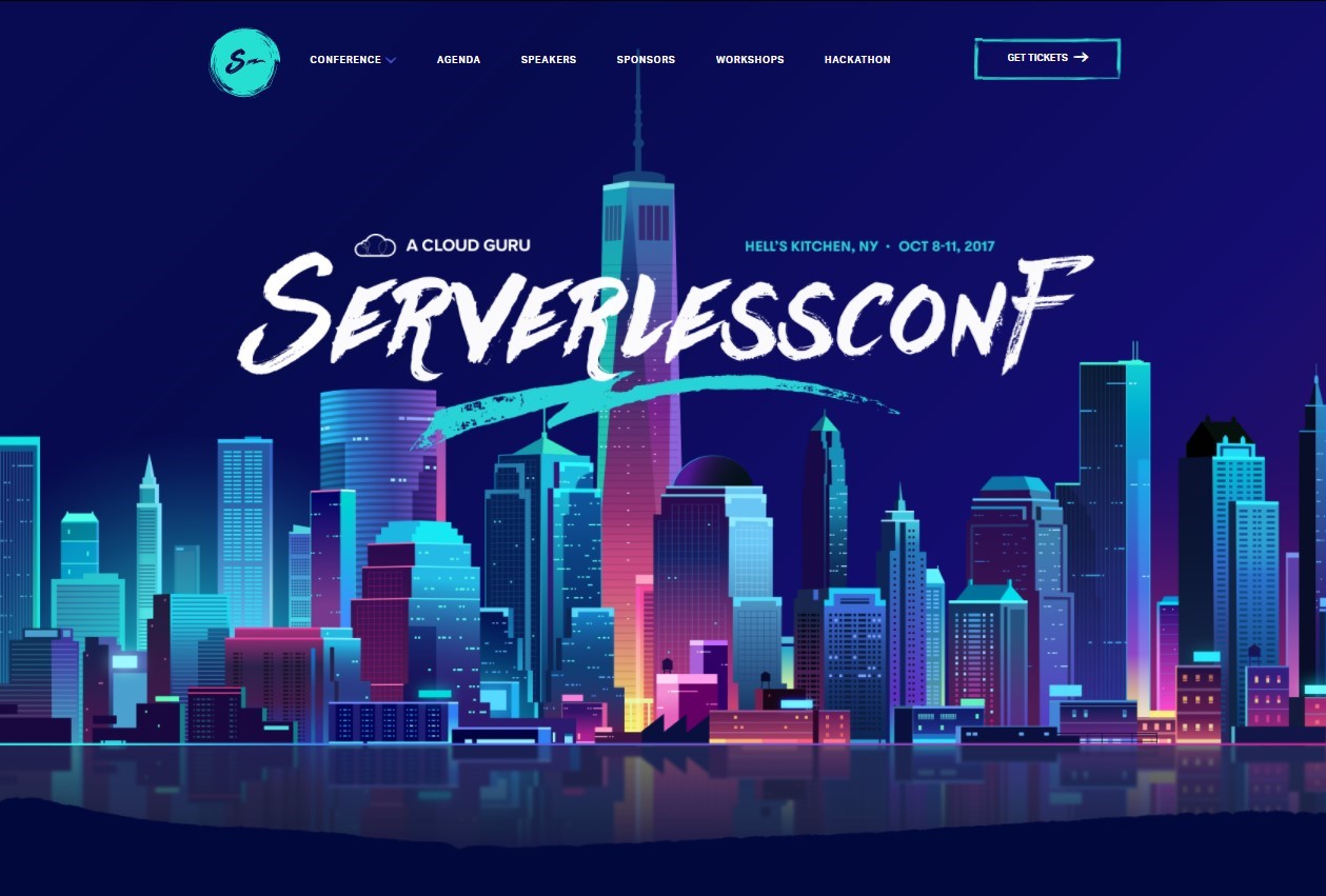
Ultra Violet
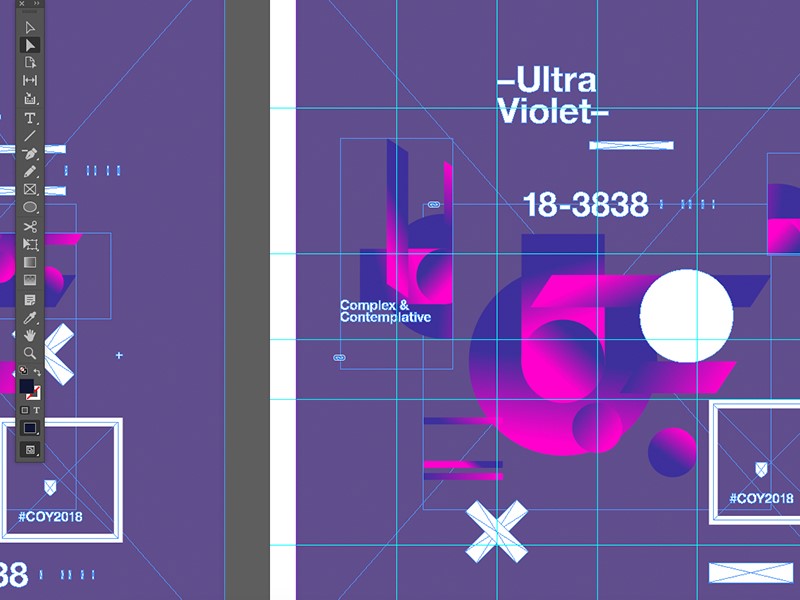
Ultraviolet is a deep purple-blue color reminiscent of the mobile disco era. It is often used to give a futuristic feel to design.
This color has recently become trendy, drawing on the space theme to provoke an atmosphere of exploration or discovery.
Futuristic themes are beginning to emerge in web design, graphic design, fashion and interior design. This is definitely a graphic design trend for 2018.
Mid Century design
Mid Century design draws inspiration from themes which existed between the 1930’s and mid 1960’s.
This trend has been growing within the interior design industry for the past while with a focus on mid-century Scandinavian furniture design. This theme gives the feeling of timeless quality and attention to detail.
During 2018, this theme will start to emerge far more strongly in the world of digital and graphic design, adding a retro feel to work that is produced.
Colored fonts
As nostalgia takes over, designers are often choosing to use colored and highlighted fonts to draw attention to their content.
This is replacing the old trend of using illustration or imagery to put a message across.
New software which allows for developing your own handmade color fonts has recently been released (Photoshop CC 2017/2018).
This enables graphic artists to create an attention-grabbing but unique element to their work. This trend is going to increase rapidly as 2018 unfolds.
Cinemagraphs
Cinemagraphs are living photographs where a person takes small continuous motions. They have become increasingly popular on social media sites.
This trend, which combines the photograph and the video is bound to become more popular in 2018, adding a new element to the design field.
Responsive logos
Recently, responsive design has emerged as a crucial element of web design. Many people use mobile phones and tablets to browse the web, and the market is even making a move towards wearable online devices.
As a result, designers are adjusting their designs so they will suit a wide range of screens.
More recently, companies have started to focus on making their logos responsive. This means ensuring that the logo is simple enough to work well on a small screen.
Many companies are also modernizing their logos in order to adjust to the current market.
Responsive logos are therefore an emerging trend which is rapidly emerging during 2018.
Greater depth
Flat design has been a recent trend in web design. This meant taking away shadows or 3D elements in website design and replacing them with simple, flat colors. However, this trend is starting to change.
Extreme minimalism is giving way to the realization that detail adds an interesting element to design, helping designers to create a hierarchy. Viewers strongly engage with the detail on a site and this helps them to engage.
As a result, sites are changing from flat to semi – flat designs. Shadows are often added to call to action buttons, long shadows, soft and subtle color variations and a larger degree of nuance.
Shadows added in this 2018 trend do not have harsh qualities as their predecessors once did. Instead, the trend is to add subtly to the site, creating interest without the contrast.
Debonair duotones
Old comic strips often show pixilated images or halftones which are printed in overlapping format.
Contrasting colors such as red and green were often used to create a visual effect. The result was an attractive two-toned image which created a sense of vibrancy.
This old printing technique has been given new life by digital media. New tools and techniques make it possible to overlay a range of different colors, from duotones to quadtones.
There is even the possibility for designers to create fake duotones using software such as Photoshop or InDesign.
Fake duotones don’t have the same contrast as the traditional duotoned image, but they are still effective and easy to create.
Retro designs – inspired by the 80s and 90s
We’ve already discussed the moody colors which are making a comeback in 2018 but the influence of the 80’s and 90’s goes further still.
Both electric and pastel colors are starting to make a comeback as designers move away from the vivid colors made popular by flat design.
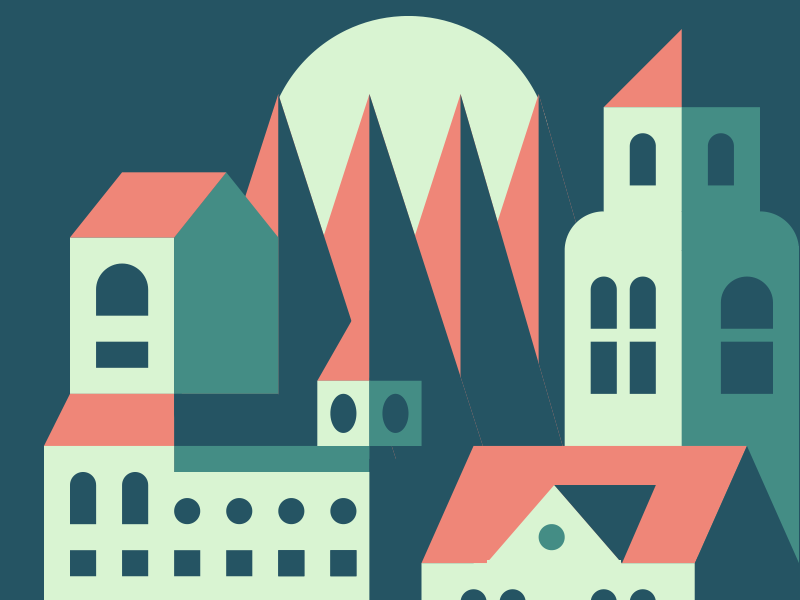
Patters from this era are also starting to influence design. Instead of the minimalist imagery of recent times, geometric patterns and abstract designs are becoming more and more popular.
Our current brand leaders and target audiences are made up largely of the millennial generation (or children of the 80s and 90s).
This is reflective of the nostalgic designs which are starting to arise. Adding a touch of nostalgia is bound to be a hit.
Focus on authenticity
This year is seeing a trend towards photographic images. Both custom photography and stock photo images can evoke emotion in your viewers.
Imagery assists designers to send out a clear and concise message. They also give voice to a brand.
In the 80s and 90s, the grittiness of authentic photography had a wide appeal. This trend changed towards staged images or photos which have become generic.
Thankfully, the trend is changing back to interesting photographs which are full of life.
Authentic images increased in popularity during 2017 and will continue to do so in 2018. Brands are seeking to connect with users rather than present them with overused and tired images.
Talented photographers are assisting by offering up excellent photos to stock image sites, often without restriction.
Summary
Graphic design is going through a rapid shift, pushing the boundaries into new arenas while simultaneously embracing the past.
We are seeing old trends fade away as new opportunities emerge within the field. The field of design is embracing a more authentic image which speaks to their audiences.
As a designer, it is now a time to take risks, breaking old patterns. 2018 is the year to allow the imagination free reign and embrace the waves of change.

