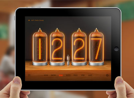
The first thing I want to tell you – Skeuomorphism isn’t dead and there’s nothing wrong with skeuomorphism in itself.
You can’t say “Skeuomorphism is a bad taste”. This phrase doesn’t make sense. In the same way you can say that pink is a disgusting color. Skeuomorphism is “a design feature that is carried forth from the original version of a product in order to make people feel comfortable with the new device..”
There are a lot of websites, UI elements and icons designed in this style. And I like them so much! Look at the collection below to find some skeuomorphism inspiration.
Lighted Rocker Switch
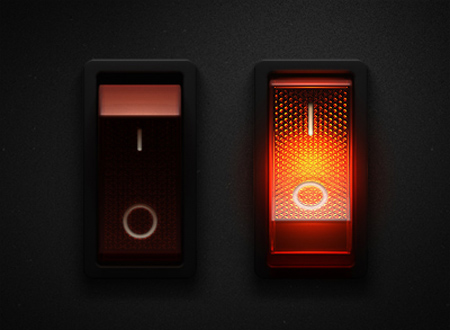
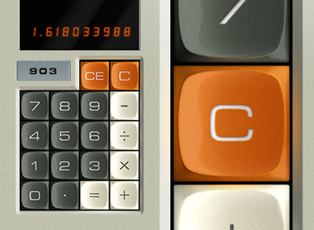
Abatron Calculator Buttons
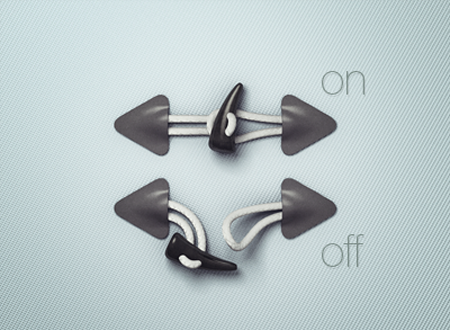
Toggle Buttons
Status Dome
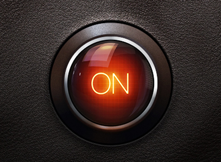
A Very Skeuomorphic Switch
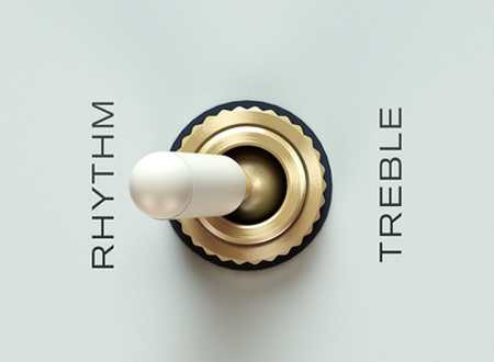
Dusty Hat
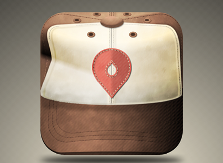
Notes App
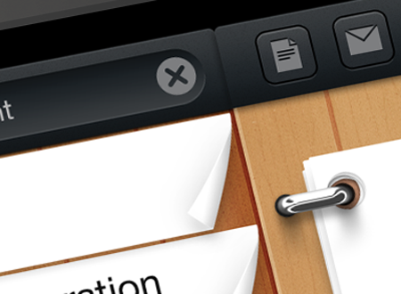
Your personal appetite multiplier
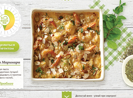
Mobile Payment / Ticketing App Concept
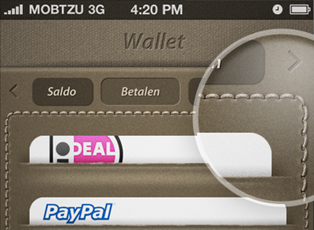
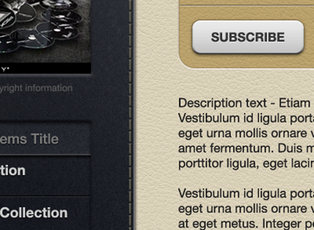
More iOS UI
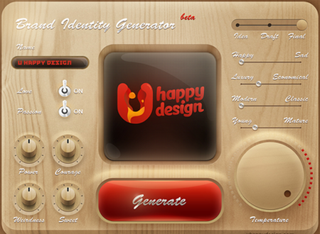
Brand Identity Generator
Mockup mockup!
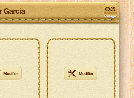
Simple
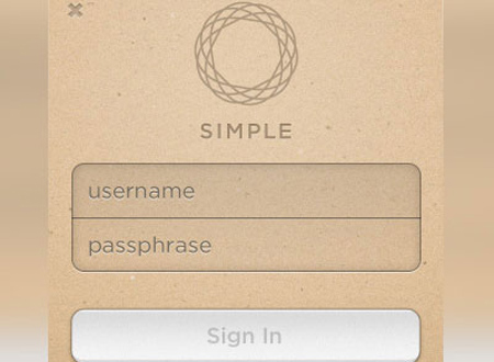
Iphone UI
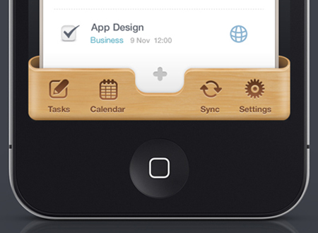
My Pizza Oven
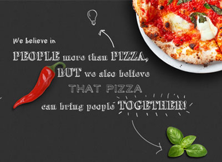
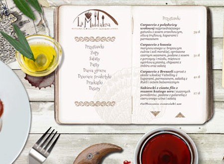
La Maddalena
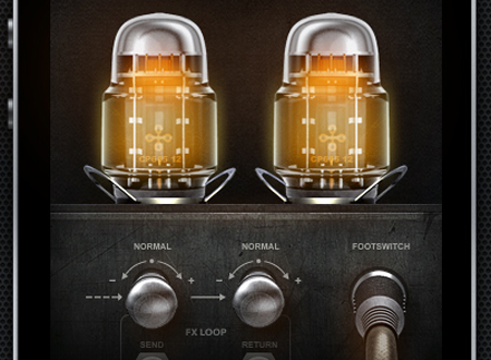
iPhone App UI
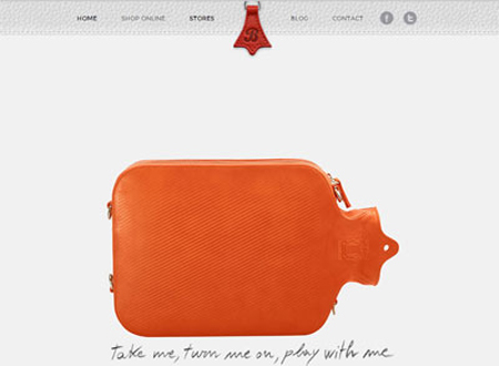
Bagigia
Big Beat radio

Night Stand HD – iPad Alarm Clock
