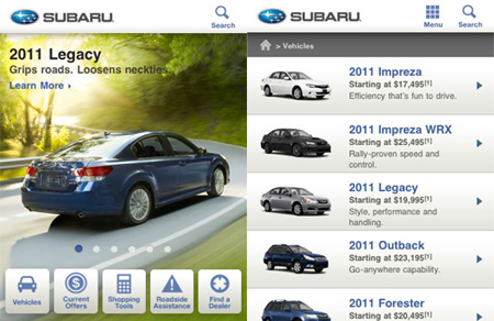
It is evermore the case that the current flux in mobile design paradigms and philosophies is being driven by the continual advancement of technology. Yes, there are still trends in design styles and technique but they’re taking a back seat as web designers continue their journey into the wild west of mobile design.
Touch
Touch is a new paradigm for design. The rapid adoption of touch technology affects design in two essential ways. First and most obviously it changes the way people physically interact with a website. The designer must not only account for direct differences, like their being no hover effects or even a mouse pointer, but also more subtle effects like directionality of flow, where with touch, a horizontal rather than vertical scroll may be desired. Similarly the pinch to zoom gesture means that zoom out and pan is now an acceptable way of navigating across a site. Touch is more intuitive than keyboard and mouse and consequently this creates the second effect on design as it changes who is going to use the site. Touch opens up virtual interactivity to new demographics. Small children, even babies are using touch devices. The elderly and techno-novices are less frightened by the intuitive interface. These newcomers bring new needs and expectations and it is the designer who must cater to them.
Device Dedicated Applications
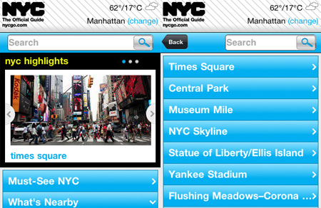
The new smart-phones have an awesome array of new hardware that is not necessarily available via an ordinary website. Accelerometers, ambient light detectors, proximity sensors and gyroscopes, to name a few. Not only can dedicated applications use all this hardware but applications come with built in monetization making it very appealing to a lot of new business models. Consequently dedicated application design, once a niche field, is now main-stream and will demand a lot more time from mobile web designers.
Connectivity
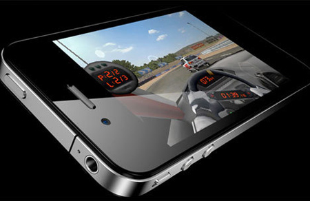
Two events have changed the light-weight page paradigm for mobile devices. Firstly telecommunications companies have been steadily reducing their prices for mobile data. Packages are now available where users do not need to be constantly aware of how much data they are downloading and browsing in fear of bill-shock. Secondly, with the explosion of wifi connected mobile devices means that if the site or application demands a very heavy page load then it is acceptable for users to connect to wifi before proceeding with the download of the content. Another option is to automatically detect the user’s download speed and design two versions of your site, one for wifi and one for telco connectivity. Automatically detecting user download speeds is neither simple nor accurate, so check with your developers first.

Social Networking
Integration with social networking has been a growing trend for some years now and it is continuing to grow exponentially. Every public facing company that hasn’t already will be looking at dovetailing their marketing and web presence with the social networks and this won’t simply be a case of putting a ‘like’ button on their home page. Millions of marketing dollars are being spent on social networking. For their commercial profiles companies are building complex social empires with feedback surveys, support forums, suggestions and a litany of other touch points by which consumers can be exposed to brands, some explicit, some veiled. Irrespective, this is continuing to drive demand for heavily integrated apps and websites that are mobile and able to utilize the social networking trend.

Development Arena
It’s not just the hardware and infrastructure that is driving change in mobile design. A major trend in 2011 is an ever increasing uptake of CSS3 and HTML5. Some people are heralding the end of Flash; however this will by no means be the case. Flash is still being used but now CSS and HTML are being brought into to the lime light. Taking advantage of the new power of these tools is a new design philosophy called the ‘responsive design movement’. This deals with creating sites to be responsive to all devices and shrink/grow to suit the resolution. It is not only iPhone/iPad applications getting into the market share of things but Android applications are ever increasing in market share.
Style
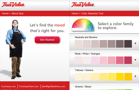
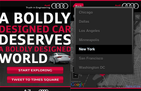
Depth and typography are in fashion in 2011. Sites with three dimensional feel are in demand. All the tricks of out of focus backgrounds, parallax scrolling, layering and shadowing are in demand. Similarly typography is still going strong, in fact with such confidence that we are seeing a plethora of creative typography mobile websites out there.
As can be seen there’s a lot of new ground out there for mobile designers, and it’s continuing to change rapidly. However the basics do remain the same. Carefully planned and thought out designs are always the key, irrespective of the platform or business requirements. Its going to be a rough ride so buckle up with the basics and lets see where it takes us.

