As a space of ideas, fresh design and inspiration, the internet is a space which is constantly changing and evolving. As designers add new elements of imagination each and every day, there is no wonder design is subject to shifts.
Web designers have grown with the increase in technology. Sites are now more dynamic but still user-friendly and precise.
Each day designers create websites which fit in with business needs, adapt to new screen sizes and are aesthetic all at once.
In 2017, mobile browsing changed the face of web design. More and more users switched from desktop browsing to tablets or mobile phones.
In 2018, there is a need for designers to stay relevant by adjusting their designs to a range of different screen sizes. As a designer, you might be wondering which other trends are emerging for 2018, and how this will influence the work you are doing.
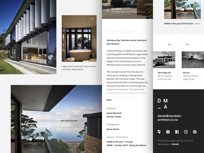
The striking impact of subtle shadows
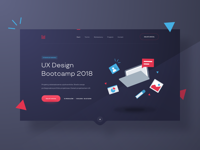
Flat design has been trendy for a while now. This trend removed all shadow from a site, creating a two-dimensional effect. 2017 saw the return of subtle shadows.
However, 2018 brings a range of new options. As designers play with grids, shadows are being used more than ever. These shadows evoke imager of a world that exists beyond the screen.
Shadows not only enhance the aesthetics of the page but also assist with directing user attention. Shadows can be used to highlight a link or emphasize a call to action.
In 2018, shadows are being combined with vibrant colors and gradients in order to enhance the effect and create a striking impact.
A new vibrancy
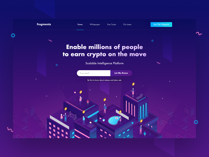
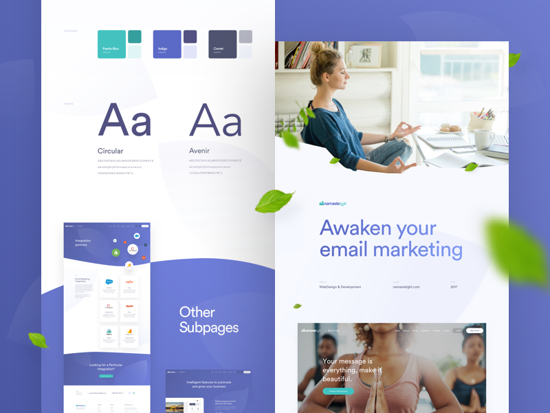
2018 has seen the introduction of a range of vibrant new colors. The subtle, safe colors of the past are being replaced with a saturated selection.
These colors have a dramatic impact. Headers are no longer timid, and now give a shout out to viewers with cheerful hues and slashed designs. Gone are the subdued sites as the internet starts to brighten up.
Brands who want to set themselves apart from traditional designs or corporate colors are now presented with an inspiring new palette to work with.
Particle backgrounds
As the design is shifting and changing towards images in motion, so are websites. The particle effect enables designers to create an evolving background image which loads quickly.
Sites with great visual impact resonate with viewers, creating a memorable user experience. Designers use images to strike an emotional chord. A moving image has a much greater impact.
In addition, moving images can be used on social media sites, with a backlink to your site.
Design for mobile devices
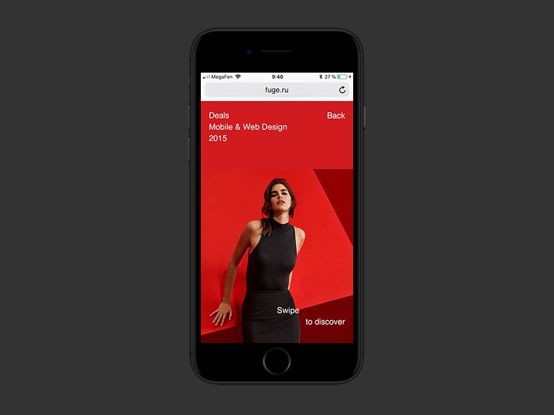
2017 saw a massive increase in internet browsing via mobile devices. These devices are highly personal and can be easily used while out of office or on the run.
As a result, designers have had to adjust, ensuring that navigation panels are effective and easy to use. Imagery has to be adapted to a small screen as well.
This ensures that a carefully selected image has the impact that designers intended. Sites are becoming simpler in order to adjust to small screens.
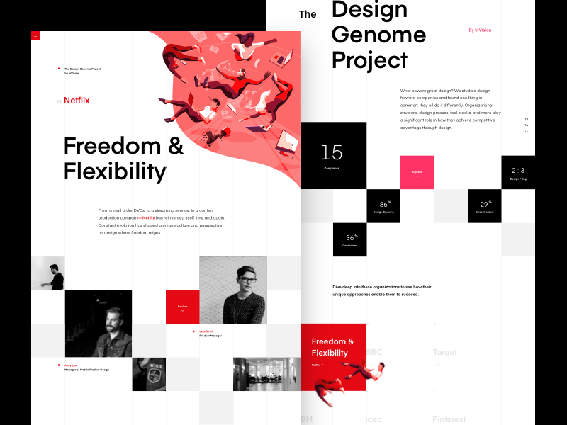
Broken grid layouts
Grids give the designer the ability to add content, images and even videos in an orderly format. Grids bring a sense of harmony to designs.
In a quest for a new level of innovation, designers are now using broken grids to keep order without the constraint. Broken grids allow designs to drift while keeping the flow.
Illustrations become predominant
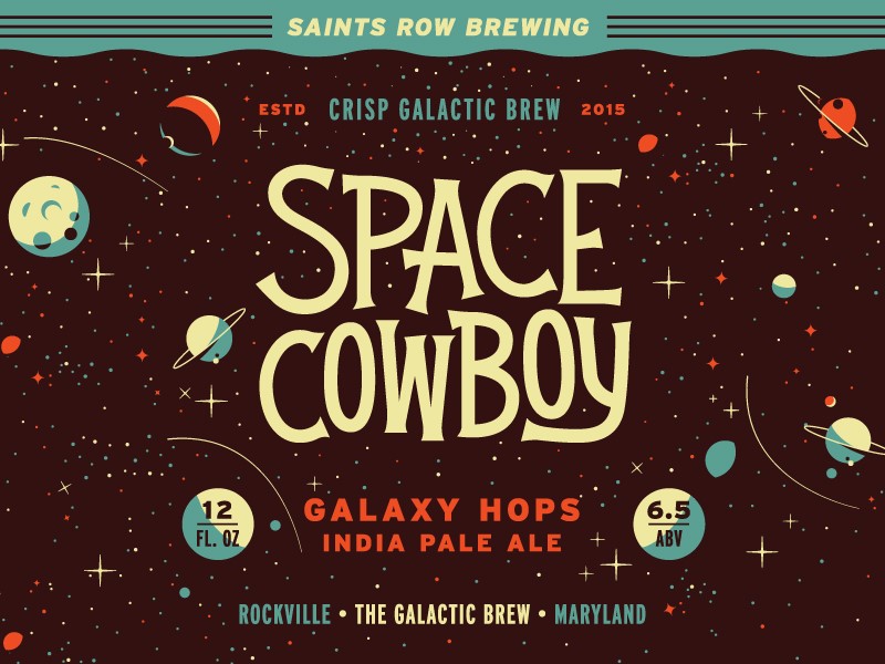
Imagery is always evocative and resonates deeply with the viewer. This is why a picture will always say a thousand words. As 2018 starts to unfold, illustration is starting to take center stage.
Both GIFs and photographic imagery still have a role to play. However, the unique very human touch that illustration brings is gaining new prominence.
Illustration creates a sense of nostalgia, taking us back to the world of 1960’s fashion. As technology grows and advances at a rapid level, illustration provides a human touch to both our websites and our lives.
Organic shapes
Sharp edges and right angles have dominated website design for the past few years, giving a clear and modern feel. However, in 2017, this started to change.
A new trend began to emerge, with big players such as Google, Twitter and Facebook adding a softer element to their designs.
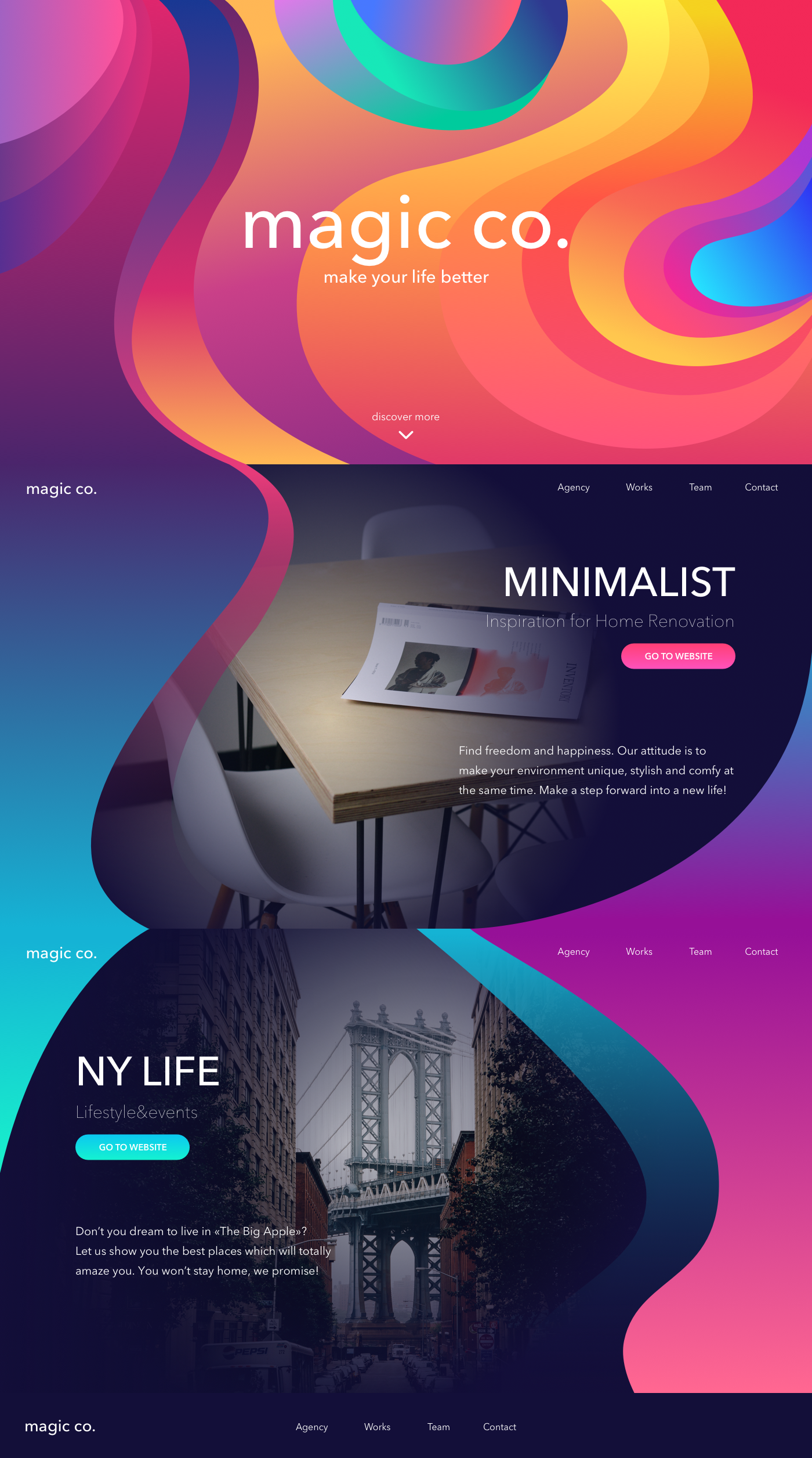
However, it isn’t just site designs which are changing. Large blobs of color are starting to give a new and very organic feel to background designs.
With the corresponding rise of illustration, this means that real-world imagery is now being given a playful and almost cartoonish element.
Superimposed images and duotones
As the internet begins to burst with color, it is time for designers to be more playful. Google launched Material Design in 2014 and shifted the boundaries of internet design.
As vibrant colors become more popular web designers are also bringing in additional features such as dual toned backgrounds or superimposed images in order to create aesthetic appeal.
Contrasting colors such as red and green create both depth and interest. Add gradients and photo saturation and the end result is intriguing. Websites are becoming far more vibrant and multidimensional.
Innovative Typography Choices
In recent years, typography has focused on clarity and simplicity, but this is beginning to change. Minimalism is being replaced by a sense of adventure and innovation.
Typography is becoming an art in its own right and is no longer willing to take a backseat in web design. As a result, 2018 will bring fonts which are bolder, brighter and more innovative.
Think cutouts, misshapen words, transparent text and larger, bolder lettering. Legibility is still key, so designers need to utilize a great deal more skill to achieve a cutting-edge effect.
Spacing is unusual in 2018. This still requires the technical eye of a designer to prevent the results from being utterly chaotic. Words are more widely spaced and this impact can be very effective when done well.
Alongside the recent growth in handmade fonts, typographers will be bringing new innovations into text this year. The results will have a massive impact.
Subtle animations
With fonts becoming bigger and bolder and colors more vibrant, the animation is becoming more subtle. Designers are saying hello to a range of micro-interactions which guide users on how to use the site.
Think of the button which shakes when you enter your password incorrectly or the text which unfolds to assist you with finding your way around a site.
These subtle animations delight viewers as they offer a deeper level of engagement. However, they largely stay in the background, allowing vivid colors and bold typography to take center stage. Balance is a large part of web design trends for 2018.
Summary
As 2018 unfolds, web design presents a brighter, bolder opportunity for designers to create a massive impact. Sites are taking a more playful approach to design, with bright colors, bold text, and integrative animations.
The mobile phone era is changing the face of design, offering up the opportunity for brighter colors and simple imagery. Use of illustration is making a comeback, adding a very human touch to a technological world.
As a web designer, 2018 is a time of innovation and change. Working towards expressive sites and subtle effects allow designers to forge personality into brands or sites more easily than ever before. The move away from minimalist sites and flat design can only be a welcome change.

