Are you in the process of building an ecommerce website? Are you doing so with the idea that it should be high converting? Are you concerned about wasting time and money on something that doesn’t get you any closer to your goals?
It’s one thing to say that you will build a high converting ecommerce website, but another thing entirely to actually do so. The harsh reality is that you won’t know much about how the website converts until you make it live and the traffic begins to roll in.
Tip: The work that you put in upfront will go a long way in helping you avoid difficulties in the future. For example, there are steps you can take to prevent problems down the road.
Here are five of the best things you can do if you want to design a high converting ecommerce website, with or without upselling. These tips don’t guarantee success, but they can definitely put you in a better place.
1. Keep it Clean
It doesn’t matter if you are a master of upselling or not, if you have a cluttered design you will never reach all your goals pertaining to conversion rate.
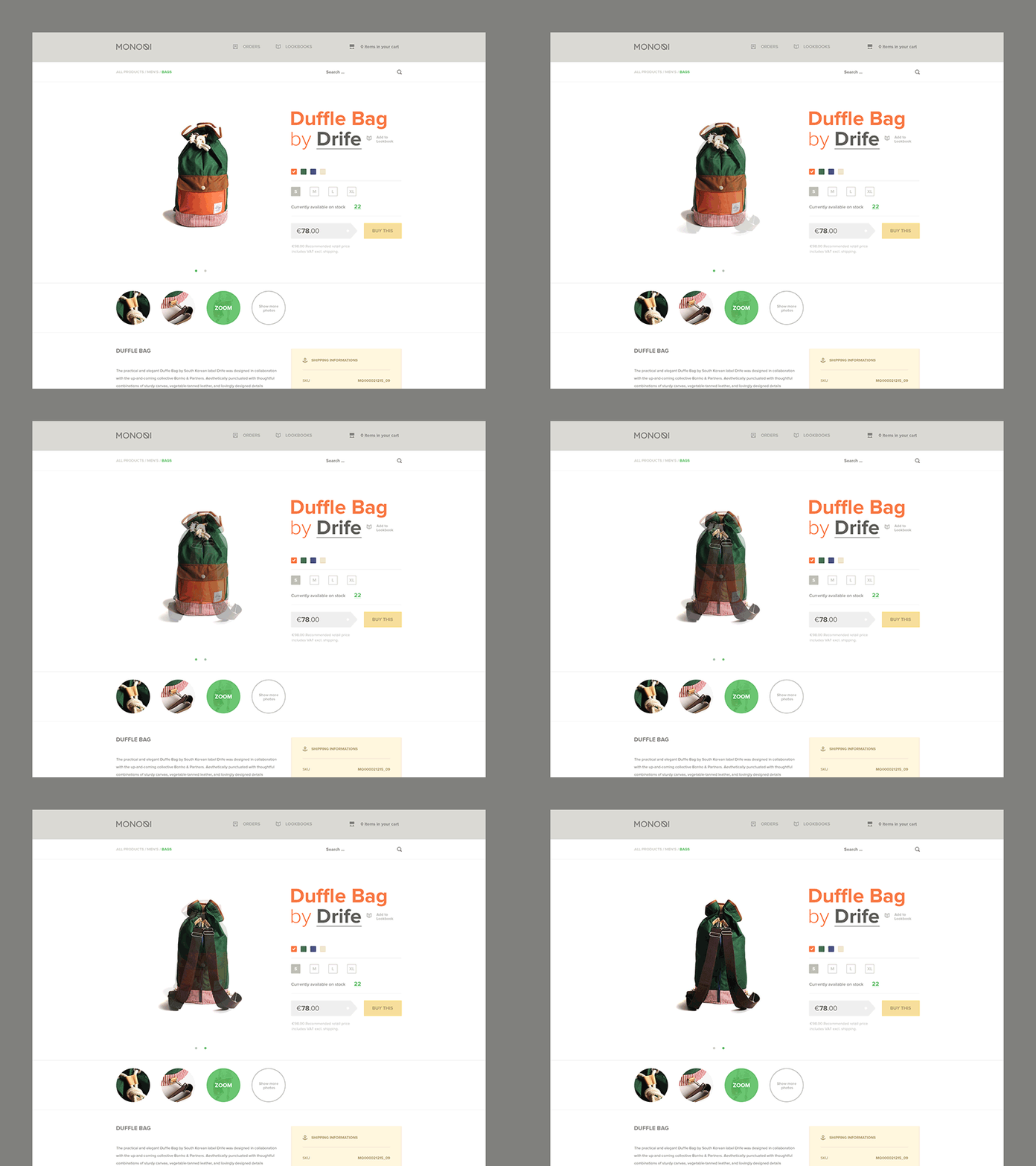
The best online stores are the ones with a clean design. This doesn’t mean you should skimp to the point of holding back information, but you don’t want to clutter your website with too much text, images, and video. This will do nothing more than confuse your audience.

2. Use High Quality Images
There is no denying the fact that you need unique content on your website, but you don’t want to stop there. Every product should be accompanied by a high quality image.
In addition to stock images, you can take your own photos if you have the time, money, and resources to do so. This is one of the best ways to set your site apart from the competition, and that’s exactly what you are trying to do.
3. Choose Your Colors Carefully
This may not sound like a big deal, but your color scheme has a lot to do with whether or not you achieve success.
Too many colors will turn people off. Conversely, the use of only one color can make your website boring and unforgettable.
Experiment with a variety of color schemes to get a better feel for what best engages your audience.
Tip: The colors you use on buttons, such as those for adding a product to a shopping cart, can have a big impact on conversation rate.
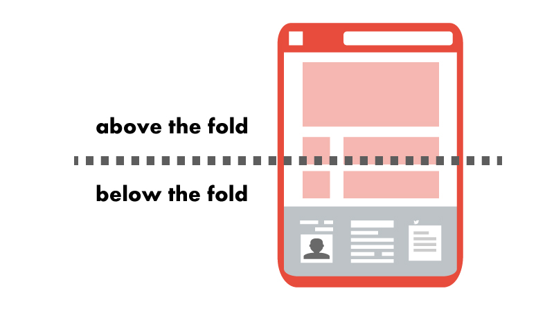
4. Put the Most Important Details Above the Fold
This is easier said than done, as you can only get so much information above the fold, but it’s something you need to think about.
What type of text makes the most sense above the fold? Should you add images and video as well?

Don’t hesitate to create and compare several layouts, as this will give you a better overview of your options. The real estate above the fold is valuable. You want to make the most of this space.
5. Focus on the Checkout Process
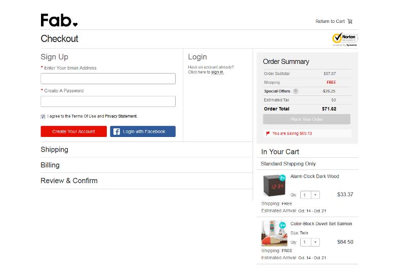
An overly complex checkout process is one of the top ways to scare consumers away from your online store. You need to make it easy for consumers to add items to their shopping cart and complete their purchase.
With an average shopping cart abandonment rate hovering around 70 percent, you need to protect against this at all costs.

Ask for Help
In addition to the five tips above, there’s one last thing you can do: ask your target audience for assistance.
For example, if you already have a solid grasp of social media, reach out to your audience for advice on what they look for in an online shopping experience. This ensures that you don’t travel down the wrong path, wasting both time and money.
Conclusion
There are many steps you can take to design a high converting ecommerce website, with these five among the most important to your success.
When you take the time to make the right design choices upfront, it’s easier to end up with a high converting website in the end.
What approach do you take when designing a new ecommerce website? Do you have any additional tips to share that help boost conversions? Discuss your strategy in the comment section below.

