Being successful means being a leader. In the Web design world, the leaders are the trendsetters. Getting in on the front end of what’s next on the Web is heavily tied to the ease of navigation. That means creating thoughtful and workable User Interface (UI) designs.

What you’re going to find here isn’t another list of UI trends, but rather some guidance as to how to change your thinking in ways that will allow your own creativity to improve Web design in ways that haven’t been done yet. You want to set new trends, not follow the forecasts of others.
Here’s how to be a UI trendsetter in the Web design world.
Make yourself useful
You don’t want to ever make changes for the sake of making changes – UI that works is UI that’s thoughtful. Scroll overs must have fruitful information attached and micro animation that’s distracting isn’t valuable for anybody. Look for ways to maximize the amount of information that you are expressing to your users.
Some truly useful and engaging UI tricks are:
- Use tiny animations to keep user attention during load time.
- Make your design warmer and more inviting with sketches and handwritten typography.
- Replace text with iconography and images that are instantly recognizable.
- Create full screen slides to focus attention and increase user autonomy.
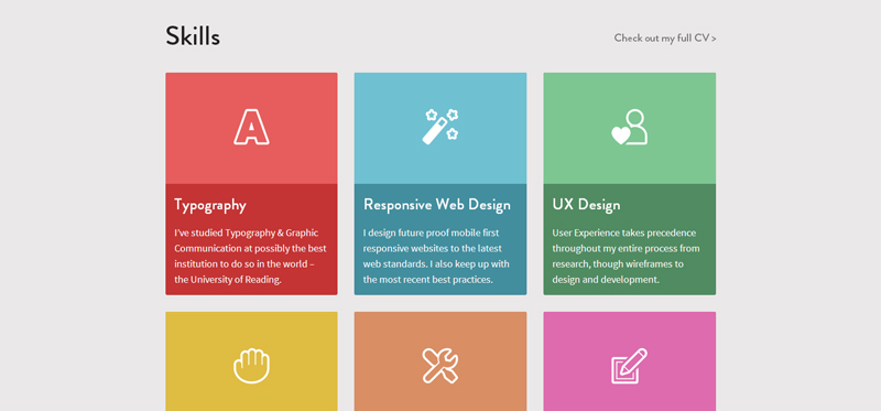
- Design a card style interface, allowing users to pick and choose content.
Elaborate designs may be fun to look at, but aren’t necessarily user friendly. When you’re creating interactions for your website, keep in mind that the reason that people have come to you in the first place is because they think that they’ll find something worthwhile. Don’t mess around with your users if you want to optimize UI – just give it to them!
Borrow ideas
It’s perfectly acceptable to graze ideas from rich Web experiences and give them to your users. There is so much UI out there that’s already been created beautifully and it’s perfectly legitimate for you to take what you need from it. You don’t have to reinvent user interface every time. Trendsetters are constantly on the lookout for what other people are doing that works. If it appeals to you and is easy for you to navigate, then more than likely it will be appealing to your users and easy for them to navigate as well. Look for a wide variety of inspiration and use elements of what you like in your own web creations.

Part of the beauty of UI is that it emphasizes intuitive and repeated experiences for users. That means that you’re actually helping everyone when you use others innovations, as the more opportunities that users have to interact in specific ways online, the more familiar they become and the better this web is as a whole.
Make sure, however, that you’re not just jumping onboard with whatever is hot at the moment. Use caution when overlaying the usage patterns of other websites onto your own lest you find yourself with a clunky and unintuitive interface that doesn’t work for your content. Customization is key.
R-E-S-P-E-C-T
In your quest to be new and innovative, don’t throw the baby out with the bathwater. Respect the interfaces that have been established. A login model is a login model, so preserve that functionality. This goes for a checkout feature as well. Your job is not to revolutionize the Web in one fell swoop. A core part of UI is realizing that users like patterns that they are familiar with. Hate the hamburger menu? That’s ok. You can hate it while still respecting that it’s become a user interface pattern that people are accustomed to. You have plenty of room for innovation, improvement and creativity even as you appreciate the usefulness of experiences that have become popular. They’re almost always popular because they work.
In fact, the actual challenge is that you are charged with respecting the conventions of user experience while still making improvements.
Repeat yourself
This might seem counter to sleek and simplified design, but the reality of people is that they need to be told things more than once. Hit them over the head with what you want to share in creative and engaging ways so that they get it. Every Web designer knows that they have a just a few seconds to get potential users onboard, otherwise those clicks are headed somewhere else. In that spirit, say it again. Offer users many opportunities to get to where you want them to be.
The trendsetting, cutting edge aspect of this approach is that you have to repeat yourself without users realizing that you’re repeating yourself..
Practice exploitation
Learn as much as you can about human behavior and then exploit your knowledge for all it’s worth. While Web designers tend to think of themselves as techies or artists or marketers, they’re just as much psychologists as they are any of those other things. UI design is concerned with how people learn and what motivates them to act, so when you figure out those motivations you’re going to be in a better position to exploit them and offer users improved interfaces.
Often it’s the smallest tweaks and changes that generate the most impact, allowing users to feel increasingly comfortable with navigation. Always take advantage of the human portion of this equation.
Forging your way in UI
If you want to be a trendsetter in UI, don’t be afraid to infuse your point of view into the Web. You have something valuable to offer the world. The most successful designers share that value without worrying over whether or not it’s good enough. Learn to be confident in well-researched, well-planned, well-thought out design elements and then go for it. Learn to listen to the input of customers and to adapt your interfaces to better serve them. Above all, don’t settle for following others – forge ahead with your own vision.
About the author: Michael Georgiou is the CMO and Co-founder of Imaginovation, a full service, turn-key digital solutions company serving Raleigh, NC and Charlotte, NC.

