Today, if you’re offering anything, whether it’s footwear, salad dressing, or something in between, you must have an e-commerce website. An e-commerce site may help you establish your brand, connect with more people, and sell more products—but only if you have the correct website design.
Being online is essential for goods vendors, much like not wearing pink and red in the same clothing. 69 percent of customers prefer to make their purchases online, and 66 percent of purchasers’ initial research preference will be internet merchants.
Strong, obnoxious businesses frequently fail to connect with current customers. The actual location might be more of a bother than a benefit. A tiny business can also be run on a shoestring budget and with no inventory at all.
Building a successful online store may appear to be a daunting endeavor for any small business, especially if you are unfamiliar with e-commerce. There are several little selections to be made, and if you lack experience, you may become disoriented among the plethora of options.
Start with a Strategy

Begin with a solid plan to assure success while developing an e-commerce website. Even the most basic e-commerce systems have nuances that must be exactly right for you and your company.
As your company expands, it is critical to anticipate your most pressing demands and issues. If you intend to sell real goods, determine ahead of time how you want shipping to function.
Consider the bandwidth and delivery choices you’ll require if you’re selling digital items. List clearly what you intend to sell, how you intend to deliver it, and any payment or time constraints.
A beautiful store

The design of your retail website is critical because clients will just click away if it is unappealing. You should be aware that a user’s purchasing decision is generally made within 3 seconds of landing on your website – therefore the initial impression is crucial. Customers who do not like it will not buy anything and will not return it.
Elegant Design

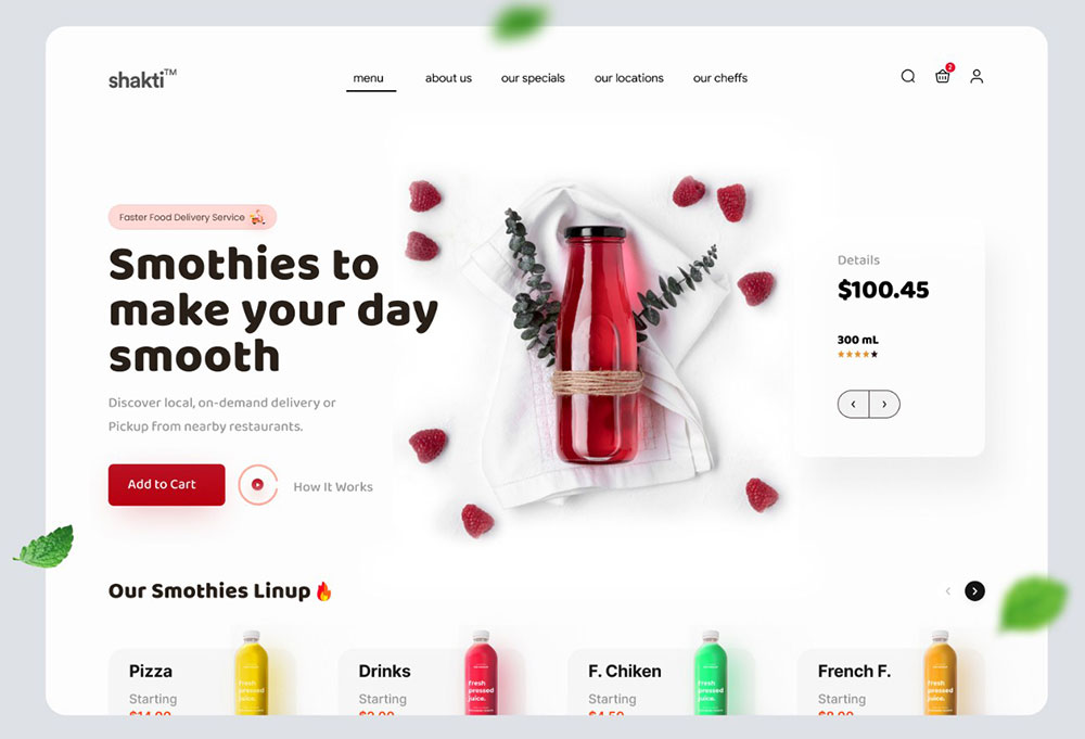
If you’re going to use a template for your store, keep it basic, useful, and appealing. More isn’t always better: don’t overcrowd your shop with buttons, material, or images. I know it’s tempting especially when you have a visual editor at your side, but keeping it simple is better.
Consider your business to be a discussion. When a potential client appears on your website, they want to jump right into the discussion (purchase a product, ask for assistance, learn about the bargain of the day, etc.) as soon as possible. You’ll have a pleased and returning consumer if you help them get to the stuff they’re interested in quickly.
Simplicity is everything
Everything revolves around simplicity. Even if you sell thousands of products, create amazing lookbooks, or create specific pages for tests or testimonials, the customer should always be able to easily find the three golden phases of the online shopping process: search products, add them to the shopping cart and pay to complete the process.
The buttons for these three phases should always be visible and lead to a simple and quick process. The sooner the payment can be done on the same page, the better because traveling through numerous pages causes users to become frustrated and is the cause of many dropouts.
Don’t require a lot of information to place a purchase, don’t require registration to buy in your online store, and include essential information such as delivery schedules, shipping charges, and return alternatives on each product page.
Use color to your advantage
Various shades may elicit various sentiments, emotions, and behaviors in individuals; thus, if you want your e-commerce site to convert, you must capitalize on those color inspirations.
For example, if you want customers to buy something, make the purchase button stand out by using a bold color like red. According to color psychology, red evokes sentiments of excitement and passion, both of which are motivators for spending—and studies suggest that tinting a button red may improve conversions by a staggering 34%.
SEO Optimization

Search engine optimization (SEO) is the most effective method for getting your shop recognized by search engines and, as a result, by customers. Find out what keywords your consumers use while searching for the things you offer and include them in your product descriptions, blog pieces, and other material. Don’t forget to include meta descriptions and tags. Most out-of-the-box e-commerce systems will make it simple to update them. As a result, your online store will be one of the first items that appear on your clients’ screens.
Your catalog’s online visibility

A branded online shop is no longer enough to stand out from the competition or be found by your consumers in today’s increasing and more competitive online market. Even if you devote all of your resources to developing the greatest online shop and app on the market, you must diversify your online presence. As a result, your visitors and sales will grow, and your customer’s online shopping experience for your items will improve.
Use high-quality images
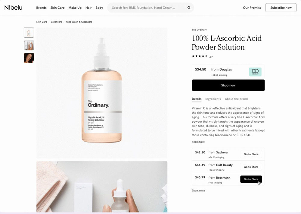
Nobody is going to buy anything they haven’t seen. If you want customers to buy your items, you must show them what they’re getting with high-quality product photographs. Having quality photos of all your items (and images of your products from several perspectives) goes a long way toward instilling confidence and trust in your consumers.
They are more inclined to buy if they are convinced that they know what they are doing. However, if there are no photographs of the goods they want to buy (or only a single, low-quality image), they will be more hesitant to purchase—and your conversions will suffer as a result.
Customer care
Outstanding customer service is another factor that will help you attract a large number of consumers. Remember, there is no greater advertisement than a pleased customer.
Make shopping at your store a memorable experience – but only in a good manner. According to a Forrester study, 45 percent of US consumers will abandon an online transaction if their inquiries or concerns are not handled promptly.
Reviews
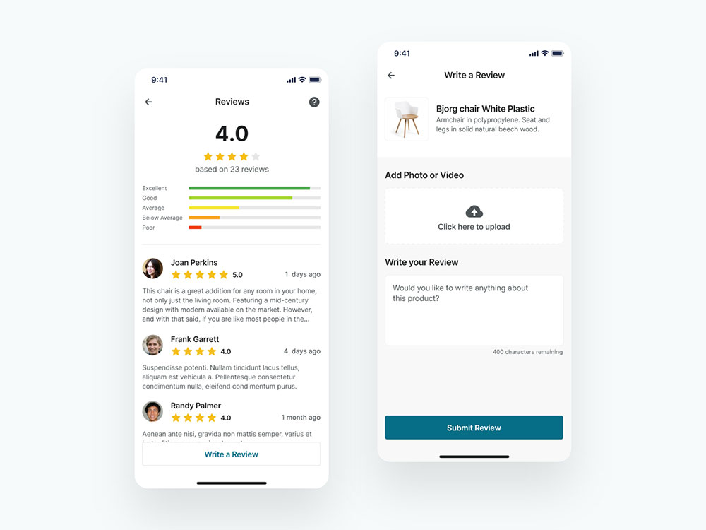
They may be frightening, and many online businesses choose to disable the option of comments and reviews, fearing that negative ratings would overshadow positive ones and propagate a negative company image.
The marketing potential provided by a negative review is enormous: it may boost your brand image and user trust if you reply swiftly to a negative comment, demonstrating empathy and giving a solution to the problem.
It also provides useful information to the marketing, design, and production departments. Examine client complaints from your rivals, as you may be able to stand out in what your competitors do wrong and become the ideal alternative in your industry.
Make your content scannable
Anyone may spend hours and hours developing detailed descriptions for your e-commerce site’s items, but we have bad news: no one will read them. According to research, most internet users only read roughly 20% of the material on any particular online page. Instead of reading material word for word, people just scan the text for crucial information—so, if you want to get your message through (and drive sales), make your content scannable.
The better it is for your audience to scan your information, the more likely they will grasp your important messaging—and the more likely you will be able to close a deal.
Preview, Test, And Publish Your Online Store

You should now have uploaded your items, personalized your store’s template, configure your payment and delivery methods, and finalized your store’s settings. But there’s one more thing you need to do before you’re through building your internet store: test it.
Ecommerce website builders make it incredibly simple to test and evaluate your online store before it goes live. Testing your shop is the greatest approach to ensure that you are meeting the demands of your consumers.
Market Your Growing Business

When you begin developing an e-commerce website, you must market your goods to boost traffic and drive sales. After you’ve built an e-commerce website, you’ll need a good marketing strategy to get the proper customers to your site and keep them coming back for more.
Tracking & Analyzing

As you put a lot of time and effort into marketing and your website in general, you want to determine how they affect your users and how they navigate your site. Setting up your Google Analytics code is the simplest approach to obtaining such information. Google Analytics default reports contain practically everything you need. If you have a specific query, you may create custom dashboards, and reports, or use ready-made solutions from the GA Gallery.
Be memorable

Because their experience was positive, 83 percent of online buyers will make another purchase from an online retailer. Making a good first impression is essential for instilling trust and enticing people to return.
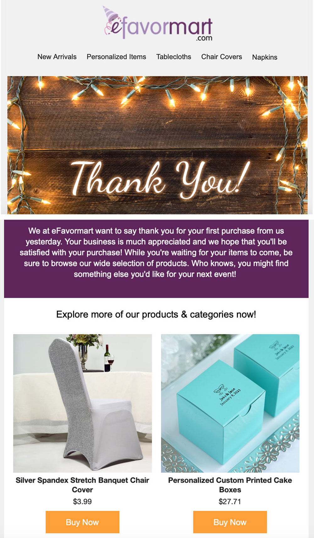
Don’t forget about your clientele, but don’t be too obnoxious about it. Create customized and tailored messages and mailings to thank customers for their purchase, remind them of things on a wishlist that is about to run out, or a shopping cart that was abandoned.
Conclusion
Some people start internet shops to supplement their retail activities. Others begin as amateurs and subsequently expand by self-funding or seeking external financing. Your store is like a sprout; you must care for it by watering and nourishing it. Your hard effort will one day result in a flourishing tree that will give fruit regularly!


