The usage of mobile technology and the number of users is constantly increasing. With the always-growing list of mobile activities, the focus is to upgrade individual features that combine into a modern mobile using experience.
The experience of a mobile user consists of the user’s approach and impressions prior to his mobile interaction; during his mobile interaction; and afterwards. It encompasses web browsing and applications on all types of mobile devices (low-featured smart phones to high definition tablets).
The ultimate result of technology improvement is that businesses have adjusted the quality of their mobile services to the same level of customer experience they offer in their stores.
Few ideas on how to build an excellent User-Friendly Mobile App Experience
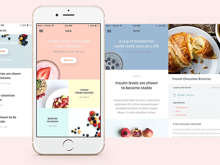
Image source: Matteo Pasuto
The Customer sets the Rules
Due to the large choice and the severe competition, customers have more and more power to choose the appropriate device and to ensure that their mobile journey will be diverse and will include various channels.
They use several devices and as technology modernizes, they upgrade their smartphones, tablets or laptops. The key to keep them satisfied is to provide a persistent, excellent-quality interface and to guide their experience through few simple steps:
Recognizing Your Users’ Context
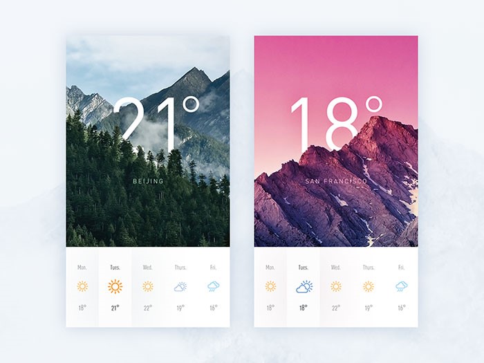
Image source: daRwin
Mobile experiences encompass large number of factors, some of them related to the app, while others with the personality of the user operating with it and the context of the operation.
For instance, checking your phone usually happens while you’re busy with a different activity. Most often, you’re trying to ‘kill time’ while traveling, having a coffee in the morning or waiting to reach the desk in a bank.
Clear Presentation
As we mentioned, people use their phones mostly when they are engaged in another, less divertive activity. Therefore, we must always approach their activities as something that is done rapidly, with no time to lose.
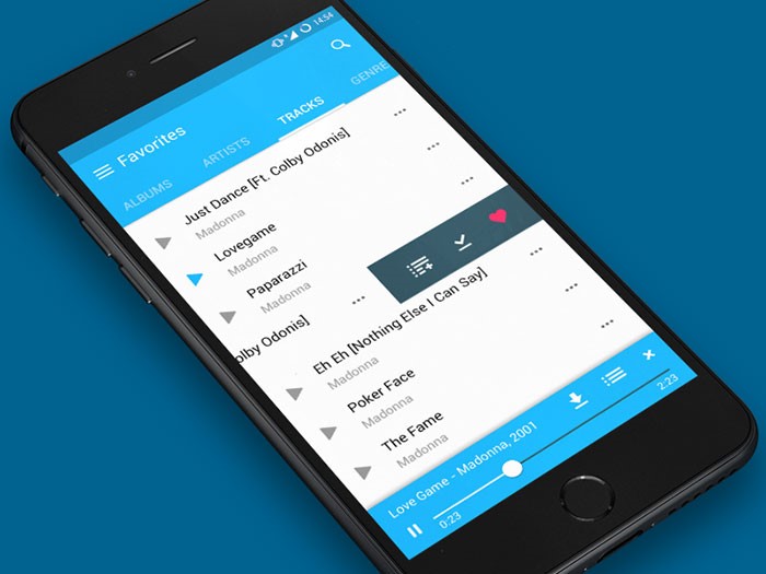
Image source: Fireart Studio
A user friendly app needs to use all of the real estate that can be found on the screen in a balanced manner. Your designs and layouts may appear perfect, but the secret lies in the fact they need to be equally applicable in every condition. For instance, it is very likely that your customer will have to use them with outside, rushing or facing a terrible connection, so you have to make sure they will remain applicable.
Remaining committed to Security
Your customer’s interactions and transactions need to be secured in every moment. It is the customers’ right and your obligation to employ secure user friendly mobile design and to cooperate only with vendors and other parties that share the same security commitment.
Marvelous Design
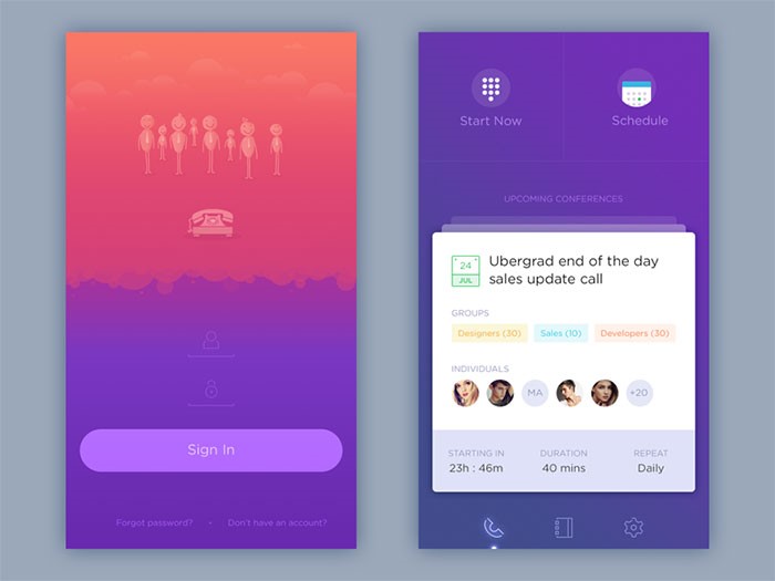
Image source: Zulal Ahmad
To start with, there is no general definition of good design. It simply depends on the taste and preferences of your customers. Design is a plan for arranging elements in such a way as best to accomplish a particular purpose.
If you’re looking for a more straightforward definition, good design is obvious. Great design is transparent. How to make a decision? Test it and check what your users think about it.
Gradual and Sustainable Improvement
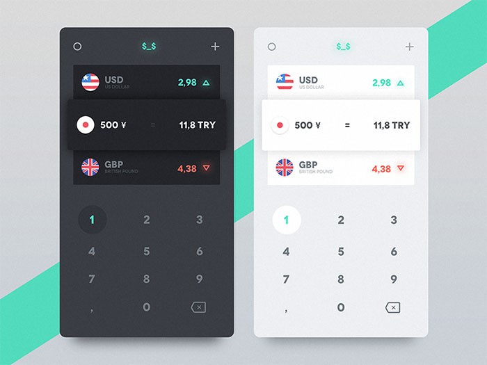
Image source: Emre Durmus
The main rationale behind technological development is to empower people and to simplify their way of living. If you wish to remain on the scene, you have to follow every development and to remain innovative.
This is a ‘full-store’ chain-you have to develop your software, the partners you’re integrating, as well as the service you’re providing to your customers. It is only your creativity that can ensure optimal customer experience and bring you maximal results.
Avoiding design mistakes in the User-Friendly Mobile App Experience
It isn’t all about color
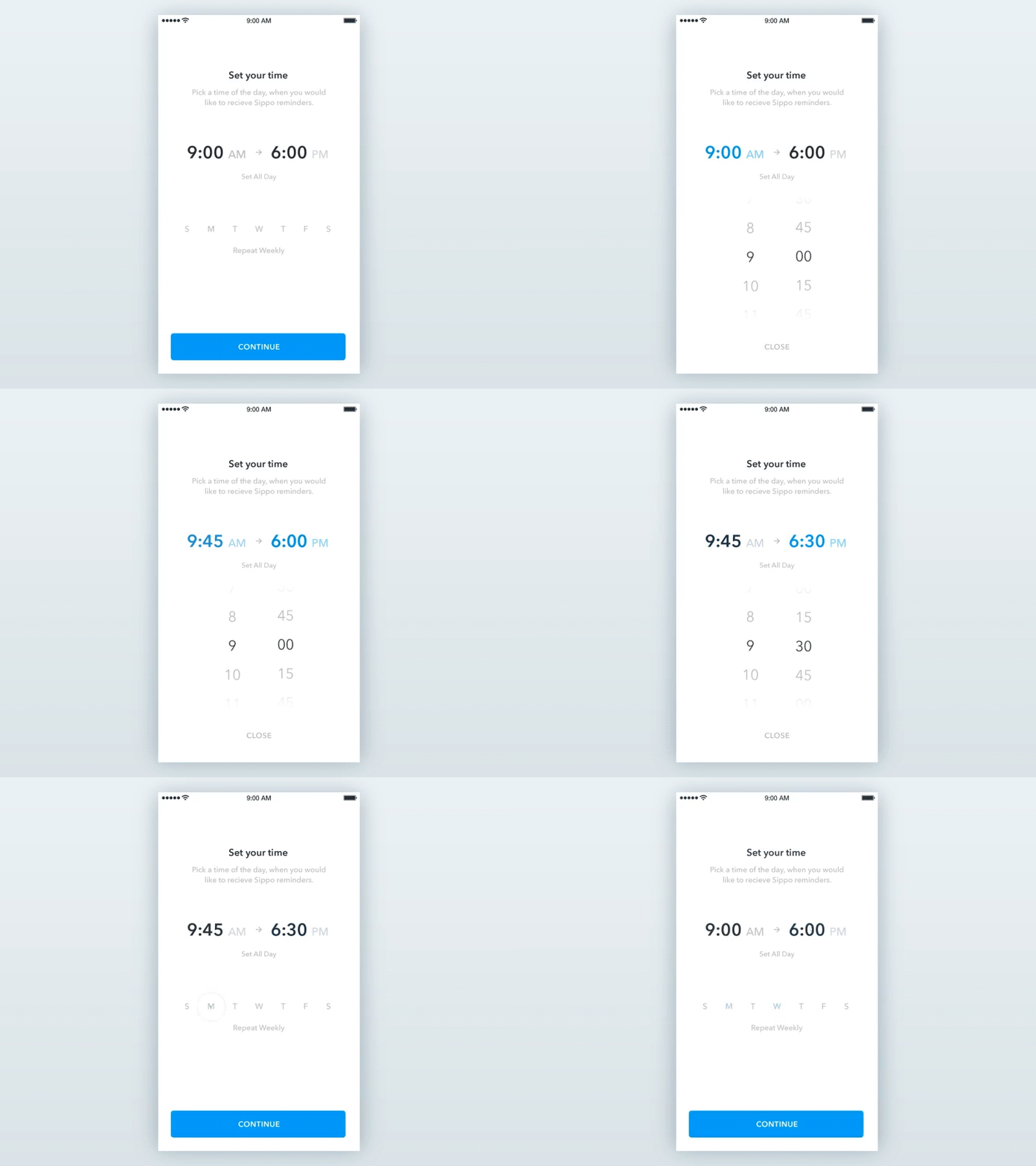
Image source: Dejan Markovic
A user-friendly app experience will be significantly bettered with interface decluttering. The best way to achieve this in your design is to employ a restricted palette of colors.
Learn from successful apps and try using the traditional black and white combination, but they apply sharper tones for headlines or other areas that need to be highlighted. They try to attract user’s attention with vivid red or orange. With no color diversity to distract them, users are free to navigate their interface without fearing to click on the wrong spot.
Icons are not random decoration tools
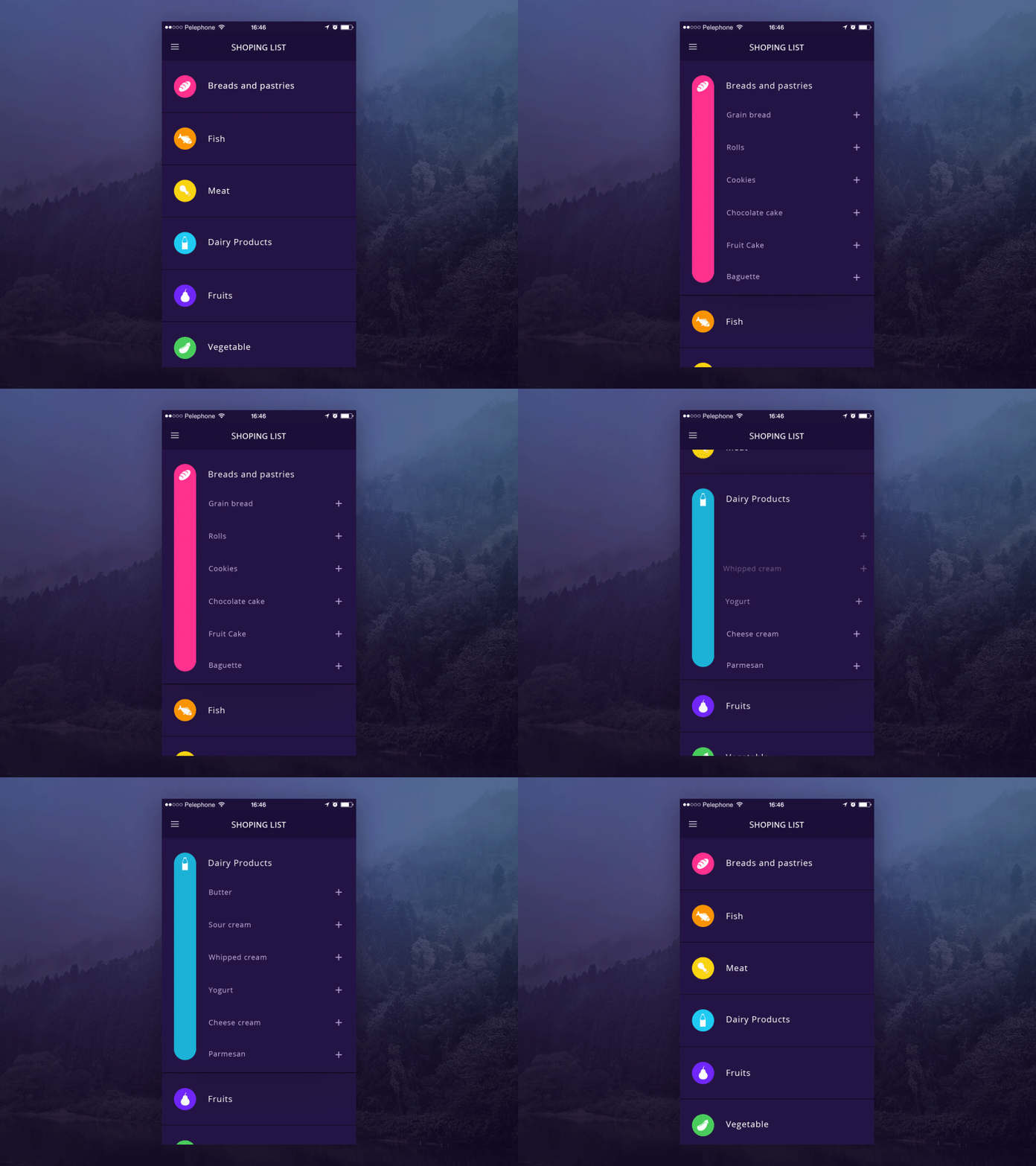
Image source: Hila Peleg
Their purpose is to ensure interaction, both in user friendly apps or websites. They save the designer some space, but offer enormous help to users who can perform their activities with a single click.
If created precisely, icons ensure an instinctive workflow without any need to rely on copy. On the other hand, messing things up would lead your customers out of the right path and it could ruin the image of your product.
Make sure the devices are compatible
The rule is one and only-in order to be user friendly, your app needs to be compatible with whatever device the user might be working on. That will inquire you to make constant compatibility tests with recent software releases.
There are numerous of excellent applications which failed just because the designer didn’t adjust them to popular software upgrades. Therefore, even if you consider your design to be perfect, you have to be aware there is a risk it will not run on an updated operative system.
Here are some tips that will keep your application usable: networking and constant communication with acknowledged designers in the branch, launching through a single “store”, and becoming unavoidably present on social media. All of this will help you to follow the trends and to adjust your design to them; to observe your own progress through customer feedback and to respond adequately.
Guidelines for creating people’s favorite user friendly app
Image source: Jakub Antalík
Get to know your users
What your users want is essential in user friendly mobile app design. You need to discover their motivation and to place triggers accordingly. Working on user experience will never be solid unless you are thinking the way your users do and unless you understand why they need the app you’re designing at the first place. Failing to do so will lead your conversion attempts to failure and will put an end to your growth tactic experiments.
Think seriously about the Offline experience
Many of the most popular apps base their usability on offline application. There should be no difference in the quality of their operation when connected to a signal or not. Designers should really take the importance of offline experience into account and think about how their application would look if applied without internet connection.
Employ Grids
Grids can help you to keep the consistency of your application when the users are switching from one page to the other. This famous design concept enables entrepreneurs to preserve their consistency, to establish excellent visual connections and to secure their design is unified throughout the entire app.
Cover all the Platforms that you can
It is no longer enough to think about all the devices your user could be in possession of. You should also consider the platforms he is using to access your application (Web browsers, Desktop) and to ensure that the app will be available, compatible and worth of their attention.
Replicate the Real World
The secret of designing a ‘blockbuster’ app is to provide fantastic experience resembling real life and responding to real needs. This task employs a serious dose of creativity, depending on the area, category or subject the app may represent.
Here is an example: If you are creating a productivity app, do some research on people’s behavior when using those particular products in real terms. That will enhance the user friendly mobile experience.
Essential to Remember
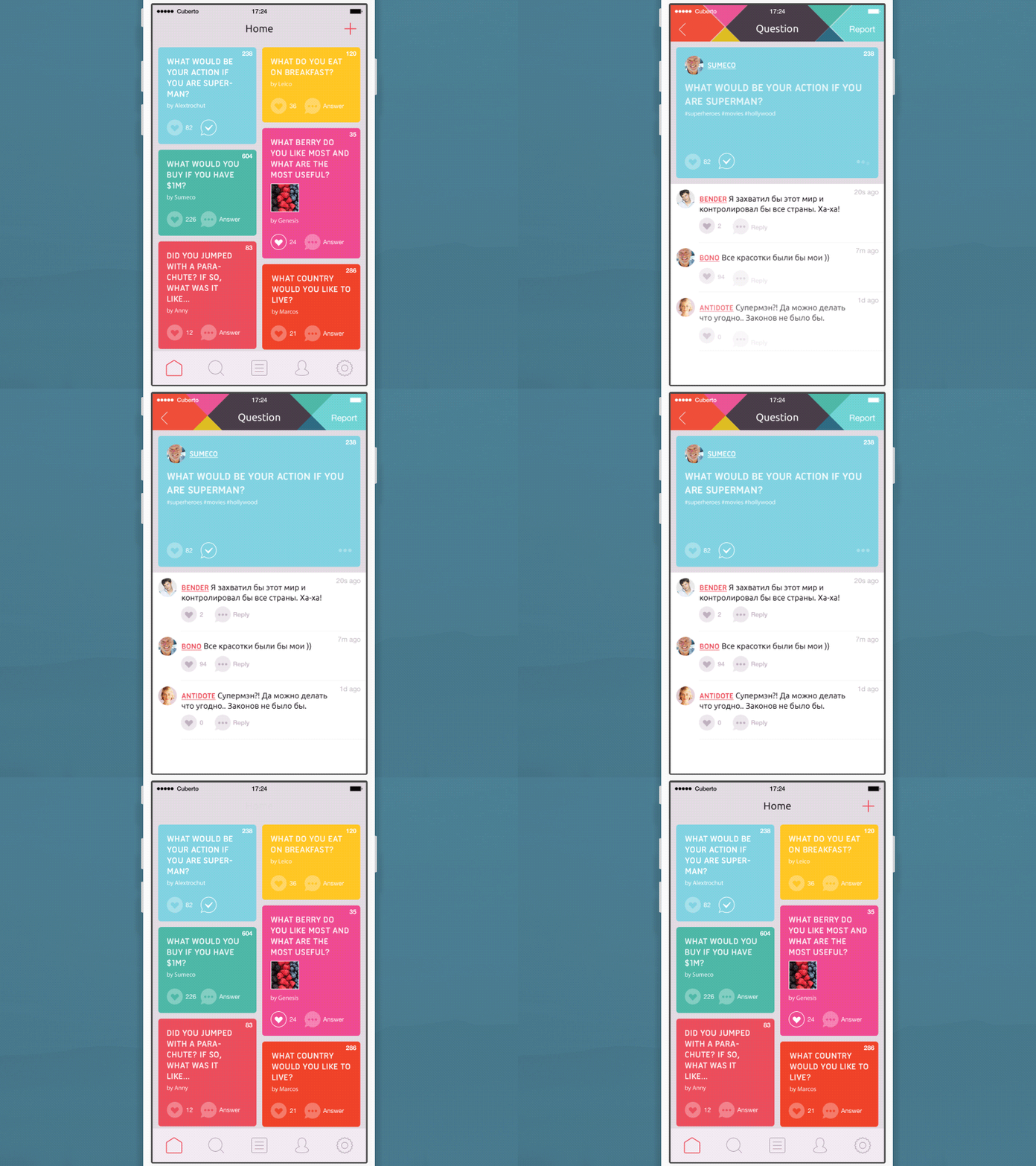
Image source: Cuberto
Designers do have the tendency to take mobile user experience for granted. They don’t employ too much creativity to delight their users and they seem to underestimate the complexity of mobile design.
It is a step-by-step procedure which consists of various mobile-characteristic considerations, tightly connected to smaller screens, varying device specifications, connection limitations, usage restrains, and the hardly identifiable modification-prone mobile context.
User friendly app design (both mobile or not) cannot be done in a rush. You need time to estimate precisely the behavior of your user, since he could always change paths statuses or interactions.
Skimping on foundation building is not an affordable luxury for a proper designer. He needs to understand the purpose: What is the aim of the app? Is it addressing a new need or improving an already existing one? Whatever you’re doing, focus on functionality. Your users will appreciate it!

