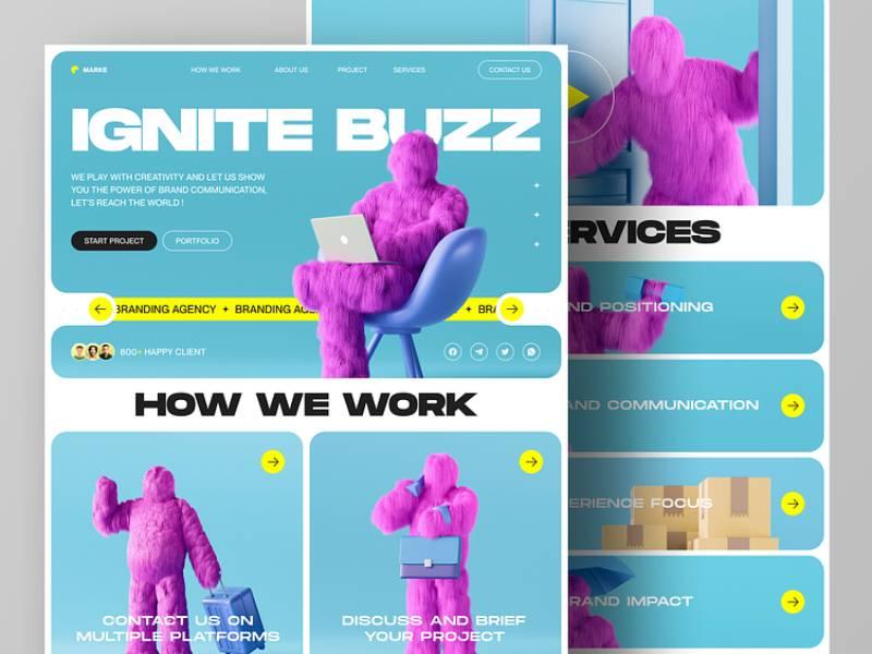
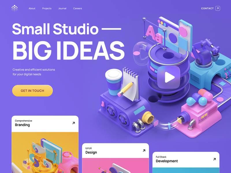
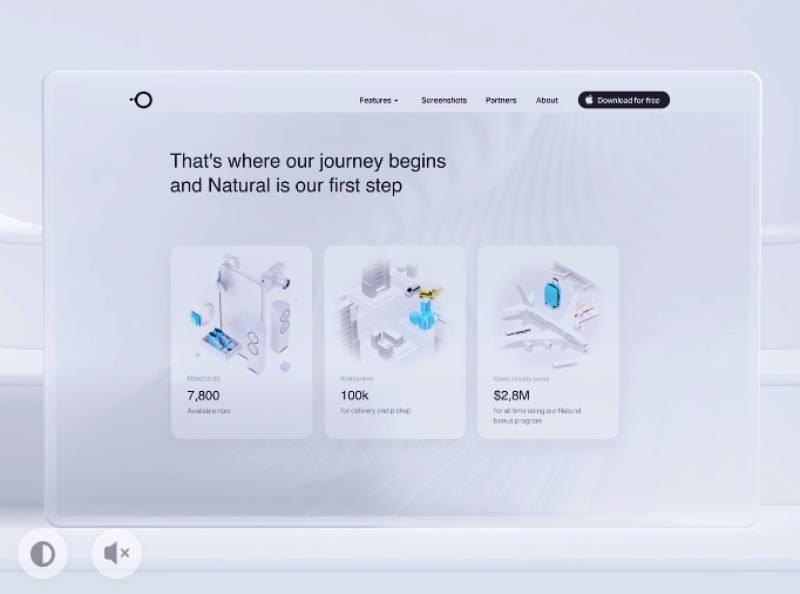
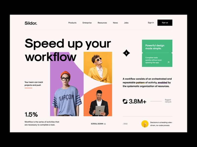
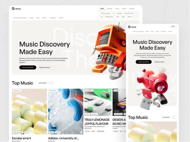
An animation portfolio website is your personal showcase, providing a glimpse into your unique creative universe.
It’s more than just a collection of work; it’s where your animated characters come to life and captivate potential clients or employers.
In an industry filled with both giants and newcomers, your animation portfolio is your calling card, setting you apart as a talent to watch on your journey towards becoming an illustrator that animates their work. But how do you build that perfect portfolio?
Whether you’re an industry veteran or just starting out, this article is your guide.
We’ll explore everything from the digital and physical aspects of portfolios to creating an effective showreel and avoiding common mistakes. Let this be your handbook for shining in the animation industry.
Types of Animation Portfolios
Digital Portfolios
Websites
Digital is where it’s at. Your animation portfolio website is not just a bunch of images and videos. It’s YOU, online. Pick a theme or template, stick to it, make it clean and easy to navigate.
Put the essentials on the homepage and let the visitor browse easily to get more info about you and your work.
Social Media Platforms
Ever thought about using Instagram or Twitter for your portfolio? Why not? Share your work, get followers, make connections. Your animation portfolio website is your main stage, but social media? That’s where the crowd is.
Physical Portfolios
Now, not everything is online, right? Sometimes you want to feel the paper, see the ink. A printed portfolio still has a place, especially when meeting someone face-to-face. It’s tactile; it’s real. Nothing will be animated, but in the corporate world some people are still asking for printed portfolios.
Essential Elements of an Animation Portfolio
Showreel
Length and Content
Let’s start with the showreel. Picture a movie trailer. It’s like that but for your animations. You want to put your best stuff in there, but here’s the thing: don’t make it too long. Around a minute is cool.
Remember, your animation portfolio website is your show, and the showreel? It’s the opening act.
Music and Sound Effects
Ever watched a movie on mute? Boring, right? Your showreel needs some beats, some rhythm.
Character Design
Originality
Characters are like people. They’ve got to have personality. Don’t be that guy copying stuff from the web. Be you. Originality shines.
Ever looked at a character and felt like you know them? That’s the goal. Make them real, make them yours. That’s what people want to see in your animation portfolio website.
Diversity of Characters
But hey, don’t get stuck with one style. Show them you’ve got range. Short, tall, happy, sad, human, alien – whatever floats your boat.
In the world of animation, variety is cool. It’s like having a wardrobe full of different clothes. Mix and match.
Storyboarding
Visual Storytelling
Animations are not just about pretty pictures; they’re stories. Your story.
Storyboarding is like drawing a map of your animation. It’s not just for you; it’s for anyone who wants to follow along. Make it clean and clear.
Consistency in Style
Ever got lost in a book because the writer changed the plot halfway through? Yeah, don’t do that with your animations.
Keep it consistent with the animations on your website. Choose a style and stick with it. It makes your work stand out on your animation portfolio website, especially if you use a simple design.
Technical Skills
Software Proficiency
Software is like your toolbelt in this game. Know your tools, know them well. Whether it’s Blender, Maya, or something else, master it.
Your animations are your craft, and the software? That’s your hammer and nails.
2D and 3D Modeling
2D or 3D? Why not both? Show them you can play on both fields.
2D is classic, like old-school cartoons. 3D? That’s the future, baby. Put both in your portfolio. Show them you’re not a one-trick pony.
Building a Successful Animation Portfolio
Selecting Your Best Work
Quality over Quantity
So, you’ve got a lot of cool stuff. Great! But don’t throw everything into your animation portfolio website.
Think of your favorite music playlist. You don’t put every song you ever heard in it, right? You pick the best ones, the ones that vibe with you.
Same with your work. Pick the top hits. Less can be more. Quality shines. Quantity? Not so much.
Relevance to the Target Audience
Now, think about who’s watching. You’re not creating your portfolio just for you. You’re showing it to someone. Maybe a future boss?
Your animation portfolio website is like a mirror. Reflect what they want to see.
Presentation and Layout
User Experience
Ever went to a website and got lost? Buttons everywhere, links leading nowhere? Don’t be that site.
Make it smooth, make it cool, modern, make it fun. They’re on a tour of your world. Guide them. They’ll love you for it.
Visual Appeal
Colors, fonts, layout – they all talk. What are they saying about you?
You’re the designer; make it sing.
Personal Branding
Logo and Theme
You know those brands you recognize just by looking at the logo? Be that brand.
Find a logo, find a theme. Make them yours. When they see it, they’ll think of you. That’s branding.
Consistency Across Platforms
Facebook, Instagram, LinkedIn, your animation portfolio website – make them all sing the same song.
They’ll recognize you. They’ll remember you.
Platforms to Showcase Animation Portfolios
Personal Websites
Benefits and Challenges
Having your own website is like owning your own house. You decide what goes where.
It’s cool, it’s personal, but hey, it takes work. Building, maintaining – that’s on you. But it’s worth it. It’s your space on the web.
Examples
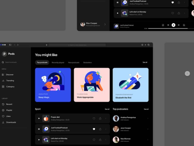
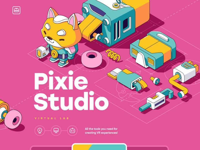
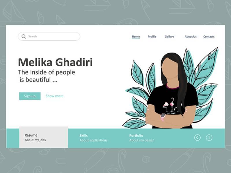
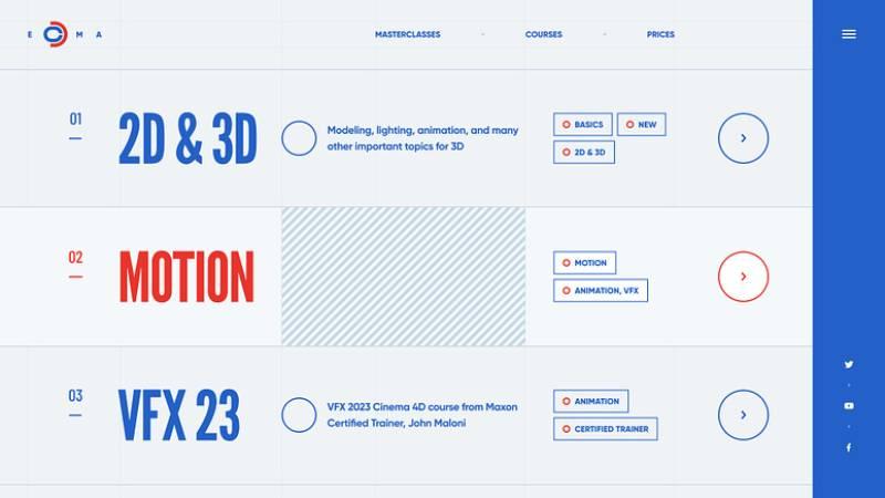
Need inspiration? Check out some cool personal websites out there. They’ve got style; they’ve got character. Learn from them, be inspired, but be you.
Professional Networks
Behance, Dribbble
These are like galleries, but online. A place for pros. Want to be seen by the big guys? Be here.
This one’s more serious, more business-like. But hey, business is where the money is. Show them you’re serious. Show them you’re a pro.
Portfolio Websites
Wix, Carbonmade
Don’t want to build from scratch? No problem. Sites like Wix and Carbonmade got you.
Pick a template, throw in your stuff, and boom – you’re online. It’s like cooking with a recipe.
Format
Want something different? Try Format. It’s another platform, another way to shine.
Common Mistakes and How to Avoid Them
Overloading the Portfolio
Finding the Right Balance
It’s tempting, I know.
Find the balance. Show enough to wow them but not so much that they get lost.
Regular Updates
Old stuff is cool, but new stuff? That’s cooler. Keep adding, keep removing. Your portfolio’s a living thing. Feed it, prune it, watch it grow.
Lack of Originality
Avoiding Clichés
Clichés are boring.
Find your voice, find your style. Your animation portfolio website isn’t just a gallery; it’s a stage. Dance to your own tune.
Showcasing Unique Voice
You’re unique, and so should be your portfolio. Don’t just show your skills; show yourself.
Be brave, be bold, be you. Your animation portfolio website isn’t just a tool; it’s a statement. Make it loud, make it clear, make it yours.
FAQ about animation portfolio websites
What’s the Best Way to Showcase My Animation Skills?
Oh, you bet, I can help with that! To showcase your animation skills, you’ve got to make sure your website has a sleek design with a clean portfolio page.
Use video clips, GIFs, or interactive elements that really spotlight what you can do. And don’t overstuff it – let your best works shine. Less is more here, you know?
How Can I Make My Site User-Friendly?
User-friendly, eh? That’s all about your audience! You want to make navigation smooth as butter. Include clear categories, easy-to-find contact info, and maybe even a FAQ section. Keep the layout intuitive, and folks will love browsing your site.
Should I Include a Demo Reel?
Ah, the old demo reel question! Definitely include one. A demo reel gives visitors a quick glimpse into your talent. Put your top-notch work at the beginning and end, keep it short but sweet, and bam – you’ll capture their attention!
What About Personal Projects? Should I Include Them?
Personal projects? Oh, absolutely! They give your portfolio a personal touch and show your passion and creativity. Just be sure they look professional and are relevant to the kind of work you’re seeking.
Can I Include Fan Art or Tributes in My Portfolio?
Fan art and tributes can be a tricky business. If it’s a huge part of your style, go for it, but be sure to have original content as well. It’s a balancing act, but it can show off your versatility.
What Should I Write in My ‘About Me’ Page?
The “About Me” page is where you get to be you. Keep it professional but let your personality shine through. Talk about your experiences, what drives you, your favorite animated character if you want – just be genuine.
How Often Should I Update My Portfolio?
Oh, updating? Regularly, my friend! Keep it fresh with new content and toss out the old stuff that doesn’t represent your best anymore. Every few months or when you finish a big project should do the trick.
Should I Have a Blog on My Portfolio Website?
A blog, huh? Well, if you enjoy writing and have insights or news to share, why not? It can set you apart, show your expertise, and keep visitors coming back for more.
Conclusion
First things first, building your animation portfolio website is a big deal. It’s not just about having a fancy website; it’s about showcasing who you are as an animator. Your skills, your uniqueness, all of it.
Remember these things:
- Your animation portfolio website is your stage.
- Quality always wins over quantity.
- Staying fresh and original is the key.
Easy to remember, right?
Look, every pro animator out there once was where you are now. It’s like this hidden journey that every artist must go through. Creating your animation portfolio website is a big part of that journey.

