The internet is a jumbled mess. Digital offers whatever you want right to your door; it is a place of abundance; it is a highly accessible market where everyone has an equal chance. Establishing a brand can be a creative process but also a cause of worry for firms just getting started or going through a redesign. Your brand is the first point of contact that customers will have with your product or service, so putting your best face forward is critical.
Creating an online presence is a major decision, but the finest websites are the result of many little decisions. Choosing the finest content management system and web host, picking a template, polishing your content, and selecting the best layouts to present your products and services are just a few of the elements that contribute to your company’s online identity. If you run a firm in the luxury sector, a luxury website design will guarantee that your online brand matches your consumers’ expectations.
For example, you may be a five-star hotel or provide another sort of luxury experience. People who are seeking those things expect your website to be presented in a certain way.
Once you’ve determined what you want your brand to express, the next step is to convert these concepts into a design and voice. It might be difficult for companies to transfer the “feel” of luxury from offline stores to online, but it is critical that you display your status, quality, and exclusivity through fundamental web design tactics.
Using a luxury website design can assist you in evoking sentiments of elegance and desire before your visitors even begin to delve into what you do. With a premium website design, you can enhance trust, attract more visitors, improve engagement, and increase online conversions!
Check out these suggestions and ideas to get you started on your next site design. It makes no difference if you sell premium items, luxury experiences, or work as a consultant in a luxury niche.
Simplicity
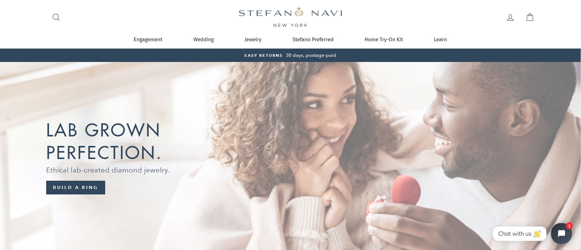
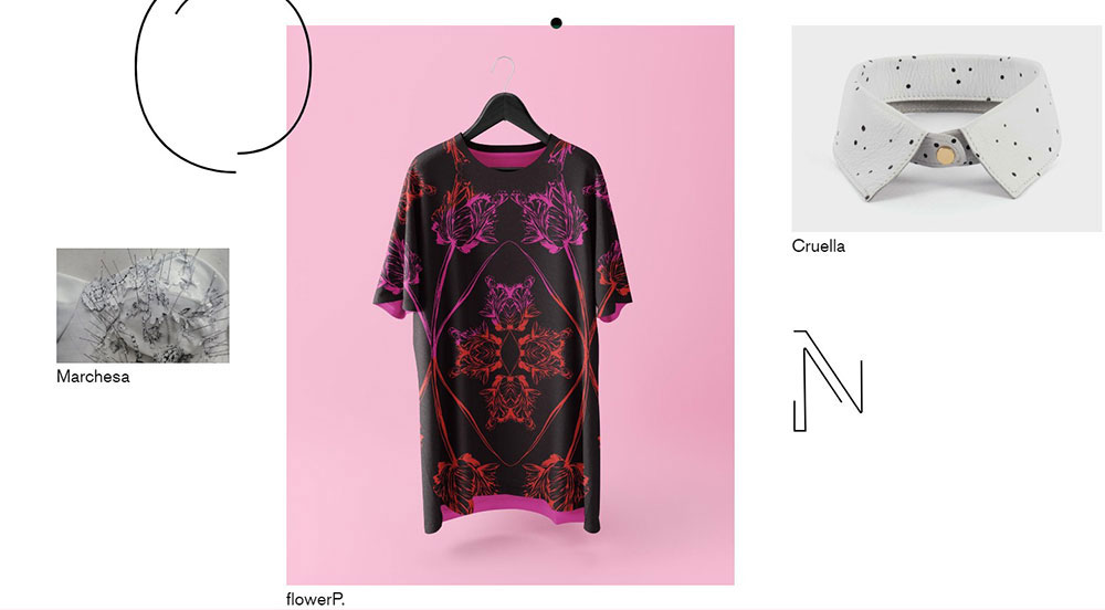
Stefano Navi’s website is a great example of a distinguished luxury aesthetic.
A nice website appears more expensive. Like attractive individuals, an appealing website appears to produce a Halo Effect, in which consumers assess product quality, customer service, and other factors more favourably.
Certain attributes are used by luxurious brands, and certain design aspects are perceived as more opulent. Simplicity is the loudest design feature that encourages visitors to feel a site is more distinguished.
Capture the class
A luxury goods website must capture a high-class appearance. While it may be difficult to pinpoint exactly what makes a design seem luxurious, modern design is always an important component of the equation. You can get this aesthetic with a luxury WordPress theme. There are plenty of them out there. You can also look at WordPress themes for small businesses. There’s a very good chance you’ll find something for you in this way.
While your design should be modest, it should also be something trendy. Skeuomorphic buttons, for example, should not be shown on your main page. It’s one thing to incorporate “traditional” aspects into your design, such as serif fonts, but it’s quite another to use little images or frames on your website.
Pick the right colour scheme and use plenty of white space
If you look at a few premium websites, you’ll notice one recurring theme: a lack of colour. Brands create a sense of scarcity by using a limited number of colours. This does not, however, imply that you must limit yourself to monotonous black and white images. The trick is to stick to a limited colour palette and use light or subdued hues.
Also, avoid the loud, crowded design. You want your website to be clean and free of clutter and confusion. White space makes the layout airier, accentuates the main idea, and provides eye comfort.
What colours work best in luxury website designs?
You may utilize a variety of aspects in your luxury website design, so the key to colour will be to create amazing contrasts that allow you to produce a user-friendly website and a memorable user experience.
If you want to go with rich hues, dark greens and deep purple tints might work nicely. Both hues can assist to provoke thoughts of richness and luxury, which is especially useful if you’re offering a premium experience or product.
Build a persona
You should now have a big list of possibilities! It’s time to start narrowing things down. But where do you even begin? Your audience—the individuals you’re attempting to market to—should be the primary motivator in selecting your aesthetic.
If you haven’t already, create a marketing persona to better understand the ideal individual you’ll be working with in the future. Consider the following questions about that person: Where do they live? Where do they go to work? What sources do they consult for information? What piques their interest? When you have a complete picture of that data, you can begin to correlate these numbers to a specific appearance, which means you will need to.
Consistency Can Be Luxurious
Another issue for web designers is keeping a consistent look and a premium brand across many platforms.
This necessitates a rigorous control policy for materials like typefaces, colour schemes, slogans, and logos, which must be portable and easily replicated. Font spacing, body font, colour, line height, and size, for example, must be set throughout the branding process, while a predetermined colour palette should be utilized to preserve and unify the brand for all online communications and goods.
It is critical to remember that your company’s brand identity is its voice, and it must be harmonized appropriately for the greatest outcomes.
Choose the right website layout
The simpler the site’s structure, the easier it is for users to browse. Each section of a website should have a function.
Consider the steps you want the user to do. Don’t just slap call-to-action buttons all over the place; instead, consider your customer’s path, how he views the site, and where his eyes could fall first.
If you’re using a slider on the page, use it to showcase your best work front and center. You can pick one of the best WordPress slider plugins for that. Oh, and don’t use the same layout as the homepage on other pages.
Your homepage should be the first impression for someone who enters your site. Repeating that on other pages would be unnecessary.
Aim Appropriately
If your business is striving for traditional, timeless elegance, a clean type-driven logo design may be preferable to trendy or cartoony typefaces. Low-key typefaces are popular because they are simple to read and complement other luxury features of web design.
You may also use parallax scrolling to improve immersion, which combines animation effects. One area that is becoming increasingly important for luxury companies is mobile, as consumers increasingly navigate web pages on their smartphones and tablets rather than desktop computers.
Being mobile-friendly frequently entails simplifying parts of a site, which contributes to the clean, simple appearance of luxury.
Create a seamless user experience
You must keep in mind that premium buyers are digitally sophisticated. Technology has certainly flipped the world on its head. It created one-of-a-kind experiences and made them available to everybody.
Improve the site’s usability, simplify the consumer experience, and keep the website’s loading performance in mind.
All of these efforts will demonstrate to the client that you are up to date on technology developments and value your customers’ time.
Don’t mess up calls-to-action buttons
When your users enter your site (most often via the blog or home page), you must direct them to areas of your site that will assist nurture them to conversion.
People are lazy, therefore make this as simple as possible for them. So, they don’t have to fight to find what they’re searching for, point them in the correct path.
Using strategically placed call-to-actions in locations such as the top right of your navigation, below parts that demand action, and at the bottom of your website pages is one of the greatest methods to improve your web design with this in mind.
Eliminate distractions
Have you ever arrived at a website only to be turned off by the pop-up screen that displays within a second of your arrival? Pop-ups are useful when you need to convey a message quickly, but they deter visitors to a premium website.
There are several techniques to draw attention to your websites, such as a discreetly moving symbol in the corner, a quick interaction, or a subtle gradient in the sidebar.
I know that in many lead generation techniques guides that there are online, they say you should smash a popup in front of the visitor, but that may have a not so good effect on some visitors.
Test and iterate
Your website should be an alive, growing part of your business, not a static component. There is almost certainly always space for improvement. Improving specific sections of your website can help improve conversions, time on page, and pages per session, but determining which solution would work best for your website is the difficult part.
This is when A/B testing comes into play. Testing two variants of a website against each other might indicate whether particular parts are causing problems for your users.
Always utilize excellent web development and design components to provide the groundwork for eventual expansion. You can therefore embrace luxury elements with confidence, knowing that your website will provide the finest UX while still being aesthetically appealing and engaging to all visitors. It takes a lot of effort to create a premium experience. An excellent luxury experience entails several stages that must be carried out with attention and accuracy.
When designing a luxury website, you must guarantee that the visitor has an outstanding and appealing experience. Put it first and foremost, and you’ll find your way.

