As the digital world grows and evolves, many businesses are starting to work online. However, in order to appeal to new clients, businesses need a website. This website provides an interactive space between a business and its clients.
An excellent website designer is able to offer a business a custom-made website. This website will be both creative and adaptive to business needs.
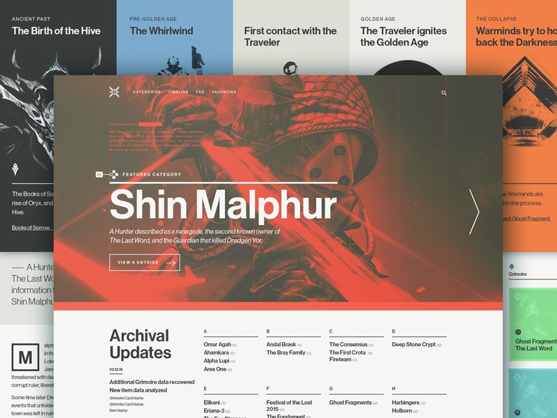
What to consider when designing a website
When you begin designing a business website, take your audience into account. There are many different types of website templates available. However, each appeal to different members of an audience.
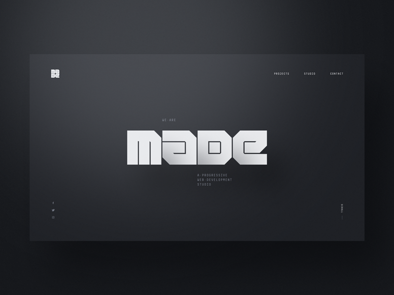
When designing a website, you might want to use an existing template which will suit a specific viewer.
Alternately, you might select a custom template. This choice largely depends on what you will be using a website for.
A good website should be able to adapt and adjust as the business expands. This will enable a business to grow with ease.
When crafting your site, partnering with experts can enhance the final product. California-based businesses can find many experienced Web Design San Francisco experts who can provide guidance tailored to specific business needs. Whether you are aiming for a sleek, minimalist design or a vibrant, engaging layout, they ensure your vision comes to life.
When creating a business website, it’s helpful to note that there are a lot of free resources which can be accessed.
These resources offer ready-made templates which can be adjusted to the needs of a site or its clients.
This enables you to save time and money on designing a site. Your site can also be up and running in a very short period of time.
Free website templates are also often very easy to manage, with drag and drop features which enable a site manager to change and adjust the content or images on a site with relative ease.
How to search for inspiration
When you’re working on a site, seek for inspiration everywhere you go. You could look at a collection of old art, view color combinations in nature or look at the dynamic movement of waves rolling off the sea.
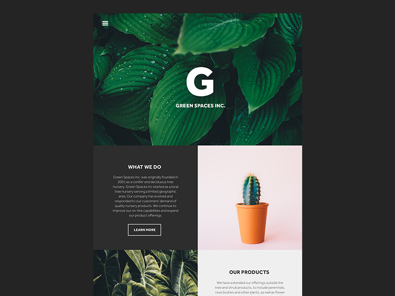
Even the evolving colors of a city street might inspire you. Once you have the inspiration you need, begin by creating a mood board. This will assist you to bring your ideas together.
Learn about colors
Color sends out a message, creating atmosphere or mood. Some colors (those next to each other on the color wheel) are complementary and can be used to create attractive but subtle designs.
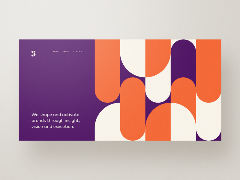
Others are contrasting (such as red and green or blue and orange). When placed together, these colors offset one another and bring a interest to a page.
Your local paint company should have a color wheel for you to explore. Interior and graphic designs both rely on color insights.
If it seems complicated, create a website with a dark background. There are lots of black textures online for you to use. And then, every color will be easily put into a contrasting scheme.
Learn about typography
When creating a website or blog, your knowledge of typography will enhance your viewing experience.
This is because, like color, typography sends out a clear message. Typography can be used to create a mood or tell a story about a site.
The layout of a webpage, the typeface was chosen, and the way this font is spaced will all make a difference to the legibility of a site.
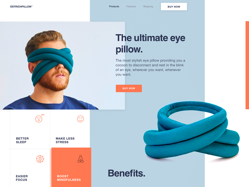
Clean-lined, well-organized text will create a pleasant experience for the reader. This will encourage the reader to engage more deeply with a site.
Look at background images
Only a few years ago placing a great deal of imagery on a site meant that the site would take a long time to download.
Now, however, bandwidth is much faster and it is easier to add attractive background images to a site.
These images can reflect the goals of a company (for example blueprint drawings might represent an architectural firm).
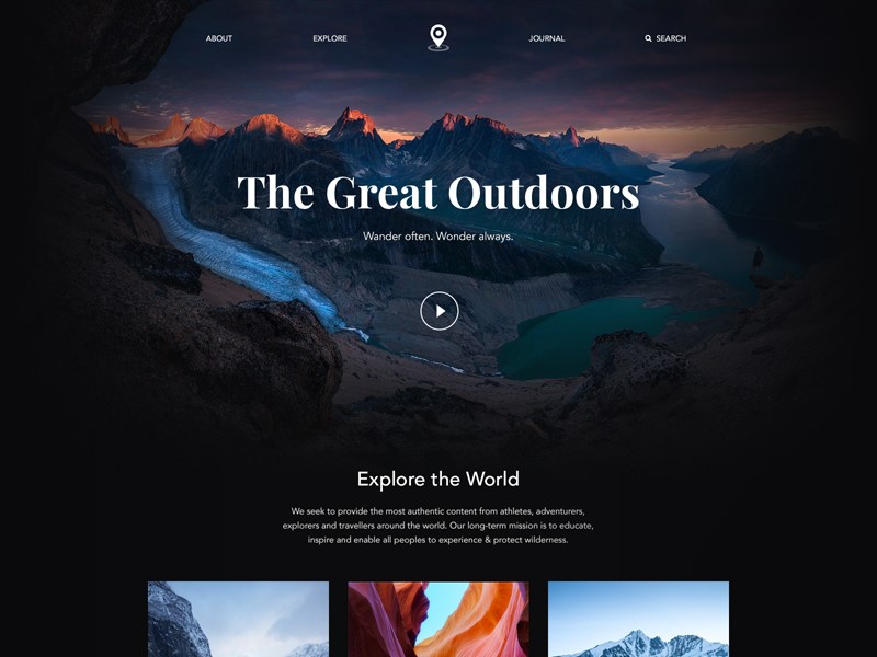
Remember to keep your images responsive though. This means they will give the same impact when downloaded on a mobile device.
Learn Photoshop
Once you’ve mastered Photoshop, you’ll be able to give your clients just about any image they need.
If you’re unfamiliar with the program, have a look for online tutorials. They’ll guide you on how to use the program in step by step fashion. Once you’ve mastered Photoshop, you’ll have far more to offer your clients.
Start drawing
Although websites use a variety of different codes to create the desired effect, begin by planning your website design on paper.
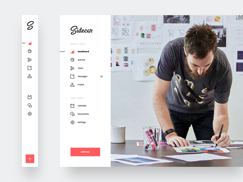
This will prevent any blocks between you and your ideas. Creative people often feel very comfortable planning on paper.
Search for internet inspiration
Once you’ve started planning your website, search the internet for a range of inspiring sites you can draw from.
Good quality web designs will offer you a multitude of different ideas to add to your site. It might also be helpful to explore ideas which don’t appeal to you.
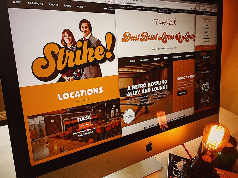
This will show you what to avoid. You could even Google ‘worst sites’. Looking at badly designed sites might be educational for you.
Simplify your home page
When you are working with website design, your goal will be to keep your homepage simple and free of clutter.
When a viewer lands on your homepage, they’re looking for evidence that they’ve come to the right place. Brand identity needs to be clear and content minimal.
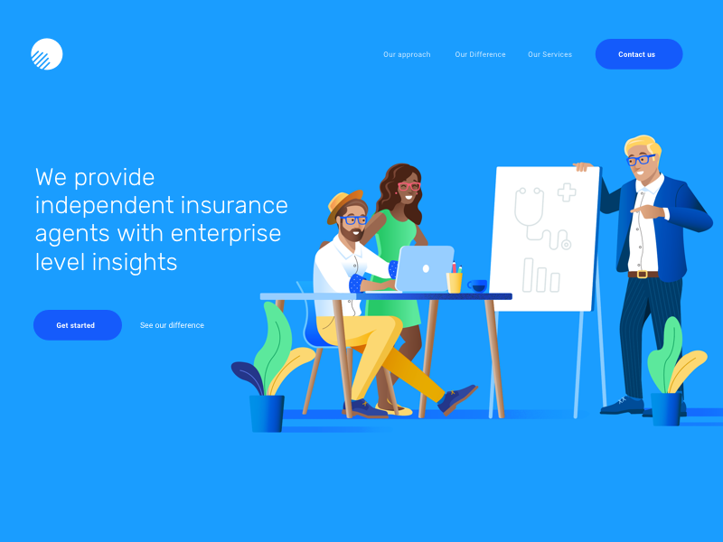
When your viewers land on your page, they will scan your page for information. The less they have to see and remember, the more likely they assess what they want from your site.
This means they will navigate more deeply into your site, or even respond to a call to action button.
If you do use content on your home page, break it up into small chunks. If you can, use an image or icon to portray a similar message. Your viewer can always search for any information they need later on.
Use hierarchy to direct your viewer
As a designer, it’s your goal to focus your viewer’s attention on important aspects of your site.
As a designer, you’ll be arranging the site and its context in a manner which is clear and easy to understand.
You’ll only have a short while to show your viewer what your site is about. If your information is clearly arranged, with headings and subheadings, your viewer will know what to expect.
You can also use contrast, color, size and spacing to show your viewer important information. Displaying your information in strips will make it easily comprehensible to viewers.
Keep your content easy to read
Legibility is always key when creating a website. No matter how attractive or profound the information you share might be, it won’t matter if viewers cannot read it. You want your viewer to be able to read and absorb your content easily.
Use contrast: if your information stands out against the background of your site, it will be easy to read. Think black letters on a white page or white lettering against a deep grey background.
This is much easier to read than the vague differences between green and turquoise, which make it hard for viewers to see.
Font size: when we read online, the screen is usually at least 24 inches from our faces. This makes small lettering very hard to read. Most online sites use a font size of at least 16pts. However, this may vary depending on the type of font used.
Use clean lined fonts: Clean-lined fonts are often referred to as ‘sans serifs’ and are often the most frequently used online font option.
Fonts with serifs are often used in books or offline publishing. Clean, easy looking text is best used for online site design.
Hand drawn text is very attractive and gives a unique feel to a website, but keep it limited to headings. It can be very difficult to read in large quantities.
Limit your fonts: When constructing your website, limit your fonts to two or three choices. This will help you to create an orderly site. Too many fonts can clutter up your site while a limited number will keep it harmonious.
Summary
As a website designer, you will never stop learning. Whether you focus on typography, digital skills or finding inspiration, there are always new steps to take.
As you grow and evolve as a designer, you will have more to offer your clients. Keep learning and you’ll watch your designs change as you do.

