When it comes to designing the perfect online casino, it’s not about putting together a website that you think looks great. It’s about designing and building an online casino environment that your target demographic can relate to and engage with time and again. That’s the biggest challenge of designing and launching a successful online casino brand – satisfied customers equals satisfactory profit.
Why online casino design should differ from other websites
The main reason that online casino designs should look and operate differently to informational websites and even e-commerce websites is that online casinos now offer hundreds, sometimes thousands, of gaming options. Whether it’s video slots, classic table games, live dealer gameshows or fusion games like slingo, the best online casinos have a bulging library of casino games for visitors to enjoy.
Unlike informational sites, where users are encouraged to browse and take their time to digest the on-site information, online casinos need to drive traffic directly to games or game sections. Online casino players are generally time-poor individuals. They don’t have hours on end to play their favourite games and look to online casinos to deliver the perfect casual casino gaming user experiences.

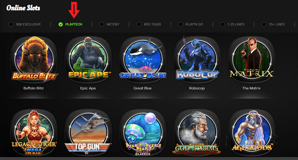
As many users have diminishing attention spans, user experiences must spoon feed gaming ideas and category suggestions as soon as the page loads. Radio buttons are smart design elements that take up minimal on-screen real estate, whilst making it easy for users to navigate categories and sub-sections with a single tap – perfect for the majority of people who prefer to play casino games on their mobiles.
Preferred colours and appearance
Take some time to consider the right colour palette for your new online casino. This is important to create a positive impact and an engaging first impression. It can also help to influence user behaviour. Bright, vivid colours like orange ooze vibrancy and openness, while blues help to communicate trust. Black is also a popular base colour for online casino designs, as they allow the vibrant colours of clickable slot and table game logos to jump out from the page. The colour black also epitomises nightlife activities, which helps to replicate the lavish, fun atmosphere that players crave when visiting land-based casinos.
Choose a design theme that creates the atmosphere you’re looking for
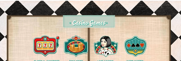
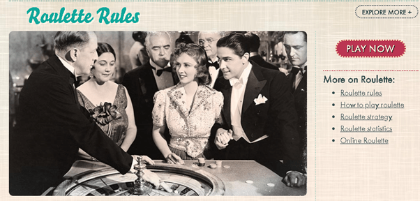
Online casino designers need to think about their user interface as their shop front – their version of a bricks-and-mortar casino experience. The perfect online casino design should accurately reflect the brand identity of the operator. 777.com’s sophisticated, retro design is a case in point, helping to communicate the nostalgic, old-school glamour of land-based casinos.


Their clearly defined online casino theme is what helped set the brand apart from day one, helping it to win Best Casino Operator and Best Digital Operator at some of the most prestigious iGaming awards ceremonies in the industry.
Incorporate personalisation to create more immersive user experiences

Some online casinos are choosing to develop their own proprietary platforms to ensure they deliver the experiences their customers demand. The Orbit iGaming platform is one such example, with its lightweight client designed to deliver streamlined user experiences. Its quick-click functionality and personalisation to recommend games based on a user’s game history has been adopted by 888casino (established 1997), this popular site has built a loyal following players with more than 25 million registered users visiting its incredible online casino.
Aside from personalisation, these proprietary platforms are also incorporating interactive widgets to help demonstrate that their brands are thriving. Whether it’s progressive jackpots increasing by the second in real time or real-time leaderboards for the latest slot tournaments, it all helps to build a picture of an active online casino community.
Simple sign-up forms ensure improved conversion rates
Simplicity is key when it comes to turning visitors into customers at an online casino. With competition in the iGaming industry reaching unprecedented levels, there is increased pressure on online casino designers to distil and optimise the sign-up process. Users not only expect web pages to load within two seconds, but they also want to be able to populate registration forms with ease too.
Ensure that you only include essential fields in your sign-up forms to comply with relevant iGaming licences. Meanwhile the use of search functionality to rapidly populate addresses and postcodes makes it easy for new customers to validate their identities.
Integrate a wealth of payment methods
Today’s online casino players need more than just a bank or wire transfer to fund their iGaming accounts. Given the time it takes for bank transfers to process, online casinos must ensure their websites can integrate a plethora of 21st century payment methods. We don’t just mean debit or credit cards either.
E-wallets are particularly popular, providing customers with an anonymous payment method that’s separate from conventional bank accounts. These e-wallets are also budget-friendly too, allowing players to ‘load’ funds into their e-wallets and set limits on their spending. E-wallets also have the added bonus of deposits being finalised instantly and withdrawals also being processed during the same day.
Fully responsive casino designs that deliver consistent brand touchpoints
According to the UK Gambling Commission (UKGC), there has been a seismic shift towards mobile iGaming. Even back in 2018, the UKGC found that almost half (44%) of all iGamers said they played casino games on their mobile in the four weeks prior to the survey. That’s almost double the amount of mobile casino players when the same survey was taken in 2015.
Wind the clock forward six years and it’s clear we’re now living in a mobile-first world. Online casino designs must be fully responsive. Although the mobile version may be a more distilled version of the desktop casino, it should still look and feel like you’re playing with the same operator.
Use imagery and certifications to convey trust and brand integrity
An online casino’s homepage is usually one of the first brand touchpoints of any new user. With so many online casino operators to choose from, it’s vital that brands quickly communicate why users should choose them. Visually displaying licensing, certifications from third-party auditors like eCOGRA and industry awards is an effective way to demonstrate that your reputation in the industry is legitimate.
Not all online casinos will incorporate all of the above factors into their design. However, with a clear, fast-loading and consistent user experience, online casinos can quickly establish their brand identities. New designs should also be built to be easily marketed, with technical SEO compatibility enabling brands to drive organic search engine traffic.

