When a client hits on your site, statistical research shows that you have 8 seconds to capture his attention. Human attention span is decreasing rapidly with digital use. There is therefore only a short period of time to capture user attention.
This information is important to site designers who are able to understand how important it is to capture user attention quickly. Without this, your user will bounce off your site.
How do you create a website which is engaging enough to hold your viewers’ attention?
This article offers guidelines on constructing a website which will offer a great user experience.
Unique value proposition (UVP)
As a designer, you need to make your website stand out. The internet is saturated with websites or blogs which aim to grab attention. Your site will, therefore, need to make an excellent impression.
However, when it comes to internet design, it is not merely first impressions which count. Overall user experience is important to take into consideration. This means offering great value to your clients so that they become loyal visitors to your site.
Researchers share that when it comes to converting your viewers, value proposition is one of the most important elements. Your value proposition shares how your product or service will assist your clients to solve their problems. Your value proposition should also state why you stand out from your competition.
What is important to consider when creating your unique value proposition?
Location
Many internet designers consider the top part of a site, before the user scrolls, to be the most crucial area of your site. Research shows that viewers tend to track the site in an F shaped pattern. The majority of users place their attention on the upper left-hand side of the site.
These studies show why many designers place their most important information in the upper part of the site (above the fold). However, this part of the page shouldn’t feel cramped or chaotic. If the page is cramped, your user experience will be less pleasant.
There is a lot of competition to hold users’ attention online. This means that when you place content above the fold, you would need to include your value proposition here. Speak to your users and share what you offer from a user’s perspective. Keep your site clear, so that you don’t overwhelm your viewer.
If your information is easy to digest, your viewers will be willing to stay on your page.
Use imagery
Imagery can have a powerful emotional resonance. When you use imagery on your site, you will connect with your viewers on a deep level. A picture says a thousand words. Viewers are also far more able to process imagery quickly than they are able to process text.
When you show your viewers your message (rather than tell them) you will have a greater impact. Images, illustrations, photographs and screenshots can share complex information without being too demanding.
Video clips keep viewers over 100% more engaged. They are also a very effective means of sharing a message. Users will grasp and retain a message far more quickly if it is presented in video format.
An important tip: when you place visuals on your site, they have to be relevant. If your visuals are either irrelevant or contradict your audience’s expectations, they will be dismissed as irrelevant. If your visuals do not support your site’s value proposition, your site may seem to lack integrity.
Besides imagery, you should also take colors into consideration. Using muted colors, for example, may help you keep your visitors on the site. Nobody wants to see flashing colors in front of they eyeballs.
Unique content
There is so much information available online that brands often find it hard to connect with viewers. Marketers struggle to come up with content which will convert their viewers into clients.
Oli Gardner shares that in order to come up with original content, it is important to consult your customers. Your customer queries or topics can assist you to create a headline. By addressing their unique needs, you will be able to come up with original content which speaks directly to them.
Your clients will also be able to share why they chose to go into business with you and what they value about your service. Your clients will also be able to share their pain points with you so that you can address them online.
When you set up your content, it is also important to address keywords in order to increase your search engine rankings. If you structure your content around a client’s questions, you will save them time. This will create a positive experience.
When you offer up unique content, present it aesthetically, using appropriate typography and great imagery. An attractive and well laid out page will offer a valuable user experience.
Greater Use of Negative Space
Whitespace, or negative space, offers up breathing room to your site. It assists you to create a cleanly designed and sophisticated site. When you use whitespace well, your content will be clear, simple and easy to understand.
When you create a site, keep in mind that many readers are more interested in scanning information than actually reading it. When you create divide your content using subheadings and use whitespace to divide up your topics, your viewers will be able to select what they want to read most. Great use of negative space will, therefore, improve your user experience.
Mobile influences on desktop designs
As people are using mobile devices to explore websites, design trends for mobile are starting to reach desktop sites. At one time, hamburger menus or large and well-spaced typography was often limited to mobile designs. However, as sites are made to be responsive to mobile use, these features are now being placed onto desktop sites too.
Another change which may reach desktop sites is the change from a navigation menu on the top of the site to one on the bottom of the site. This keeps the buttons easily accessible.
Summary
When you’re designing a website, focus on user experience if you wish to achieve all of your site goals. Sites with a great UX have a high conversion rate. Ineffective websites are easily abandoned and will not achieve their site goals.
An understanding of psychology will help you to explore how users relate to your site. By focusing on user experiences, your viewers will have an enjoyable online experience and you’ll end up getting the conversion rates you need.
How to design websites with great user experience
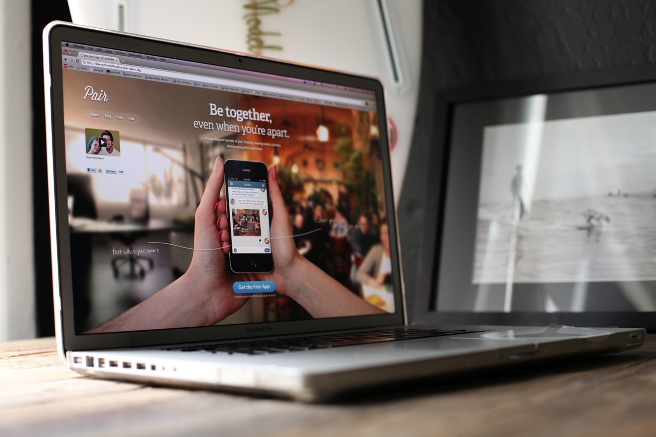
When a client hits on your site, statistical research shows that you have 8 seconds to capture his attention. Human attention span is decreasing rapidly with digital use. There is therefore only a short period of time to capture user attention.
https://dribbble.com/shots/559643-Pair-s-new-homepage
This information is important to site designers who are able to understand how important it is to capture user attention quickly. Without this, your user will bounce off your site.
How do you create a website which is engaging enough to hold your viewers’ attention?
This article offers guidelines on constructing a website which will offer a great user experience.
Unique value proposition (UVP)
As a designer, you need to make your website stand out. The internet is saturated with websites or blogs which aim to grab attention. Your site will, therefore, need to make an excellent impression.
However, when it comes to internet design, it is not merely first impressions which count. Overall user experience is important to take into consideration. This means offering great value to your clients so that they become loyal visitors to your site.
Researchers share that when it comes to converting your viewers, value proposition is one of the most important elements. Your value proposition shares how your product or service will assist your clients to solve their problems. Your value proposition should also state why you stand out from your competition.
What is important to consider when creating your unique value proposition?
Location
Many internet designers consider the top part of a site, before the user scrolls, to be the most crucial area of your site. Research shows that viewers tend to track the site in an F shaped pattern. The majority of users place their attention on the upper left-hand side of the site.
These studies show why many designers place their most important information in the upper part of the site (above the fold). However, this part of the page shouldn’t feel cramped or chaotic. If the page is cramped, your user experience will be less pleasant.
There is a lot of competition to hold users’ attention online. This means that when you place content above the fold, you would need to include your value proposition here. Speak to your users and share what you offer from a user’s perspective. Keep your site clear, so that you don’t overwhelm your viewer.
If your information is easy to digest, your viewers will be willing to stay on your page.
Use imagery
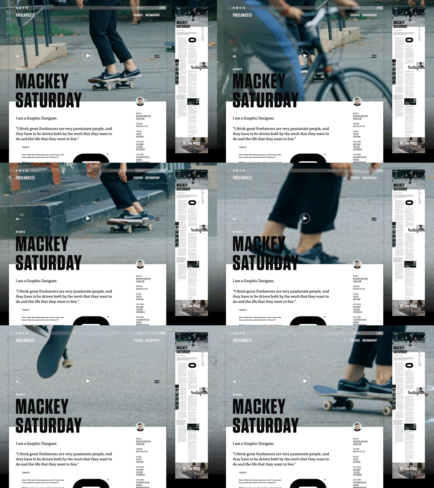
Imagery can have a powerful emotional resonance. When you use imagery on your site, you will connect with your viewers on a deep level. A picture says a thousand words. Viewers are also far more able to process imagery quickly than they are able to process text.
When you show your viewers your message (rather than tell them) you will have a greater impact. Images, illustrations, photographs and screenshots can share complex information without being too demanding.
https://dribbble.com/shots/3457011-Mackey-Saturday-on-Freelance-TV
Video clips keep viewers over 100% more engaged. They are also a very effective means of sharing a message. Users will grasp and retain a message far more quickly if it is presented in video format.
An important tip: when you place visuals on your site, they have to be relevant. If your visuals are either irrelevant or contradict your audience’s expectations, they will be dismissed as irrelevant. If your visuals do not support your site’s value proposition, your site may seem to lack integrity.
Besides imagery, you should also take colors into consideration. Using muted colors, for example, may help you keep your visitors on the site. Nobody wants to see flashing colors in front of they eyeballs.
Unique content
There is so much information available online that brands often find it hard to connect with viewers. Marketers struggle to come up with content which will convert their viewers into clients.
Oli Gardner shares that in order to come up with original content, it is important to consult your customers. Your customer queries or topics can assist you to create a headline. By addressing their unique needs, you will be able to come up with original content which speaks directly to them.
Your clients will also be able to share why they chose to go into business with you and what they value about your service. Your clients will also be able to share their pain points with you so that you can address them online.
When you set up your content, it is also important to address keywords in order to increase your search engine rankings. If you structure your content around a client’s questions, you will save them time. This will create a positive experience.
https://dribbble.com/shots/3651278-Less-Is-More
When you offer up unique content, present it aesthetically, using appropriate typography and great imagery. An attractive and well laid out page will offer a valuable user experience.
Greater Use of Negative Space
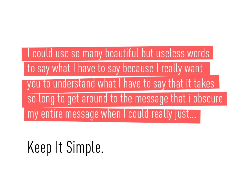
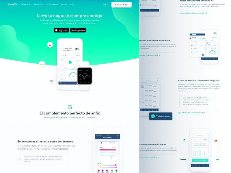
Whitespace, or negative space, offers up breathing room to your site. It assists you to create a cleanly designed and sophisticated site. When you use whitespace well, your content will be clear, simple and easy to understand.
https://dribbble.com/shots/4337906-Feature-Page-Design-for-Invoicing-SaaS-Company
When you create a site, keep in mind that many readers are more interested in scanning information than actually reading it. When you create divide your content using subheadings and use whitespace to divide up your topics, your viewers will be able to select what they want to read most. Great use of negative space will, therefore, improve your user experience.
Mobile influences on desktop designs
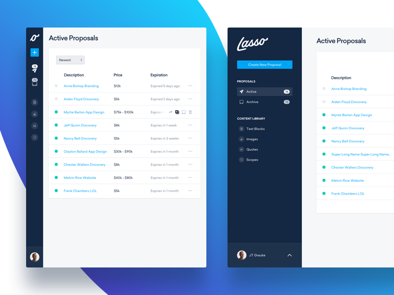
As people are using mobile devices to explore websites, design trends for mobile are starting to reach desktop sites. At one time, hamburger menus or large and well-spaced typography was often limited to mobile designs. However, as sites are made to be responsive to mobile use, these features are now being placed onto desktop sites too.
https://dribbble.com/shots/3503732-Responsive-Lasso-Screens
Another change which may reach desktop sites is the change from a navigation menu on the top of the site to one on the bottom of the site. This keeps the buttons easily accessible.
Summary
When you’re designing a website, focus on user experience if you wish to achieve all of your site goals. Sites with a great UX have a high conversion rate. Ineffective websites are easily abandoned and will not achieve their site goals.
An understanding of psychology will help you to explore how users relate to your site. By focusing on user experiences, your viewers will have an enjoyable online experience and you’ll end up getting the conversion rates you need.

