The principal objective of an e-commerce site is to turn its viewers into a regular customer from whom long-term benefits can be gained. In this continuously changing business world, e-commerce has become one of the most competitive business sectors that facing increasing competition every day every moment.
This tremendous competition among e-commerce sites has made it very challenging to attract visitors and potential customers. Moreover, the number of e-commerce sites has increased largely during recent years that has created a wide range of alternatives for the customers. So, if you want to attract more customers, you have to ensure a much better user experience (UX) than the competitors to make your investment fruitful.
In recent years, the term ‘User Experience (UX)’ has become a buzzword in the digital marketing platform. It is more important to ensure a better UX now than to mere lucrative web design. A better UX can be ensured by coordinating different elements that help the viewer easily steering over a site to find the required products or services most efficiently.
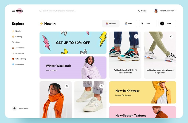
UX is very important in new e-com sites to attract visitors, since, 38% of the online customers lose interest in an E-commerce site when it doesn’t look lucrative enough to stay there, as statistics shown.
The most useful way to attract customers to a site is to provide them with the best user experience in shopping. In this article, we will illustrate the most useful techniques and examples of improving UX to achieve the ultimate goal of an e-commerce site.
Tips to Improve Ecommerce Website through Better UX
Smooth Navigation- the Key to better UX:
It is difficult to navigate the site if there are several product ranges, so many alternatives, and variety in similar category products. Users get too much annoyed while browsing a ponderous menu. Purchasing a product can largely depend on how faster and easier it can be found and how easier the checkout procedure is.
Complicated and too creative web design makes it painful for customers to navigate, which eventually results in losing potential customers. So, you should keep in mind while designing an e-commerce site that the user doesn’t need to face to go through any unwanted steps while navigating.
Responsive website:
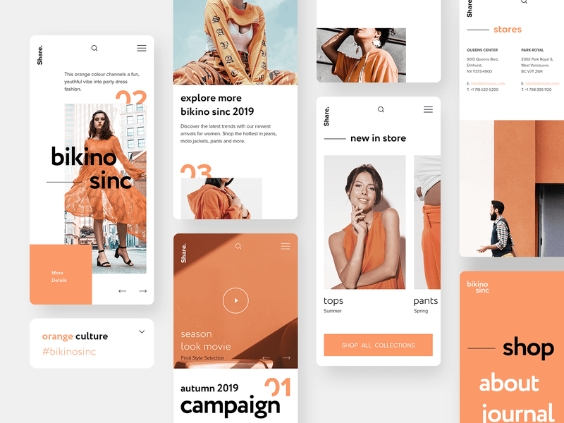
Users feel comfortable to browse a site that responds faster, and they are more likely to become a frequent visitor to the site and become a regular customer.
According to statistics, the possibility of losing sales is 60% if your website does not respond faster, and the visitor finds it difficult to navigate the site in mobile devices. On the other hand, approximately 70% of online customers have a possibility of coming back to the receptive sites, and around 65% are willing to do shopping form those sites.
Making Personalized Suggestions:
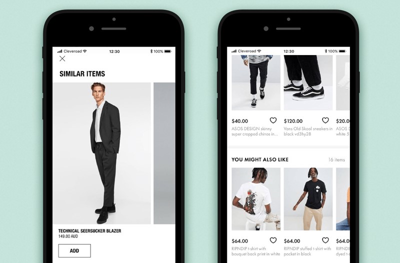
Making personalized suggestions based on the customers’ previous purchase history or browsing history can help a regular user to find the desired products or services easily. This process also makes the customer loyal to the business.
Nowadays, there are numerous e-commerce sites, each of which has a wide variety of products and services, so personalized suggestions can give the customers a better UX. It may also help the users to feel interested in purchasing new items, which will eventually increase the sales turnover of an e-commerce site.
Another thing worth adding here is that the product should have many options for every customer. If you recommend a suit to one of your visitors, make sure it has all the possible features on its page so that the visitor can pick his or her size, preferred color, material and so on. By default, some ecommerce CMS don’t have this, but you can further customize your products with extra product options or various addons, depending on what platform you are using.
Faster Page loading:
It’s disappointing for users to navigate a slow loading page, which consequently reduces the number of users. Therefore, you must ensure the pages at your site must load faster to feel comfortable for the users.
To ensure a better page loading time and smooth navigation, you must focus on arranging required infrastructures such as expanded caches, larger server storage, little or no external links, and a high-speed internet connection of your server.
All that is useless, though, if you don’t change the site infrastructure. For large ecommerce sites, you need to use newer and more efficient web technologies. Just some PHP won’t cut it anymore.
Focusing on the Presentation at Home page:
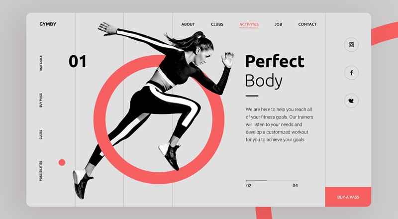
The homepage of a site creates the first impression of users, which largely determines whether they are going to stay or leave the site. So, the home page should be designed in such a way that it looks professional, and the contents are presented in a well-organized manner.
The users get the instruction or direction to hovering over the site to look for the required content. So, to ensure better user experience, the homepage should be designed in such a way that the users easily get everything they need.
Reducing User Attempt:
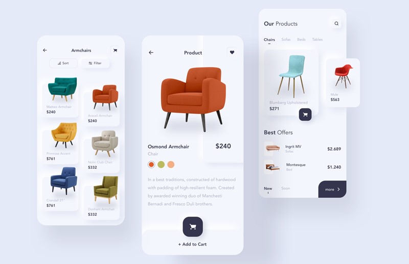
One of the most important things to improve UX is to reduce the number of attempts made by the users and to help them purchase the required products without spending much time.
Following tips can be helpful to save the time of users-
- Keep the menu as simple as possible so that users can get the required products with a minimum number of click
- Categorize items according to the group. Colors and shapes can be used to make them separately identifiable
- The layout of the website should be pleasant & soothing to the user’s eye
Customized Search Options:
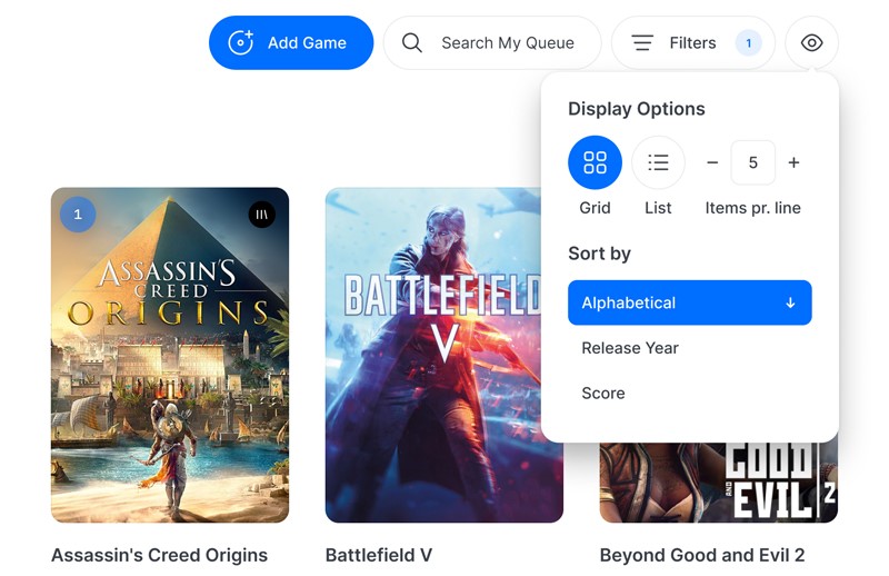
Nowadays, users have become more agile than before, and most customers don’t like to waste time by clicking over menus/options.
Instead, they would rather search it in the search box. So, you must design the search options in the most customized way so that users can easily find what they are looking for. Also, the search option should be compatible with cell phones and pc to ensure a better UX for all users.
Adding Great Product Images:
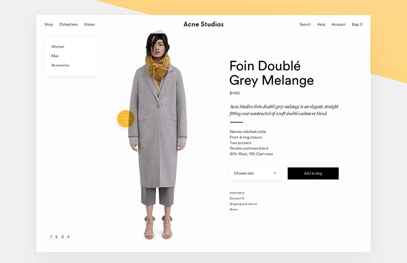
Since visitors are not able to see the product physically while shopping online, you must add the most realistic pictures of the products with the description, so that the users feel comfortable enough to purchase them.
But, you have to be careful while adding images, as it may impact your long term business if the customers find any deviation between the image and the physical product. So, be fair, be honest to build the trust of the customers so that they come back to your site for shopping regularly. Also, ensure the images are of high resolution so that customers get a clear idea of the product and feel reliable.
Easy Checkout Procedure:
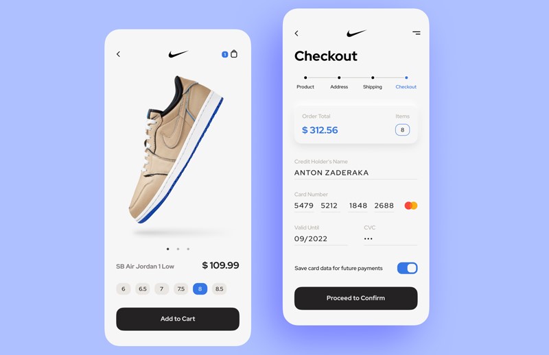
The secure checkout process is also a great factor to help the users to get a better UX and make the customer return to the site. A troublesome checkout process annoys the customers and reduces the possibility of returning to the site. So, make the checkout procedure as simple as possible, not necessarily make them on a single page.
Using a simple input form:
Make the customer information input form as simple as possible so that customers need to provide only the most important info since no users are fond of filling up a lengthy form.
Using Drop Down Menu:
The dropdown menu helps the users to select the required info from a dropdown list, which saves time and give a better experience to the users.
Real-time Authentication:
To ensure if the customers have provided the correct information in the input-form, add the authentication process. For example, a green checkbox will appear if the info is accurate, and a red checkbox while the info is incorrect. It will save the time from coming back to re-input the info while checking out.
Enable Auto-fill:
Auto-fill is a beneficial tool for the regular customers of the e-commerce sites, which saves time by skipping re-input the info into a site where a user has visited already. So, enabling this option in your site will certainly give a better user experience to your customers.
Arrange Customer Feedback
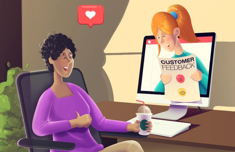
Customer feedback helps you to design and improve your site as per customer expectations. So, add customer survey forms and feedback box at your website so that customers can provide feedback on your products, services, and the navigation experience.
Regular Updating the Site

Monitoring the site regularly and making the required update regularly helps to improve the user experience. You have to be careful of the latest info that needs to be updated into the site and update them promptly. You must also ensure the overall design of the site is matched with the latest trends.
Conclusion
After discussing all the points, we can conclude that improved user experience is the key to success in new e-commerce sites, and the above-mentioned suggestions can certainly help to improve it largely.

