What is the conversion rate for? In terms of bare numbers, email marketing conversion is a purchase-related percentage of brands’ subscribers who completed the desired action. Sounds simple, doesn’t it? But speaking wider, these metrics are among the most important things to evaluate and measure our success. Because the conversion rate is an indicator of ROI (return on investment).
Sounds impressive. It means we should do our best to grow conversion. The matter is that no alchemic formula exists to boost conversion fast and easy. Sad but true: only the constant work, many efforts, and creativity applied to all vectors of email marketing strategy can bring a significant positive result.
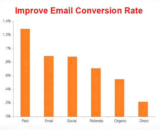
But it doesn’t mean there are no helpful practices to increase conversion. We have some tips. And we are going to share them in the current post. These practices are totally applicable for modern email marketers that are already equipped with the best experiences and assisted with tools like email signature generators, HTML template builders and ESP/CRM services. So the rest depends on you. I mean your creative approach and wise implementation are key factors here.
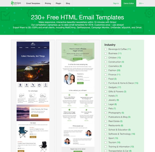
So let’s take a look at these best practices we collected for your convenience… and of course for the higher conversion of your business.
Stick to your unique style
We will start with an axiom of email design. This basic rule is known as brand consistency. It says that all our commercial emails must be visually associated with our brand’s style. They should be also be designed in the vein of our websites. This requirement means we have to choose similar color schemes, logotypes, fonts, and the rest of the graphic elements.
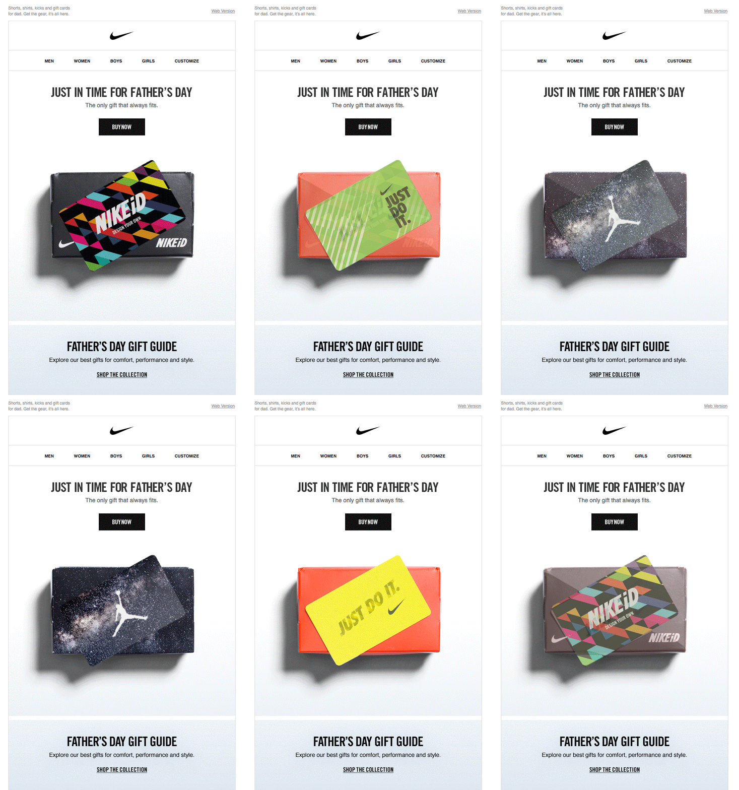
No, it doesn’t mean that visual experiments are prohibited. We can try new ideas, we can even change the brand’s face radically from time to time. But these updates should be applied to everything, from billboard ads to bulk mailings. Regarding unplanned experiments, be careful. Think twice: doesn’t it kill the recognition of your voice? Otherwise, it may become the reason why we fail to grow the conversion rate.
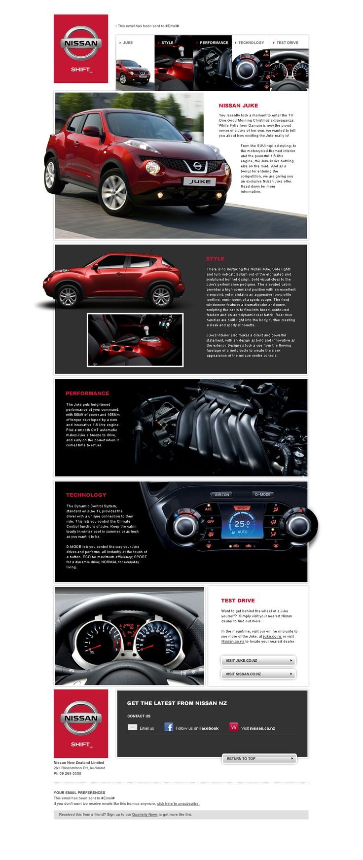
The amount of purchase is caused by customers’ trust. So our advice is: consider the entire visual style of your further campaigns. It’s better to pre-design the concept for a year, or even longer. Choose the best design solutions to use them in various cases, from regular newsletters to triggered messages. And only then, you can send your first bulk mailing.
Keep the optimal balance of content and ads
We receive tons of inbox emails every day. And, to be honest, we are even tired of such a massive emailing. So we are pretty demanding, even severe, about the content of incoming emails. So where do all those numerous newsletters filled with tons of ads go? Right, their regular destination point is the spam folder. Only when the recipient isn’t interested in their content. But it happens not in 100% of cases…

So remember about useful and relevant content, not only advertisements. Contacts subscribe to our emails for helpful information. We cannot give one-size-fits-all tips here. The ratio of information and ads depends on multiple factors. Niche, target audience, brand specifics, etc. Everything matters.
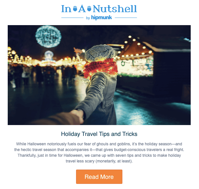
The only universal recommendation is simple: always keep on mind what do people want from you and which problems you can help to solve. This is the precious knowledge to pick up only the relevant content for your newsletters. Subscribers appreciate such care, so they will become loyal clients much faster.
Write the strongest texts
The next point logically comes from the previous paragraph. Your copy should be clean, concise, and compelling enough to complete the mission of making content really helpful.
Appeal to the right feelings. Do you present a new model of gadget? Focus on the human urge to be the first. Charity? Call upon compassion. Does your target audience consist of fashion girls? …you got the point, I think 🙂
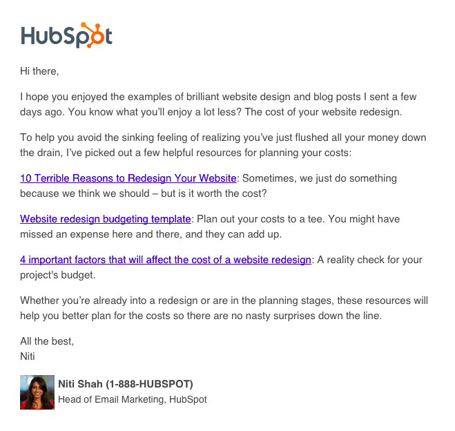
Another essential condition regarding the email copy is perfectionism. Mistakes and typing errors kill the impression of the whole brand’s professionalism. So don’t ignore the spellcheck! Have you written the copy? Check it for errors. There are many special tools to get rid of various spelling, stylistic, etc failures in the text.
Make experiments with the text/images ratio
Constant Contact stats witness the common fact: emails with up to 3 pics and 20 text lines show the best CTR. So we can consider this ratio as an optimal solution to follow.
But it’s a more creative solution to find the perfect practices on a personal base. So target your efforts on a specific sphere and unique tasks. For instance, some marketers say that product brands need newsletters with about 15 images to represent their assortment.
If we want to share a piece of single news, it’s enough to add one picture and a CTA. What matters is to make each image in your email clickable.
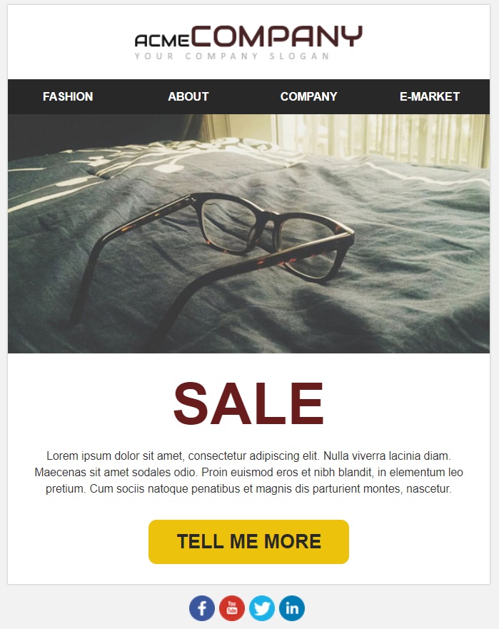
Also, don’t forget to add the alt text to every image. This way people can imagine what your newsletter is about even if pics are blocked somehow.
Try visual trends
A row of email marketers considers old good plain-text as a perfect alternative to sophisticated messages full of photos and other visualizations. They believe that simple text messages are creating the mood of friendly, honest, non-advertising email. Well, plain-text can be another visual trend too. And these newsletters can increase the conversion rates.
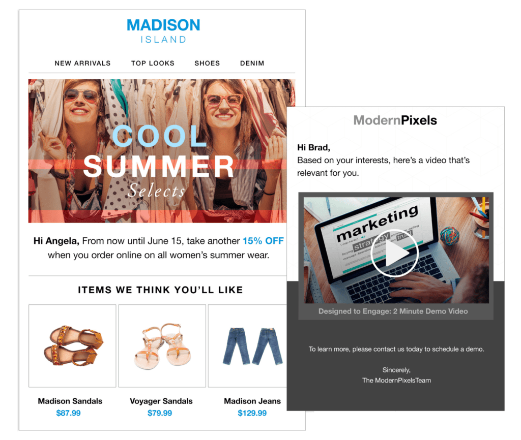
But emails based on visual content still dominate. In particular, it caused by our brain work. It processes “video streaming” from our “dual camera” 60.000 times faster than a copy. Imagery perception is much more convenient than reading the text as well.
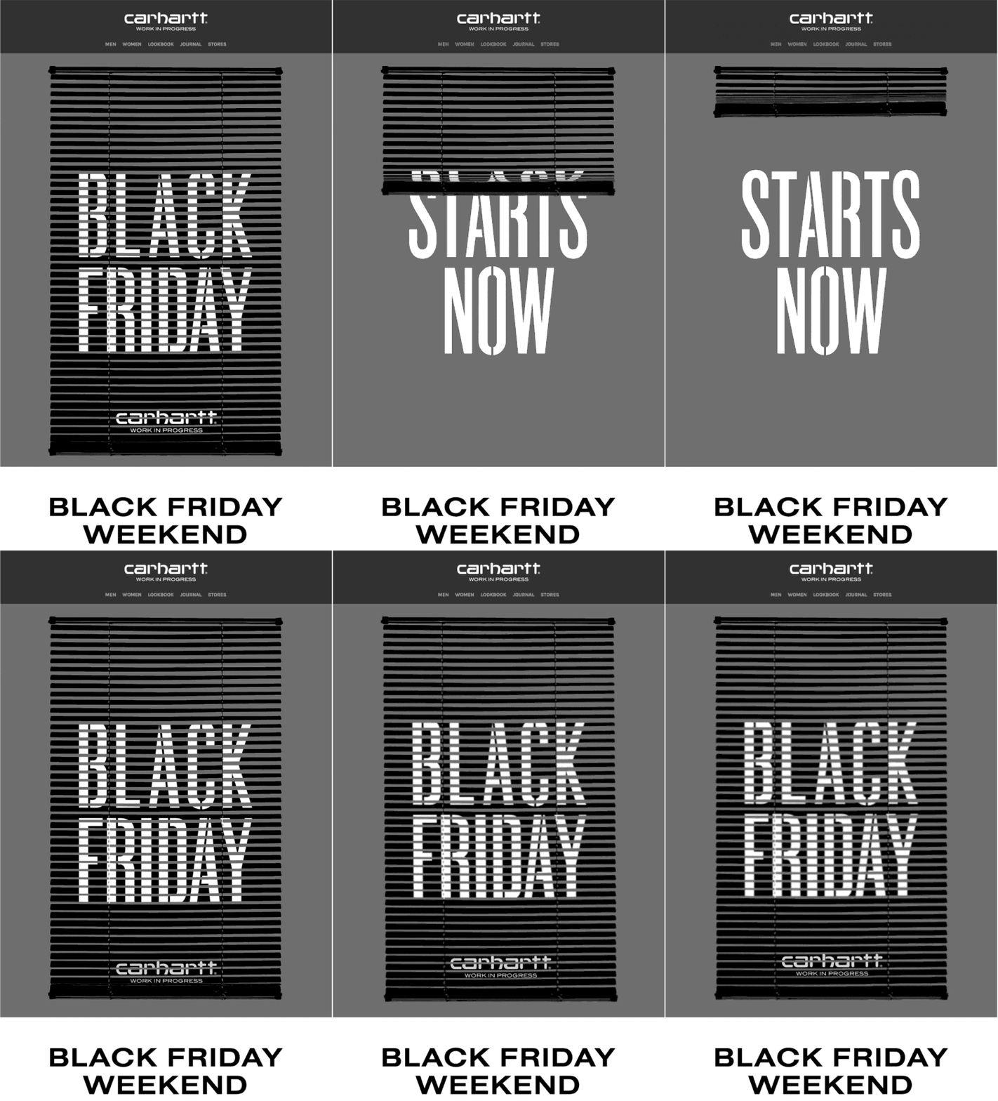
So just follow the visual trends. Add GIF animations, embed videos, craft AMP blocks and interactive elements, set creative backgrounds… This year, minimalism and dark themes are in trend. Why not make a play with them? Try everything to make emails vivid and attractive. It should result in the recipients’ anticipation.
Get closer to your clients
This is maybe the strongest advice to improve the conversion rate of your marketing strategy. What do we speak about? Firstly, your offers should be not even personalized. It’s time for hyper-personalization today.
Modern technologies and AI-based tools allow not only to segment the contact list by age, gender, geolocation, preferences, and so on as it was before. Various techniques of advanced data processing and customer behavior tracking are available today. It helps to personalize the offers for a certain customer really precisely.
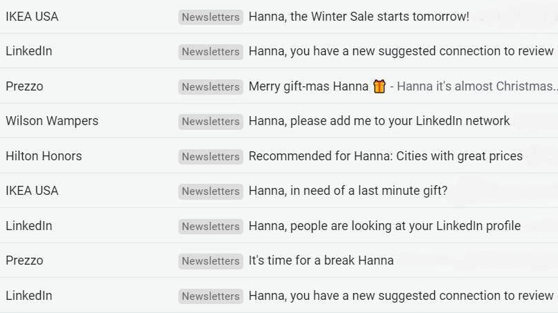
Just a bare fact: personalization by geolocation alone boosts CTOR by 29%.
Look how Grammarly tracks their users’ activities – and then comes with really personal emails based on this data.

Personalized emails not only bring higher profits. In a modern world, it’s really nonsense to send non-personalized emails. Only spammers behave this way.
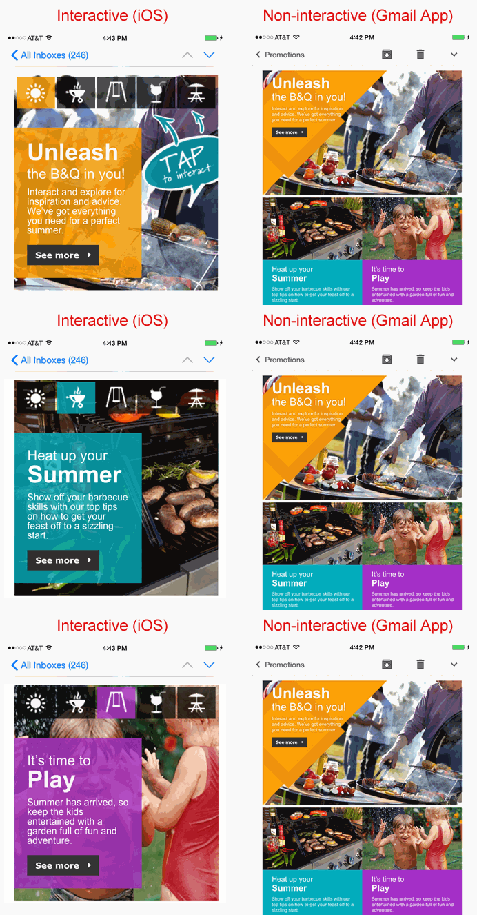
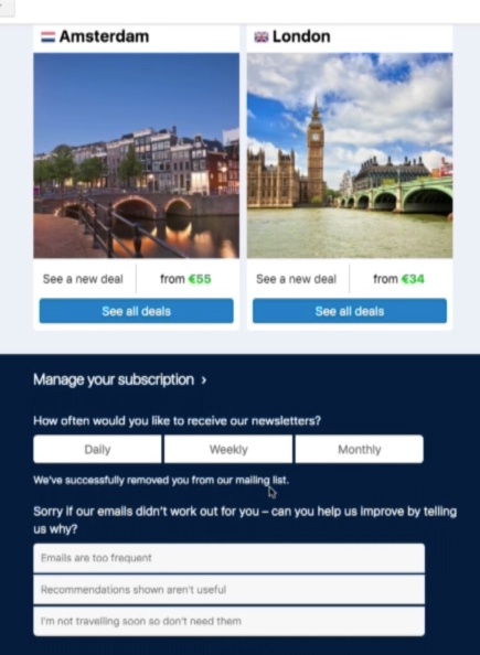
Another recommendation is to get interactive. In the previous paragraph, we have mentioned the AMP elements. It’s a trend of the trends since 2019. And a great opportunity to implement interactivity, gamification, and feedback in the brand’s newsletters.
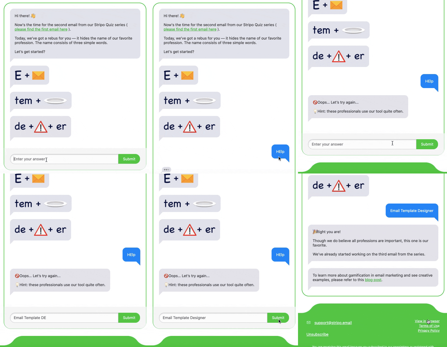
Feedback is essential for businesses. Since AMP4Emails allows to upgrade email itself to the level of “mini-website”, why not embed the feedback blocks powered with AMP forms? It’s catchy as people like to interact. It’s useful as you’ll receive the precious feedback and reviews via this channel. And it will engage your clients with a new hi-tech option. As a result, conversion grows. mission completed 🙂
Test, analyze, then choose
Last but obviously not least is analytics. From analyses, the proper choice of the best marketing solution comes. What imagery performs best? Which subjects turned out to be the strongest stimulators for the open rate? What copy to use on the CTA button: “Buy now” or “Order it now”?
It’s impossible to find universal answers. They are simply don’t exist. We should just test different solutions, and then measure the performance via A/B and multivariate tests. Fortunately, AI tools are to the rescue today, they offer advanced ways of analytics.
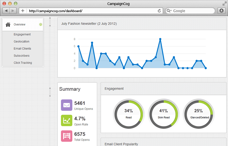
So we have to analyze the results. And find what works best. For this purpose, track the performance on a constant base. Look not only at the email campaign open rate or CTR separately – we have to see the complex picture to figure out the right solutions.
Remember: there is no universal conversion rate standard at all. Because standards are different for each specific sphere and industry.
Final words
So what should we do to boost the conversion rate? Let’s recap what we said above:
- follow the rules of brand consistency. Your style and brand voice should be always recognizable among thousands.
- helpful content and advertisement – both are important. Find the best balance of these components.
- let your text sound strong and compelling. Zero tolerance to mistakes and errors!
- text/images ratio is not a dogma. Find the best ratio according to your style and needs.
- pay attention to visuals and check the hottest design trends.
- get closer to your people: personalize, communicate, interact.
- never underestimate the analytics, it’s a way to grow!
And one more bonus tip. Didn’t you forget that percentage of emails opened on mobile devices is growing so much that it already overpassed the share of desktop devices? We’re sure you know this. And you’re probably reading inbox emails on smartphones too 🙂
What does it mean? Each email must be 100% responsive. Never forget this essential truth! Adjust your messages to mobiles, set the bigger legible fonts, full-width CTAs, set the text styles for headers… Then test the displaying via Litmus or Email on Acid. Your mission is to make every message look perfect in any environment!

…A newsletter that brings conversion is relevant, clear, valuable, and engaging. It makes the life of our subscribers comfortable and bright.
Keep this truth in mind to improve the conversion rate of your email marketing. And you will surely win!

