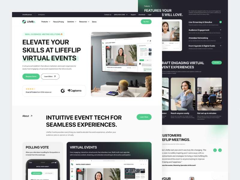
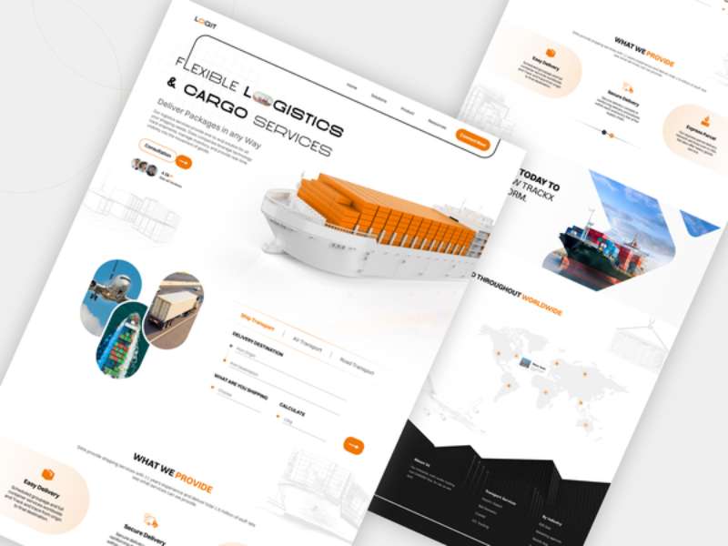
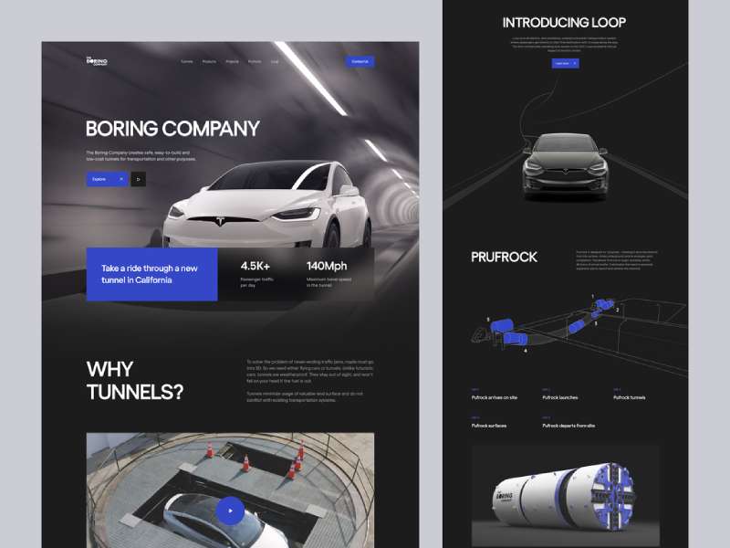
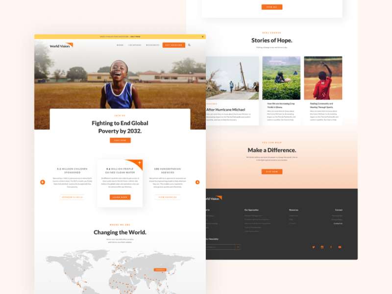
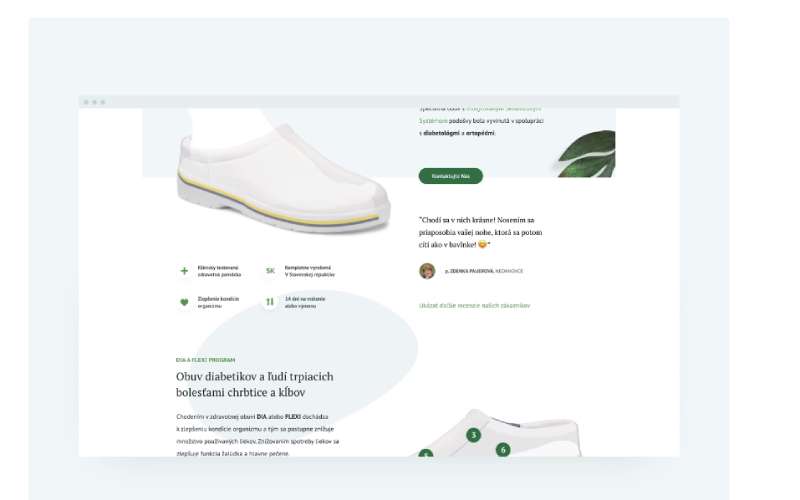
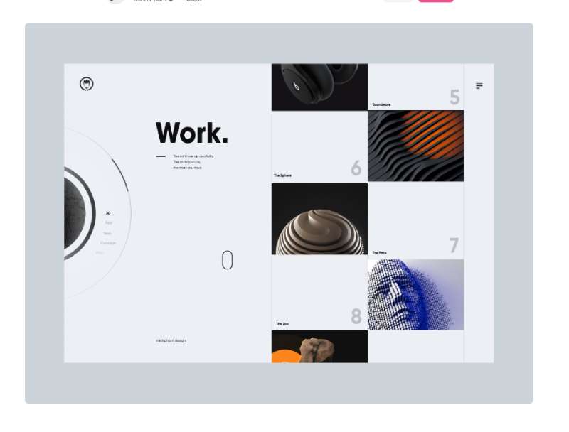
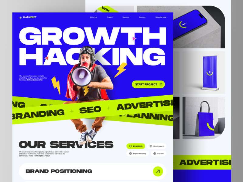
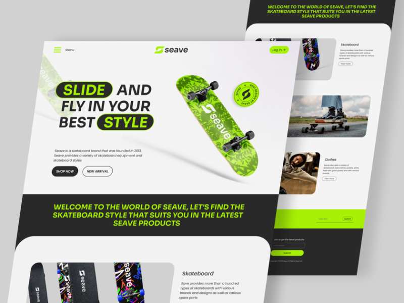
Picture this: You’re cozied up in your favorite spot, phone in hand, and you’re browsing through a digital story. You’re scrolling, not clicking.
The text flows seamlessly, images blend together like a beautiful tapestry, and interactive elements pop up now and then, engaging you even further. That’s the magic of a long scroll website. It’s like an endless path of information, but the journey is so intriguing that you can’t help but keep going.
A long scroll website can’t just be long. It has to be engaging. It has to be captivating. Think about it like a book – if the first few pages don’t grab your attention, it’s unlikely you’ll read the rest.
The same applies here. Users need to be pulled into the experience right from the start, and the interest needs to be maintained throughout. This is the real challenge of creating a captivating long scroll website. But don’t worry, we’ll get into the nitty-gritty of how to do that.
Understanding Long Scroll Websites
Definition and Purpose of Long Scroll Websites
Imagine you’re telling a story. You wouldn’t want to constantly interrupt the narrative flow with “To continue, click here” or “Go to next page for more,” would you?
That’s what a long-scroll website helps to avoid. It provides a seamless, unbroken user experience, taking visitors through a visual and textual journey without constant interruptions.
The purpose?
To keep users engaged, to tell a story, to provide a lot of information in a digestible format, and to make browsing feel more natural, like scrolling through a social media feed.
Benefits and Advantages of Long Scroll Design
Long scroll websites have a lot to offer. For one, they work great on mobile devices. We’re all used to scrolling on our phones, aren’t we? With a long scroll design, there’s no need to pinch, zoom, or squint at tiny navigation menus. Just scroll and go.
They’re also incredibly versatile. Whether you’re telling a brand story, presenting a portfolio, or even selling products, a long scroll website can be a creative, visually appealing way to present information.
Plus, these sites tend to be more engaging. With the right design elements (which we’ll talk about soon), a long scroll website can create a captivating, immersive user experience that keeps visitors hooked.
So, you see, long scroll websites are much more than just trendy. They’ve got substantial benefits, but their success largely depends on their execution, on how well they’re designed, and on how effectively they manage to engage users. But more on that in the next section.
Elements of Engaging Long Scroll Websites
So, how do you keep a long scroll website engaging? What elements do you need to use, and how do you use them effectively? Let’s dive right in.
Compelling Visual Storytelling
Using Captivating Imagery and Videos
Look, a picture is worth a thousand words, and a video? Well, that’s an entire story by itself. When it comes to a long scroll website, you’ve got a unique chance to leverage visuals to tell your story.
Try integrating high-quality images and interesting videos into the design. And I’m not talking about plain old stock photos either. Choose images that connect with the user, that evoke an emotion or create a connection. You could use powerful background images, intriguing iconography, or interactive infographics. The goal? To captivate your audience. To make them want to keep scrolling.
Incorporating Parallax Scrolling Effects
Oh, parallax. It’s like the secret sauce of long scroll websites. For those who are new to this term, parallax scrolling is a technique where background images move slower than foreground images, creating a 3D effect as you scroll. Sounds cool, right?
It’s more than cool, it’s captivating. It creates depth, it creates intrigue. And it’s a surefire way to make your long scroll website stand out. But remember, with great power comes great responsibility. Don’t overdo it. Keep it subtle. Keep it classy.
Smooth Navigation and User Experience
Implementing Intuitive Scrolling Mechanisms
Ever been on a website where you just didn’t know how to navigate? Frustrating, isn’t it? On a long scroll website, the last thing you want is for users to get lost in the scroll.
That’s why it’s crucial to implement intuitive scrolling mechanisms. Think about progress indicators, sticky menus, or even “back to top” buttons. These small elements can go a long way in enhancing the user experience on your long scroll website.
Optimizing Mobile Responsiveness
Let’s face it, we live in a mobile-first world. If your long scroll website doesn’t work well on a smartphone, you’re going to lose a good chunk of your audience.
Make sure your website is responsive. It should look just as good, and work just as smoothly, on a small screen as it does on a large one. Keep the mobile experience in mind throughout the design process, not as an afterthought.
Chunked Content Organization
Breaking Content Into Visually Distinct Sections
The thing with long scroll websites is, they can get overwhelming. That’s why you need to break down your content into visually distinct sections. Each part of your website should feel like a new chapter in a book, giving users a brief respite and a sense of progress as they scroll.
Utilizing Clear and Concise Headings
Clear, concise headings are like signposts on a highway. They tell users what’s coming up, what they can expect. Plus, they help break the monotony of endless scrolling by signaling a new topic or idea.
Don’t shy away from making your headings bold and prominent. Remember, they’re not just functional, they’re also a part of the overall design.
Interactive and Engaging Features
Incorporating Interactive Animations and Micro-Interactions
Animations can bring your long scroll website to life. They can draw attention, evoke emotion, and provide feedback. Micro-interactions, like a button that changes color when clicked or an icon that animates on hover, can create a delightful user experience and make your website feel truly interactive.
Design Techniques for Non-Boring Long Scroll Websites
Okay, let’s dive into the really juicy part! There’s a big difference between a long scroll website and an engaging long scroll website. We’ll explore some cool design techniques that will not only hold your user’s attention but also turn the scrolling experience into something they’ll absolutely love.
Engaging Typography and Font Choices
First things first, typography. You’ve heard it, and I’ll repeat it – typography is key! It’s not just about readability but also setting the right mood and tone for your audience.
Selecting appropriate fonts for readability and aesthetics
Imagine you walk into a super hipster coffee shop, the kind with exposed brick and minimalist art on the walls. Now picture the menu written in Comic Sans. Doesn’t quite fit the vibe, right? Fonts tell a story, they set the atmosphere.
So, for your long scroll website, choose a font that matches the mood and tone. A cool and professional sans-serif for tech startups, maybe a quirky handwritten font for a craft blog, or a clean and minimalistic font for a design portfolio.
Utilizing creative typography treatments for emphasis
Now let’s play with our text. Sprinkling some creative typography treatments can create emphasis and draw attention to key parts of your content.
Imagine a huge, bold statement welcoming users to your site, or a whisper-thin line of text running along the bottom of the page. Or even cooler, having words grow larger as the user scrolls down, creating a sense of depth and dynamism. The possibilities are endless, and the only limit is your creativity!
Color and Visual Hierarchy
Next up, color! Who doesn’t love a good color scheme? But it’s not just about looking pretty; colors also play a vital role in creating a visual hierarchy and guiding your users through your long scroll website.
Establishing a visually pleasing color scheme
Choose a color scheme that not only complements your brand’s style but also enhances the user experience. It could be a calming monochrome scheme for a wellness blog, a vibrant, contrasting palette for a creative agency’s portfolio, or even a bold and dramatic black theme for a modern, sophisticated look.
Creating a clear visual hierarchy with color cues
Visual hierarchy is crucial for an effective long scroll website. It’s all about guiding the user’s eyes through your content in a purposeful way. And colors can help you do just that! Use lighter colors for background and darker shades for text to create contrast and improve readability. Highlight key information or call-to-action buttons with vibrant, eye-catching colors.
Scroll-triggered Animations
Oh, animations, the spice of web design! Used right, they can make your long scroll website a joy to navigate.
Using animations to reveal content as the user scrolls
What if, as you scroll down the page, images gently fade in, text boxes slide in from the sides, or graphs animate to life? It’s like every scroll is a little surprise, and it makes your users want to keep scrolling just to see what’s next.
Employing subtle and purposeful animations for engagement
But remember, with great power comes great responsibility. Animations should add to your site’s functionality, not distract from it. Keep it subtle and purposeful. A little bounciness here, a gentle fade there, maybe a playful tilt on hover. It’s all about balance!
Engrossing Content Presentation
The content is the heart of your long scroll website. Let’s talk about how we can make it truly engrossing.
Incorporating multimedia elements like videos or interactive infographics
Who said content is just text and images? Use a mix of multimedia elements like videos, interactive infographics, or even audio snippets to create an immersive, engaging experience.
Employing storytelling techniques to maintain interest
Storytelling isn’t just for books and movies. It can make your long scroll website captivating too. Craft a narrative with your content – introduce a problem, present your solution, share testimonials, and lead the users to a call-to-action. It’s like a journey that users embark on as they scroll through your site.
Tips for Optimizing Performance and Loading Speed
Alright, let’s get down to the nitty-gritty stuff. Sure, our long scroll website looks amazing now, but what good is it if it takes forever to load? Let’s talk about some essential tips to keep our site both beautiful and snappy.
Image and Media Optimization
We love our high-resolution images, our crisp videos, and those fun animations, don’t we? But these media elements can really weigh down our long scroll website if we’re not careful. Let’s find the right balance.
Compressing images for faster loading times
The trick here is to find that sweet spot where your images still look great but are light enough to load quickly. Tools like TinyPNG or JPEGmini can help you compress your images without sacrificing too much quality. And always, always choose the right file format. If you don’t need that transparent background, go for JPEG over PNG.
Utilizing lazy loading techniques for media files
Lazy loading is like the hero we didn’t know we needed. Instead of loading all your images and videos at once (which can slow down your site), lazy loading only loads the media that’s currently in the viewport and waits to load the rest until the user scrolls down. This way, your initial page load time is much faster, and your users won’t be left waiting.
Code Optimization and Minification
Our beautiful long scroll website runs on code, lots of it. But the longer our code, the slower our site. So let’s trim it down.
Minimizing CSS and JavaScript files
Every line of code, every extra space, every comment in your CSS and JavaScript files adds to your site’s load time. Tools like CSSNano or UglifyJS can help you minify these files, stripping out all the unnecessary parts and shrinking your files down to their most efficient form.
Implementing caching mechanisms for improved performance
Caching is like giving your long scroll website a short-term memory. When a user visits your site, the browser can store some data in a cache so that the next time the user visits, the browser can load the page much faster.
There are various ways to implement caching, depending on your website’s needs and your server’s capabilities, so do some research and see what works best for you.
Testing and Optimization Tools
Guess what? There are tools to help us ensure our long scroll website is running smoothly and efficiently. Isn’t that fantastic?
Tools for analyzing website performance and identifying bottlenecks
Performance analysis tools like Google’s PageSpeed Insights or WebPageTest can help you understand how your long scroll website is performing and where you can improve. They can point out things like slow server response times, render-blocking JavaScript, or large images that are slowing down your site.
Techniques for optimizing server response times
Your server response time, also known as Time To First Byte (TTFB), is the time it takes for your server to start sending data in response to a request.
You can optimize your TTFB by reducing the amount of dynamic content, utilizing a Content Delivery Network (CDN), or upgrading your server hardware or hosting plan.
Conclusion: Creating Engaging Long Scroll Websites
So, we started with the visuals. Remember how we used captivating images and parallax scrolling effects to create a sense of depth and movement? And then we focused on making the user experience smooth and intuitive with easy navigation and mobile optimization.
We also paid attention to the content organization, breaking it into visually distinct sections with clear and concise headings. And who can forget the fun part? We sprinkled our long scroll website with interactive features, making it more than just a page to scroll through, but an experience to enjoy.
Then we dived into the design details. We played with typography, colors, and animations, carefully selecting and crafting each element to not only look great but also guide the user through our content.
And last but not least, we made sure our long scroll website runs like a dream. We optimized our images and media, we minified our code, and we tested and tweaked until we achieved peak performance.
And just like that, what could have been a potentially endless and boring scroll turned into an engaging journey. That’s the magic of a well-crafted long scroll website!

