You are probably already familiar with the concept of call to action, but if somehow you are new to web design, call to action refers to elements in a page that request an action from its visitors.
If you are indeed new to web design, there are high chances that you will neglect this important part of a website, but the real problem is that experienced designers do it as well.
A lot of web designers struggle to understand their true function, beyond looking attractive. Yet, call to action buttons are too valuable to be placed carelessly on a website, without any real regard for their purpose.
It is essential for designers and developers to have a good understanding of the various ways in which color, size, text, and other features can affect the value of a call to action button.
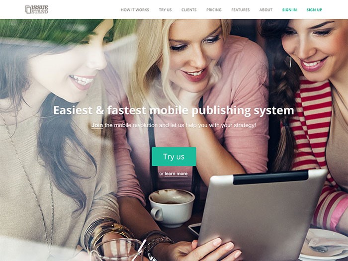
The techniques employed to create better call to action buttons are not overly intricate, but they do need a reasonable amount of planning and care if they are going to successfully encourage visitors to exhibit desired behaviors.
For call to action buttons that perform successfully, it is first necessary to work out how they should gel with the rest of the website design. This is referred to as ‘establishing the ground architecture’ and it will help you to further understand how call to action buttons work within the web interface.
The primary goal of all business websites is to turn a profit. As better call to action buttons actively contribute to the achievement of this objective, it makes sense to spend a reasonable amount of time thinking about their design, even if they do only take up a tiny amount of space. In many ways, they are the true stars of a web page.
How to make them better
Use size and color properly
It is a good idea to think carefully about the size of your call to action buttons. A button that is too big is likely to distract visitors in a negative way, but a button that is too small will get lost in all of the other features which are competing for attention.
The best call to action buttons are big enough to draw in the eye but dainty enough to gel with the overall design.
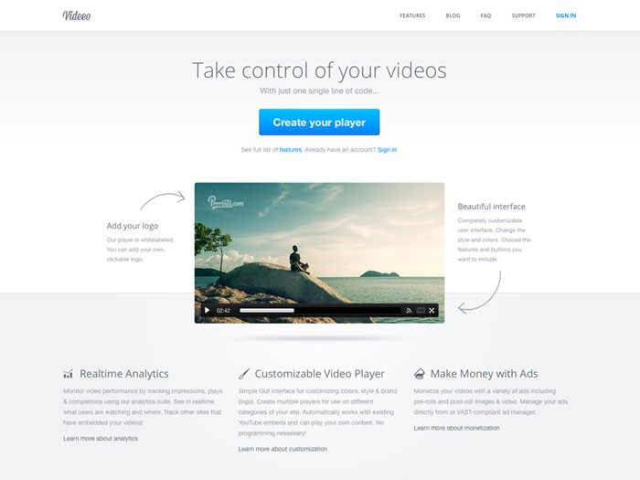
In fact, color is a great way to further balance out the scale of the call to action buttons. For bigger buttons, opt for a shade that is used infrequently within the overall website design.
It should still be a color that is bright enough to stand out. The opposite is true for shades that are used frequently; in this case, a bold tone will really make the button stand out.
So, if you’re using a WordPress plugin to insert the buttons on the page, make sure not to use the default ones. Customize them to your design and for your users. Use a legible font, and make sure not to use one that you fancy from other sites. This means that you should say no to using the font that Instagram uses just because you like it. Your audience might not.
Use directional cues
It is common for businesses to surround call to action buttons with images associated with clicking or looking at them. This is to further encourage visitors to want to go where they promise to lead.
If you use the right images, this kind of technique can be very effective – why not try a series of arrows or even a picture of a person looking directly at the button?
For human beings, directional prompts can be very powerful. You only have to think about what happens when we spot an individual looking intensely in a specific direction – in most cases, everybody else would look there too, in order to find out what was causing such interest. This is why directional cuing can be a successful technique.
Use a good copy
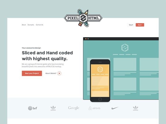
The copy featured in your call to action buttons needs to be simple and easy to understand. A good call to action button is one that tells a visitor what it offers in a fraction of a second. This means that they do not have to pause to find out, and are much more likely to follow it.
It is perfectly okay, necessary in fact, to use direct language within call to action buttons. For example, words like Click Here, Call, Visit, Buy, Register, and Subscribe are common and effective. Look at German startups and how they are doing things. They’re known for being direct. Their call to action buttons have a simple and efficient copy.
However, if you want to have a unique website not just in terms of design, but also copy, you can use more creative copy variations.
It is just as important to think about the size of your copy. It should be significantly bigger than the rest of the text on your website so that it stands out. It should also be boldly colored, and contrast enough so that it is easy to read quickly.
Tell visitors what they get after clicking

If necessary, you can use a call to action button to tell visitors what to expect. However, this is most effective when it comes to the use of ‘trial’ and ‘download’ functions. The information provided usually pertains to the size of a download, or the length of a free trial.
For call to action buttons that feature extra data, it is still vital that their key goal is prioritized above all else.
In other words, do not forget the action which you are trying to promote. This can be achieved by making sure that the ‘action’ words are more prominent than everything else.
The button’s placement
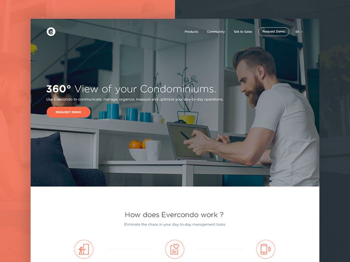
For most webpages, the best place to position a call to action button is just above the fold. In fact, if a button can only be reached with scrolling, many visitors will simply ignore it, or not see it at all. This is what some people say, at least. The truth, however, is that it depends.
You can get around this by placing two of the same call to action buttons on a page, with one at the top and one at the bottom. This way, if they can only be reached via scrolling, you have doubled the chance that the prompt will be effective.
It is equally important to think about proximity to other items. For instance, it can be valuable to position call to action buttons close to reviews, testimonials, about us pages, and anything else which clearly states what your company does, and what it promises to offer visitors.
Use whitespace

It is a mistake to assume that the placement of a call to action button is all that matters. The area surrounding it can be just as vital because the more empty space there is around a call to action button, the more chance there is of the eye being drawn there. If there is too much ‘noise,’ they may get lost.
Create urgency (if applicable)
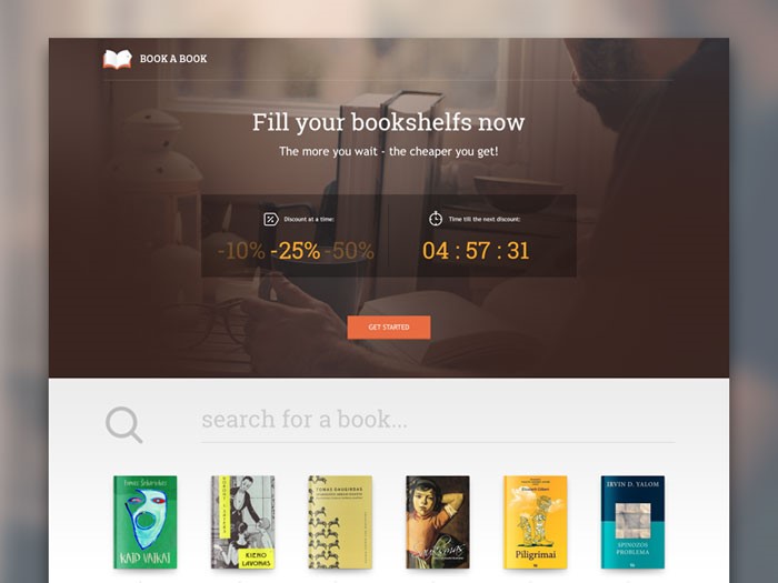
The main aim is to prompt visitors to exhibit the behaviors which you want to see with as little effort as possible.
Whilst deception is not the aim, it is important to make sure that they do not get too many opportunities to pause and think about whether or not to click through. The internet is a place that moves extremely fast, and you have to work fast if you want to secure conversions.
This is why it is important for call to action buttons to convey a sense of urgency. They should make it seem like the only opportunity is right now as if the only chance to take advantage is to follow the directions quickly.
In the case of high-cost purchases, this might not be successful, but for low ticket items, it can lead to a hike in sales. For example, if your site sells tickets to events, you might want to create a sense of urgency to sell them faster.
Ending thoughts
In many different ways, call to action buttons are essential to the success of online businesses. For all website developers, the primary aim is to secure either more attention or increased sales, and this feature is a big part of achieving that.
It could be purchases, registrations, membership enrollment, or anything else which needs participation – whatever the aim, use call to action buttons to make it so. They may take up a tiny amount of space, but these little buttons can have a big impact on business.

