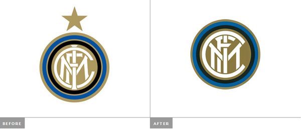
The popular Italian soccer team, the Inter Milan, recently unveiled a redesign of its logo. To be honest, it would be better to talk about a realign of the logo, with a simplification of shapes and a more modern look-and-feel.
However, it is not how the Inter Milan sees its new logo. In a comical press release, they seem to think that their new logo is the best thing that happened to the worlds of soccer and graphic design in the past ten centuries. Judge for yourself:
MILAN – Try and picture the scene. Your wife smiling at you, or your husband hugging you. A friend you can count on, a dinner in a special place. Imagine music, art. Imagine the best goal Inter have ever scored, the game that gave you the biggest thrill. Imagine it. The best ever. Now that those sounds, tastes and colours are dancing in your head, now that you’re thinking about the best thing ever, think of it in terms of the Nerazzurri. In terms of Inter. The team that makes your heart beat faster.
A picture is gradually filling your mind, right? First a few simple lines, then circles come together and finally a star. It is starting to take shape. “It” is our new logo, now part of our team. Our “corporate identity” to use the appropriate jargon. An image which will be used everywhere: in our communications, on the team bus, at the academy. One voice for a special team. A team that will be Milanese and international. Fair and surprising. It will be legendary just as it always has been. Imagine it. Then look at the new logo. You’ll notice they’re much the same.
No, this is not a fake, it’s the Inter Milan’s presse release about the logo. Image via BrandNew.

