
Albeit small, logos play a very important role in businesses. They serve as the face and the brand identification of a company. Logos are symbols used to quickly communicate a brand to an audience, and just one small logo design can communicate so much. The whole point of having a logo is to ensure that when consumers see it, they’re immediately able to associate it with the company or business that it belongs to.
Today, companies have become even more creative with the way that they create their logo designs. Many people choose to use letters and typography as the foundation for their logos. However, this can be tricky – you don’t want your typographic logo to be confused with normal text. If you choose to use text as the basis of your logo, you’ve got to set it apart as an image.
Typography is the art of the letterform, and typographers closely analyze and carefully craft every detail of each character – even the negative space, called the counter. We often ignore and overlook the counter space because that’s not what we normally read. However, the counter can offer some rich forms and creative opportunities that warrant a closer look. Negative space, for instance, is very important as it helps create compositions that are balanced and unified. With negative space, it’s easier for the person viewing the art, image or logo to identify the focal point. This keeps the logo from looking too busy and, ultimately, ineffective.
As an example, check out the logo of Survey Cool. The font or typography of the logo itself is very clear and, true to its name, “cool”. It uses a playful font style that can catch the eye of the younger generation. Then, there’s a “cool” dog, complete with sunglasses and a clipboard with a check mark, which can be visual representations of the words “Survey” and “Cool.” In effect, the logo balances the white space on the background and lets you focus on the image and typography. In doing so, the focal point, which is the logo itself, stays simple, but easily catches attention.
That said, here is also a list of logo designs that are great examples of using negative space in typography:
Here is the list of logo design great examples
This logo design cleverly uses the image of its namesake to form the first two letters. The u is positively outlined as the handle of the umbrella and the m is cleverly outlined in the positive space underneath the umbrella.
Even without the words underneath, you’d know that the company behind this logo does something with electronics. The plugs cleverly outline the E in the negative space.

Again, Wiesinger Music hints to their services through making their typography into an image. The counters of the font act as the black keys on a piano.
The logo for Two Giraffes plays with the counters of the 2 and makes them into giraffes. Their simple logo design communicates their company name.
These three logos all utilize the counters of the letter A by filling them with different images that reflect their services or their name. They’ve all used the letter A creatively in accordance with what each of their respective brand names is trying to convey.
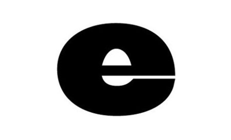
Egg in a Spoon took advantage of the counters that already exist in the small letter and made some minor tweaks to make it look like an egg in a spoon. I would even question if these folks didn’t see the shape in the e first, decided that it looked like an egg in a spoon and named their business after the logo.
Elefont Design is a company that’s focused on providing engaging user-centric designs. This starts with anything from fonts to digital innovation, and even apps. The logo uses negative space effectively by incorporating the trunk of an elephant on the small letter e. It’s actually a witty way to remember their business name by associating it with an elephant.
Effective Sports follows the same example as that of the design above. Here, the company uses white space to incorporate muscles on the small letter e of its logo.
By incorporating a small bit of negative space, Free & Equal is able to communicate both aspects of their company name. It shows “F” for “free” and “E” for “equal”.
AG Low is a construction company. They’ve cleverly formed their typography to look like the walls of a floorplan. The negative forms here act as the open space of the hypothetical blueprint. On the top part of the logo, you can read “AG”, and on the bottom, “Low”.
French Bakery—when you hear the name, you’d immediately know that it’s a bakeshop. Its logo uses creative typography for the letter F. Here, you’ll see how it’s meant to look both like French bread, and the letter F.
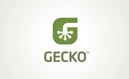
Gecko
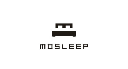
Mosleep
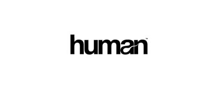
Human
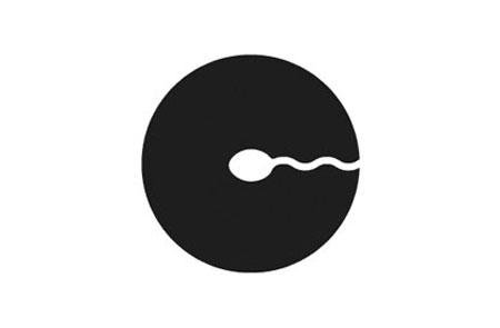
Conception
Hammer
Some logos use the images that represent their names to carve out space in the letters. This both visually and textually communicates the brand. In the examples above, you’ll see how their names are carved out creatively in their typography. For instance:
- The brand Gecko has a gecko in the letter G
- The brand logo of Mosleep is creatively formed to look like a bed, associating it with its main business niche: sleep
- The brands Human and Conception all have the image of a sperm cell traveling through the letters H and C respectively
- The brand “Hammer” has a hammer in the letter “H”, so when looking at it, you can easily note that the business has to do with construction-related matters
- The brand Pelican has the beak and head of a pelican to form the negative space in the letter P

Salmovac, a fish vaccination company, used two fishes swimming around each other to create an S in the negative space.
Guitar necks just happen to fill a white box to make a T for Troubs, a music business.
Xmas. In this logo, you’ll see how a Christmas tree was creatively placed on the negative space of the letter X. That way, this brand can be associated with anything that is Christmas-related.
This font was carefully chosen for its counter space. The knife in the negative space of the a fits right in with the rest of the narrow counters of the rest of the letters.
By placing the two ls closely together, the negative space halfway completes the image of a gift. By adding a little bit more white space, the image is complete.
Gulp noticed that the negative form created by the U looks like the punching bag in the back of our throats and capitalized upon it for a very smart logo design.
Eat Innovations uses images to connect the counters between the e and a. The counters within the e also interact with one another. Notice how the negative space in between the a and t parallel the two letters, making for a pleasing streamline effect.
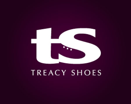
Treacy Shoes hugs the t and s here to form the shape of a shoe in the negative shape that the two letters create. Notice here that the choice of font was integral to create this form. Another font wouldn’t have made as good of a shoe.

Straight Up sandwiches the negative U form between the straight up arrow and the P.
The arrow here just happens to positively form the U and negatively shapes the P.
Etfi cleverly fits all four letters into a rectangle of space. It’s almost too perfect that the counters of the E and T create an F and I.
The i fits in the counters of the f and t.
Notice how the negative space between the E and x create an arrow, subliminally implying that FedEx will get your shipments moving. The font choice here was pivotal to create this shape. Very few other fonts could have fit together to make the arrow. One of the best logo designs for sure.

The negative space of the arrows here conveniently create the H. Again, this font was carefully chosen. Imagine this logo done with a serif font – the result would not be so elegant.
The counters of the d and p are joined together through a red cross, which is fitting for this clinic.
The counters of the D and O are connected through the negative shape of a bone for this brand named Fido.
The counters that run through all three letters here cleverly form a shovel.
This logo and branding is clever on many levels. “Doug” sounds like “dug,” and there is a shovel in the counter space of the u, which is all too appropriate for this landscaping company.

The negative space that runs halfway through all of these letters form the crossbars for more than half of these letters.

It’s not that the Is are missing, but rather they’re being formed in the negative space. This is mainly accomplished through the rest of the letters being squeezed up right next to each other.
Other logos use other letters as the counter space of another letter, as seen here in Peter Ryan’s logo. This is useful if you have several letters in your logo.
Franz Bernard
In order to fit the b and o together, Black Observer had to choose a font that had rounded glyphs.
Anthony Lane
Elena Alexeeva
Edge Board hints at an edge just by shaping the negative forms in the E and B and blending them together. It’s both an optical illusion and an effective logo that communicates two letters.

Warranty Direct’s logo is doing many things at once. The positive red form is both a W and a human figure. The negative space is shaped as a wrench, which points to what sort of services Warranty Direct provides.
Mouse Universe uses its initials to creatively draw the picture of a mouse.
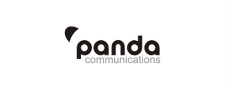
Through carefully chosen font and the addition of that half egg shape at the top, Panda Communications manages to draw out a panda in the simplest way.
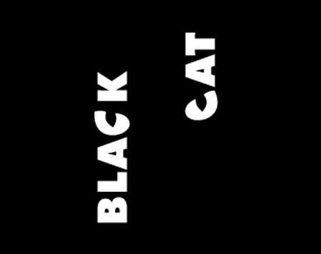
By turning the letters on their sides and positioning them carefully, Black Cat could make the Cs into the watchful eyes of a cat. This is a creative way of using typography to better enhance its brand awareness through its business name.
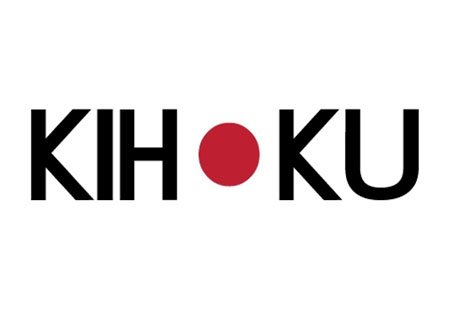
Kihoku is a Japanese brand and the negative space here effectively forms the Japanese flag. This makes for better brand association. Once you look at it, you immediately know that this company is selling products related to Japanese culture.
Recognizing typography as a collection of images, many people turn to letterforms when creating their logos. However, these letters must be differentiated from normal text. One way to go about this is to utilize the negative space of the glyphs. From the examples above, it’s now easy to see how this can be achieved in an effective and creative manner. There are even many ways to go about this particular method. Some have used images in place of the standard counters while others have used other letters. Some use images to create letters in the negative space. Regardless of the method, among other logo design tips, using negative space can make a logo much more effective and clever.

