We all know this piece of popular wisdom: “The devil is in the details”. Designers all know how true it is. Obviously, a poorly designed project will not be saved by thoughtfully designed details, but a well-designed project can be ruined by overlooked details.
This is particularly true for branding projects, that’s the reason why we have to hire a professional brand design agency for important projects. This kind of agency knows the importance of consistency and carefulness in branding design.
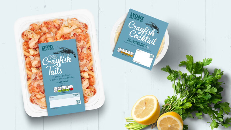
Don’t go wild in your font choice
Ask any graphic designer, he will tell you that typography is crucial to any good printed design. This also goes for digital projects, of course.
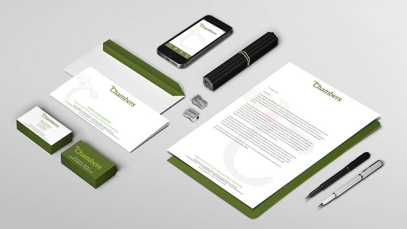
When you choose the typefaces that you will use in your branding project, make sure that you don’t go over two fonts, maximum three. You can make some tests to see how well they match, then stick to it. Having different fonts on packages than on your letterheads or banners is out of
Remember, your clients should be able to recognize your brand at first look, even if your design is in black-and-white.

Stay consistent with colors
The advice given above about font use can also apply to colors. Yes, you can use crazy and bold colors, but you should use it consistently and make sure you stay recognizable.
Clients associate a brand with colors. To be more accurate, they associate a brand with a color AND a color scheme. This means that you should be careful when adding new colors to your branding’s color scheme, as it can have a big impact on the brand.

Stick to your narrative
Your brand tells a story that your clients and prospects should instantly understand by the messages you are sending them. For example, nothing says environment-friendly like craft or recycled paper.
Each choice you are making, whether it’s the way you package your product or the medium chosen communicate, should follow that narrative and assure your clients of your branding.


