Graphic designers love to judge books by their covers. At restaurants and bars, they can’t stop being critical when entering the place or taking the menu in their hands. Most restaurants have poorly designed menus, making the food a little less tasty for our fellow designers. Hopefuly, some designers work hard on helping the other restaurants and bars to get stunning menu designs, like the following ones.
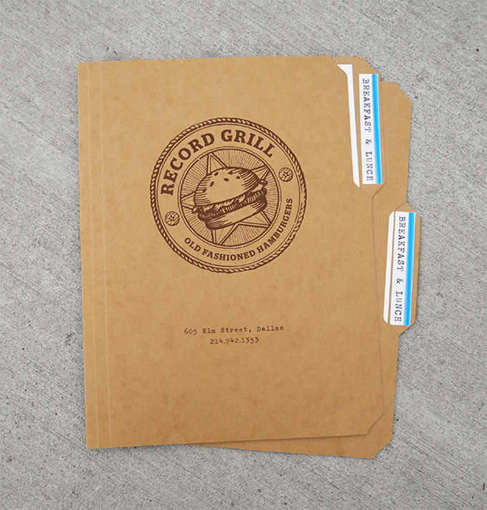
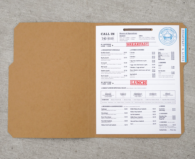
Record Grill
Record Grill is a Dallas-based restaurant who got lucky with its graphic designers. Studio 70kft did the grill place’s identity pro bono. Beside the logo and folder idea being very cool, they also did everything by hand: the screen-printing, the folding work, and assembling all the docs.
Keystones
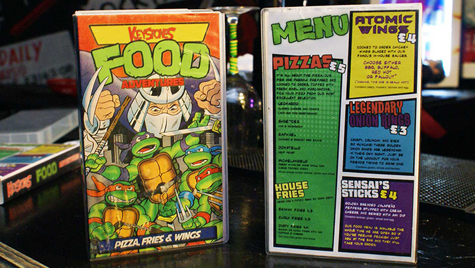
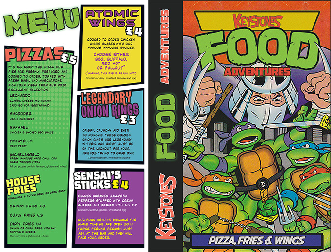
Not the most subtle design all around, but the cocktail club picked a theme and sticked to it pretty well. The food menus are contained in VHS boxes and make some funny comics reference. The comics style is used for everything, from illustrations to titles and even the name of dishes. Great work by Marmalade Soup for Keystones.
The Swan Hotel
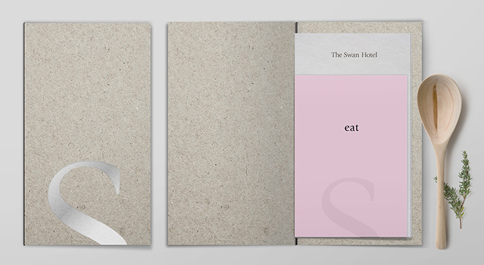
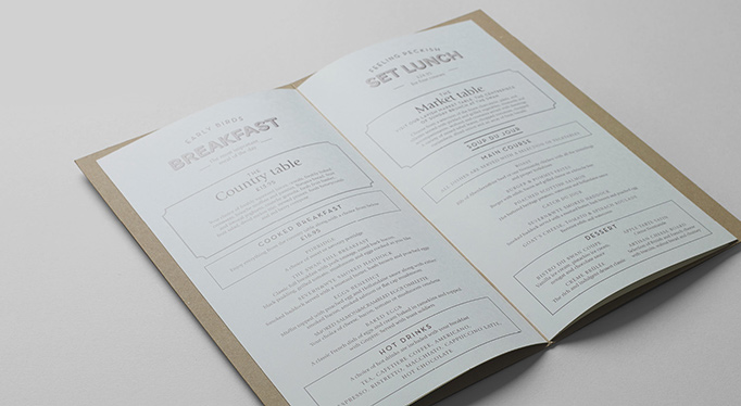
A minimalist identity that works wonderfuly, thanks to great attention to details by Procter&Co. The designers made perfect use of white space, typography, and choice of paper. This hotel from the countryside of England can now be proud of its visuals.
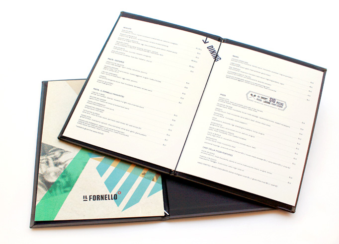
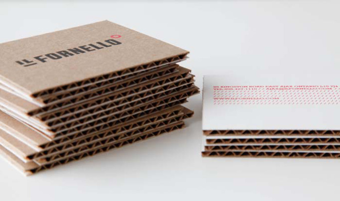
Il Fornello
A good layout inspired by constructivist designs for Il Fornello, a pizza place in Toronto, Canada. The menu itself get a more traditionnal layout for better readability, but the cover and all accessories are gorgeously designed by Biography Design Studio.
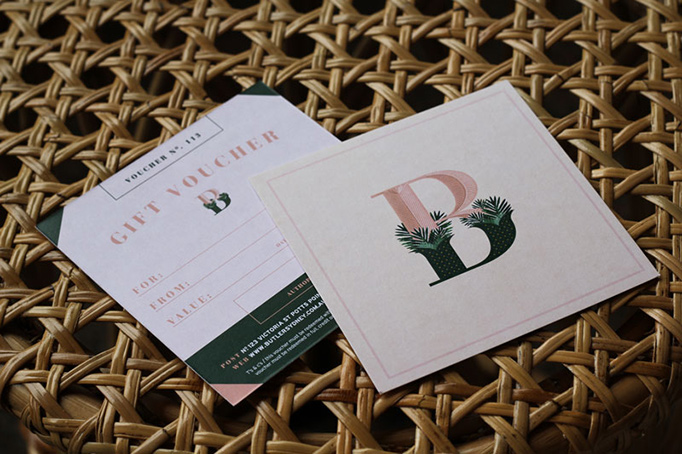
The Butler Potts Point
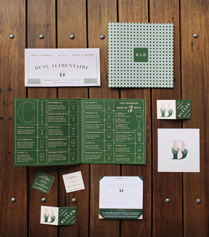
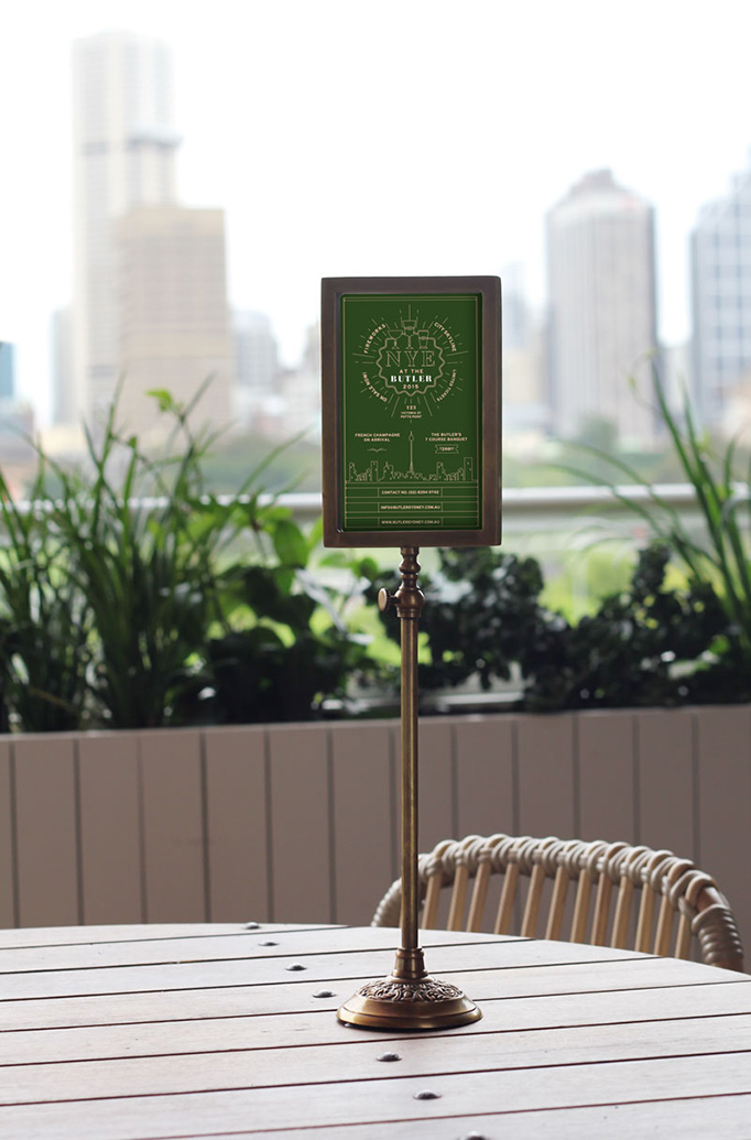
Butler’s Restaurant chose a French graphic designer, Julia Jacque, to design its identity and menu, she didn’t disappoint and brought the French touch in the best possible way. With subtle typographic work and elegant color schemes, she gave a nice classy touch to the restaurant’s design.
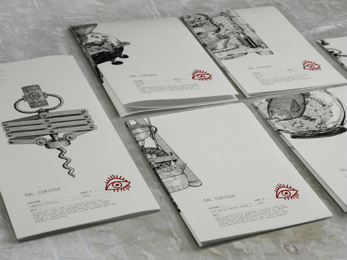
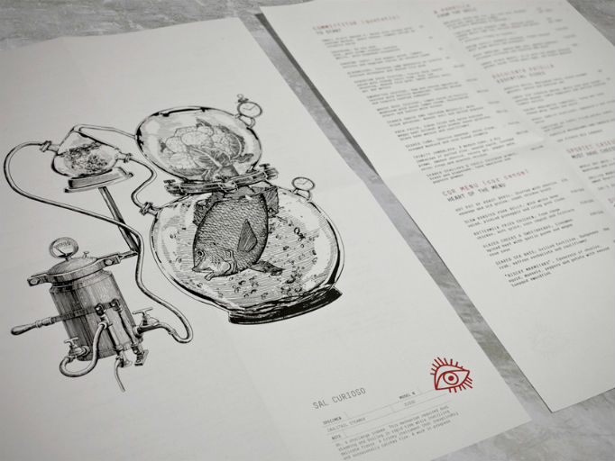
Sal Curioso
These menus with gorgeous illustrations were made for Sal Curioso, a Hong Kong restaurant that is now closed. Nevertheless, this had to be featured for the amazingly good design work by Substance.
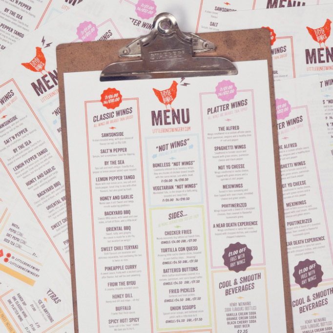
Little Bones Wings
Little Bones Wings got a fairly simple design for its menu, but spot on for its market: wings. The little grungy touches in the type make it look more man-made, and less industrial, differenciating it for large food chains. One Plus One design studio is behind this great project.
Spot
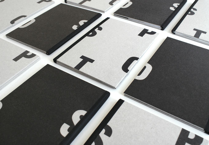
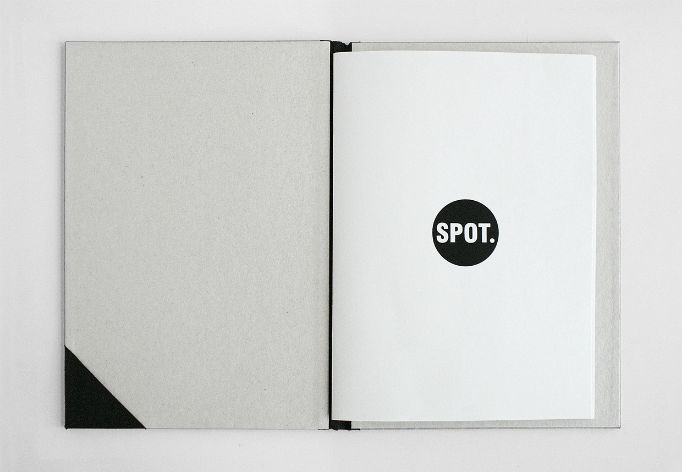
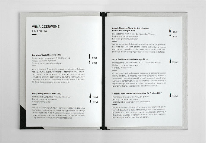
Typography lovers, here is a café you need to go to some day: Spot. The menu design by Zupagrafika is a minimalist layout of type that makes white space central. Some nice laminated cardboard is used for the cover for a more human look-and-feel.
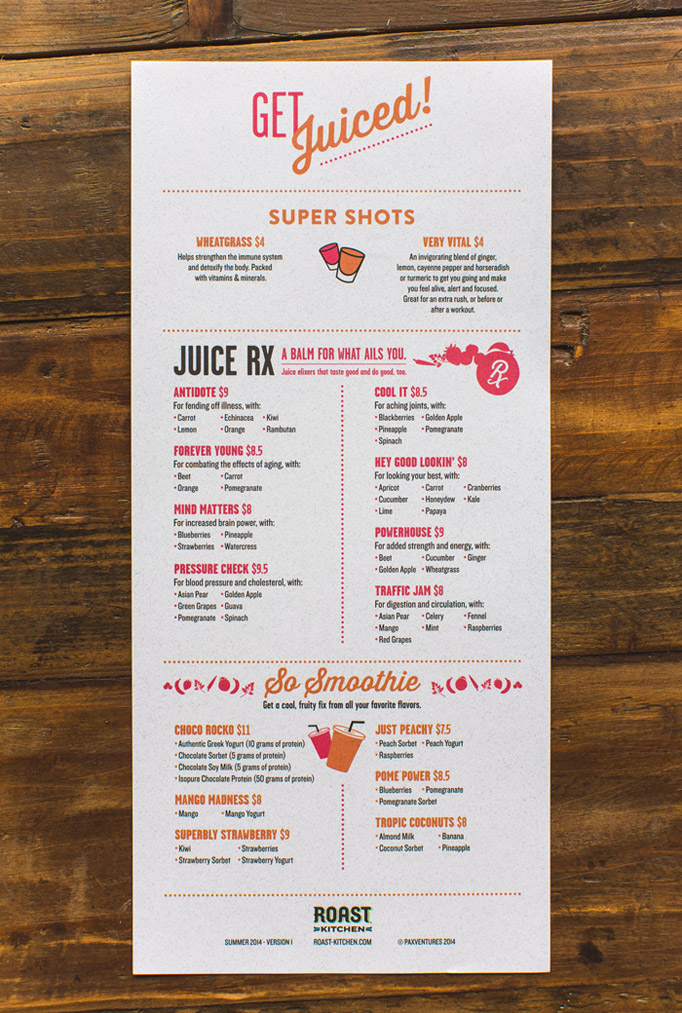
Roast Kitchen
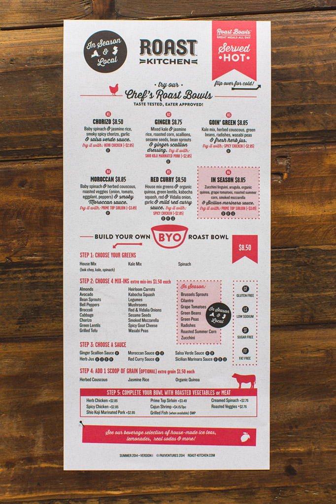
A special, long, vertical format is what strikes you first upon seeing this menu for Roast Kitchen. Well organized, the design intelligently mixes a nice script font with grid usage and overall good typography. Designed by American Design Language.
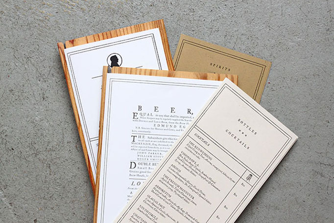
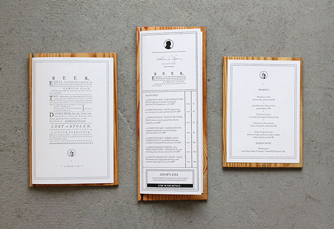
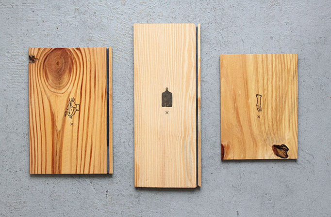
Edmund’s Oast
A old-school typographic menu design that has a very British look-and-feel. I’d like to see a bit more white space in it, but they did stick to the chosen style. The best part might be the wooden boards that give a really handmade, pub-like atmosphere. Designed by Stitch & Design Co for Edmund’s Oast.
NUDO
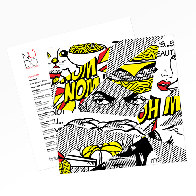
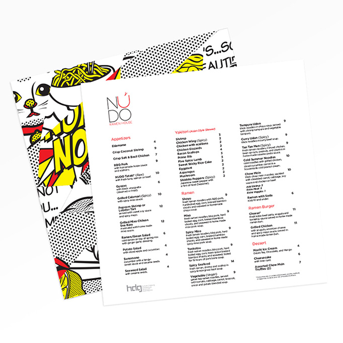
NUDO is a Spokane-based ramen place with a spectacular menu design. The cover has Roy Lichtensteinesque illustration that give a fun, pop-art style you can’t miss. Excellent work by Magner Sanborn.
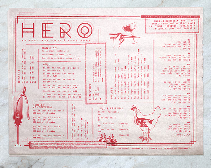
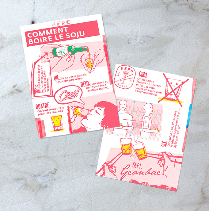
Hero
Hero is a Korean fried chicken restaurant based in Paris. They have a cool menu printed in one-color on low-quality paper. The unconventional layout and illustrations actually give it a friendly look-and-feel. It was designed by Safari Sundays.
