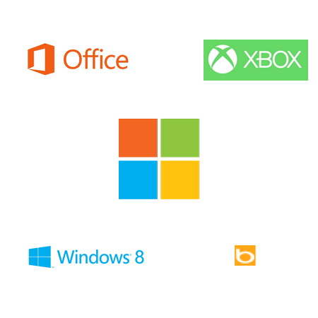
A couple of days ago, continuing its rebranding effort with the Metro design style, Microsoft announced a new logo to be used in its Microsoft store in Boston. The new logo seems familiar, it’s in the same line as the new Windows 8 logo. It looks very simple and plain, four squares on the left, forming a window with four colors, a bit like Microsoft AZ-500 Practice Test Dumps or Microsoft AI-900 Practice Test Dumps. Some people online speculate that each color represents one of Microsoft’s product: Office (dark orange), Windows8 (blue), Xbox (green) and Bing (light orange). While it has not been sourced, it makes sense when you see that those services logos are now monochrome.

It is probably a good thing that Microsoft redesigned its logo, the previous one was getting a bit old since it hasn’t been changed for… 25 years. However, my first reaction was to wonder why they modified the old Windows logo to rebrand Microsoft. If you look at this 1995 video, you would think that they just took some old work they did for Window 95.
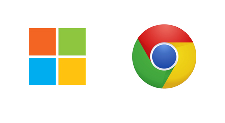
On a more formal side, I’d say that the four colors window symbol is good and works well in terms of global products branding, but the chosen colors might be a bit too… Chromish. The font used for the logo is Segoe, it’s a quite average sans-serif, I’m not so sure about the ligature of the last two letters, it feels like it adds some weight at the end of the logo. Another thing I dislike in this logo is the grey used in the word Microsoft, in my opinion it lacks contrast and makes the logo look quite pale.

Microsoft’s new logo vs Chrome logo, quite similar colors.
Sponsor : Life cycle assessment

