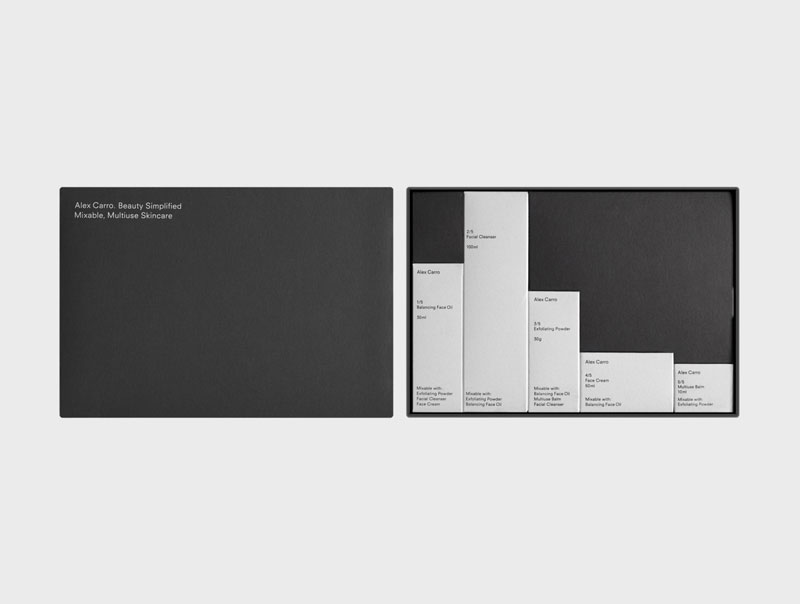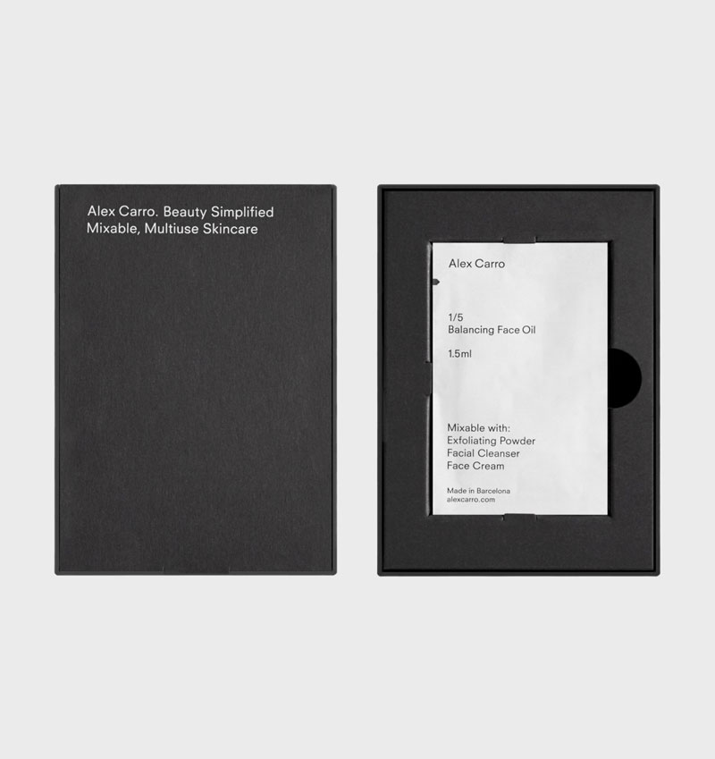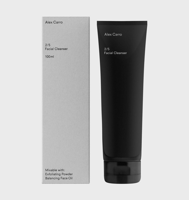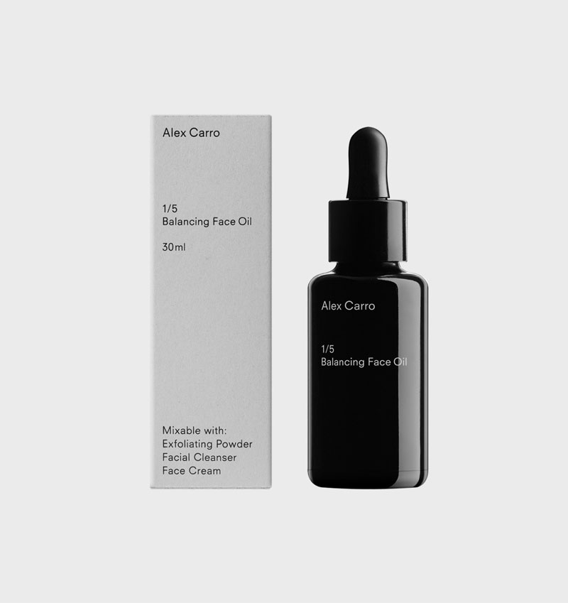
To design their new line of products, Alex Carro, a Barcelona-based skincare brand, hired graphic designer Malva Sawada and art director Andrew Trotter. The duo went for a minimalist design with beautiful use of white space and typography.
My personal favorite is the skincare set that you can see on the first image in this post. It creates a grid-layout type of design that perfectly uses negative space to give a sense of rythm.


