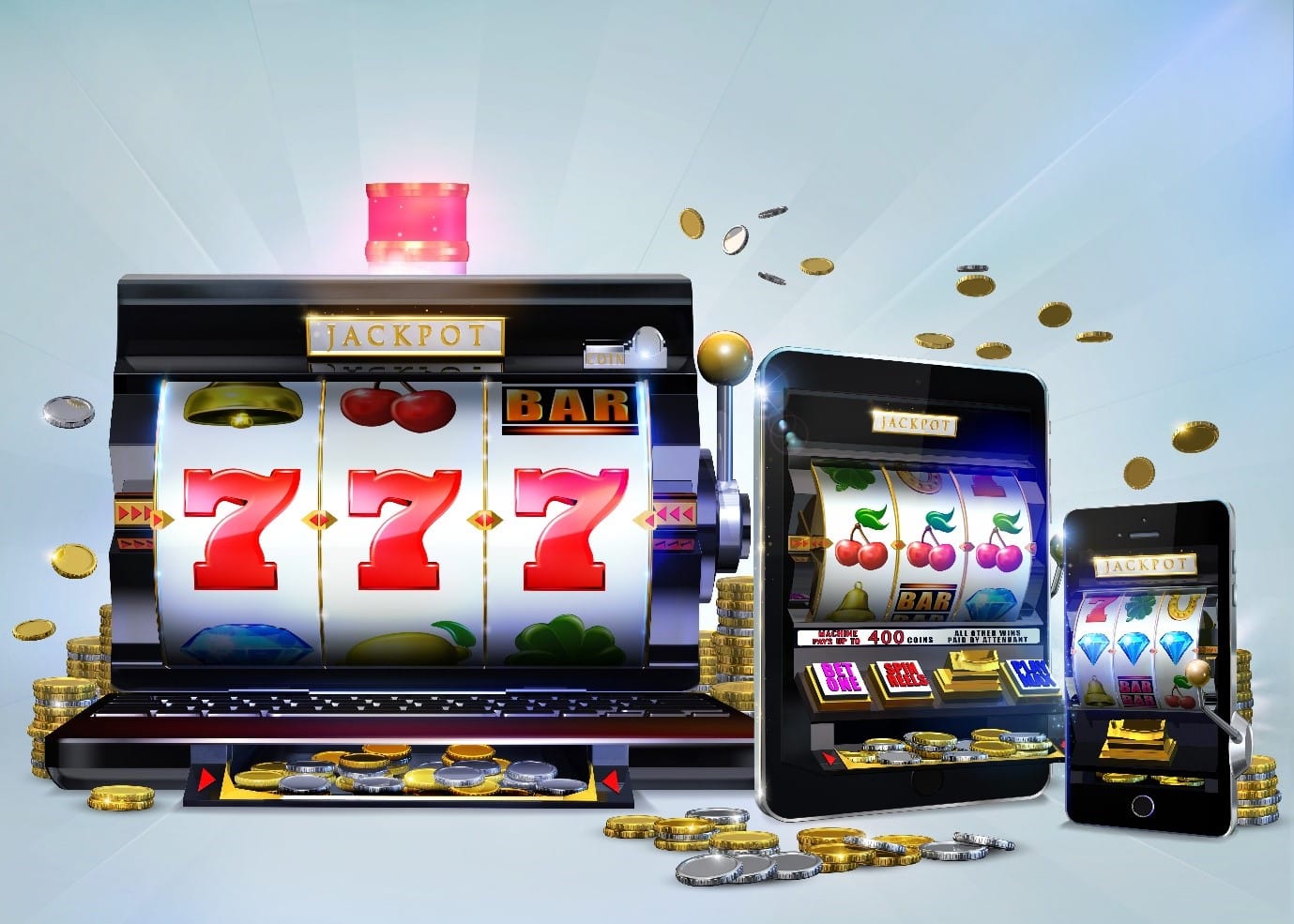
While land-based casinos are striking in their glamour and splendor, online casinos are noticeably different in the way they present information.

Opening an online casino, or even updating an existing one, you need to pay attention to the interface. It is crucial to work out every detail to attract players at the first glance to your home page, and then keep them feeling comfortable and confident.
A good color scheme, easy navigation, and seamless registration can be the deciding factors whether a player will become a regular visitor.
Beauty in the eyes of the player
Lack of visual appeal is the first thing that prevents many platforms of online gambling from succeeding. Unpleasant aesthetics discourage the player even before he gets to the game catalog. You have to give players something to enjoy.
The home page should be attractive and bright. It is best to limit it to a simple palette with a combination of three or four colors and use the same colors on each page.
Brightness is healthy when it’s warm and soft, so it’s best to make sure you don’t cross the line or use acid colors or overly harsh contrasts. The website design should be prominent, but not too intrusive. Bright and flashing colors may attract players to a land-based gaming room, but when they are glowing from a monitor or computer screen, they are likely to provoke a player to leave the site.
Many big, successful brands prefer a calm color scheme, with cool blues and greens that let the yellow and white text stand out. Other casinos feature color gradients, where colors move across the spectrum, such as pink to purple, with light blue buttons – this gives the platform a fun and vibrant atmosphere. Different themes are used to express different emotions, but they all have something in common – they don’t look like abstract art with screaming colors splattered haphazardly across the screen.
You may look at the NZ gambling sites as an example of a good and attractive design.
The text should be easy to read
This is one of the rare cases where visual attraction and navigation go together. This is especially apparent when it concerns the registration and deposit buttons. A large font size and a color that makes it stand out will make the buttons immediately noticeable.
When players are looking for games, they usually look through rows and columns with names and pictures that let them know what the game has in theme. Very often operators use the pictures directly as the developer has compressed them; as a result, the different sizes make the pictures look unclear and unsightly, and the presentation of the game is not successful.
If the same size pictures are used, it will help players find a game that they will enjoy, and the platform will look neat and professional.

Loud noises
Unexpected alarm sirens are probably going to force new visitors to close the web page, without any idea where the noise is coming from. When the player has made up his mind about the game, then it comes down to the audio effects, so it’s better to let them choose what they like rather than being annoyed by harsh unpleasant sounds.
This is another method in which the land-based and online spheres are strikingly different – in the arcade, loud noises or whistles attract attention, but on the website, they are only annoying.
Finding the perfect logo
A good logo is also a key part of a good online casino website. It should convey to players the impression you want to create. By writing your casino name in elegant italics, you’ll show that your site offers an exclusive, elite experience.
Other ideas can be conveyed through the symbols incorporated into the logo, such as a lightning bolt to highlight the excitement and thrill of the games on offer. Casinos represent themselves as fun, exciting, cool, or sophisticated establishments to their clients.
Whichever logo you choose, remember: less is better. The attempt to express a lot of ideas can make it difficult for players to decode your complex message. Work with a professional designer when creating your logo, a good specialist will help you improve the recognizability of your brand and your online casino will be successful.
License
Another thing players pay attention to, especially experienced ones – is the license. Online casinos usually have the logo of the licensing authorities at the bottom of the home page. The player can click on the symbol and go to the jurisdiction’s website or see the license confirmation. The presence of such an icon can have a fantastic effect on the reputation of the site.
Special Offers
Welcome bonuses are awesome, but they won’t motivate players to sign up if they don’t know about them. Special offers, bonuses, and urgent opportunities (such as tournaments) should be in the most prominent place, just like they do on the best $20 deposit bonus NZ. Let it be the first thing a player sees when entering the site.
Promote bonuses and offers prominently. The text should be visible, high, and centered, above everything else. Make sure there is a visible button on the bonus and promotion ads that you can click to take advantage of the opportunity.
Special offers are a great way to attract new players as well as motivate old ones to come back again and again.
Mobile version
The development of mobile devices has had a big impact on Aygaming, just like in any other industry. Players in developed countries are spending more and more time on their mobile devices, and in developing countries, mobile Internet access is growing by leaps and bounds. More and more betting, and in some countries even the majority, are made from mobile devices.

This means that the number of players who can see an online casino site from a mobile screen is increasing.
It’s critical for an online casino to have a design that works from both the monitor and the phone. Of course, the mobile version is done differently – menus are grouped for a higher and narrower screen.
The mobile design is based on the fact that the player is likely to use the site with one hand, so the buttons are placed so that they are easy to reach with the thumb of the palm that holds the phone.
Players are betting from their cell phones more and more, so sites without a mobile versions are dying out. If your online casino is still not adapted for phone screens, don’t wait for the mobile world to pass you by.

