The Nostalgia Generation. That’s a new moniker given to Millennials, and even Generation Y. And not without reason; diagnosed generationally with ‘early-onset nostalgia’, this generation more than any which has preceded it has a powerful sense of nostalgia which is influencing everything from art to services to fashion.
It’s been a well-known fact for marketers that people bring their memories (and the feelings those memories inspire) to the buying process for years. And for years, marketers have capitalized on this nostalgia, linking clever designs to memories. Sometimes called user-centered design, this is used to connect emotions to products and brands, and to influence purchasing decisions. Coca Cola has been doing it, visibly, for decades.

But it’s a tricky subject. Not all people are nostalgic about the same things. And nostalgia is an intangible in the consumer, a complex, memory-based emotion which is difficult to manipulate without absolutely understanding both the cause for the nostalgia and the sentiment it inspires. Despite the casual use of the word ‘nostalgia’ in lay conversation and in design, it’s still actually relatively uncommon for marketers to understand or be able to articulate what it is.
You can see the nostalgia phenomenon in a few seconds on Netflix. A revamped version of Full House rests besides many ’90s cult classic films, all ushered back to the screen by hundreds of thousands of devoted fans who still watch them regularly. ‘Groundhog Day’ enjoys unending seasonality, decades later. It’s not that nostalgia doesn’t hit everyone, eventually; but that for this particular generation, it’s 20 to 30 years earlier than has been seen in previous generations. And to some, it’s no surprise: the relaxed pop-culture of the ’90s was before the threat of global terrorism, high unemployment, and an increasingly shaky global economy.
And what are some great examples of this in design?
Recalling Childhood Icons
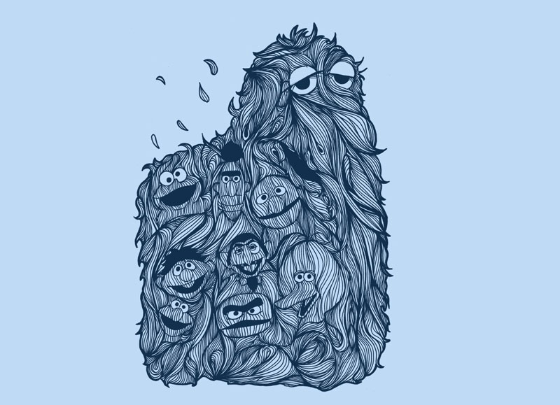
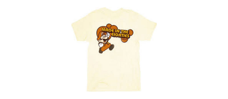
Childhood icons have made an amazing, thorough, and sweeping nostalgic resurgence. From clever internet memes celebrating the Garbage Pail Kids to adult t-shirts featuring childhood cartoons like Sesame Street and He-Man. What were once obscure nerdy culture icons have been revived, and celebrate prime real estate in the spotlight. Vintage Atari and Nintendo icons are “in”, and plenty of childhood figures feature heavily in popular internet memes and cultural references.

The Age of the Comeback
But it’s not just recalling childhood icons: plenty of much-beloved cult classics have enjoyed reboots, comebacks, and sequels. Jurassic Park, Star Wars, Star Trek, they’ve all been revamped and made newer, brighter, and arguably more clever for the nostalgia generation. Classic television shows are being revived left and right, from Trailer Park Boys to Full House. The Odd Couple, X-Files… NBC has even confirmed a reboot of Xena: Warrior Princess. Nostalgic design will no doubt feature heavily in all of this, combining the best of what we loved with the polished aesthetics we’ve grown to expect.
Re-Hashing Classic Themes
Nostalgia has been manipulated in another way, too: re-hashing nostalgic themes and elements. Displaying the old stuff we’re nostalgic about in a new way. Disney’s live-action remakes of all its classic films and its villain feature films are a great example of this. Taking some of the nostalgia generation’s most beloved characters and displaying them in new stories, or from new perspectives.
How Can You Manipulate Nostalgia In Your Designs?
The answer to this question will, of course, vary depending on what you’re trying to design– and for whom, and what feeling you want it to inspire! Creating vintage, retro, or nostalgic looks usually starts with a solid concept: something you want to emulate! It could be the rugged feel of a Levi’s logo, or the neon, poppy look of a buddy-cop action film title. Crowdsource a great color palette related to the type of design you want to remake, and emulate classic lines: usually rounded, less sharp, and less clean.

