Nowadays packages you’ll find in your local supermarkets are commonly filled with information, legal or not. Why not take a look back and see how packages were more minimalist in a not-so-far past?
1. Paper for packaging
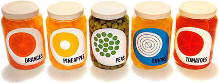
A concept packaging by Champions, a paper company, for some ads promoting packaging paper.
2. El Producto
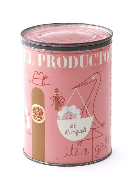
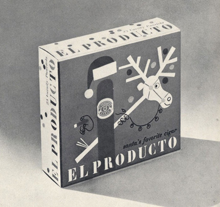
Cigars packaging created by Paul Rand. Via The Dieline.
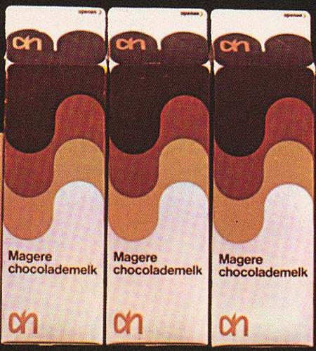
3. Dutch chocolate milk
A chocolate milk package design made by Louis Swart, a packaging Designer in the Netherlands in the 1960s and 70s. Via Grain Edit.
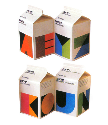
4. Ducats milk
If I ever see this kind of milk packaging in the supermarket I’d buy it right away.
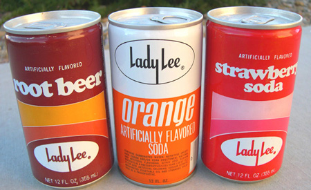
5. Lady Lee drinks
Cool drink packages for Lady Lee drinks. Via Flickr.
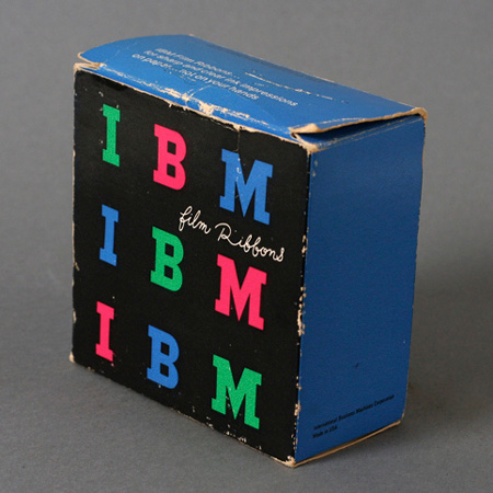
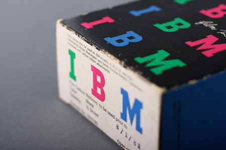
6. IBM film ribbon
Another packaging by Paul Rand, this time for IBM film ribbons.
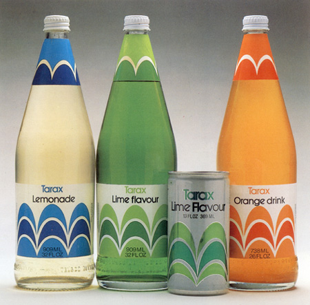
7. Tarax drinks
Some cool drinks labels, I’m not so sure about the name of the brand though. Via Re:collection.
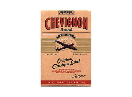
8. Chevignon cigarettes
A gorgeous vintage cigaretts package. I’m not a smoker but I might start if I stumbled upon packages like that.
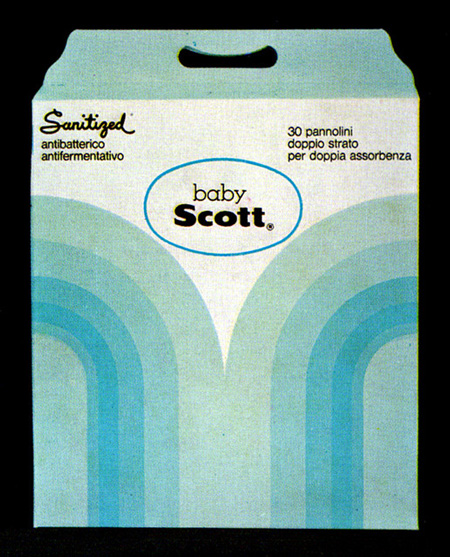
9. Baby Scott
Awesome geometric packaging for baby wet napkins. Via Flickr.
10. Ink packaging
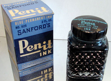
Nice typography used on this ink packaging for Pen it. Via The Dieline.
