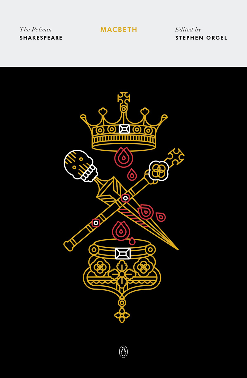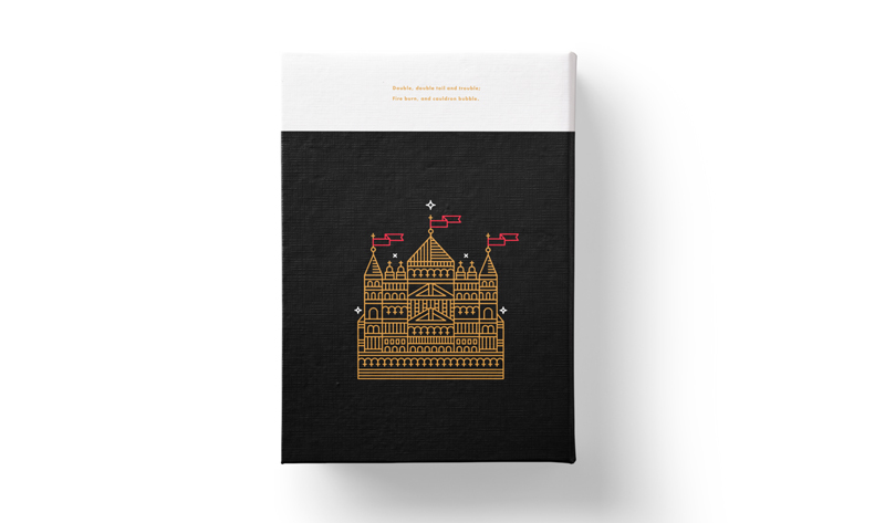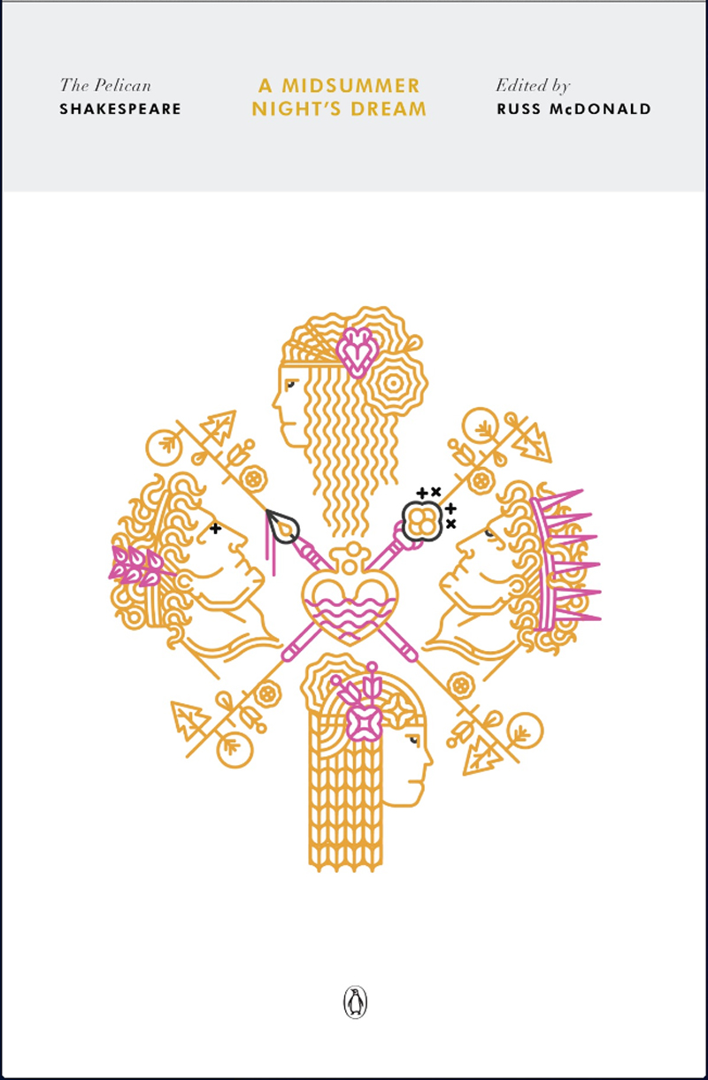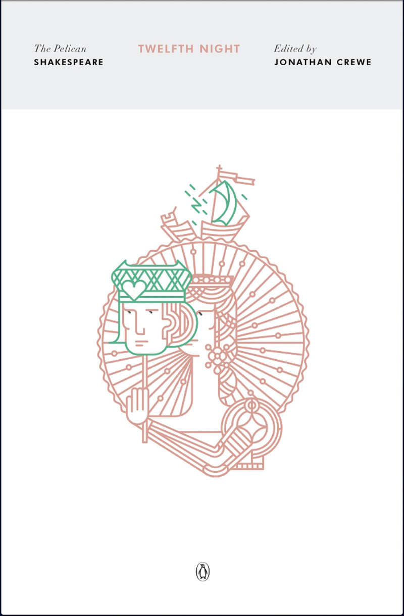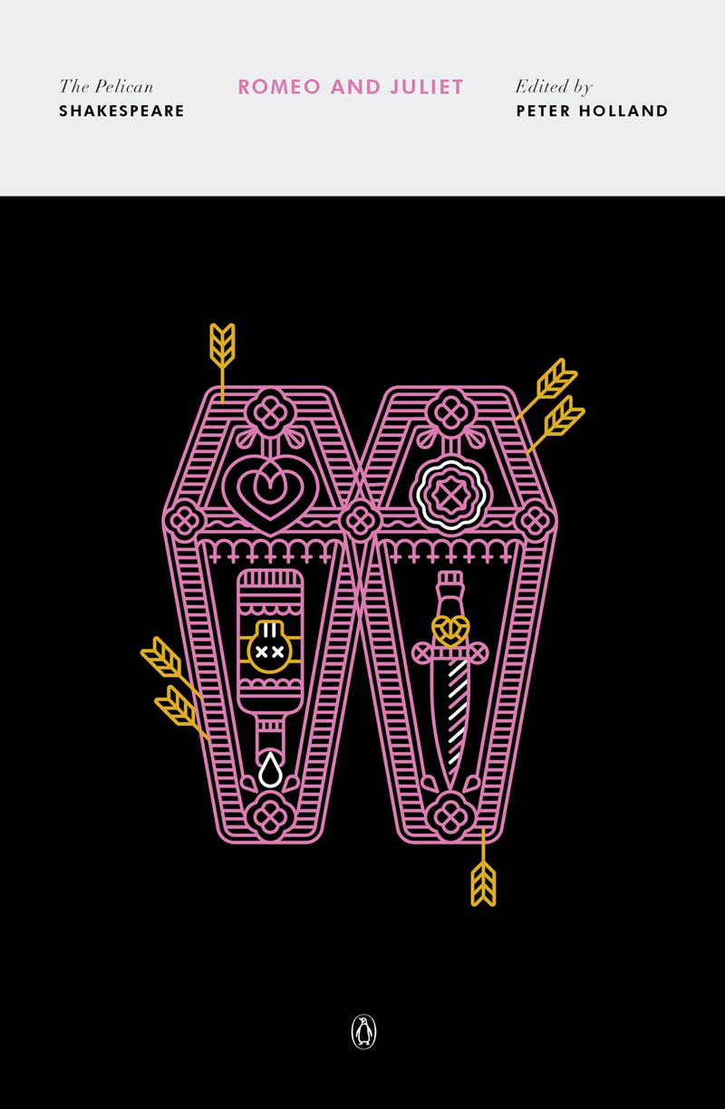
Penguin did it again. The publisher redesigned one of their popular book series that includes Shakespeare’s classics. Layout-wise, the covers feature a simple yet elegant design, with a minimalist approach to the title and other typographic elements.
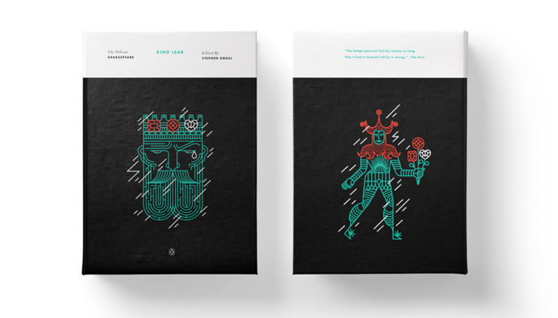
The big change comes from the illustrations, prominently displayed in the bottom part of the cover. Graphic designer and illustrator Manuja Walda was commissionned to create 40 drawings that are used on the covers.
With a line-based style of illustration, the artist mixes and matches elements from each book in the illustrations. Most books presented by the publisher come with an elegant black background and bright colors that pop out on it.
