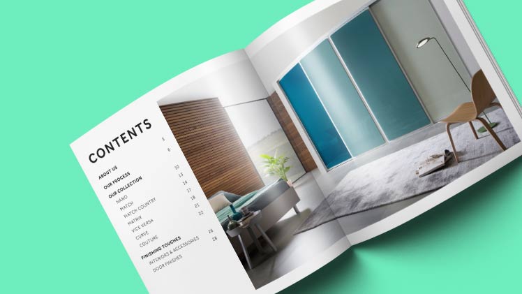
There’s a lot of noise online. Adverts get skipped, and emails get deleted.And with so many businesses clamouring for attention online, it’s all too easy for your message to get lost in a sea of digital promotions.
So what’s the best way to cut out the competition and go straight to your audience?

With a physical promotion you can put right into their hands.
So if you want to give your prospects something lasting and tangible (and something that’s different from your online competitors), a printed brochure is one of the best ways to get results.
Here are the essentials that every brochure needs:
A striking cover
There’s no getting around it – first impressions count. And that means you need to hook your readers from the moment they lay eyes on your brochure.
And how do you do that? With an eye-catching front cover.
As a bare minimum, the front cover of your brochure should include:
- A bold, full-page photo – either of one of your most interesting products, or of your ideal customer in a situation where they need a service like yours
- An irresistible headline – that could be a strong promise of an enticing benefit, or an intriguing question that appeals to your target audience
- A call to action – even a simple subheading (like “Find your perfect summer bargain”) could be the difference between someone opening your brochure or throwing it in the bin.
Source Reliable Printers Online with years of Experience
Search for a quick, professional and cheap printer in London. Digital print shops have years of experience in the business and can easily take care of all your printing needs quickly and efficiently and bring your designs to life. Their experienced in-house designers are eager to assist with custom document and brochure printing near me.
A structured narrative
A good brochure isn’t just a list of products and specifications.
It’s a selling tool. And that means it needs to charm and persuade your audience before it can convince them to buy.
When you’re planning out the text of your brochure, make sure your message:
- Eases them in gently – start with a simple introduction in a friendly tone, and save the in-depth technical stuff until later on
- Shows your readers that you understand them – the type of person they are, the situations they’re in, and the problems they face
- Demonstrates how your products or services can help – how what you do and what you sell can solve the specific problems and challenges your customers have to deal with
- Directs them to the important next step. There should be no confusion about what your readers need to do next, or how they can get in touch with you – so always end with a strong call to action.
A consistent look and an explicit USP
First impressions count. But first impressions last far beyond the first page.
If your brochure is the first point of contact with a potential customer, you need to do everything you can to show them that you’re a professional outfit that cares about his image.
That means printing a brochure with branded colours, high-quality photos and company logos, and a professionally designed layout throughout.
Perhaps most important of all, your brochure needs to make your company’s USP (Unique Selling Point) painfully obvious. And that means answering the following question:
Why should they choose you over any of your competitors?
Are you the fastest? Are you the highest-rated? Do you offer free consultations? A lifetime guarantee?
If you’ve got any of these things to boast about, boast about them!
Don’t waste space with a fluffy mission statement or a boring company history:
Put the best bits front and centre, and you’ll end up with a business brochure that can’t be ignored.

