Linotype has a great discount on Neue Frutiger value packs for the launch of this great new font. This kind of high-quality fonts is quite expensive for freelancers or design students, so I assume that this is a great opportunity to buy it on Linotype’s site.
What got better in Neue Frutiger?
Improving an amazing typeface like the Frutiger is a big challenge, even for an experimented typographer like Adrian Frutiger. However it seems that he’s done a very good job with the help of Akira Kobayashi. Let’s take a look at what got better.
Improved legibility
The previous Frutiger font was already created to be extremely legible, but it even got better.

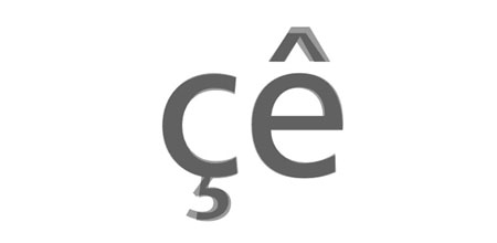
Better accents
Another subtle improvement of the typeface is the work made on the character accents, not so important in english but good for other languages like french.

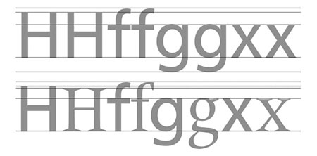
Miscibility
If you already possess the original Frutiger, the redesign has been made so that you can use this new version with the old one, they have the same x-height.

Improved spacing
Letter spacing can make a huge difference in terms of readability, great work has been achieved to get a better spacing in Neue Frutiger.

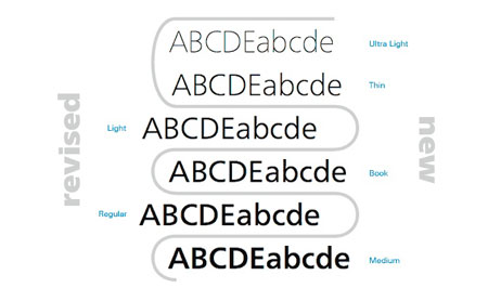
More font styles
As if the Frutiger font family wasn’t large enough, some new variants have been added to give you even more possibilities.

Did you like what you saw? Then buy the font at Linotype.com.

