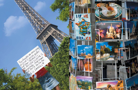
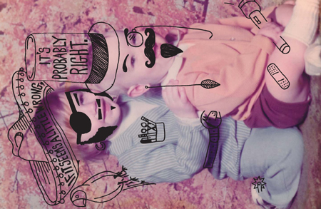
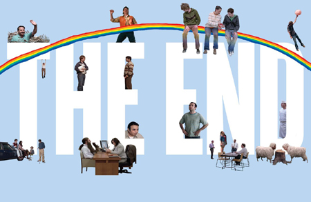
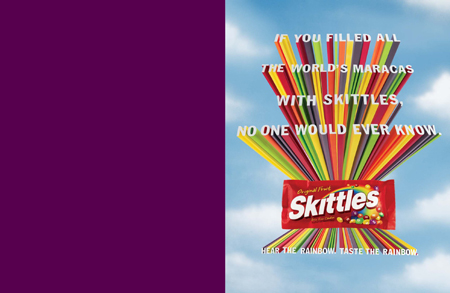
The brand book created by Skittles’ design team is quite uncommon, just like Skittles’ website or ads are. It’s very wild and colorful, probably the best statement Skittles could do about its branding.
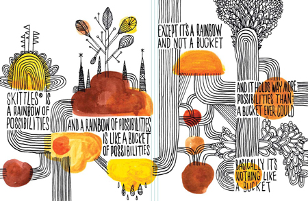
When creating their brand book, designers usually try to explain how to properly brand the company and go into details on how to use every graphic element. For example, you’ll get explanations about what size your logo design should be for every situation: business cards, corporate identity, packages,… The result is often quite boring since it’s just a lit of specifications for designers to follow.
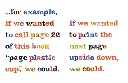
Skittle sends a strong message about its intents in terms of branding. Just do whatever you want with our logo as long as it’s cool, and try to be creative. This kind of guidelines is probably every graphic designer’s dream, who wouldn’t want to work totally free and let his own creativity flow? I find it also interesting that despite the wild layout and illustrations, the whole book is very coherent and makes just as much sense (or even more) than any branding book.
