When talking about street typography, people will immediatly think of graffiti. This is of course part of the typographic elements you’ll see in the streets, but it’s far from being all of it. Street typography consists of every typographic element that you can possibly find in cities outdoors, such as billboards, graffitis, road signs, shop fronts,…
When you travel from city to city, those typographic signs give a general atmosphere and participate to the fact that you like or dislike the place (among other things of course). Discover down here some of these street typography elements with links to see more. Enjoy!
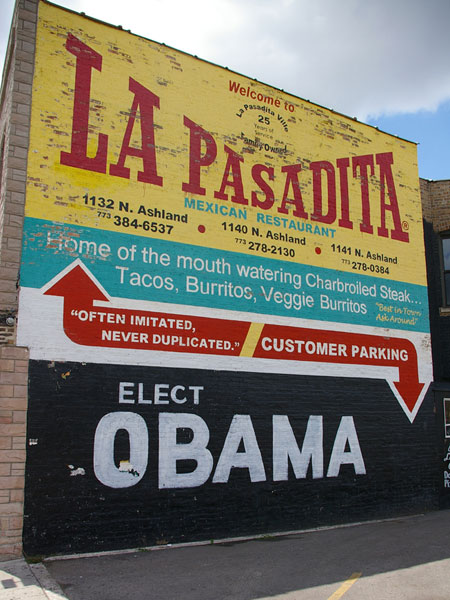
A lively wall full of fonts, taken from Chicago Type where you’ll find much more.
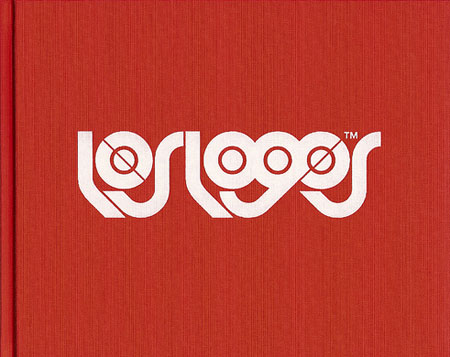
Los logos is a great project and serie of books pushed by Büro Destruct. They basically present logos that aren’t brand oriented and represent a more humanistic and artistic aspect of logo design.
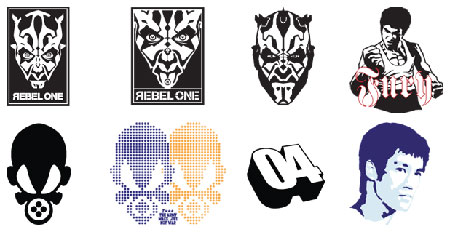
Images taken from the Los Logos book.
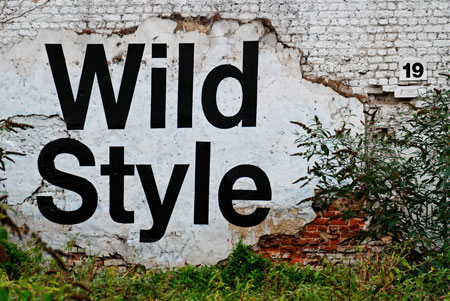
A very original graffiti from the streets of Brussels, it’s actually really painted on the wall, no Photoshop.
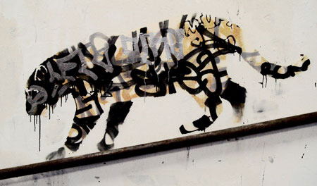
Making something cool out of ugly graffities, by Banksy of course.
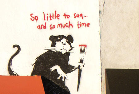
Another graffiti by Banksy, with handwriting and a cool drawing this time. Got to love the message too.
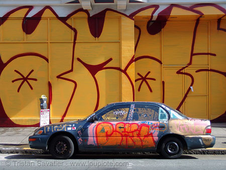
A cool pic of a giant graffiti in San Francisco. Big bold letters, a classic.
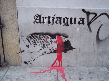
Beautiful drawing along with a nice gothic font and some great use of typography on the t-shirt. Somewhere on a street corner in Mexico.
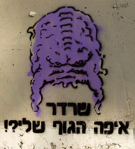
Yep, hebrew typography is indeed beautiful, even though I don’t understand anything.
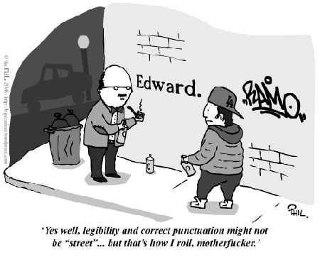
And just for fun, a cartoon via the rut.
At last but not least, just for fun, create your own graffiti with the graffiti creator.

