
Some great resources and inspiration for editorial design.
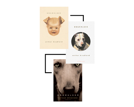
Interesting article on Printmag, they asked height designers to share their favorite rejected book covers and explain why and how they were dumped. Definitely a good read.
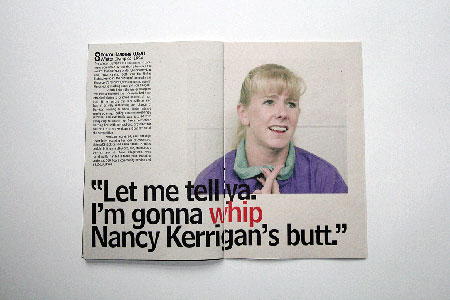
James Reynolds is a talented young designer from London. You should definitly check out his portfolio, there isn’t a lot of work yet since he just graduated, but you will like what you see for sure.
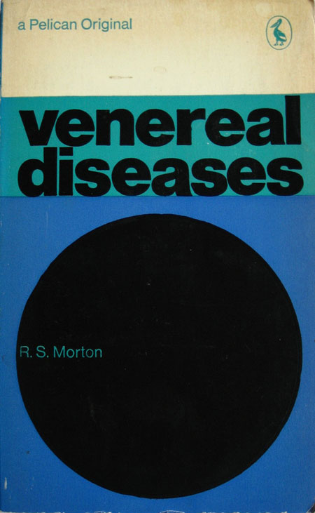
I didn’t get many opportunities to design book covers, but if I had to I would definitly want to do it for Pelican or Penguin. Those birdy publishers seem to give a lot of freedom to their cover designers, even the freedom to use the simplest shapes to give a general feeling to the reader […]
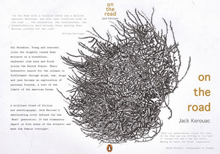
You should take a look at the Penguin Design Award Shortlist (via Kottke via Book Design Review), the results are quite inspiring. I really find this year’s winning covers much more interesting than last year’s. 1st Place, Jenna Jones – Norwich School of Art and Design 2nd Place, Jez Burrows – University of Brighton 3rd […]
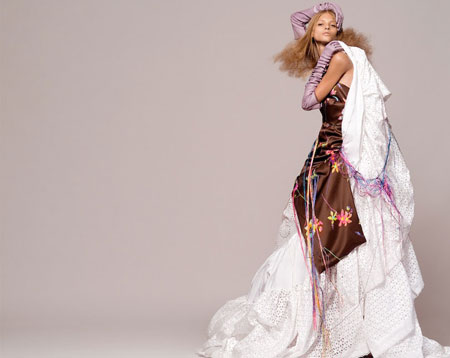
Capturing beauty is an everyday challenge for photographers working for fashion magazines or clothes advertising. Following is a random selection of fashion photographers that make beautiful design look even better. Stratis & Beva – Two photographers based in Paris, exhibiting their work around the world. Zhang Jingna – Singapore photographer with beautiful fashion design shoots. […]
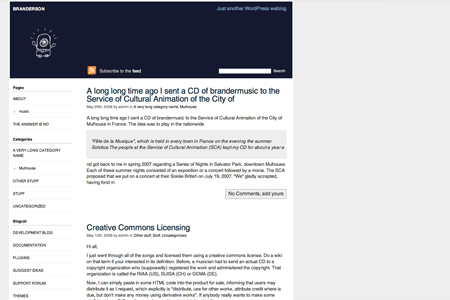
Happy Cyclope is a 2 columns, easy-to-customize wordpress theme. It is of course widget ready and WordPress 2.5 ready, but hasn’t been tested with previous versions. Categories and archives pages are presented as lists, which makes it nice for sites with a lot of content. The header is made of two images, one for the […]

Fatal attractions Smart contextual advertising Cute little typographic illustration Pixel style graphic design layout Photoshop HDR tutorial Beautiful vinyl turntable Design is thinking made visual Great wall-painted animatio If you don’t want to miss any of the links shared, you can of course follow me on my Tumblelog if you are a Tumblr user.
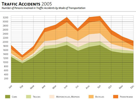
The information design patterns application is a collection of 55 design patterns that describe the functional aspect of graphic components for the display, behavior and user interaction of complex infographics. For each pattern, you’ll find an extensive description, a layout example and a real-world example. A left menu allows you to see other patterns that […]

The impossible art of Li Wei Cider package design by Amore Nice covers for the Divine Comedy Soviet retro posters Street art in East Village You can of course follow me on my Tumblelog is you are a Tumblr user.
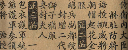
Sometimes being a compulsive eBay buyer can be a good thing. Recently I acquired an old chinese book. The thing that immediately amazed me is the quality and the variety in the pages layout and the typography. Unfortunately I can’t read japanese, so I don’t understand anything about the meaning of the book. Interesting headers […]
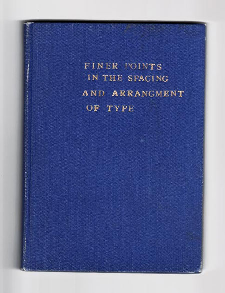
A really ironic book cover, seen on typography.com. Via Daring Fireball.
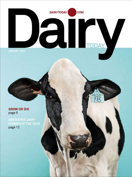
I guess that not many of you are readers of Dairy Today. However you have to read this article about the spectacular redesign of the magazine. The elegant use of typography combined with great photos gives a strong graphical impact to the covers. The plain background colour is a really good choice to give a […]
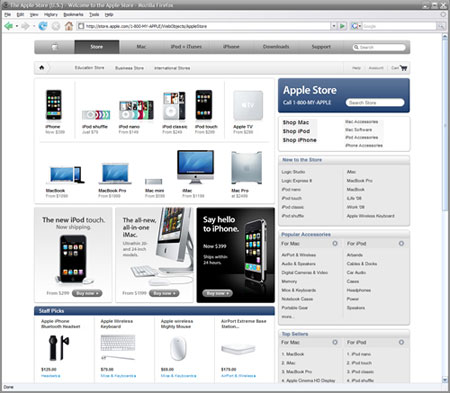
Design View has an interesting article on bad layout conventions, check it out.
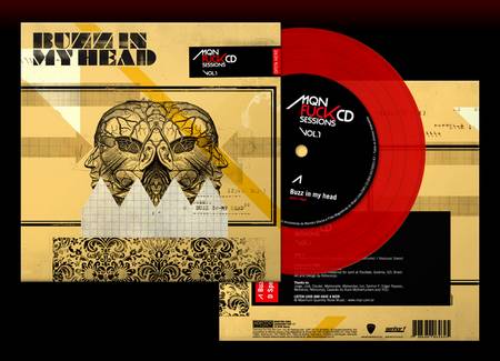
Amazing portfolio by Nitrocorpz.