
Some great resources and inspiration for editorial design.
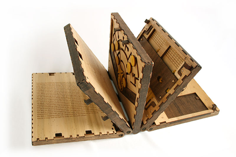
When you start thinking that everything has already been done in book design, an innovative designer pops up and creates something you’ve never seen and you would never have thought of. Brady Whitney is an industrial designer, which gives him a different approach to designing books, thanks to his background. If you take a look […]

As his name suggests, Olafur Eliasson is an artist from Northern Europe based in Berlin, Germany. I only discovered recently one of his earlier project: Your House. Your House is a concept book that was released as an artistic project and published by the Library Council of the Museum of Modern Art back in 2006. The […]
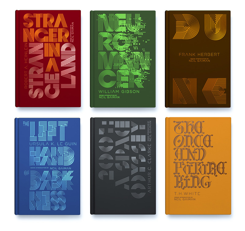
Penguin did it again, they released a new series of classic books (sci-fi this time) with gorgeous covers. This time, they asked New-York based designer Alex Trochut to work on the designs. The designer chose to take a purely typographic approach to the project. For each cover, he used a line-based lettering system that he […]
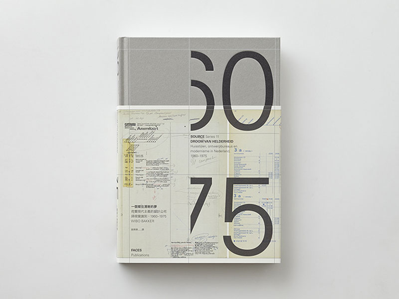
Wang Zhi-Hong is a talented Chinese graphic designer based in Taiwan. His work in general shows a great eye for typography, color, and graphic design in general, but it’s his book layout on Dutch modernism that really caught my interest. The layout is obviously grid-based, shows all the work of the Dutch designers with proper […]
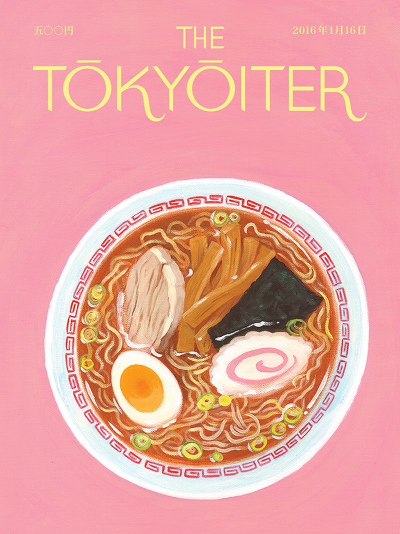
Andrew Joyce and David Robert are two designers based in Tokyo. Inspired by the gorgeous covers of the New Yorker or the Parisianer, they decided to pay a tribute to these magazines iconic covers by creating an imaginary Tokyo counterpart: the Tokyoiter. The covers layouts and illustrations are of course heavily inspired by the two […]
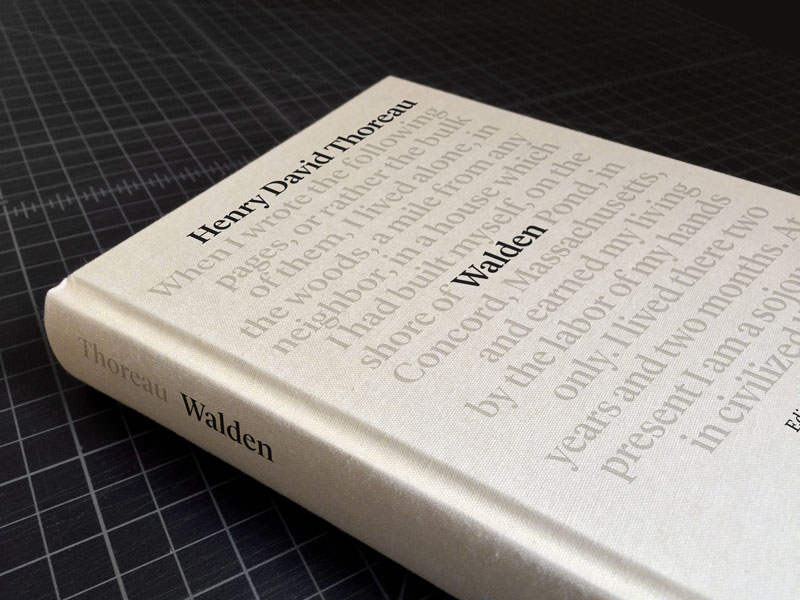
If you follow world politics a little, there is at least one of Henry David Thoreau’s concepts that you are already familiar with: civil disobedience. If you are not familiar with that book or the ideas it promotes, just know that examplary people like Martin Luther King or Gandhi used this book as inspiration to […]
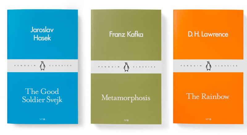
As usual when Penguin launches anything, designers around the world take a good look and enjoy the work. They opted for a minimalist style with a clever use of color for the covers. The colors may seems randomly chosen, but each color is attached to the original language of the book. Orange is for English, […]
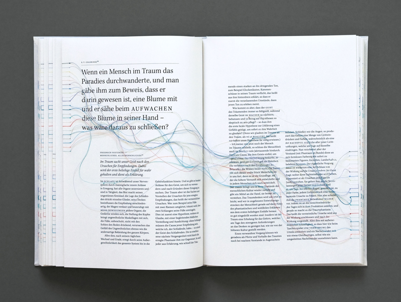
Internet browsers took some concepts from books, like the bookmarks for example. For her design diploma’s work in 2010, Maria Fischer did the opposite, she took a concept that is typically found on the internet, hyperlinks, and tried to apply it to a book. For that purpose, she used strings to connect words with other […]
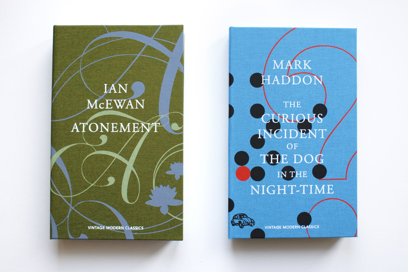
To achieve perfection in your craft, it’s good to spend a lot of time focusing on one thing. For designers, specializing in one field of graphic or web design can be the way to create your best work. Based in UK, graphic designer Anna Green has become one of the top book designers out there, […]
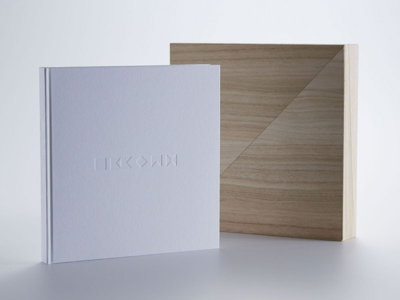
Ever noticed how looking for something colorful on stock photo sites inevitably brings up some candies and sweets photos? It’s probably the colorful thing that appeals the most to our inner-child. In Japan, they also produce traditional confectionary name wagashi. I can’t tell you about the taste of it, as I haven’t tried it for myself, […]
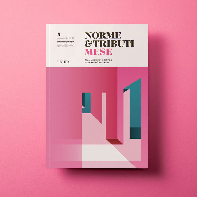
Grid-based design with nice typographic hierarchy, check. Gorgeous Didone typeface for the title, check. Awesome, catchy, and colorful illustrations, check. I’d love to find something that’s not perfect with these covers for the Italian Economic Revue, but in my opinion they are flawless. The illustrations are the work of the talented Italien illustrator Ray Oranges. Now […]

Editorial illustrators need to regularly convey complex ideas into simple images that give a quick understanding to readers and make them want to read the article. This is a lot to put into one single image. Based in Québec, illustrator Sébastien Thibault has a real talent to bring poetry into his work, even when drawing about […]
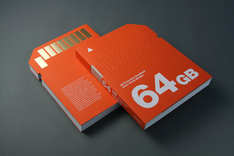
Viction:ary is a publisher from Hong Kong. They are noteworthy because of the high-quality of design in everything they publish. Specialized in all the visual related fields like art or design, they pride themselves in keepling a high-level of quality in their editorial design. You can see a few of their coolest books in this post, […]
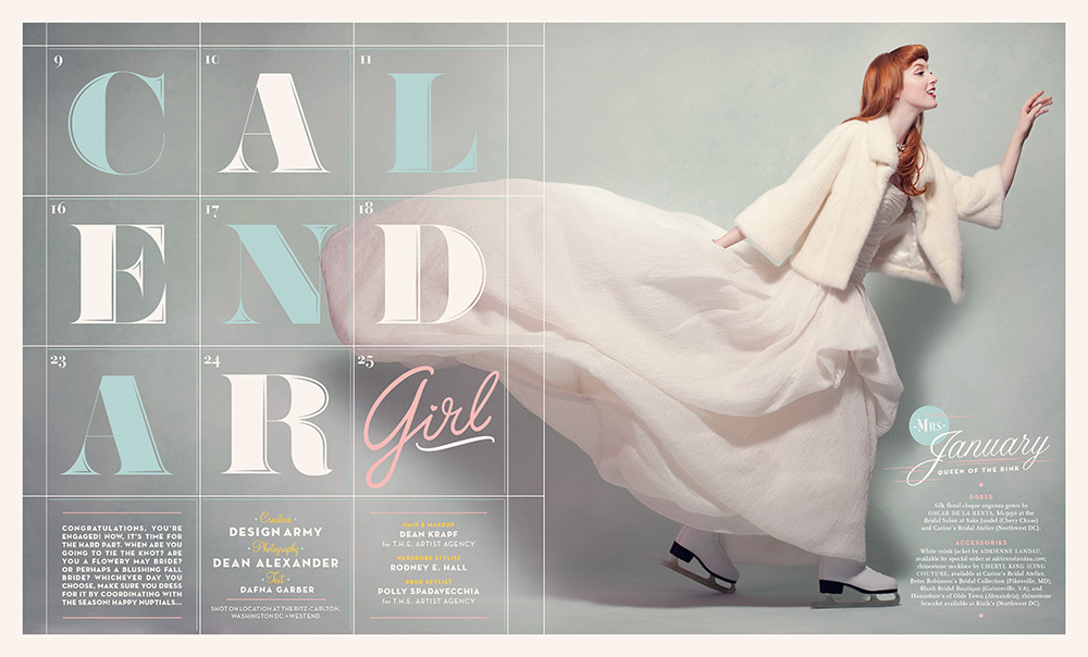
Editorial design is my favorite part of a graphic designer’s job, unfortunatly, it isn’t the easiest one to get job in. Here is some inspiration for some well-designed editorial layouts. 1. Calendar Girl This is an editorial spreads for the Winter / Spring 2012 cover story of Washingtonian’s Bride & Groom issue. You can view it […]
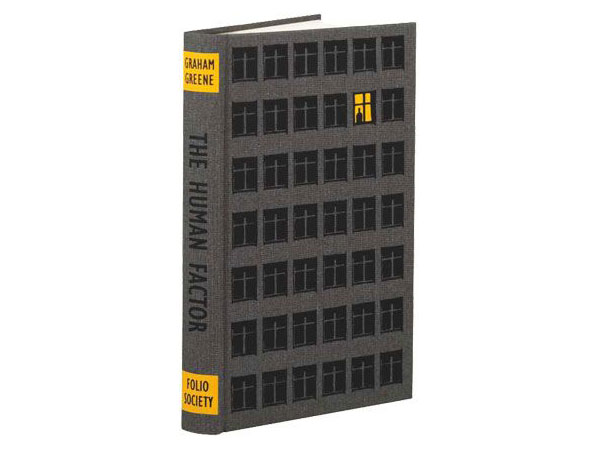
Editorial design is my favorite part of my work as a graphic designer. Laying out magazines and books is much more satisfying than it looks to the non-designer. In my opinion the harder part is probably the book cover. Unlike for magazine design, you don’t have a featured story to pick an image for, you […]