Logo designers at their best, some great inspiration for all graphic designers.

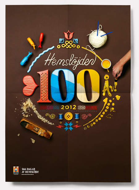
The Swedish Handicraft movement had the excellent idea to commission Snask for their branding. They went with the obvious, handmade design, but executed perfectly.

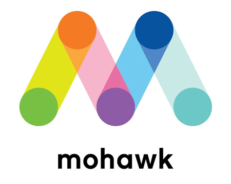
The prestigious paper company recently redesigned it’s logo and corporate identity. The result is very colorful and modular, which is probably the best part about this new identity designed by Pentagram. Via Brand New.

Translations with non-latin characters are strangely a pretty good way to test the strength of a brand. To adapt the logo, you need to reinterprate it using the codes of the visual, such as lines, curves, font style and color. If your visuals are very easy to identify, it makes the adaptation much easier. In […]