
Logo designers at their best, some great inspiration for all graphic designers.
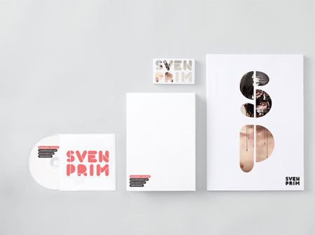
Your corporate identity is more than just your logo applied to promotional material, it is the way you will use colors, shapes and hints from your brand to make your company recognized right away. The following picks are excellent example of what good corporate identity design can be. 1. Matter strategic design 2. Tyneside Cinema […]
Ritator is a swedish design agency with a nice arty touch to their work. Their portfolio showcases very subtle identity work, cool digital illustrations or innovative concepts.
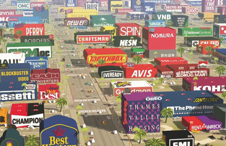
Logorama, a short action-movie taking place in the world of brands, recently won the Oscar of the best short animated film. It is the creation of the french studio H5, often awarded in the past. It took them 5 years to complete this 17 minutes animated movie so this Oscar is probably more than welcome. […]
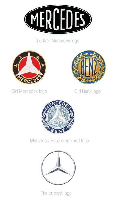
The evolution of big companies logos is always interesting, and I found car companies logo designs to be among the most interesting to inspect. One of my favorite aspect of these is to see how logos are handled when two or more brands are merging (see Audi, Mercedes-Benz or Mitsubishi). Renault Audi Volkswagen Mercedes-Benz I […]
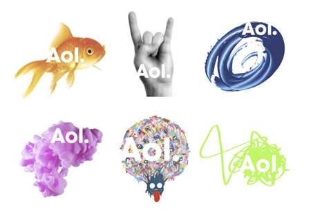
While preparing to massively lay off its employees, AOL (sorry, Aol.) announced a rebranding that looks… erm… Microsofpaintesque! On the typographic side, I like the logo going lower case and taking some distance with the acronym, thus showing the company’s new orientation. The dot is also quite nice and acts as a connector with subdivisions […]
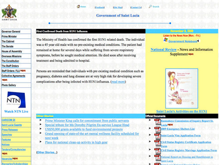
Here are some nice design-related blog posts you shouldn’t have missed this week. Fugly government websites, the ultimate list So many talented web designers, so few of them working for governments… Print Design to Web Design: Comparative Analogies A good read for any print designer who has never worked on the web. Awesome Papercraft self-portrait […]

The end of the year will be here quickly, so your clients should soon be asking you to prepare some unique gifts for their own clients. You may also want to send some gifts to your best clients, it is always appreciated. My m&m’s Put your clients’ company logo & a message on MY M&M’S […]
Creating a great logo design is quite a tough job, you have to synthetize concepts in a simple, powerful image. I think that the following logos did achieve that very well, take a look for yourself. 1. Push The Bottle 2. Saturn Electronics 3. Frankenstein Films 4. Cloud Corner 5. Tokyo Fashion 6. Cakefilm 7. […]
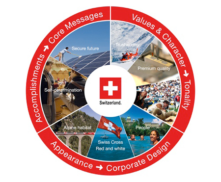
I already knew that my country’s government was paying a lot of attention to its marketing worldwide, but I didn’t expect it to work so well on its branding. I found this article via SwissMiss’ blog, it was a very interesting read and lead me to this website where you can have all the details […]

Designing an Olympic logo must be a quite challenging work, the outcome will be seen by many and everyone will give his opinion about it. Designing for a candidate city just as challenging, so let’s see how well the 2016 candidate cities did. Madrid 2016 – Designed by Joaquin Malle Chicago 2016 – Designed by […]
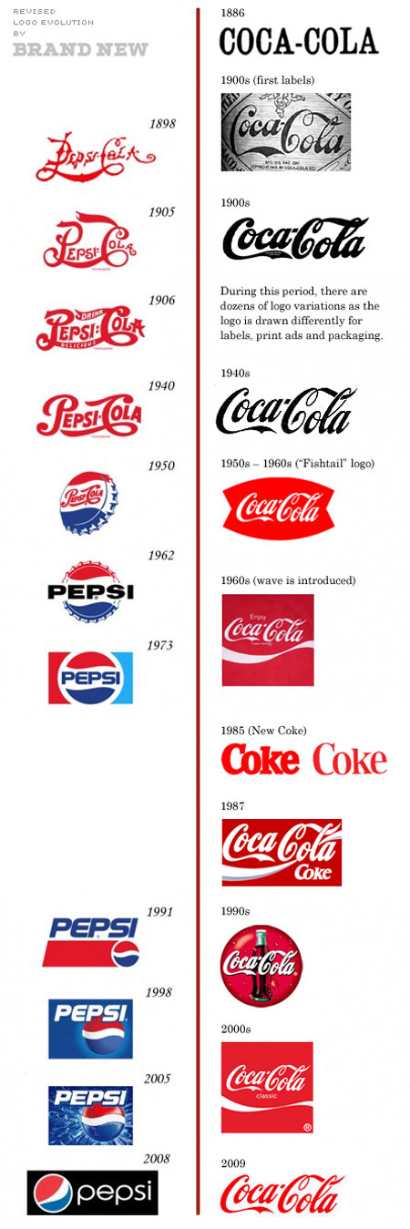
Brand New just released a revised version of the very popular Pepsi vs Coke branding chart (found via Design Notes). I don’t think that the initial chart was designed to be accurate, but to make a point about branding using humor. The revised version shows that Coca-Cola also tried to make its brand change and […]