
Logo designers at their best, some great inspiration for all graphic designers.
In a recent article on its blog, Mozilla announced a rebranding that brings the company to its roots. The non-profit company changed from a plain text, sans-serif logo, to a more thoughtful design that uses a slab serif logo and twists a few letters to make you think of your browser instantly. A before/after view […]
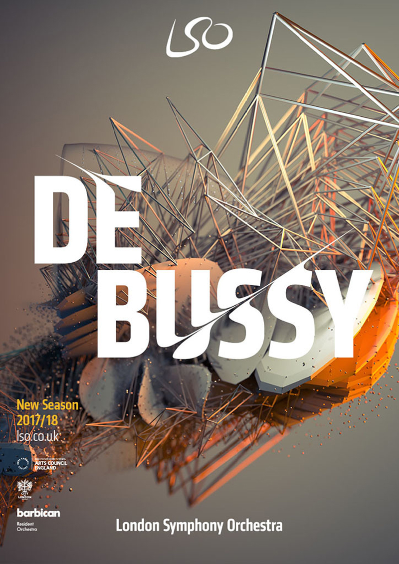
The London Symphony Orchestra new logo and identity was reveiled recently by The Partners, the agency behind this new creation. In a creative twist, the designers took the type at the core of the logo and tweaked it to follow the movements of the orchestra’s conductor.
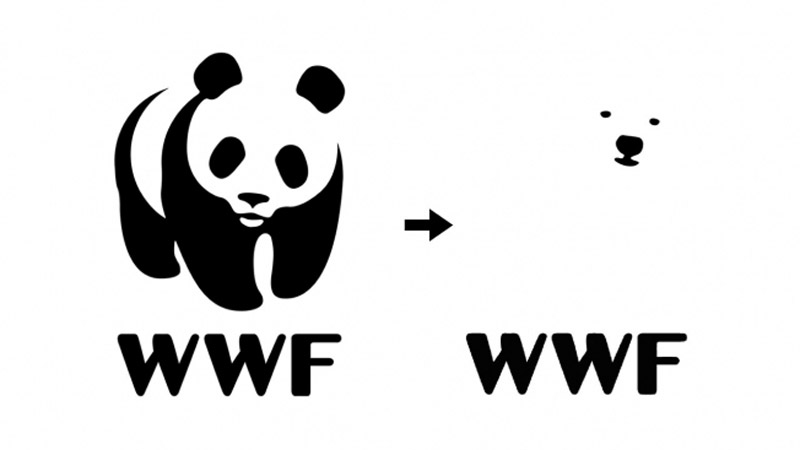
For decades, the panda was the iconic animal used by the WWF on its logo. The Chinese animal was emblematic of disappearing species, thus an excellent choice for the NGO. With the debate on climate change and its effect on animals’ environment, should the WWF send a strong message and go as far as changing […]
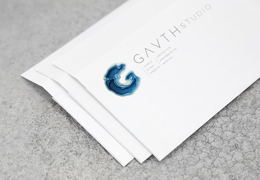
For this corporate identity, London based graphic design and art director Tugba Ozcan took her inspiration from topographical maps to give a sense of depth to the logo. The word Gavth meaning deep pit in old language, the choice of the topographical features makes a lot of sense.
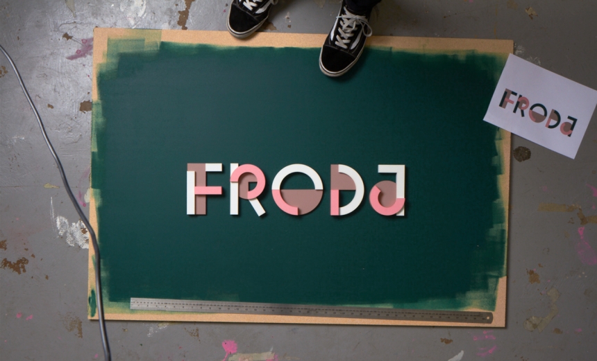
To better suit their activity, Monetize decided to change name and become Froda. With that, the company had to find someone to design a new logo. They called Snask, a Swedish design studio. The designers took the option to work with building blocks, but litterally. They used blocks with three different colors to create a […]
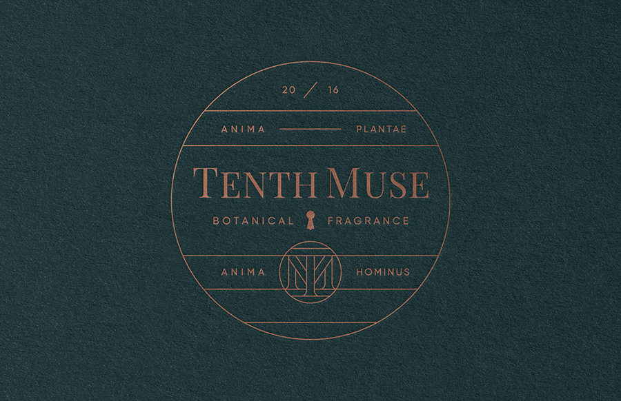
Based in Minneapolis, Minnesota, MPLS Studio is a design agency that knows how to create powerful branding. They proved it again by creating the corporate identity for Tenth Muse, a perfume brand that can now brag about having one of the coolest line-based identites.
50 Words is a logo collection created by Lucas Gil-Turner during a workshop. The graphic designer took common words and designed a logo for each, each logo being a brand that reveals something about the word. Black & white was used to focus on the form, the words chosen are the 50 most commonly used […]
Refinery 43 is one of these super reliable design studios. They are not superstars, but you can count on them to always produce top notch design work. Located in Newburyport, Massachusetts, they work as a small team to do big things. But just see for yourself.
When you come from Europe, the tipping culture is a somewhat surprising part of American culture. Tipping culture means that waiters are not getting paid well if the restaurant has little business. When business goes well, waiters are getting a share of the revenue that is not really fair for chefs, dishwashers, and all other […]
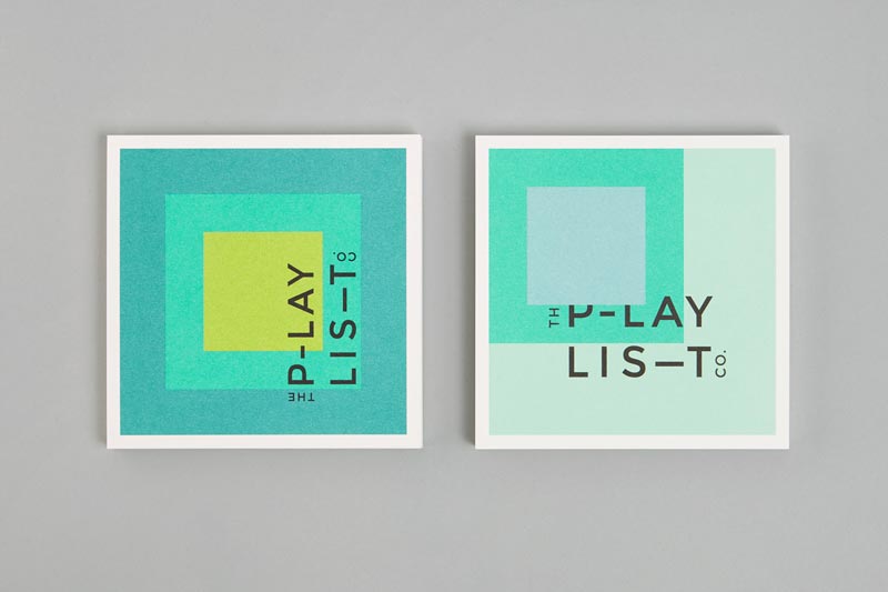
Toronto based graphic design agency Blok created a pretty cool geometric branding for The Playlist. While grid-based, this identity is just as playful as you would expect it. The designers had fun moving the colors around to create layouts that match the music business consultants’ activity.
On Designer Daily, we’ve often discussed the importance of white space, here is some practical inspiration in logo design. Knoll A subtle logo that looks like a gift, designed by NB branding & communication. Ryan Biggs associates A clever way to combine the company name’s initial letters. Design by id29. Yoga Australia Nice way to […]
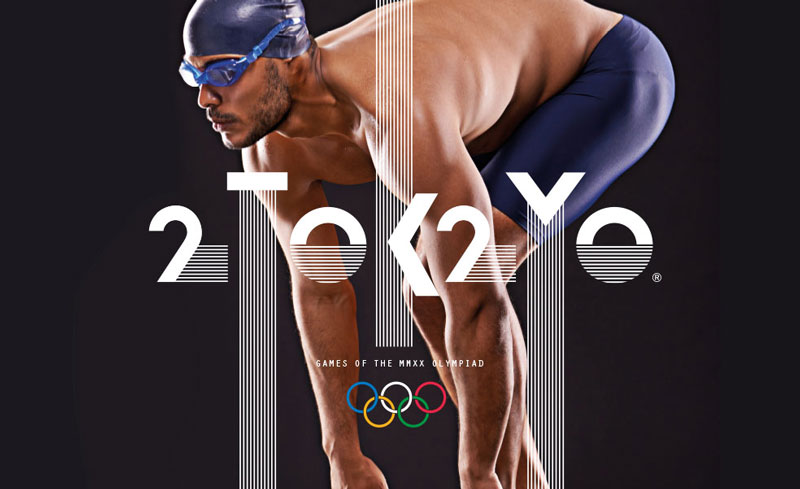
The Tokyo 2020 Olympics logo is a disaster. It’s not a matter of design, the official logo doesn’t look too bad. The problem comes from all the controversy that came with the creation of the logo. The first logo proposal was abandonned because of plagiarism accusations, so there is a lot of bad PR around the branding […]
Graphic designers’ job consists mostly of transmitting messages in a simple, visual manner (to make it short). This is never as obvious as with logo design. A logo must express concepts in a matter of second, with very little visual elements used. While not always the most pretty, the following logos are great examples of […]
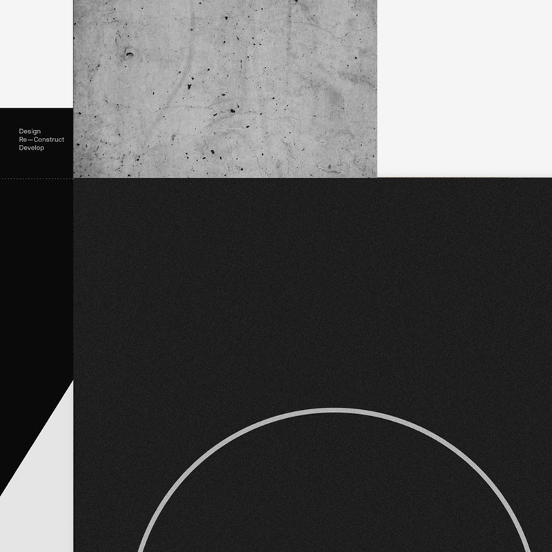
Using type, a grid and some textures, Greek graphic designer Dimitris Papazoglou created a stunning new branding for architecture studio Urban Soul Project. The type is derived from a deconstruction of the monogram of the brand, the letters extracted are then turned into a new writing system. Urban Soul Project turned to Papazoglou at the time […]
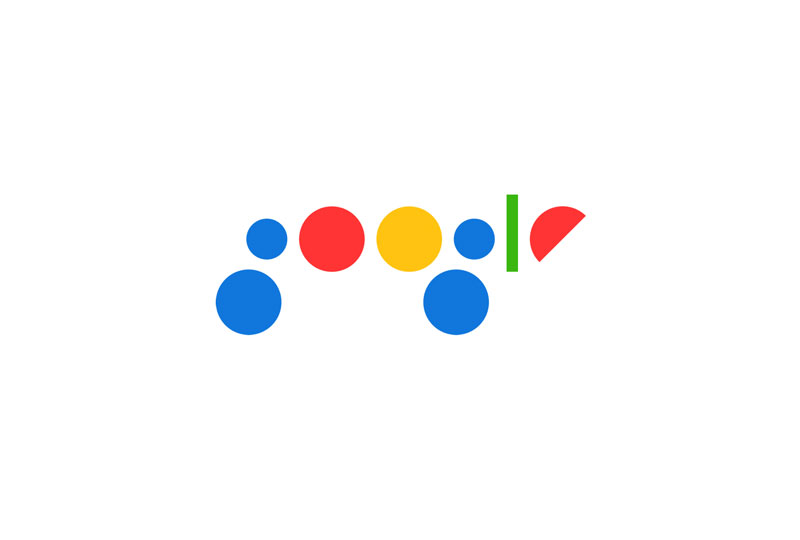
Graphic design Bruno Bua, from Portugal, had a lot of fun with the Google logo. He tried to imagine a minimalist re-branding using only geometric shapes and the Google colors. This logo is not truly outstanding or practical, but it shows some interesting thinking on the shapes that form the identity, and some thoughts on […]