
Logo designers at their best, some great inspiration for all graphic designers.
Today, we have a collection of 25 inspiring handwritten logo designs which are very elegant and creatively designed. The below listed handwritten logo designs are carefully designed to increase brand loyalty and customer interaction. Usually, during a creation of logo for the following types, the designer has two types of choices. First one is to […]
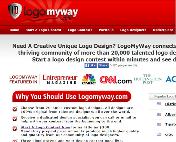
Finding a unique, creative and affordable logo design just got easier. These days you can run a contest just for about anything, why not a Logo Design. LogoMyWay allows you to start a logo contest putting up your own prize money. The prize must be between $200 and $1000. Of course the higher the amount the more […]
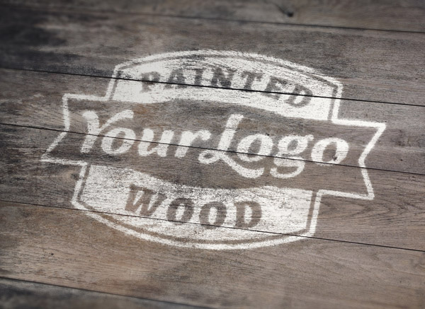
Many of the freelancers find using PSD mockup template, the best way to impress their clients for logo design work. These mockup templates help to create a realistic preview of how the logo would work in real time environment. Here, we have 10 such awesome PSD templates for logo mock-ups that you can use anytime […]
A logo is not only a simple design, but a brand design that reflects your business. Sometimes designers find it most challenging to create a compelling logo for desired company. The whole theme, website, posts and promotion go along with the logo for branding purpose. Thus, your logo should be very appealing as well as […]
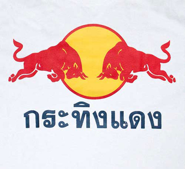
I already knew that the drink tasted horrible, but I never thought of checking its origins, or where its logo comes from. Now, thanks to Logo Design Love, I know that some Austrian guy discovered the drink while traveling in Thailand, and found out that it was a cure for his jet lag. You can […]
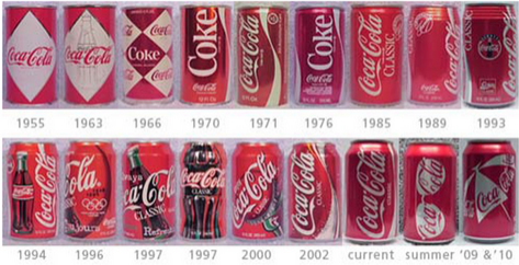
Soft drink companies rarely change their products. So, the only way to revive and entice its brand is to redesign the can. Since early 20th century, soft drinks have been a part of world culture that has iconic logos. Today in this blog post, we’ll introduce you through an interesting catalog of the evolution of […]
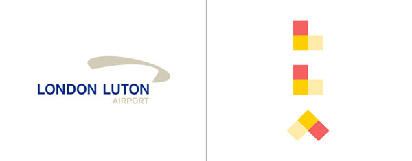
The city of London might not be the biggest in the world, but it is definitly loaded with airports. In fact, it has more airports than Switzerland (if you only count commercial airports). London Luton, while not exactly in London, had a hard time to distinguish itself. It’s not the biggest no the nicest airport […]
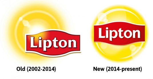
With the evolving technologies and trends, it is vital to rebrand and redesign the products in order to fit in the changing environment. Today in this blog post, we will see 10 big companies that had a logo redesign in 2014. Though it might be hard to accept the new changes in design (especially logo) […]
Today in this blog, we are introducing you an awesome collection of creative logos for your inspiration. These logos are perfectly designed for their respective niche. Have a look at the beautiful logo designs below. 1. Fun in the Run logo This logo is designed by Levelb for his neighborhood’s first annual festival. It is […]
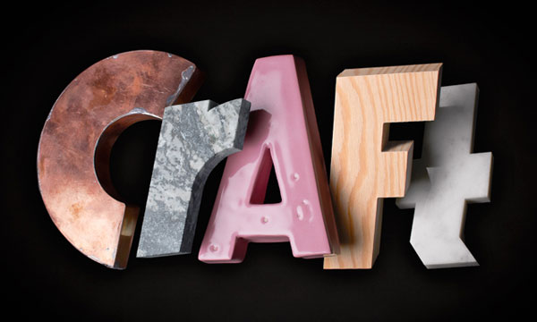
For its Craft summer exhibition, Swedish art gallery Liljevalchs Konsthall commissionned Snask design agency to create a visual identity. The word craft is made of various materials used by crafters, combined with a gorgeous stencil font in the catalogue and other marketing material.
An PR company with a name like BANG must have an explosive identity. It’s done now, thanks to RE:, a design agency from Sydney, Australia. The visual identity can be exploded to adapt to pretty much any situation and surround any content you want.
All the artists, illustrators and designers, if you are looking for some awesome retro logos then here we have massive logo collection just for you. Have a look at it below! Circles Circles have been the most prominent trend for logo design. It’s really a retro style that lots of designers seem to directly connect […]
Negative space can be called as an art of utilizing the available space around the logo for making another image. Doing so will make your logo unique, catchy and memorable. If you do not believe then here are 15 excellent examples of negative space logos that will blow your mind. Have a look! 1. Pin […]
The Hershey company changed its logo a bit. The internal design team did the work, and overall I think they did a pretty good job. The typography in the logo was simplified, a font was even created with that new type. But the icon of a Hershey Kiss just looks like a turd that sits […]
Your brand or company is well known through its logo. If the logo looks good enough then that surely leaves a better impression. Many companies thrive for best logo designs. There are great ways to design a logo and make it professional. Typography plays a great role while designing a logo because it makes it […]