
Logo designers at their best, some great inspiration for all graphic designers.
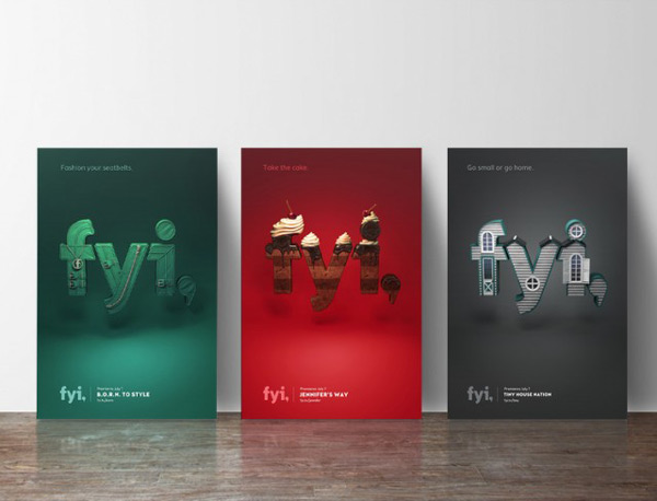
The TV channel FYI Network recently commissionned Sasha Vinogradova to design their visual identity. The graphic designer played with the 3 letters of the brand’s name and dressed it in 3D. Prints for new shows focus on foodie pursuits, home design, makeover themes and other.
If you believe that there is no such thing as bad publicity and that all Internet buzz is good buzz, then AirBNB’s new logo announcement is a great success. If you think that bad press is bad publicity, then AirBNB just had a disastrous launch. After the announcement, social media, blogs, and even mainstream news […]
Using animals can be a great way to add character to your logo designs. People will identify the company’s logo to the characteristics of the animal on the logo, a great way to transmit unspoken information. 1. Energy Australia How do you represent Australia and energy in the same logo? Easy. You take one of […]
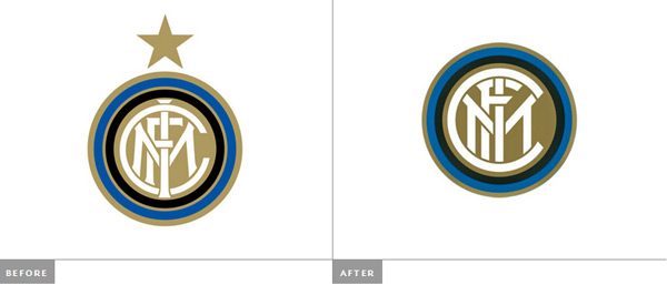
The popular Italian soccer team, the Inter Milan, recently unveiled a redesign of its logo. To be honest, it would be better to talk about a realign of the logo, with a simplification of shapes and a more modern look-and-feel. However, it is not how the Inter Milan sees its new logo. In a comical […]
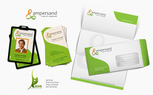
Sadly enough, there are many logo designers out there who think that a company’s logo and their brand are one-in-the-same. In reality though, a logo is just a small piece of the brand puzzle. Perhaps, this post will clear things up a bit. So what is a logo exactly? Simply put, a logo is merely […]
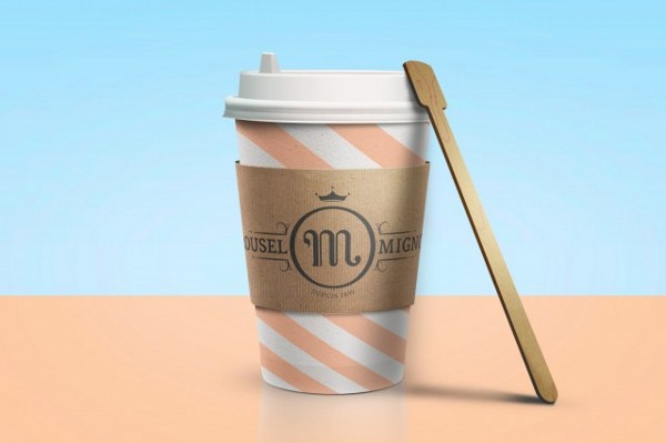
A delicious identity created by Benoît Galangau for Mignon, a sweets shop based in Marseille.
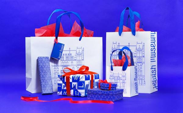
Sagmeister & Walsh recently shared the work they did for the visual identity of the Jewish Museum. More than a simple corporate identity, they created a real system that can even be adapted for the collaborators’ photos. Via The Dieline.
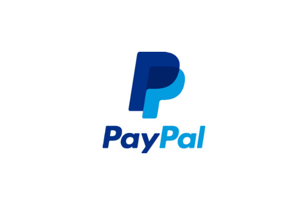
If you connected to your PayPal account recently, you may have noticed that the logo on the top left hand of their interface has changed. The redesign is not a radical one, but the changes are important enough for PayPal to send out press releases about it. Most noticeable, bot capital “P”s have been closed […]
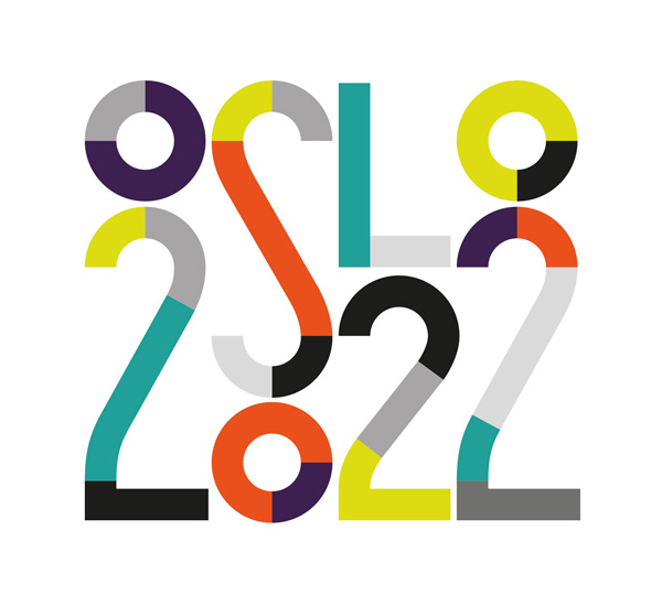
For their bid to host the 2022 Winter Olympics, the city of Oslo asked Snohetta design agency to design their visual identity. The result is a playful and colorful branding that makes a great first impression. Via Dezeen.
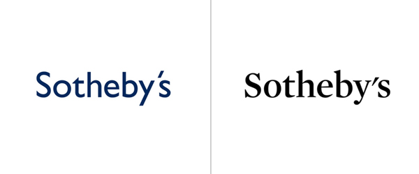
Sotheby’s recently announced a redesign of their logo by Pentagram. As usual, it’s brilliant work by Pentagram, with a choice of font much more suitable for the auction company. This said, I find that the apostrophe in the new logo looks really aweful, wasn’t there a way to make it look nicer? Via Brand New.

This line-based logo design is great by itself, but it’s even better when you see the whole design process. The color scheme works very well and fits perfectly to the illustrations. This redesign was created by Denis Bashev of Moscow, Russia.