
There is more to packaging design than simply putting items in a box with a name on it. We feature great packaging design in here very often.
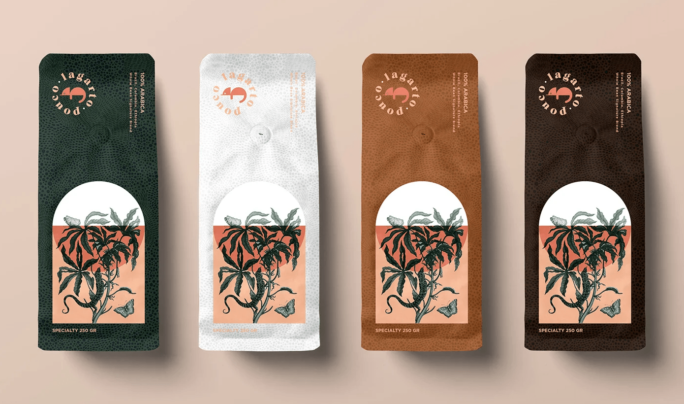
Coffee packaging seems so ubiquitous in designers’ portfolios that it could almost be a design field in itself. For that reason, getting noticed with packaging design is a difficult mission, as you are competing with multinational companies as well as graphic designers who start importing coffee in their village. In this post, we take a […]
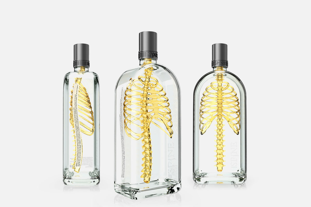
Need some inspiration for designing a package for a product? Find some ideas in the following list of awesome ideas that took product packaging to the next level. 1. Spine Vodka Want to drink a product with a backbone? Give a try to the spine vodka, designed by Johannes Schulz. This design takes advantage of […]
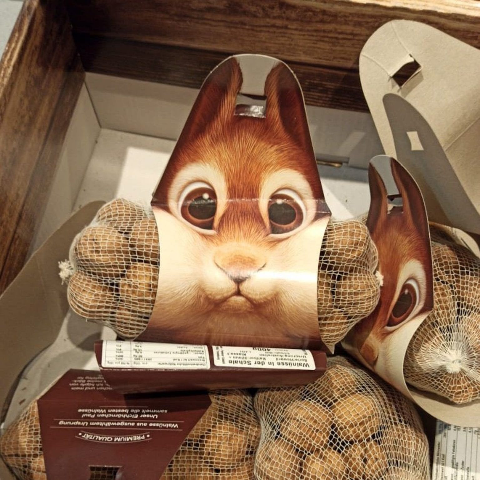
As a designer, you may sometimes wonder how useful it is to publish concept designs on the Internet. Of course, you get to display your skills and build a portfolio, but will it just disappear in the depth of the Internet or will it have a use at all? This design by a wallnut seller […]
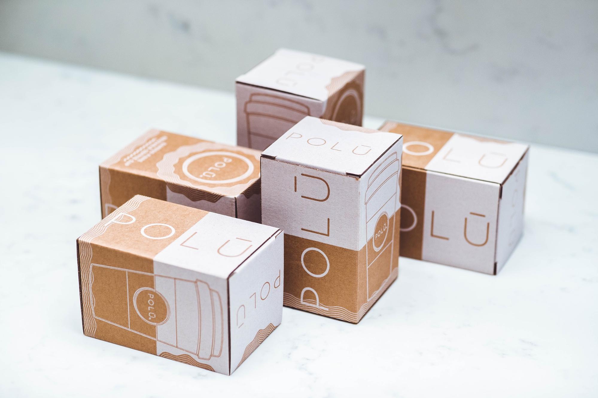
Packaging – for many brands, it’s something that’s left to the last minute. For designers, it’s an uncommon blank canvas to work on. But the truth is that designing packaging presents multifaceted challenges that test even the most resourceful graphic designers. Graphic designers need to work on different materials, in a variety of shapes to […]
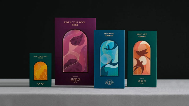
Birds nest are a commonly eaten delicacy in China. Praised for the health benefits they are supposed to bring, they have become a luxury product there. Wwave Design was commissioned by Yan Yan Fang, a famous birds nest brand, to redesign its product packages. The main goal of this operation was to distinguish the brand […]
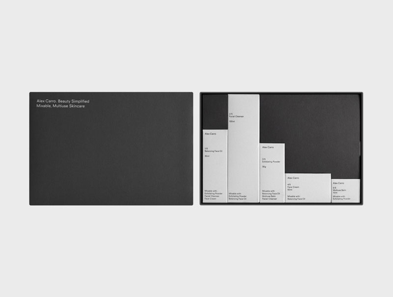
To design their new line of products, Alex Carro, a Barcelona-based skincare brand, hired graphic designer Malva Sawada and art director Andrew Trotter. The duo went for a minimalist design with beautiful use of white space and typography. My personal favorite is the skincare set that you can see on the first image in this […]
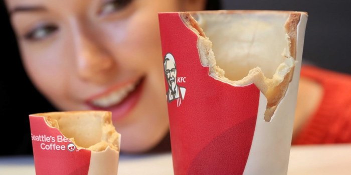
The compulsory environment-friendly food packaging will soon come into effect in each and every country. Checkout 10 best examples of innovative and sustainable food packaging.
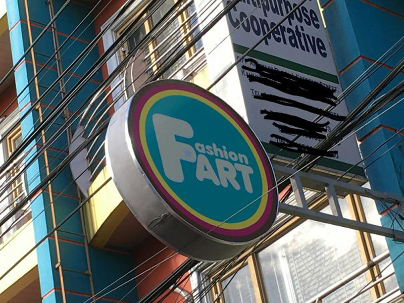
The easiest way to demonstrate the purpose of design is maybe the absurd way. Good design isn’t always spectacular, while bad design will show you exactly what parts of the work the designer is paid for. Here are 10 examples of design fails that will make you smile. 1. Fashion Fart When using a capital […]
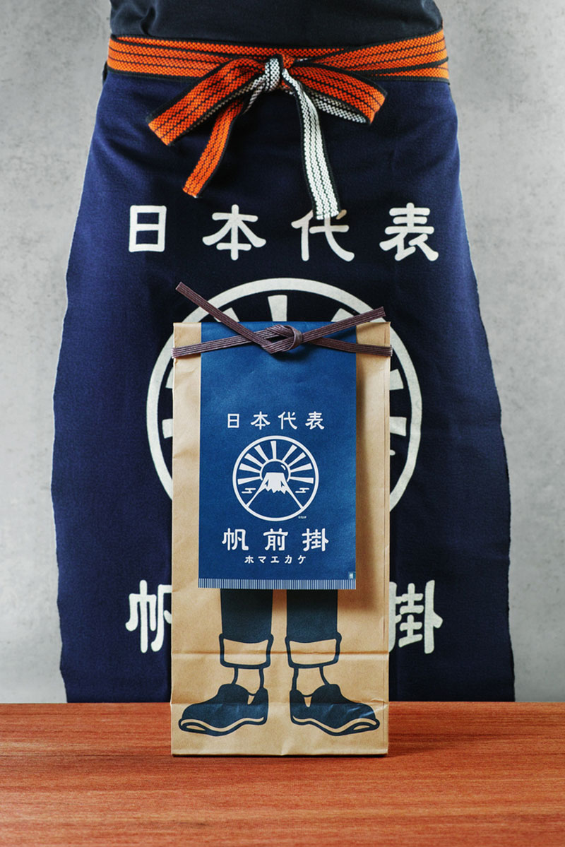
In many Japanese stores like rice or miso shops, you could find that the people working traditionally wear a special type of apron, these are called Maekake. For their apron packaging, Anything, a company established in Japan, hired Nosigner to design a creative packaging. The designers made a tremendous job of creating a reference to […]

The old saying “Don’t judge a book by its cover” applies to packaged goods as well. Just because a product has an attractive package doesn’t automatically mean it will be a good product. Still, brands need to entice consumers to try their product in the first place, and one way to do this is through […]
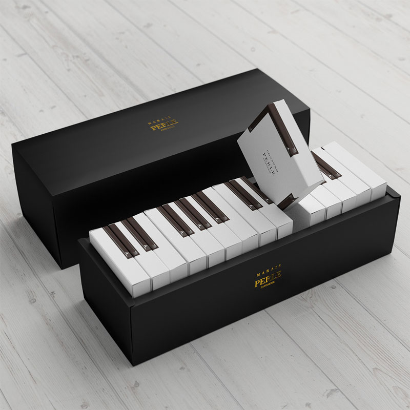
To package their cakes, Marais called Kazuaki Kawahara, a Japanese designer. The designer went for a design that requires to package each cake individually, which is not the most eco-friendly choice. It does however allow for a very cool packaging concept that plays with the keyboard design.
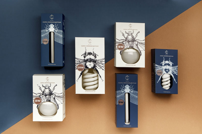
To create this lovely branding for CS Electric, Belarus-based graphic designer Angelina Pischikova worked with illustrator Anna Orlovskaya. They took their inspiration from old physics books and their very detailed illustrations to build a new kind of electric insects. The result is both poetic and efficient, with a clear, minimalist use of white space and type.
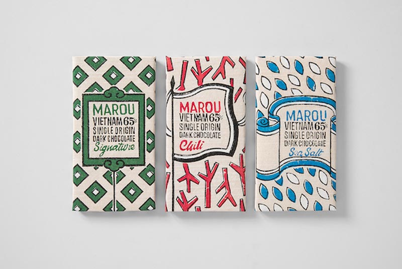
The National Gallery of Singapore teamed up with a Vietnamese chocolate brand, Marou, to create a limited edition of packaging. The design studio, Rice Creative, was commissionned with the task of creating an artistic package that would make a bridge between Singapore and Vietnam. For that purpose, the designers worked with traditional Vietnamese printing studios and […]
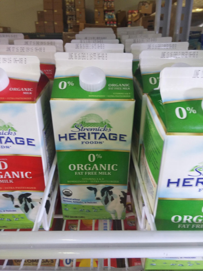
I don’t know where this picture was taken, I found it on the r/crappydesign sub-reddit. I found it was the perfect example of how bad handling of small design details could become a disaster. In this case, it wouldn’t take much to improve it and turn it into a normal package design (although it would […]
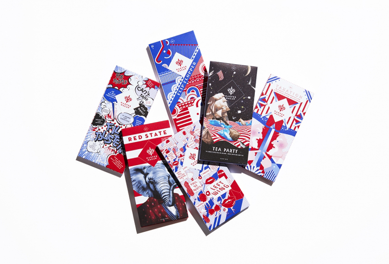
These limited edition chocolate bars were designed by Design Army just for fun. The creative agency did a graphic take on US political parties and designed chocolate packages for each political movement. They even went further than this and worked with the chocolate makers to have a specific flavor for each party. Although it’s a concept […]