
There is more to packaging design than simply putting items in a box with a name on it. We feature great packaging design in here very often.
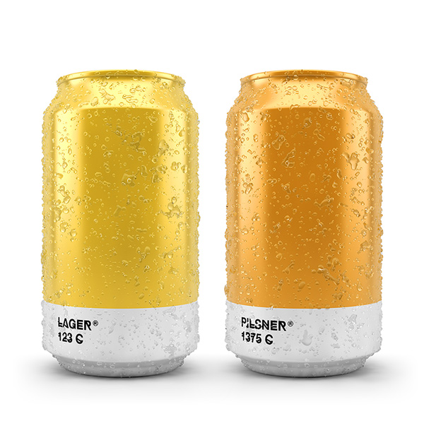
The simplest ideas are often the best. Txaber Design Studio created some packaging for beers that just matched the color of the liquid inside using the corresponding Pantone color. The result is surprisingly good, at least it made me thirsty.
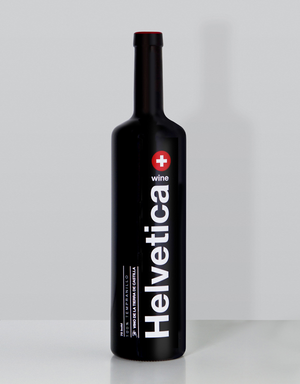
A wine-themed tribute to the most iconic sans-serif font. While this label is quite interesting, I don’t think it works very well as a wine bottle design. At least I wouldn’t buy it in store. It was designed by WildWildWeb and printed as a 1300 serigraphed limited edition.
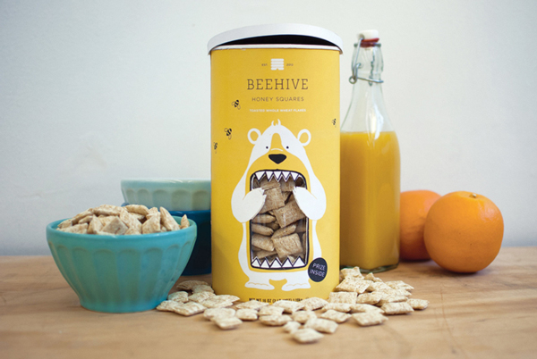
A cute packaging design for Beehive Honey Squares cereal boxes. A great way to stand out from the competition.
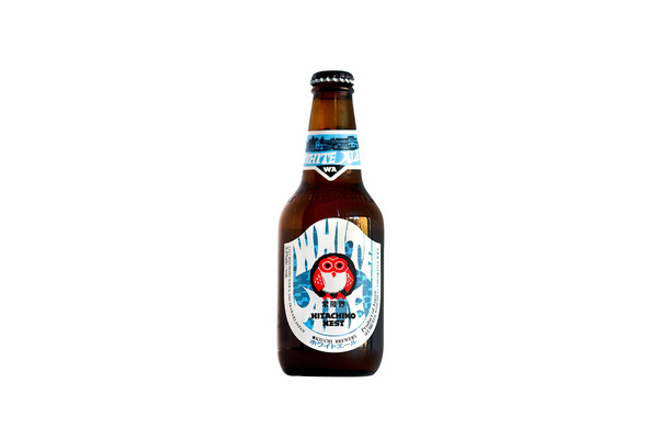
Milton Glaser, the designer of the I Love NY logo, has been asked to give his opinion on small breweries beer labels. In short: he doesn’t like it. Glaser did some branding for a brewery himself, you can check the case study on his site.
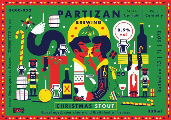
London based brewery Partizan commissionned Alec Doherty to create these amazing illustrated labels for its beers. That was a great idea. Via FormFiftyFive.
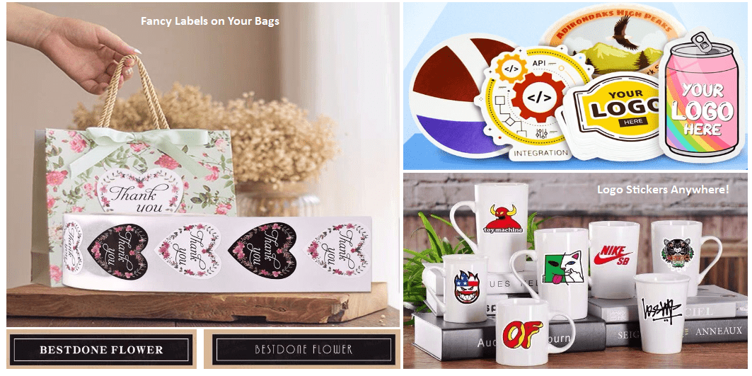
Whenever we talked about product packages, the first thing that came to our mind may be cardboard boxes, plastic bags, custom labels, logo stickers, custom stickers, etc. Meanwhile, custom stickers also can be used for decorating your packaging, and you can stick them on your package, such as cartons, bags, boxes, etc., which will make your […]
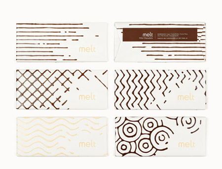
If you are like me, you buy your chocolate based on its packaging. That’s why designing great packages is so important for chocolate companies. In this post you’ll discover some awesome chocolate packaging. Many of these are just concepts, but they are still great inspiration for designers. 1. Melt Packaging and logo design for a […]