
Some amazing examples of poster design by graphic designers and artists.
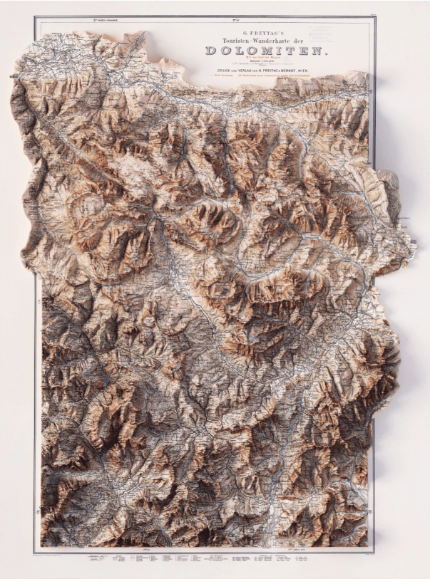
From the very first maps, cartography has always been at the intersection of design, science, and art. It has progressed at a fast pace with data acquisition technology getting better and faster, and design improving little by little. In a project that adds the 3D component to their maps, VizArt uses data visualization to make […]
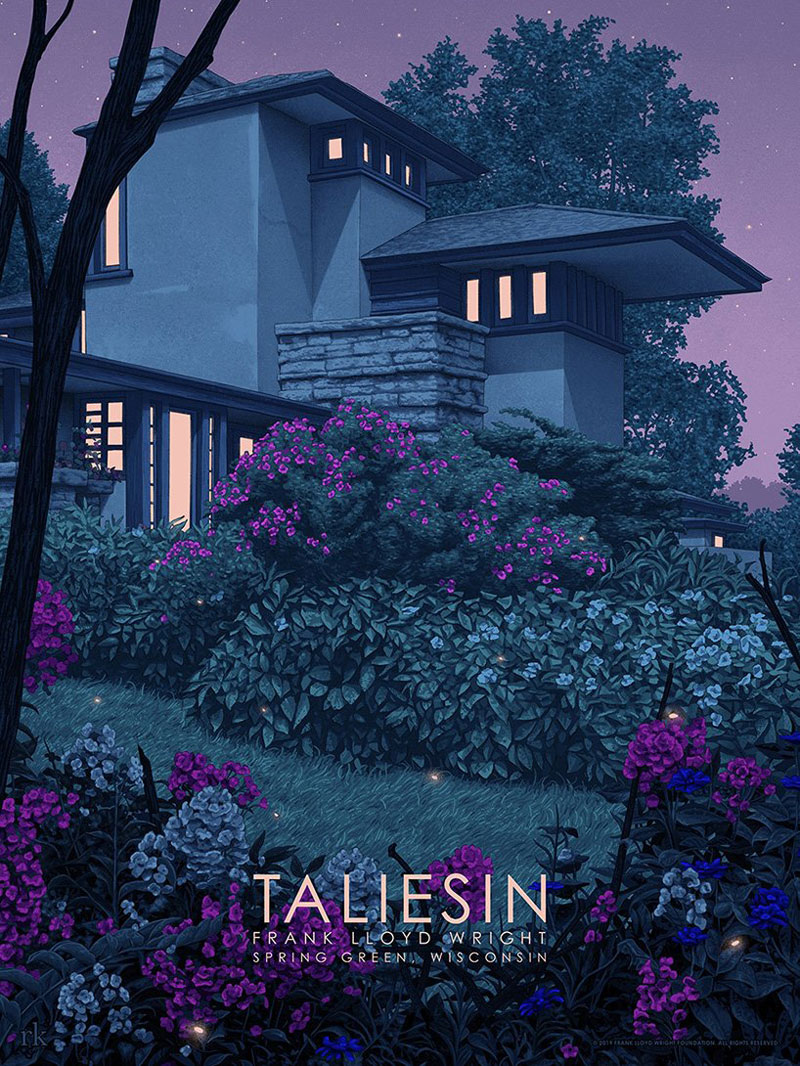
In a fruitful collaboration, the Frank Lloyd Wright Foundation and the Spoke Art Gallery have made an important announcement for their second Frank Lloyd Wright: Timeless exhibition. This time, the event will be live and will feature live-streamed events and limited-edition prints inspired by the iconic American architect. The posters, which you can see in […]
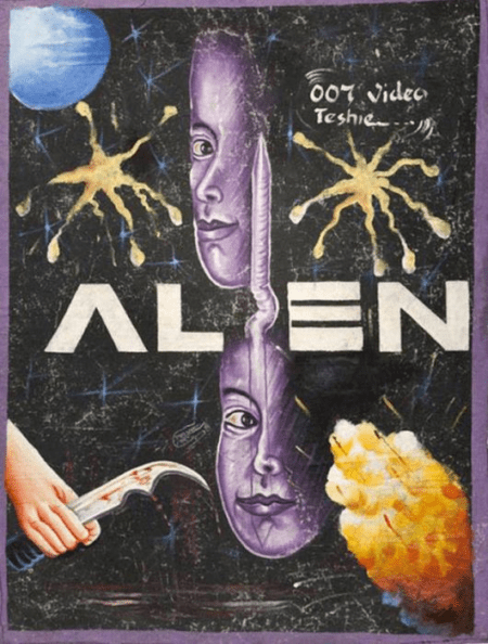
Due to the expensive licensing and printing costs, some African movie theaters commission artists to pain custom movie posters. The problem for the artists? Some of them have not even seen the movie they were doing a poster for, so the results are sometimes quite hilarious.
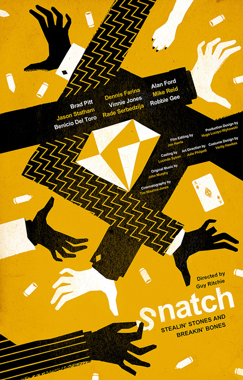
Freelance graphic designer and illustrator Levente Szabo, who goes by the name Brisk Graphics, has a portfolio filled with amazing work. His illustrative style is a perfect fit for poster design and book covers, as it brings a very different look-and-feel from all these photographic posters that you see everywhere. In his designs, you can […]
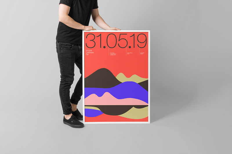
Based in Barcelona, Spain, Quim Marin is a talented Art Director and Designer who creates stunning posters. In this post, you can see a few of the designer’s posters, which perfectly mix grid-based layouts with colorful illustrations.
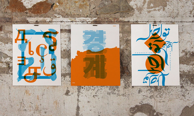
Design as a tool that breaks borders. Sounds too good to be true? Maybe, but it was the theme of this typographic project organized by Mayúscula, a design studio based in Barcelona. The concept was simple: invite designers from all overs the world to send a creation with a black graphic on the theme “Design […]
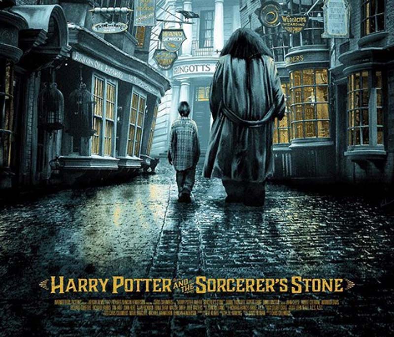
Have you ever seen a movie poster and thought “Really? I could do better than that!” Well, it seems a lot of other people have thought the same thing, but actually did something about it. Alternate movie posters are quickly becoming one of the biggest trends on the Internet today, as many talented designers from […]
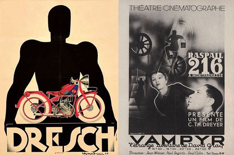
Raymond Gid is a French graphic designer who specialized in posters and typography. He started working as early as the 1930s, but his most prominent work was done in the 60s and 70s. Gid created posters for many famous French movies of his time and could be compared a bit to Saul Bass for the […]
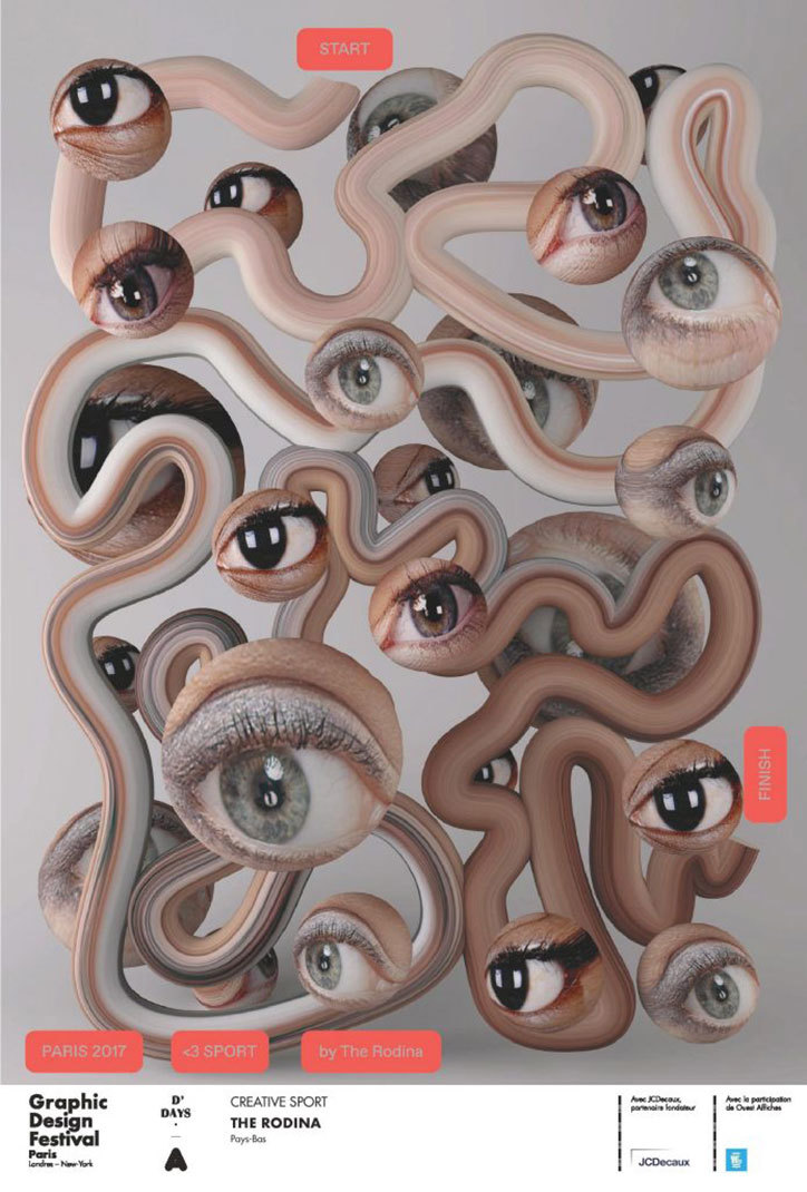
For its 2017 edition, the Graphic Design Festival in Paris asked 19 graphic designers to create a poster around the theme of sport. The posters will be displayed in the city during the festival.
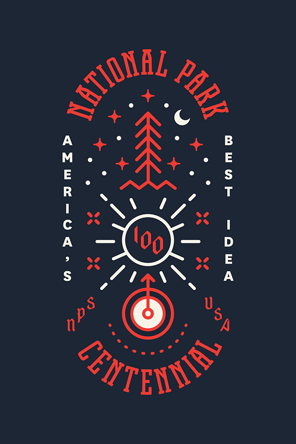
Type Hike is a collaborative design project that take a look at the US national parks from a typographic perspective. 60 designers have each created a poster about a national park, type being the main graphic tool used for each poster. Time to take a walk on the type side…
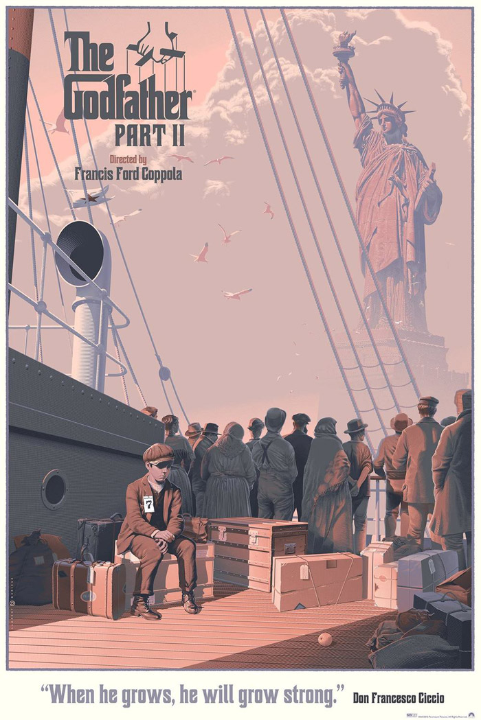
With a vintage style, Belgian illustrator Laurent Durieux creates impressive illustrated posters of famous movies. The drawing details, color schemes,… everything about this is wonderful.
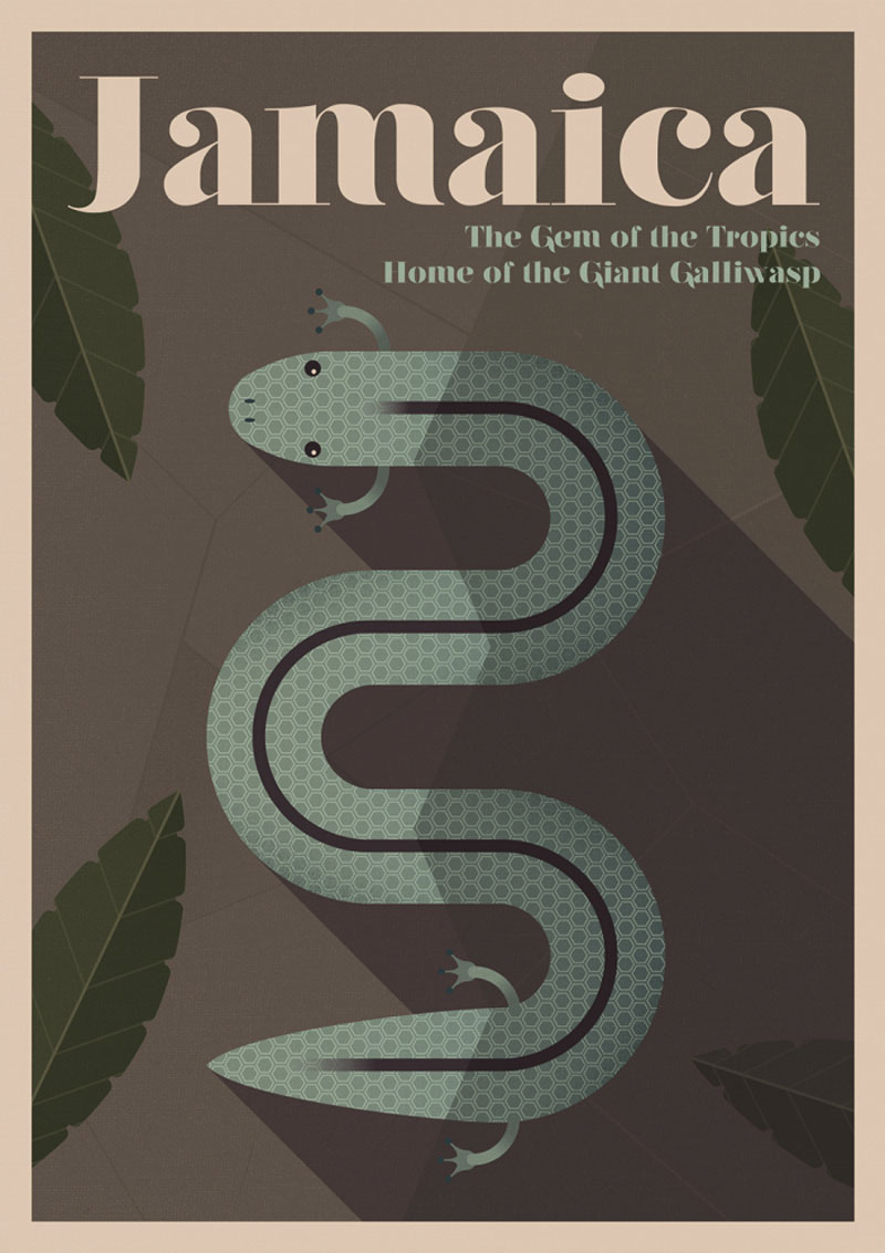
A series of posters that was created in a vintage style for Expedia. The vintage posters celebrate some popular travel destinations and the animals that used to live in it and went extinct.
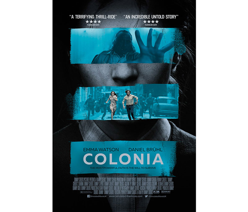
Scott Woolston specializes in movie posters, and the least you could say is that he’s good at it. He creates multiple proposals for each movie, and each of these proposal is good. Discover more on his portfolio.
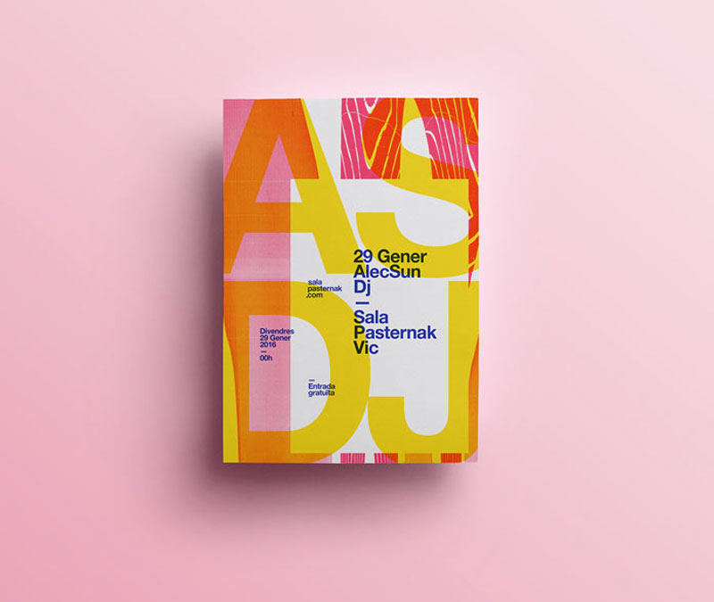
Using type, simple graphics, and a lot of experiments, Spanish graphic designer Quim Marin has a tremendous poster portfolio to show. Every year, he releases some of his favorite posters. On this post we made a selection, but you can see more on his portfolio.
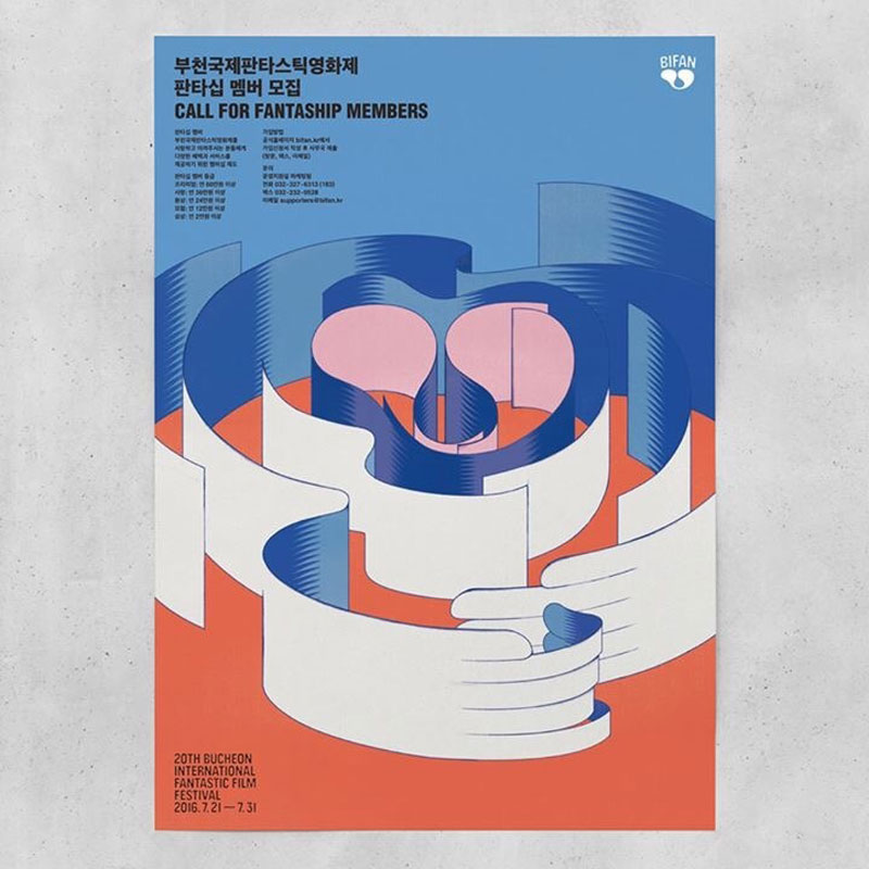
Korean illustrator Jee-ook Choi has made herself a name in the world of illustration. Her surreal worlds create a charming environment that convinced the organizers of the BIFAN festival to commission her to create posters for the festival. The posters she designed for the festival are just fantastic, with simple lines and two prominent colors, […]