
Typographic inspiration, tools and resources. Find even more on our typography blog.
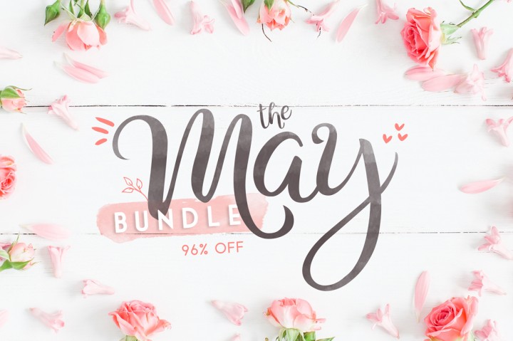
The month of May is coming to an end soon, and if you missed this impressive font bundle by our friends of The Hungry JPEG, it will be gone forever next month. In the bundle, for just $29, you’ll find over 70 high-quality fonts of all styles, pretty much a full font library for a […]
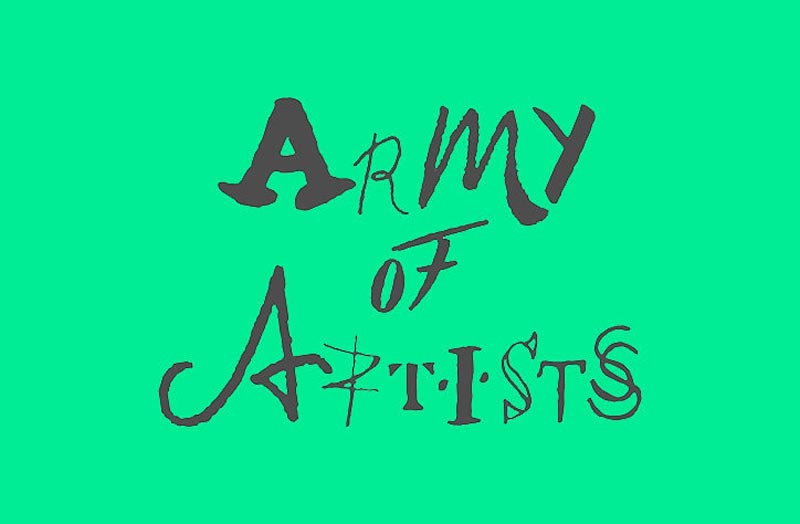
In the “unusual typefaces” family, a new kid has appeared: Army of Artists. The font was designed by Landor, a design consultancy with offices around the globe. The concept font takes the first letter of famous artists’ signatures and uses it to represent one letter of the alphabet, a clever way to celebrate the artists’ individuality.
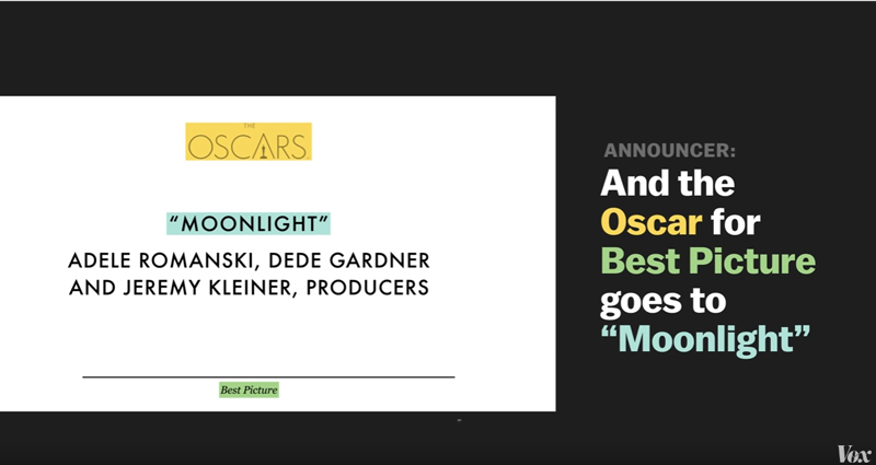
Bad design can have dramatic consequences. It will not be too hard to convince readers of this blog of it, but in the population at large, it’s not as obvious as it looks. This short video by Vox makes that point very well, with convincing evidence. They start with the latest iteration of bad typography […]
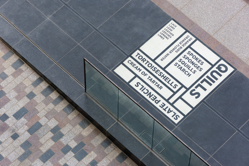
The Comedy Carpet is one of the nicest large scale typographic project you’ll see in a while. You can find it in front of the Blackpool tower in Lancashire, UK, and there is no way you’ll miss this 2’200 square meter piece of work by Gordon Young and Why Not Associate.
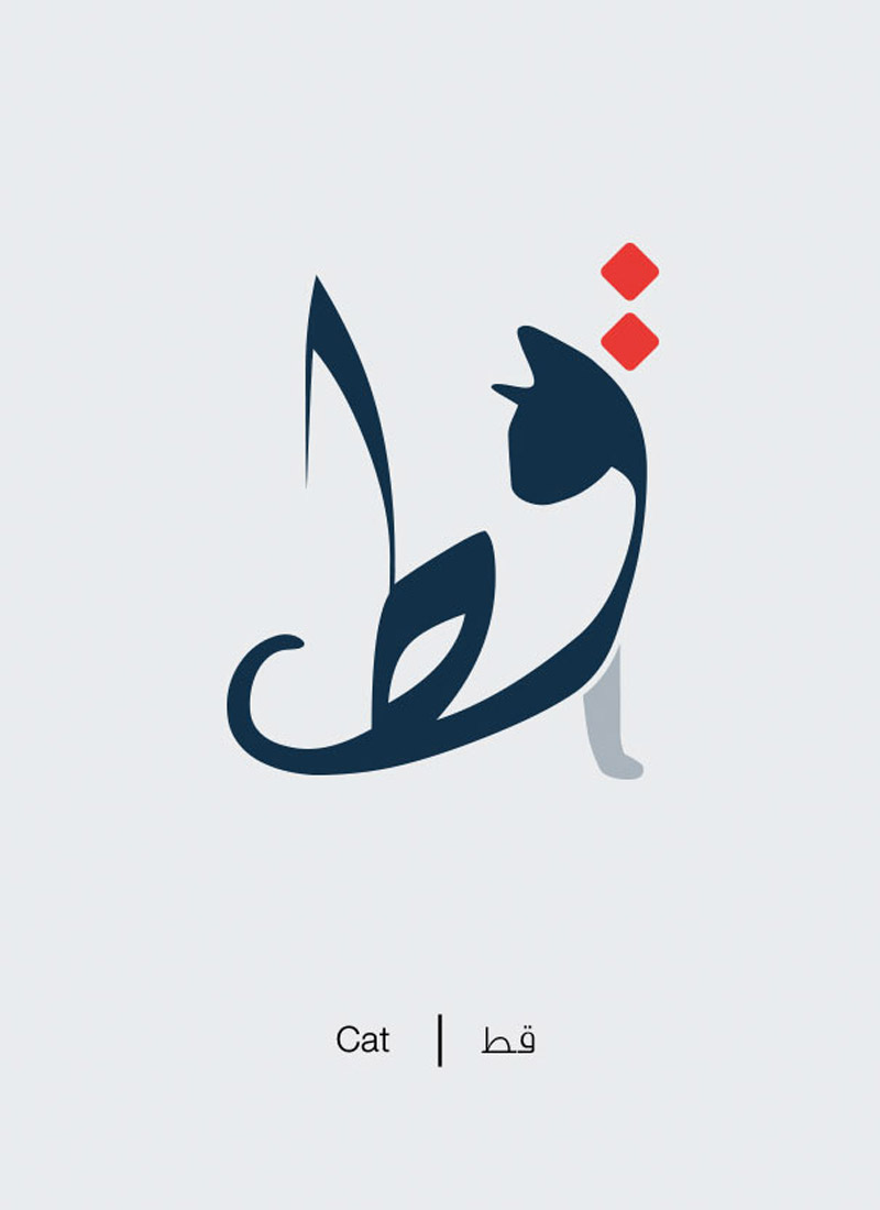
Westerners like myself often like Arabic characters for the simple reason that they look graphically pleasing. Mahmoud El Sayed, a graphic designer from Egypt, played with this and created a collection of educational illustrations that take the meaning of Arabic words litterally. By distorting each character, El Sayed makes the word look like its meaning. […]
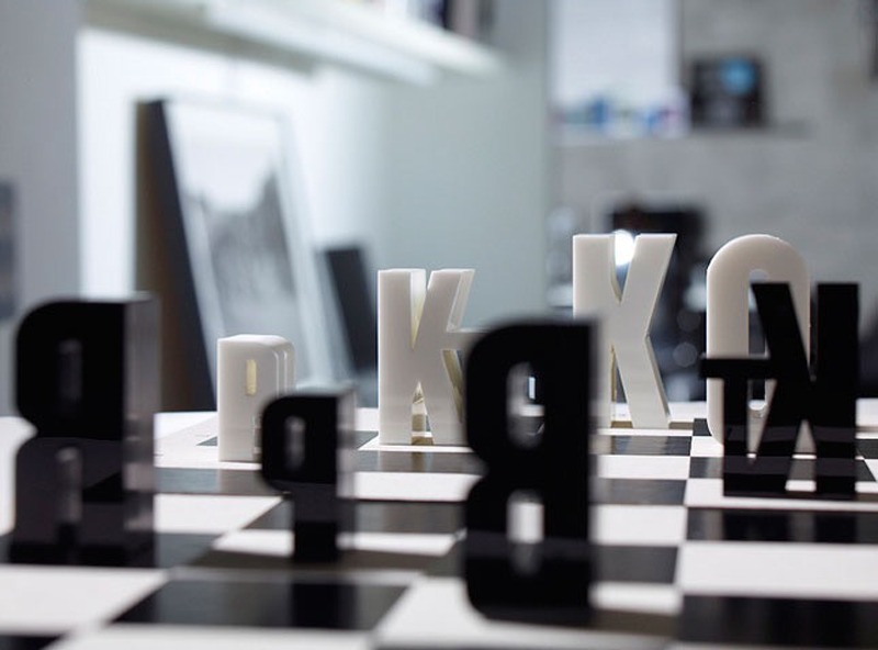
Type experts are not the only ones who enjoy the beauty of letters. Of course, regular people will not be obsessed with an ampersand’s curves, but they’ll be able to enjoy nice typographic decoration. 1. The type chess set How about a more conceptual chess set that will look great on any table? Created by […]
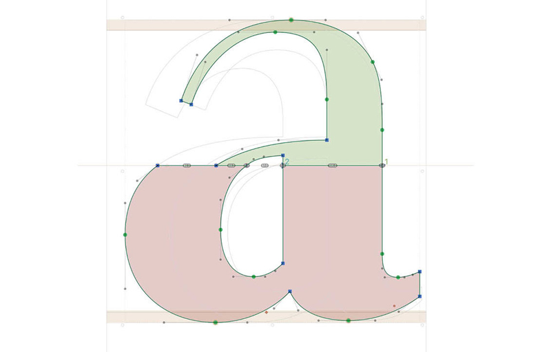
Astrid Stavro, the artistic director of Atlas Design, worked on a typeface about the city where she lives and works: Trieste. The Italian city has a dual personality, with architecture inspired by Austria (the closest neighbor) and a very Italian lifestyle. The designer worked on a typeface that reflects this and uses type features to […]
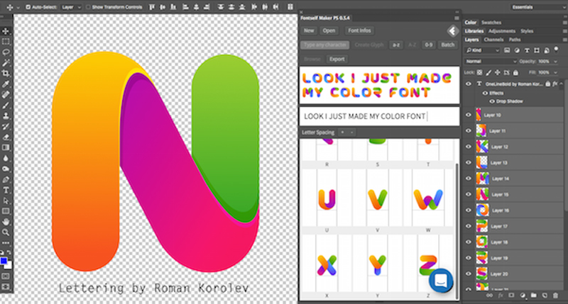
On Designer Daily, we already mentionned Fontself when they were looking to fund their first iteration of the project. At the time, they were looking to create an add-on for Photoshop and Illustrator, starting with the latter. The Illustrator plugin was released months ago already and was a great success. Recently, Fontself launched the Photoshop […]
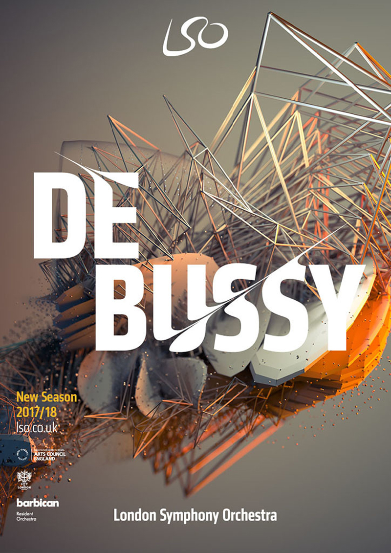
The London Symphony Orchestra new logo and identity was reveiled recently by The Partners, the agency behind this new creation. In a creative twist, the designers took the type at the core of the logo and tweaked it to follow the movements of the orchestra’s conductor.
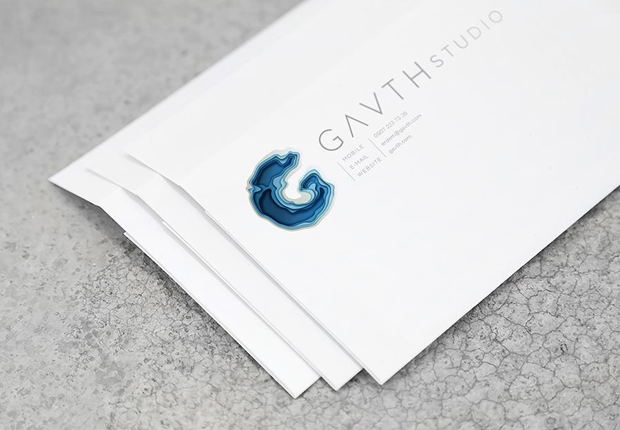
For this corporate identity, London based graphic design and art director Tugba Ozcan took her inspiration from topographical maps to give a sense of depth to the logo. The word Gavth meaning deep pit in old language, the choice of the topographical features makes a lot of sense.
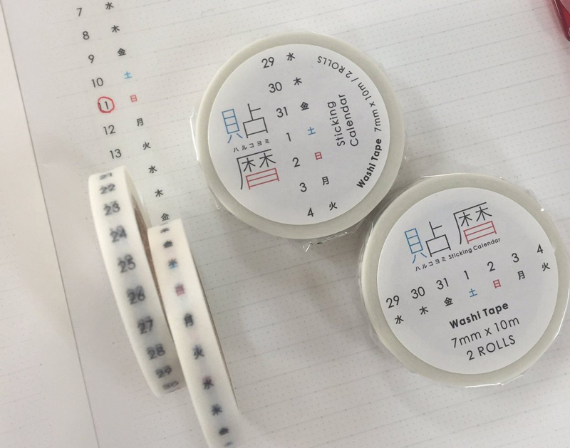
Some ideas look very simple, yet borderline genius. This calendar masking tape sold by Japanese design shop icco nico is one of those. The idea seems obvious, it’s very simple to use or design, but they are the only ones who did it. Two rolls of tape are sold separately, one with the dates, the […]
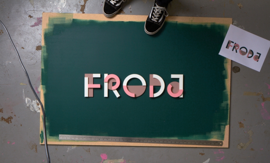
To better suit their activity, Monetize decided to change name and become Froda. With that, the company had to find someone to design a new logo. They called Snask, a Swedish design studio. The designers took the option to work with building blocks, but litterally. They used blocks with three different colors to create a […]
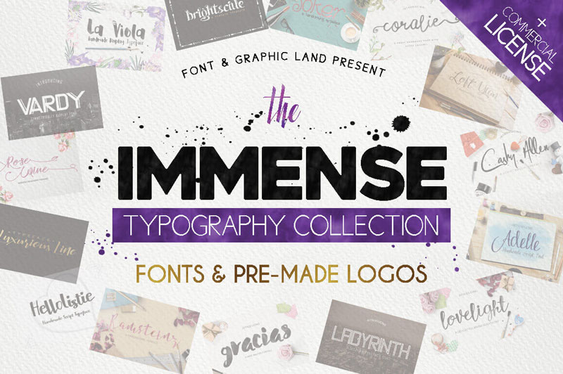
Every week, we’ll give you an overview of the best deals for designers, make sure you don’t miss any by subscribing to our deals feed. You can also follow the recently launched website Type Deals if you are looking for free fonts or font deals. The Immense Typography Collection of 120+ Fonts & Logos Two great tastes that taste […]
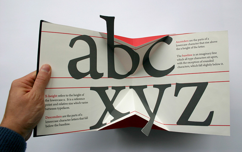
I’ve always wondered why books with paper gimmicks were mostly designed for children books, but now there is a great example that targets type lovers and graphic designers. This Movable book of letterforms was designed by Kevin Steele to serve as an example to show how pop-up books can be used to educate people. In […]
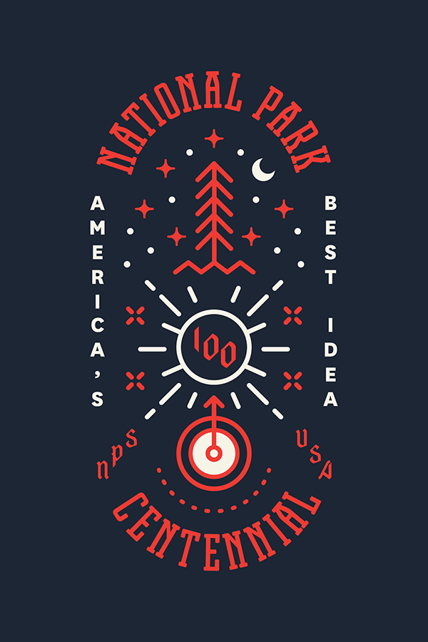
Type Hike is a collaborative design project that take a look at the US national parks from a typographic perspective. 60 designers have each created a poster about a national park, type being the main graphic tool used for each poster. Time to take a walk on the type side…